How does light affect colors in architecture
How does light affect colors in architecture,
Famous architects have used light to improve their designs over the years,
as light in architecture goes beyond functions to transforming architectural designs into great works.
It also brings life to the architecture, creates the right mood and allows for visual comfort.
Light also affects how we perceive color, making it highly interconnected,
so it is important to understand how your application of light can affect color perception in your architecture.
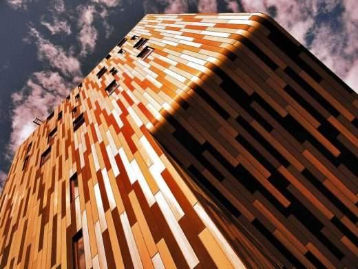
Light determines how we see color. A wall or structure can look different the moment you change the type and color of lighting on it.
So light can change our visual impression of color,
Here are some of the qualities and features of light that may affect color in architecture:
Color rendering index (CRI)
When incorporating light into your design, you should be aware of the color rendering index of the lighting device you are purchasing.
The CRI is a measure of how accurately a light source depicts the true colors of the object it illuminates.
Natural daylight is considered to have a maximum CRI value of 100, and each light bulb is measured proportionally against this value.
Thus, higher values will improve the colors used and accentuate textures and patterns on surfaces,
and as a result the colors will appear bolder and brighter.
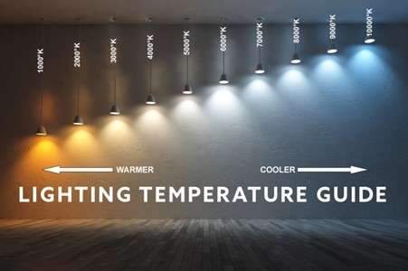
Correlated color temperature (CCT)
Another essential property of light is the color temperature of light, especially when it comes to architectural lighting.
The warmth or coldness of the emitted light is measured against the Kelvin scale. For example,
a 2700K light source will produce a warm glow that creates a relaxing and intimate atmosphere, making it ideal for residential spaces.
On the other hand, a 4000K bulb will produce a more neutral white,
while a 6500K bulb will generate cooler light which is great for industrial applications.
The associated color temperature generally determines the mood and ambiance of a space,
as values on the Kelvin scale replicate the glow caused by carbon when heated to different temperatures.
As for how the color temperature of a light source affects the actual colors in your architecture,
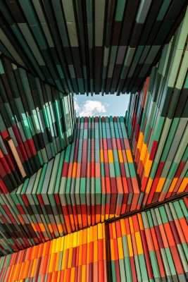
warm lighting enhances warmer colors like red, orange, and yellow.
While cool lighting makes cool colors like blue and green look more vibrant.
The neutral white temperature creates a good balance between warmer and cooler colors,
so it is important to select the most appropriate color temperature, depending on the body or panel color.
Light Intensity
Lighting level is a primary concern when lighting for jobs, in lighting design.
There are recommended standard lighting levels that need to be met, depending on the use of the space,
in order to ensure the visual comfort and security of any tasks undertaken in the field.
The intensity of light also affects the color in architecture.
Low-intensity lighting makes colors look visually darker than they actually are,
and as your light levels increase, color will be more accurately portrayed.
Then increasing the light even further will make it look dull, so getting the right light intensity is key.
The effect of surface properties on how light affects color in architecture
In addition to the many characteristics of light that affect color,
understanding how different surface properties affect how color reacts under different lighting conditions is critical.
We’ll look at some of the more important surface attributes that may affect color:
Surface reflection
Colored surface reflectance is a measure of how much a material absorbs light and how much light bounces off the surface.
Highly reflective colored surfaces appear darker and more saturated under optimal lighting compared to surfaces with low reflectivity.
However, when surfaces with high reflectivity are exposed to high intensity illumination,
there may be glare as too much light is reflected from the surface.
But the following factors must also be considered:
Surface glossy
Glossy surfaces have a higher reflectivity than matte surfaces, so glossy surfaces tend to have deeper,
more saturated colors than matte surfaces under the same lighting.
When lighting rough and smooth colored surfaces, remember that they react differently under lighting.
Rough surfaces often appear duller and less saturated because they scatter light in a more diffuse reflection.
Softer surfaces are also richer in color since they result in a specular reflection when lit.
Surface color properties
If you are familiar with the principles of light, you realize that color is simply light energy perceived at different wavelengths.
When a beam of light is refracted through a glass prism, it is decomposed into the seven colors of the rainbow, each with a different wavelength.
As such, the following surface color characteristics will affect how a person perceives architectural colors under lighting:
Surface tone
Color has a significant impact on the psychological state of room occupants.
Research has shown that warm colors such as red, yellow and orange have an invigorating and brightening effect.
On the other hand, cooler colors like green and blue are more relaxing and soothing,
however, trends have seen skillful blending of warm and cool colors on building facades and interiors to give a more playful look.
This must be done with a lot of careful consideration because if poorly applied, it can cause visual fatigue.
Also, different colors under illumination will retain the same saturation as their true colors in white light;
however colors will appear visually different under lights at different color temperatures.
Likewise, higher light levels will make colors appear brighter
- Color value
The color value determines the brightness level Or the opacity of a color with a fixed color gradation,
where a certain color tone can be referred to as a shade when it is darker,
or its light color when it is lighter.
In general, the more white you add to a color, the lighter it becomes,
while the more black you add to it, the darker it becomes.
When illuminated, light colors tend to reflect more light than dark colors,
which absorb more light instead.
So this can be a major consideration when choosing the right lumen lamps to illuminate spaces or structures painted in different shades or tints of color,
as the luminous intensity required will certainly vary.
Conclusion
Light and color both play fundamental roles in architecture, as they not only increase aesthetic value,
but also define how we experience architecture.
Since these two elements are so closely interrelated, you cannot simply focus on one without looking at the other.
Light affects color in different ways, influenced by the characteristics of the luminous surface of the structure,
and combining all of these factors creates a variety of potential outcomes that you can incorporate into your design.
Thanks to technology, lighting companies have now developed several virtual demo room programs that allow you to test different lighting fixtures with adjustable settings.
This allows you to see in advance how your space or structure will look under the influence of these lighting fixtures.
Lighting design is a broad concept, but it is so essential in architecture,
by mastering the principles we mentioned of how light and color interact in your design,
you can make lighting work for you, achieving superior impact on all of your architectural designs.