A design language introduced by Microsoft focusing on typography and simplified icons.
“Modern UI” redirects here. For Nullsoft’s installation system, see Nullsoft Scriptable Install System § Modern user interface.
“Microsoft Metro” redirects here. For the file format codenamed Metro, see Open XML Paper Specification.
See also: Aero (user interface) and Fluent Design System
The Music+Video hub on Windows Phone
Microsoft Design Language (or MDL),[1] previously known as Metro, is a design language created by Microsoft. This design language is focused on typography and simplified icons, absence of clutter, increased content to chrome ratio (“content before chrome”), and basic geometric shapes. Early examples of MDL principles can be found in Encarta 95 and MSN 2.0.[2][3] The design language evolved in Windows Media Center and Zune and was formally introduced as Metro during the unveiling of Windows Phone 7. It has since been incorporated into several of the company’s other products, including the Xbox 360 system software and the Xbox One system software, Windows 8, Windows Phone, and Outlook.com.[4][5] Before the “Microsoft design language” title became official, Microsoft executive Qi Lu referred to it as the modern UI design language in his MIXX conference keynote speech.[6] According to Microsoft, “Metro” has always been a codename and was never meant as a final product, but news websites attribute this change to trademark issues.[4]
Microsoft Design Language 2 (MDL2) was developed alongside Windows 10.[7][8] Later, the Fluent Design language extended it.
History
The design language is based on the design principles of classic Swiss graphic design. Early glimpses of this style could be seen in Windows Media Center for Windows XP Media Center Edition,[9] which favored text as the primary form of navigation, as well as early concepts of Neptune.[10] This interface carried over into later iterations of Media Center. In 2006, Zune refreshed its interface using these principles. Microsoft designers decided to redesign the interface and with more focus on clean typography and less on UI chrome.[11] These principles and the new Zune UI were carried over to Windows Phone first released in 2010 (from which much was drawn for Windows 8). The Zune Desktop Client was also redesigned with an emphasis on typography and clean design that was different from the Zune’s previous Portable Media Center based UI. Flat colored “live tiles” were introduced into the design language during the early Windows Phones studies.
In an interview it was explained that different Microsoft divisions use each other’s products, and the extension of Metro was not a company-wide approach but instead teams such as Xbox liking Metro and adapting it for its own products. Many of Microsoft’s divisions ended up adopting Metro.[12]
Microsoft Design Language 2 (MDL2) was developed alongside Windows 10. This version introduced a new set of widgets, including date pickers, toggles and switches, and reduced the border thicknesses for all user interface elements.[7][8]
Principles
Segoe UI font in Windows Vista and Windows 7 (top); Windows 8, Windows 8.1, Windows 10 and Windows 11 (bottom)
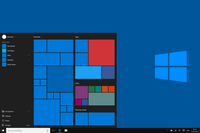
Microsoft design language design principles behind the Start screen in Windows 8 and Xbox One (top) and Windows 10 “Threshold” (bottom), that is also used in Windows Store, Xbox Music and Xbox Video: Tiles represent atomic units of information
Microsoft’s design team cites as an inspiration for the design language signs commonly found at public transport systems.[13] The design language places emphasis on good typography and has large text that catches the eye. Microsoft sees the design language as “sleek, quick, modern” and a “refresh” from the icon-based interfaces of Windows, Android, and iOS.[14] All instances use fonts based on the Segoe font family designed by Steve Matteson at Agfa Monotype and licensed to Microsoft. For the Zune, Microsoft created a custom version called Zegoe UI,[15] and for Windows Phone Microsoft created the Segoe WP font family. The fonts mostly differ only in minor details. More obvious differences between Segoe UI and Segoe WP are apparent in their respective numerical characters. The Segoe UI font in Windows 8 had obvious differences – similar to Segoe WP. Characters with notable typographic changes included 1, 2, 4, 5, 7, 8, I, and Q.
Joe Belfiore was one of the architects of Metro. At Nokia World 2011, Belfiore explained that the UI aims to be “artistic” in textual elements and iconography. He also mentioned the “motion” of the UI, specifically in Windows Phone, of the Live Tiles, moving dots, and kinetic scrolling.[16]
Microsoft designed the design language specifically to consolidate groups of common tasks to speed up usage. It achieves this by excluding superfluous graphics and instead relying on the actual content to function as the main UI. The resulting interfaces favor larger hubs over smaller buttons and often feature laterally scrolling canvases. Page titles are usually large and consequently also take advantage of lateral scrolling.
Animation plays a large part. Microsoft recommends consistent acknowledgement of transitions, and user interactions (such as presses or swipes) by some form of natural animation or motion. This aims to give the user the impression of an “alive” and responsive UI with “an added sense of depth”.[17][18]
Reception
On mobile
Early response to the language was generally positive. In a review of the Zune HD, Engadget said, “Microsoft continues its push towards big, big typography here, providing a sophisticated, neatly designed layout that’s almost as functional as it is attractive.”[19]CNET complimented the design language, saying, “it’s a bit more daring and informal than the tight, sterile icon grids and Rolodex menus of the iPhone and iPod Touch.”[20]
At its IDEA 2011 Ceremony, the Industrial Designers Society of America (IDSA) gave Windows Phone 7, which uses the UI, its “Gold Interactive” award, its “People’s Choice Award”, and a “Best in Show” award.[21][22] Isabel Ancona, the User Experience Consultant at IDSA, explained why Windows Phone won:[23]
The innovation here is the fluidity of experience and focus on the data, without using traditional user interface conventions of windows and frames. Data becomes the visual elements and controls. Simple gestures and transitions guide the user deeper into content. A truly elegant and unique experience.
It was reported that the UI was better received by women and first-time users.[24]
Criticism particularly focused on the use of all caps text. With the rise of Internet usage, critics have compared this to a computer program shouting at its user. IT journalist Lee Hutchinson described Microsoft’s use of the practice in the macOS version of OneNote as terrible, claiming that it is “cursed with insane, non-standard application window menus IN ALL CAPS that doesn’t so much violate OS X’s design conventions as it does take them out behind the shed, pour gasoline on them, and set them on fire.”[25]
On Windows 8 desktop
With the arrival of Windows 8, the operating system’s user interface and its use of the design language drew generally negative critical responses. On 25 August 2012, Peter Bright of Ars Technica reviewed the preview release of Windows 8, dedicating the first part of the review to a comparison between the Start menu designs used by Windows 8 and Windows 7. Recounting their pros and cons, Peter Bright concluded that the Start menu in Windows 8 (dubbed Start screen), though not devoid of problems, was a clear winner. However, he concluded that Windows 8’s user interface was frustrating and that the various aspects of the user interface did not work well together.[26] Woody Leonhard was even more critical when he said, “From the user’s standpoint, Windows 8 is a failure – an awkward mishmash that pulls the user in two directions at once.”[27]
In addition to the changes to the Start menu, Windows 8 takes a more modal approach with its use of full-screen apps that steer away from reliance on the icon-based desktop interface. In doing so, however, Microsoft has shifted its focus away from multitasking and business productivity.[28]
Name change
In August 2012, The Verge announced that an internal memorandum had been sent out to developers and Microsoft employees announcing the decision to “discontinue the use” of the term “Metro” because of “discussions with an important European partner”, and that they were “working on a replacement term”.[29] Technology news outlets Ars Technica,[30]TechRadar,[31]CNET,[32]Engadget[33] and Network World[34] and mainstream press Bits Blog from The New York Times Company[35] and the BBC News Online[36] published that the partner mentioned in the memo could be one of Microsoft’s retail partners, German company Metro AG, as the name had the potential to infringe on their “Metro” trademark. Microsoft later stated that the reason for de-emphasizing the name was not related to any current litigation, and that “Metro” was only an internal project codename,[37] despite having heavily promoted the brand to the public.[38] In some contexts, the company began using the term “Modern” or the more generic “Windows 8” modifier to refer to the new design, possibly as a placeholder.[39]
In September 2012, “Microsoft design language” was adopted as the official name for the design style.[1][40] The term was used on Microsoft Developer Network documentation[41][42][43][44] and at the 2012 Build conference to refer to the design language.[1][45]
In a related change, Microsoft dropped use of the phrase “Metro-style apps” to refer to mobile apps distributed via Windows Store.[40]
See also
Carbon Design System by IBM
Flat design
Skeuomorph design
Human interface guidelines
Windows Aero
Universal Windows Platform apps
Microsoft by the Numbers website
Modern Design at Microsoft (Archive)
UX guidelines for Windows Store apps on MSDN
Design Guidelines for Windows Phone on MSDN
Ibrahim Fawakherji
As the Director of ARCHUP, I'm honored to lead the premier architectural platform in the Arabic-speaking world. We are dedicated to meeting the dynamic demands of our valued audience, providing access to architectural excellence. Explore our content to stay updated and inspired by the latest in the architectural realm.

 العربية