Rostokino, Moscow, Russian Federation

Rostokino Moscow Russian Federation

Home » News » Rostokino Moscow Russian Federation

Rostokino Moscow Russian Federation

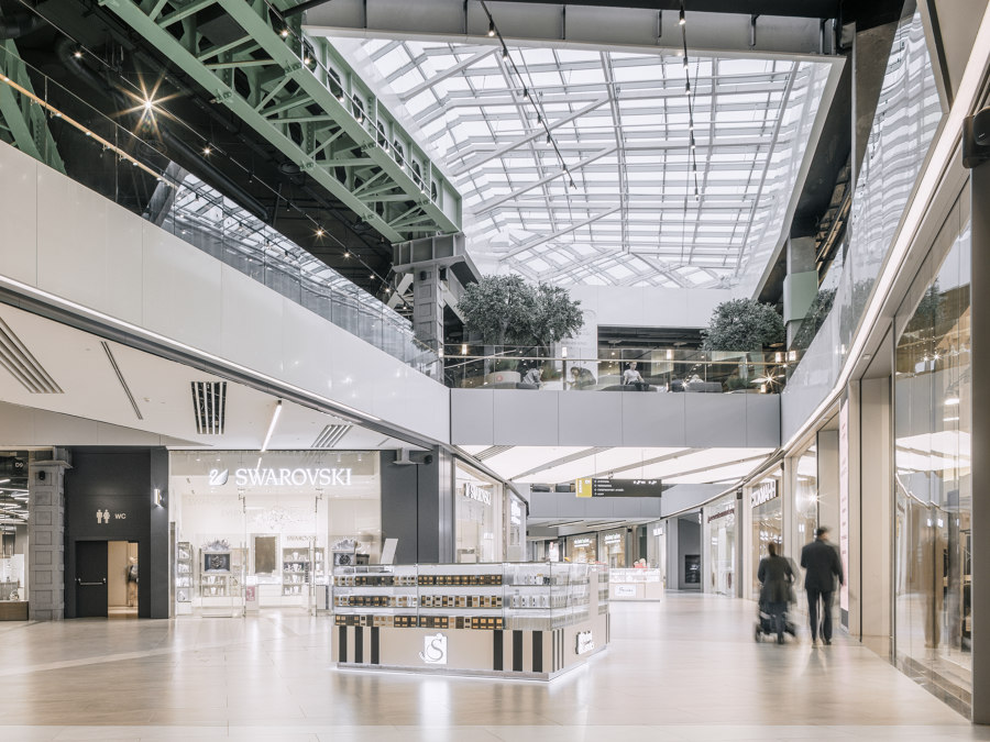
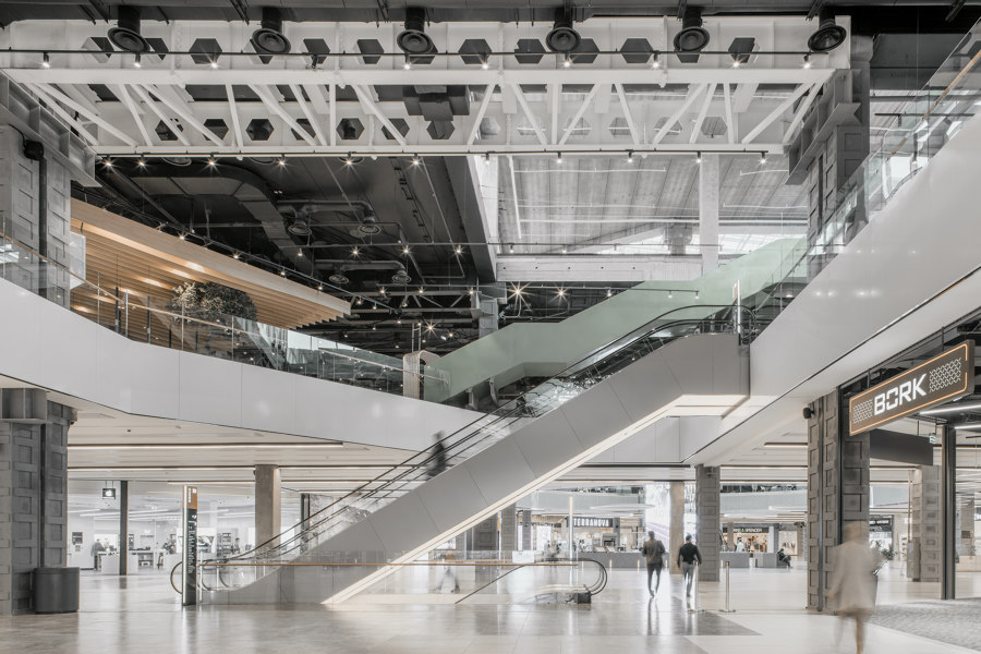
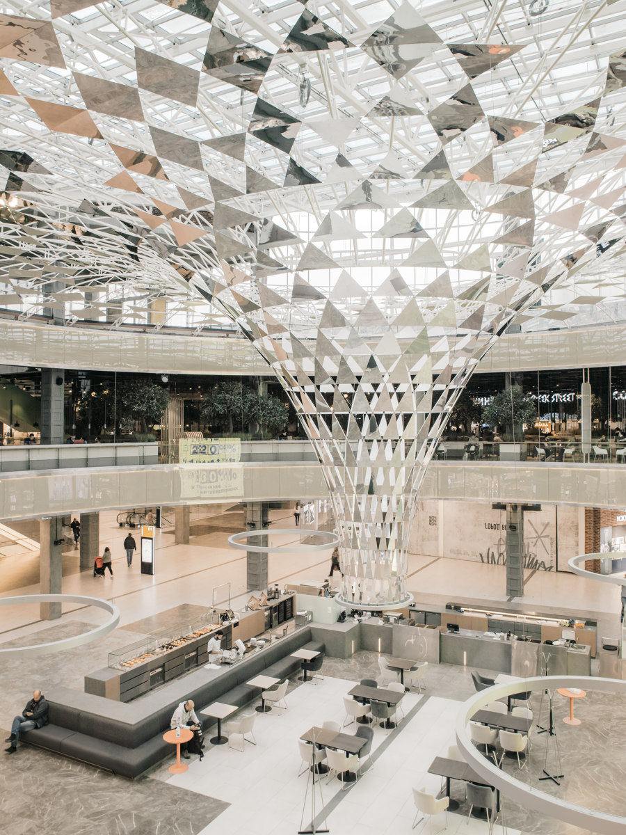
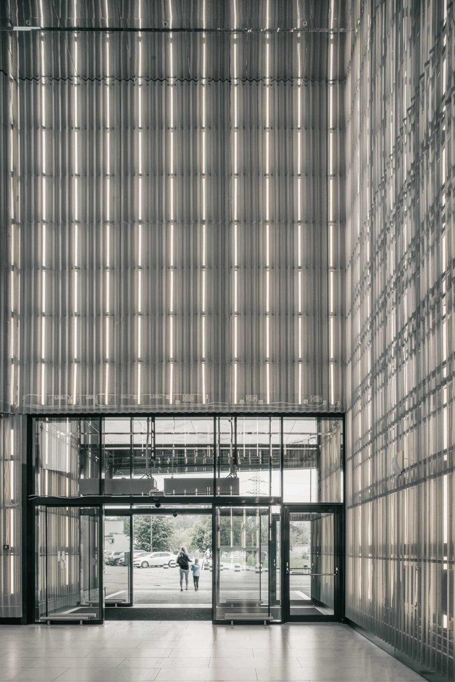
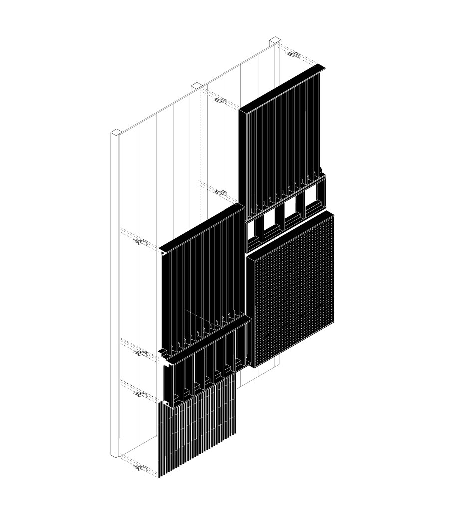
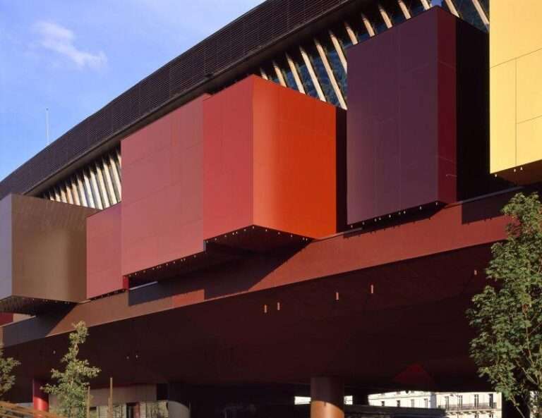
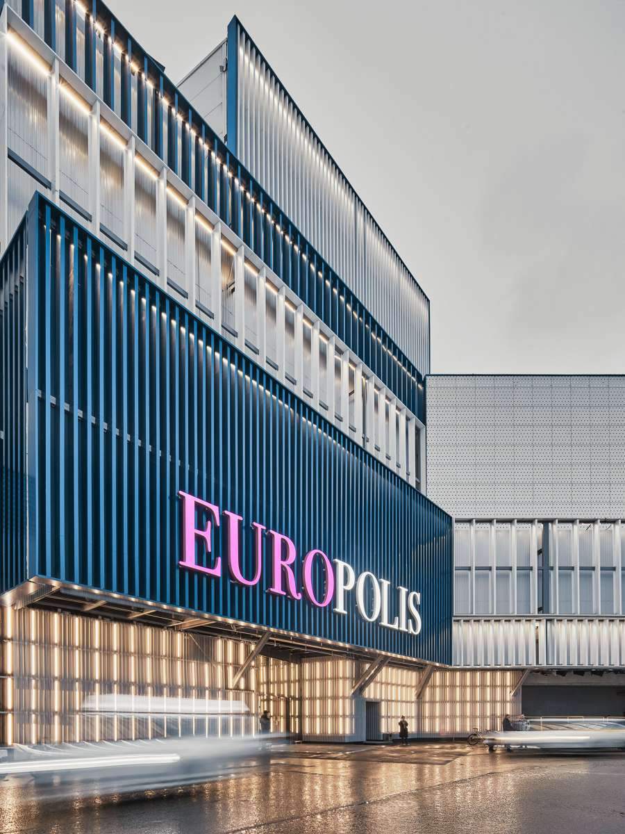
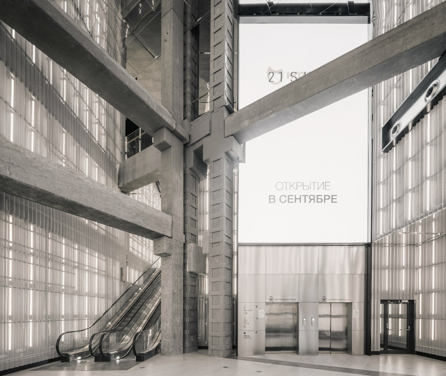
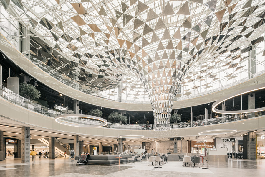
The Moscow City Shopping Center, with an area of ​​more than 250,000 square metres, was taken over in 2004, and was in need of a new brand identity. The client requested a new facade and interior design strategy for all shopping malls and plazas.
short period of time.
The process was divided into several parts in the research process.
Shopping, More Shopping, More Shopping All spaces are designed to produce a retail experience for their items and needs.
For a pre-identity search system. The versatility of these elements allowed a configuration compatible with the existing interface.
With this system the construction process is improved in terms of costs and costs due with the client and the project’s participatory design intentions.
design team:
CLK Architects
روستوكينو من قبل CLK Architects | مراكز التسوق


روستوكينو من قبل CLK Architects | مراكز التسوق

روستوكينو من قبل CLK Architects | مراكز التسوق

روستوكينو موسكو ، الاتحاد الروسي
Rostokino, Moscow, Russian Federation

روستوكينو موسكو ، الاتحاد الروسي

روستوكينو من قبل CLK Architects | مراكز التسوق

Rostokino Moscow Russian Federation

Photographer: Grigory Sokolinsky

Read more World Architecture Day 2021

Further Reading From ArchUp

  • Aquellum: A New Architectural Marvel in NEOM’s Landscape of Innovation

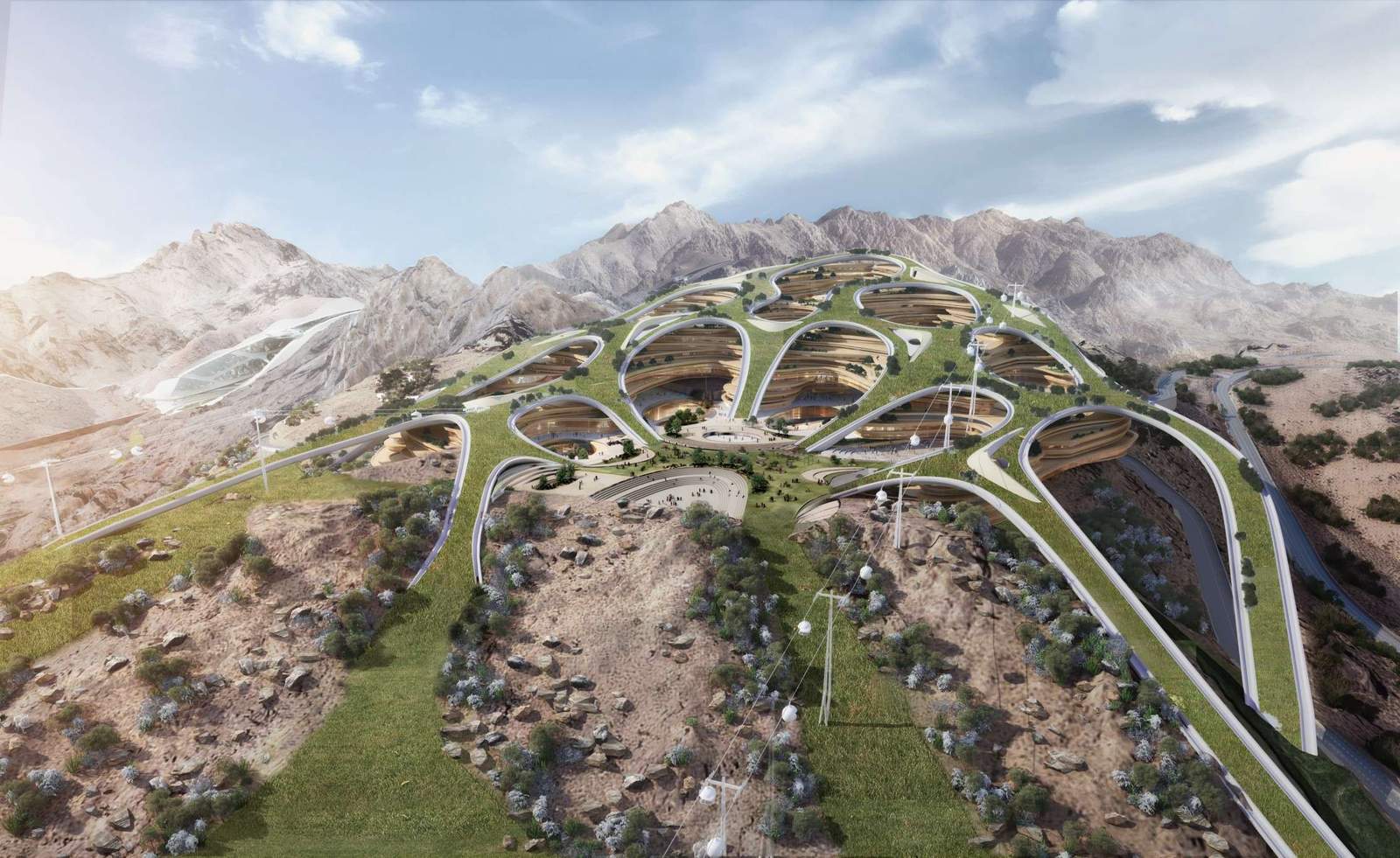
    Aquellum is a subterranean community within the NEOM region of Saudi Arabia, situated inside a mountain range along the Gulf…

  • Akon wants to build a pharaonic smart city in Senegal

    Akon is famous for having been an ultra-popular RnB singer during the 2000s, notably with his singles Lonely or Smack…

  • How to use quantum computing in the construction industry

    Quantum computing is a field of computing that selects relevant solutions from a large number of options. It uses quantum…

  • Aromanordic Inhaler by Puchong Khampiman for APAUL

    Download our DWalking guide (pdf, mobile-friendly) with all the info for visiting.The carry-on herbal inhaler represents a healing companion as the name of the brand itself: “A” represents one, “Pal” means friend while “U” is the symbol of a smile.APAUL creates a culture of inhaler products passing on Thai cultural heritage from its origins to the

Leave a Reply

Your email address will not be published. Required fields are marked *