






🌟 Welcome to ARCHUP, where architectural passion meets purpose! As an architecture addict and PR professional, I’m dedicated to building a vibrant community of Architects and design enthusiasts, all committed to capturing the excellence of this field. Discover our exclusive Architectural Competitions and bilingual content showcasing the latest trends shaping the future of Architecture. Join us in celebrating the art and impact of design. 🏛️✨
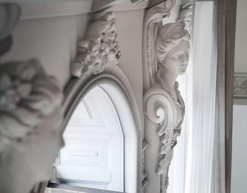
Design and visualization of the apartment.Designer: Anna AfanasyevaVisualizer: Anna AfanasyevaThank you for watching!
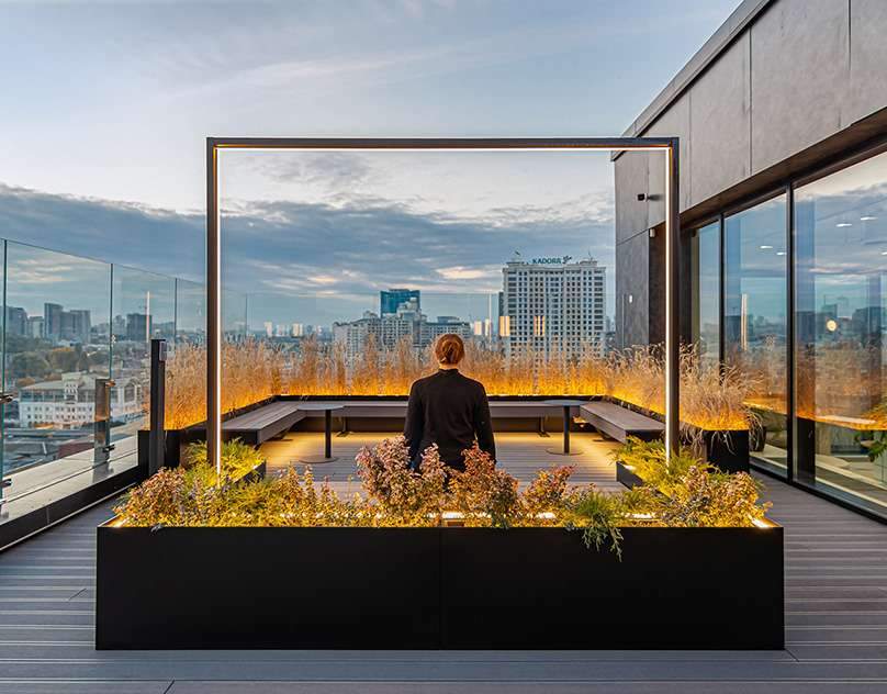
SQUADLocation: Kyiv, UkraineType: public, officeArea: 7 650 sqmYear: 2021Status: CompletedArchitects: Maksym Parokonnyi, Valentyna Perevalova, Julia Koberidze, Antonina Savchenko, Alex Pedko, Oles Kuntsevych, Dmytro SvintsovNavigation design: Pavlo VelichkoPhoto Credit: Alex PedkoSQUAD is a new office space located on 5 floors in a renovated factory building in the center of Kyiv, which has become the main residence for a large IT company and created an opportunity…
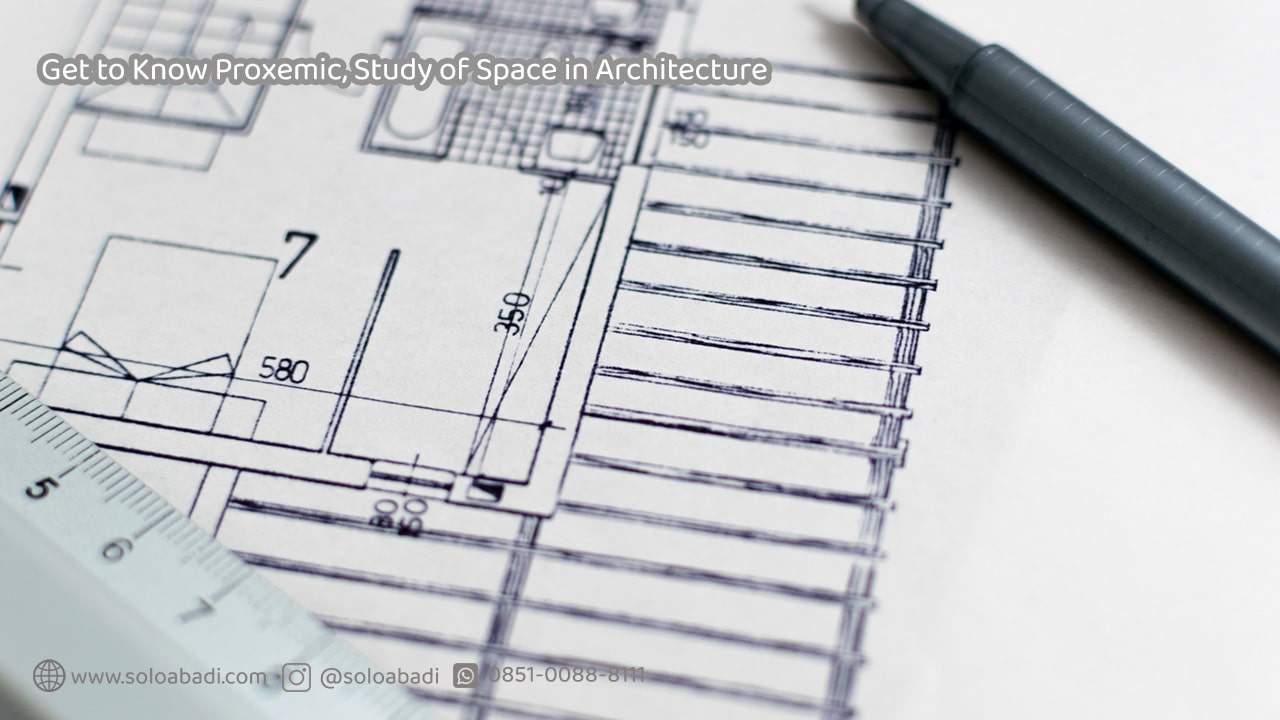
When receiving the first copy of the New Projects Design Brief many questions arise, which stem from one main fundamental question: How will this space be used and lived in? This is where space planning begins to take shape. Below…

Espacio is a company dedicated to home design and equipment. With a history of over four decades, it has experienced significant growth and evolution in recent years, becoming an indisputable reference in the sector with a total of seven showrooms open to the public in Mallorca.The aim of the rebranding project is to revitalize the…
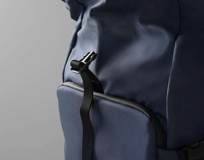
EXPLORER designed for Nava Design2020. Italy. MilanBags and Accessories CollectionThis collection comes from the idea of exploring a new product category: lifestyle / travel.For Explorer we pictured a user who makes short and international trips, for work but also for pleasure. A city traveller.This collection has soft and versatile accessories for those who like to get lost in the…
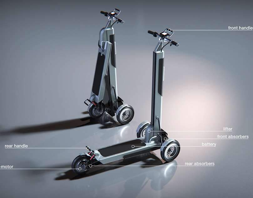
The challengeThe main featuresPrototype testing Team project Levan Baazov CEO …