

🌟 Welcome to ARCHUP, the largest Arabic Architectural Platform beyond social media! Connect with our vibrant community of Architects and design enthusiasts committed to documenting excellence. Discover our Architectural Competitions and the latest trends shaping the future of Architecture. Join us in celebrating the art of building. 🏛️✨

I worked with WP BrandStudio to make these illustrations for the release of Season 4 of Amazon Prime Video original show The Expanse. Love me some SCI-FI!Illustrations: Matt ChinworthAD: Qiushuo Li.https://www.washingtonpost.com/brand-studio/amazon-the-expanse/the-next-gold-rush-will-take-place-in-the-cosmos/See more of my work here:Portfolio: ChinworthIllustration.comInstagram: @mattchinworth

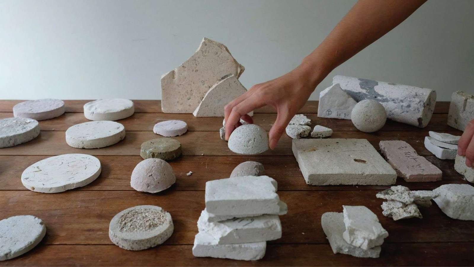
Today, as the world and the Global Cement and Concrete Association (GCCA), in particular, race to reach net-zero emissions by 2050 to avoid the worst effects of climate change – researchers are working to decarbonise concrete, one of the most polluting materials in the world.Did you know concrete’s key ingredient cement currently accounts for about

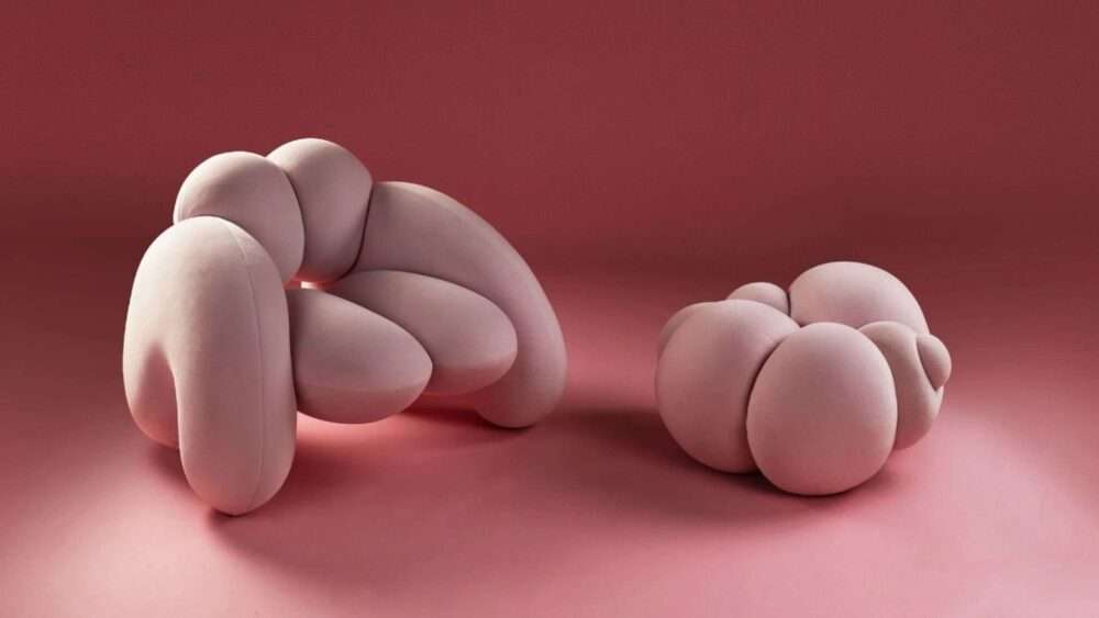
Download our DWalking guide (pdf, mobile-friendly) with all the info for visiting.“The female form has always been a source of inspiration in art, photography and design but often with an unrealistic eye or as a response to society’s perception of how the female body ’should’ look. I wanted the Peaches collection to be a pure and

The Emoji jacket is a model that empowers cyclists to express their disposition and goals, partner them with individual drivers. Regardless of whether you feel baffled, furious, or fulfilled, you simply need to say something to your kindred drivers. Therefore,…

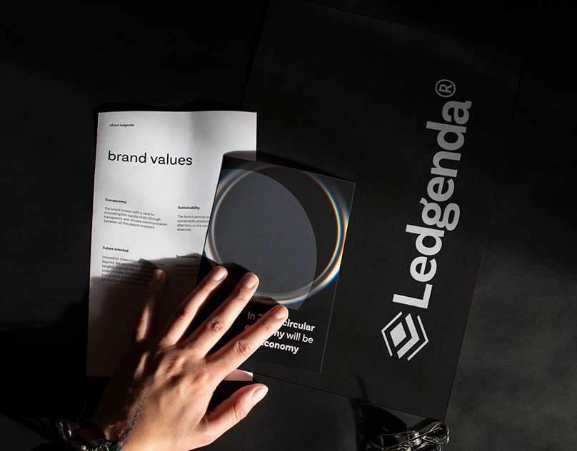
AboutYear 2020 Agency Paradigma Innovation Work branding, brand guidelines, website designLedgenda is a startup that aims to make the production chain transparent in order to generate circularity and lengthen the life cycle of products in order to make the supply chain sustainable both from a…