Herzog & de Meuron Reimagines Hospital Design in Zurich
✕
“Hospitals can be among the ugliest places in the world,” declared Jacques Herzog during the inauguration of the Kinderspital (University Children’s Hospital) Zurich—or Kispi, as it is familiarly known. After 150 years in its original home, the prestigious institution, which is not only Switzerland’s largest pediatric facility but also a leading research center, has decamped to ambitious new premises built by Herzog & de Meuron in the city’s leafy suburbs. “architecture can contribute to healing,” he continued. “Over the past 20 years, we’ve made great efforts to address this theme.”
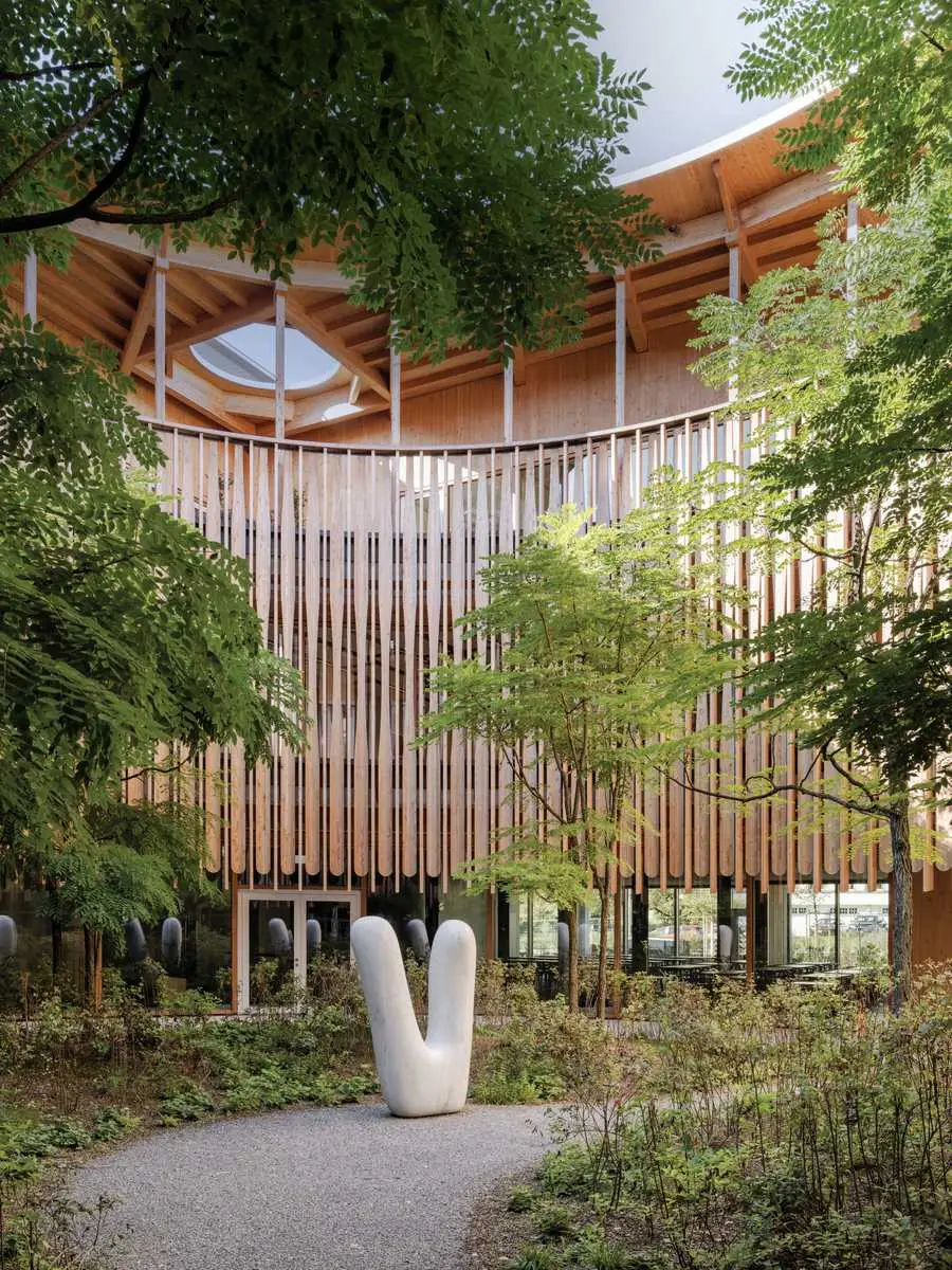
Photo © Maris Mezulis, click to enlarge.
Herzog & de Meuron’s first health-care project was REHAB (1998–2002), a center for spinal-cord and brain injuries in Basel, the firm’s hometown. Asked to design a clinic that didn’t look like a hospital, the architects produced a long, low building that prioritized connections with greenery, minimized the need for elevators, and maximized timber. On the strength of REHAB, the Kispi invited Herzog & de Meuron to participate in the 2011–12 competition for its new home, which the firm won by unanimous jury decision. “Theirs was the best project in terms of efficiency and price per square meter,” explains Martin Vollenwyder, president of the nonprofit Eleonorenstiftung, which administers the Kispi. “For us, design was less important than processes, which Herzog & de Meuron excel at.”
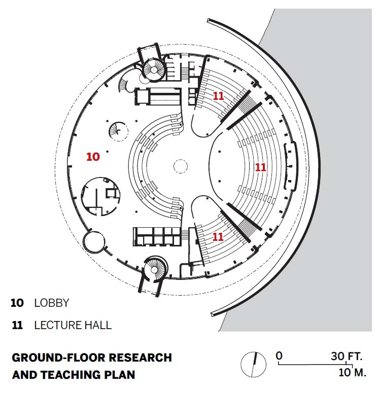
For Herzog, “the Kispi is like the next step, the big sister of REHAB.” Occupying two greenfield sites in Zurich’s Lengg district—home to Switzerland’s largest health-care hub—the $886 million facility comprises the children’s hospital proper, on a generous hilltop plot overlooking Lake Zurich, and a research and teaching building on the other side of Lenggstrasse, which unites previously scattered Kispi departments. A tight white cylinder that stacks its functions vertically, the research center “is about concentration and experimentation,” says Christine Binswanger, the lead partner on the project. “With its abstract, precise geometry, it’s related to our work for [Swiss pharmaceutical giant] Roche. The hospital is much more organic—it’s about breathing.”
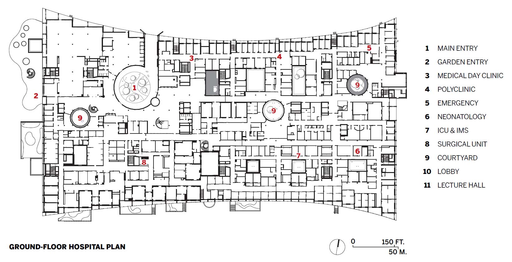
With its giant footprint—650 by 200 feet—the $679 million hospital “breathes easier,” rising just three stories above Lenggstrasse. “For us it was very important to make an unthreatening building,” says project architect Mark Bähr of this horizontality, which also allowed fluid organization of the many ground-floor functions: main lobby, emergency and outpatient departments, surgical unit, intensive-care and MRI units, offices, pharmacy, cafeteria, restaurant. “The ground floor is more or less the built diagram of the connections requested by the client,” comments Bähr. Though Herzog & de Meuron floated the idea of a mass-timber building, the “general climate was not quite ready for that 13 years ago,” says Binswanger. Instead, the hospital comprises a lean, two-story concrete frame, with timber and fiberboard infill on the lower levels and all-timber construction on the third floor. Grouped at the top, the 200 patient beds enjoy views, light, and air, while treatment rooms occupy the middle story. There are also two below-grade floors, the first a semi-basement, due to the sloping terrain—it has technical spaces in its dark areas and therapy rooms on its elevations—and the second housing the parking garage.

1
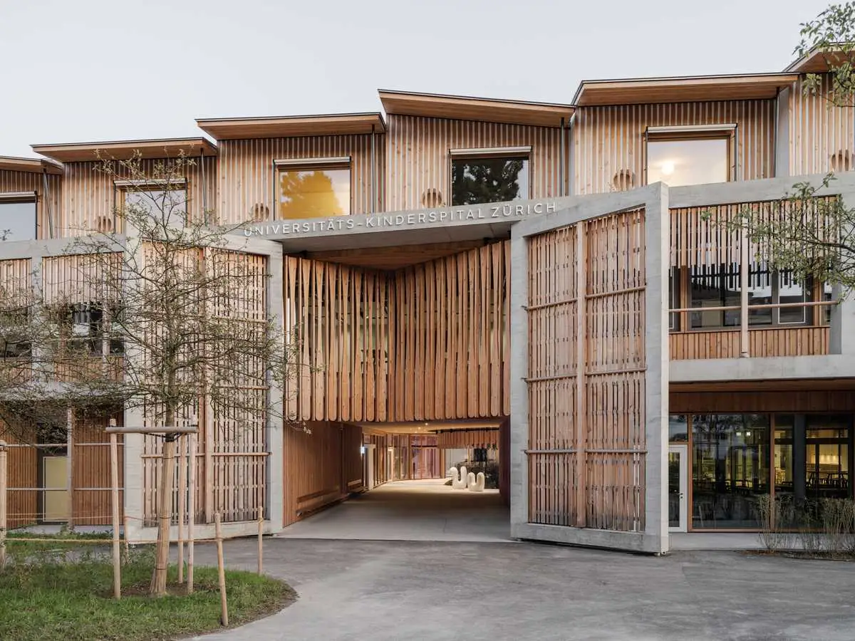
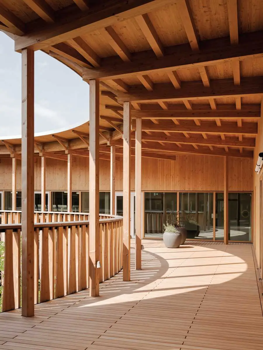
KISPI’S large footprint (1) is eased by a two-story facility (2) built with timber (4) and kid-friendly touches (3). Photos © Maris Mezulis
2
3
4
At 853,000 square feet, this is a very big building. Instead of “threatening” height, visitors are confronted with relentless replication, the basic bay unit repeating ad infinitum on all four elevations. Loggias ensure shade and privacy, and sport timber brises-soleil reminiscent of the daggerboards hanging from the eaves of traditional Swiss chalets or railroad-station canopies. Structure is expressed both inside and out, with highly soigné detailing where wood meets concrete. From the exterior, the top-floor patient rooms read as a series of adjoining cabins set back from the perimeter.
Along the Lenggstrasse approach, the facade’s gentle curve mitigates the monotony. Indicating entry, an oversize two-story gate leads to a generous planted courtyard. Since this is such a deep building, courts and wells—16 altogether—are essential for admitting daylight. All planted to some degree, they provide calming pauses in the dense program and come in two varieties, circular or rectangular. “Perfect, soothing, and quiet, the round ones represent community, whereas the square ones create a backyard effect,” says Binswanger. Bähr even hopes that the court adjoining the emergency department—picturesquely landscaped with trees, shrubs, and glacial boulders excavated on-site—will help calm frayed nerves and reduce violence toward staff. Moreover, since the circular courts stand out from the grid, they constitute “events” in the internal landscape that aid wayfinding and indicate department entrances. Other such events are provided by the building’s exposed-concrete cores, which contain elevators and stairs, the latter always bravura and plentiful enough that circulation is possible without recourse to mechanical ascent.
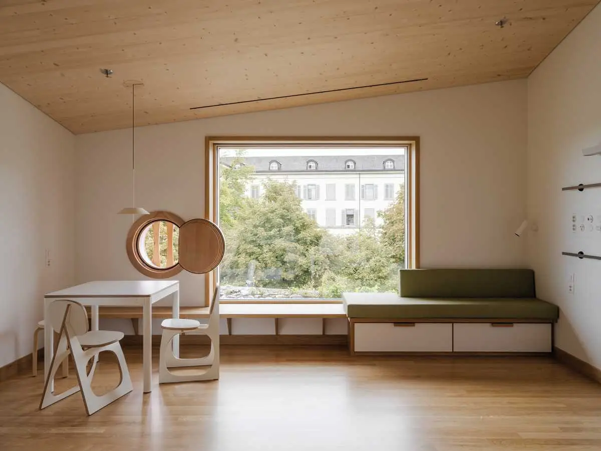
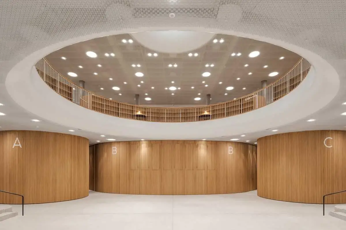
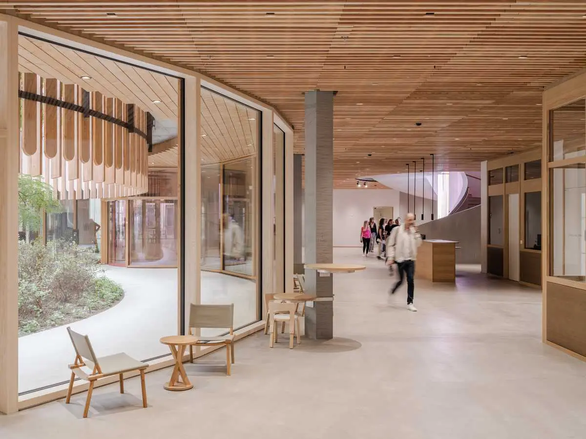
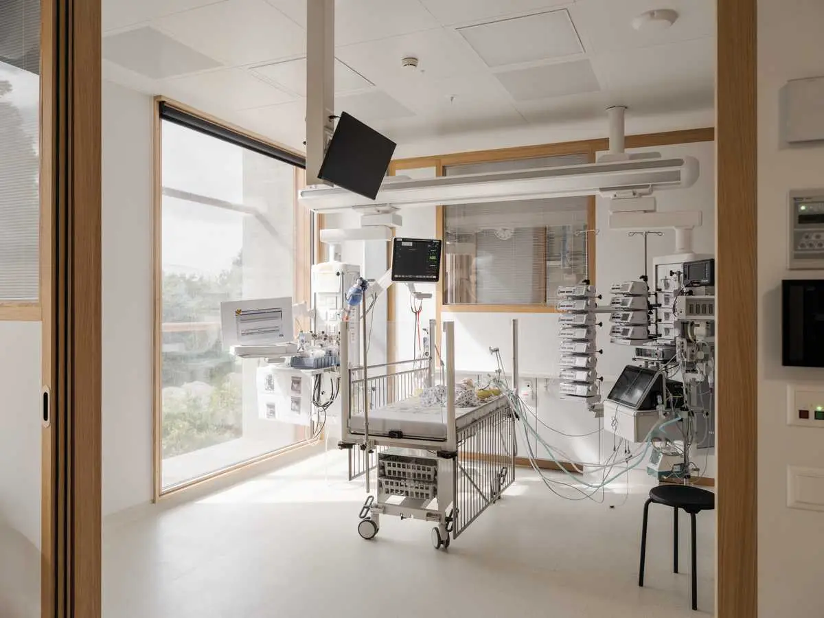
On the three principal floors, a wide central “boulevard” constitutes the main access route. Once again, the ambience is designed to soothe, with electric lighting that is mellow and subdued compared to classic hospital-corridor glare. Similar tactics prevail in the patient bedrooms, where warm oak boards—an unusual material inside hospitals—cover both ceilings and floors. “The Kispi was open to using timber in the wards and even in intensive care,” says Bähr, “but refused it in treatment rooms for fear that constant exposure to disinfectants might cause maintenance issues.” Spurning the bright colors associated with childhood, Herzog & de Meuron have kept their palette pleasantly autumnal—after all, this is a place for parents and staff too. Nonetheless, low-set portholes provide a kid-scale leitmotif throughout the building, even in the elevators.
5
Warm oak boards and mellow lighting create a soothing ambience in Kispi’s main entry (5), central boulevards (6), and patient rooms (7). Photos © Maris Mezulis
6
7
“Today, a lot of hospitals try to look like hotels,” says Binswanger, “but I wanted the Kispi to feel like a hospital, only different.” In fact, it often feels like a classic medical complex, but one with special events—landscaped courtyards, sculptural staircases, child-friendly aesthetics, artworks such as a James Turrell light room or a Raphael Hefti luminous sculpture—grafted onto it. These, along with attention to lighting, scale, views, and detailing, accrete in such a way that they attenuate the stresses induced by what might otherwise be a dauntingly institutional building. In this manner, design can indeed contribute to healing.
Herzog & de Meuron is currently working on hospitals at Hillerød in Denmark and University of California San Francisco’s Parnassus campus in California. While the Hillerød project pushes the low-rise, garden model to its extreme, the UCSF scheme applies the firm’s healing approach to a 15-story tower. Though Herzog frames the issue in terms of ugliness, it’s debatable whether such measures are about beauty. More a question of well-being, they improve patient experience, and could be implemented in any new medical building without requiring a health-care revolution.
Click plan to enlarge
Click plan to enlarge
Credits
Architect:
Herzog & de Meuron — Jacques Herzog, Pierre de Meuron, partners; Christine Binswanger, partner in charge; Michael Schmidt, Martin Fröhlich, project directors; Mark Bähr, Birgit Föllmer, Alexander Franz, project managers; Andrea Erpenbeck, Raúl Mera, Klaus Molterer, Mònica Ors Romagosa, Milou Teeling, project architects
Engineers:
ZPF Ingenieure (structural); EBP Schweiz (civil); Gruner (HVAC); Amstein + Walthert (electrical); Jobst Willers Engineering (building automation); Ingenieurbüro Riesen (plumbing)
Landscape Architects:
August + Margrith Künzel, Andreas Geser
Consultants:
Gruner (fp); Pirmin Jung Ingenieure, Buri Mueller Partner (facade); Kopitsis Bauphysik (building physics); Evomed, IBG (medical planning); Laborplaner Tonelli (laboratory planning); Kinzo Architekten (office); Transsolar Energietechnik (climate); Basler & Hofmann West, DB-B Dieter Bauer Beratungen (sustainability)
General Contractor:
Specogna Bau
Client:
Kinderspital Zürich
Size:
1.39 million square feet
Cost:
$886 million
Completion Date:
October 2024
🔗 Source: design-in-zurich” target=”_blank” rel=”nofollow”>Original Source
📅 Published on: 2024-11-18 05:03:00
🖋️ Author: – An expert in architectural innovation and design trends.
For more inspiring articles and insights, explore our Article Archive.
Note: This article was reviewed and edited by the ArchUp editorial team to ensure accuracy and quality.


