
 العربية
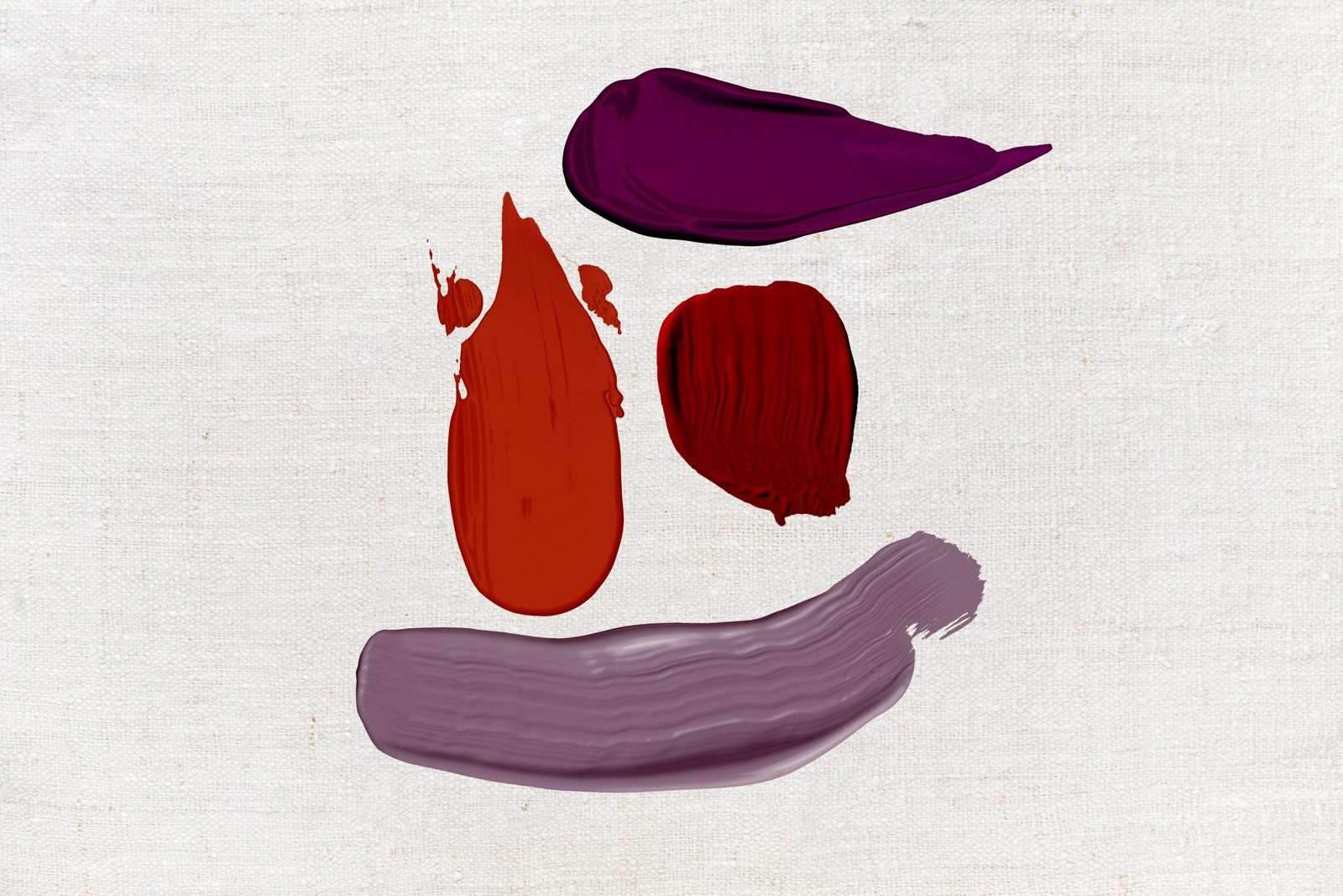
As a child, Bradley’s parents allowed her to paint big swirls of yellow across her bedroom walls. But despite her deep connection and nostalgia for the color, she would avoid using it in the bedroom. “If we took that yellow and wrapped a room in it, it would be way too much,” she says. Instead, Bradley recommends using yellows (or other nostalgic but demanding colors) as accents, such as on a door or in decor. Cue the throw pillows.
Similarly, orange is another citrus to forgo. “The color is reminiscent of optimism and energy,” says interior designer Sherrell Neal of Sherrell Design Studio in Houston. “I would find it difficult to fall asleep with such an active, attention-grabbing color. Citrus fruits are delicious, but I don’t want to be reminded of them every morning when I open my eyes.”
5. Bright reds and purples

Even former Vogue editor Diana Vreeland, who was famous for her crimson-clad apartment, dismissed red as a choice for her bedroom. Likewise, April Gandy, the founder and principal designer of Alluring Designs Chicago, “would never recommend” saturated purples or reds as bedroom paint colors. Her clients often want to feel like they’re safely tucked away “in a sanctuary,” a vibe she says is better achieved through neutral paints with dollops of color.
Amy Pigliacampo of Amy Pigliacampo Interiors also thinks true reds “tend to ramp up the energy level” of the room and should be out of the question “if rest and relaxation is your goal.” Instead, consider the range. “I love dark tones in a bedroom,” the Denver-based interior designer continues. “They can really make the most basic room feel sophisticated and hotel-like.”
Alternatively, if rest is not exactly your priority when it comes to spending time in a bedroom, capitalizing on the vibrant energy tied to red paint might be worthwhile. “There may be some people for whom the bedroom is a temple of sensuality,” Recker says. “Perhaps that means that a smoldering shade of red is completely, 100% appropriate and excellently coordinated with their cheetah-patterned sheets.”
6. Browns and overly earthy colors

Even though a beige room “works great” for certain people, Adams finds deep brown tones to be “rather distasteful, depressing, and difficult” to elevate in the bedroom, simply because they’re not enduring. Even when used in an office, brown is usually balanced out by other colors. The same goes for other overly earthy tones like a dark olive or a sandy tan. If you’re committed to inviting the outdoors into your bedroom, look for a taupe. Sherwin-Williams’s new Terra collection Threshold Taupe or Shiitake might be a good place to start.