Color strategy in environmental graphic design
Color strategy in environmental graphic design,
Our daily life includes constant contact with the city.
As we move through different spaces, we ask ourselves questions like “Where am I now?”,
“Where am I going?”, “What am I looking for?”,
“What is this building?” and “How do we do it?” Am I testing this space?”
While spatial encounters may seem intuitive, environmental graphic design (EGD),
It provides the answers by acting as an important interface between us and the built environment.
Design includes graphic elements that blend with architectural, landscape,
urban, and interior designs to make spaces more informative, easier to navigate, and memorable.
EDG consists of three main elements: text, shape and color.
Text and shapes usually encapsulate graphic information.
But the colors expose and amplify it and help connect it within busy city scenes.
In spatial experiences, we perceive colors first, because our senses register mostly visual sensations.
Therefore, strategic use of color is critical for environmental graphics to provide a layered experience of imagery of identity,
sense of place, and emotional connection.
inscription forms
One of the oldest forms of graphic text inscription on architecture is Egyptian hieroglyphics.
Which put stories on the buildings as a historical document of the civilization.
Today, environmental graphic design has evolved to encompass more than just storytelling.
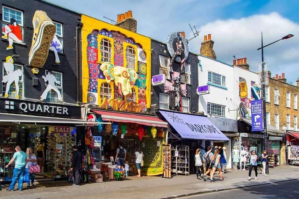
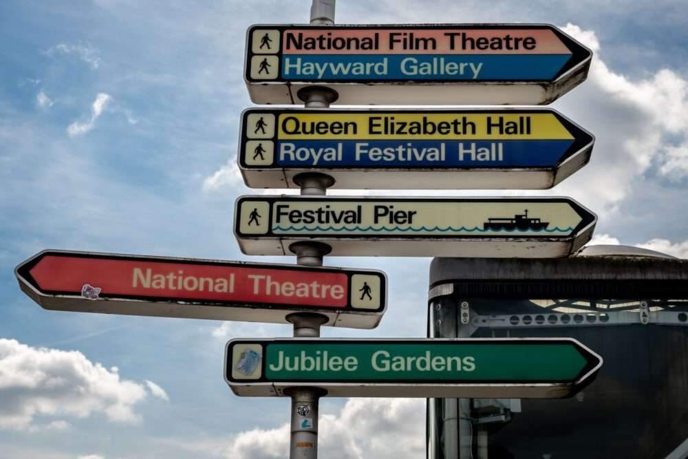
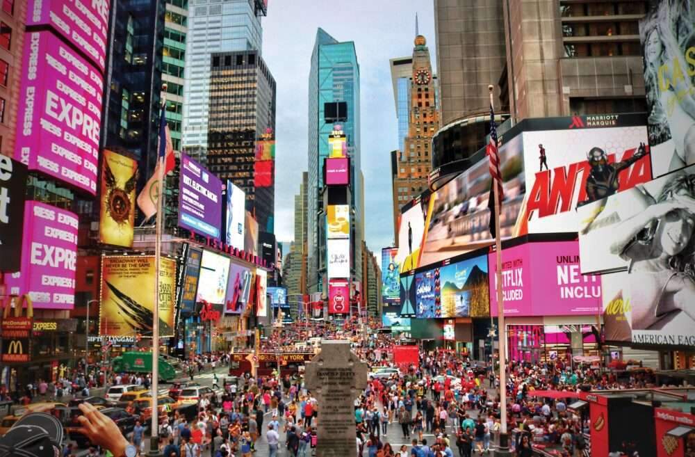
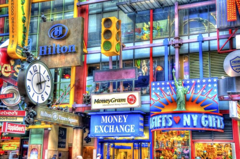
It is present in signs, billboards, traffic lights, mailboxes, public facilities and other experiential spaces of the city.
that visually translate the processes of complex societies.
He is able to communicate all these things through color as an interface that has a direct impact on perception.
It not only puts the information in a fun and beautiful way, but also creates a sense of coherence, relaxes people psychologically,
It reduces anxiety in large-scale structures, and creates order in urban environments.
In graphic design, certain colors are known to elicit specific psychological responses.
Red evokes strong feelings such as passion, excitement, and urgency.
Blue is often associated with calmness, confidence, and reliability. Yellow represents happiness, energy and optimism.
Green mostly symbolizes nature and can denote health, harmony, and balance,
while purple represents luxury, creativity, and spirituality.
Strategically combining these colors and layering them with the existing aesthetic of the buildings and the city not only allows for the perception of information, but also evokes an emotional response.
For example, in hospital designs, green and yellow are commonly used for graphic elements on white interior surfaces to reduce patient anxiety and improve overall health.
For more architectural news