Interact with nature and people
Project name: Pink House
Architect: 23o5Studio
Project location: Long Xuyen, Vietnam
Project year: 2019
Project area: 290 square meters
Site area: 257 square meters
Building area: 145 square meters
Principal Engineer: Ngo Viet Khanh Doi
Design Team: Hung Tran, Nguyen Minh, Phu Thanh Linh, Pham Duc Minh
Interior design: 23o5 studio team, host father’s workshop
Pink House is a residential project designed by 23o5 Studio in Long Xuyen, western Vietnam. The architects explored nature, context, and people, and as a result, designed a living space that revolves around these three.
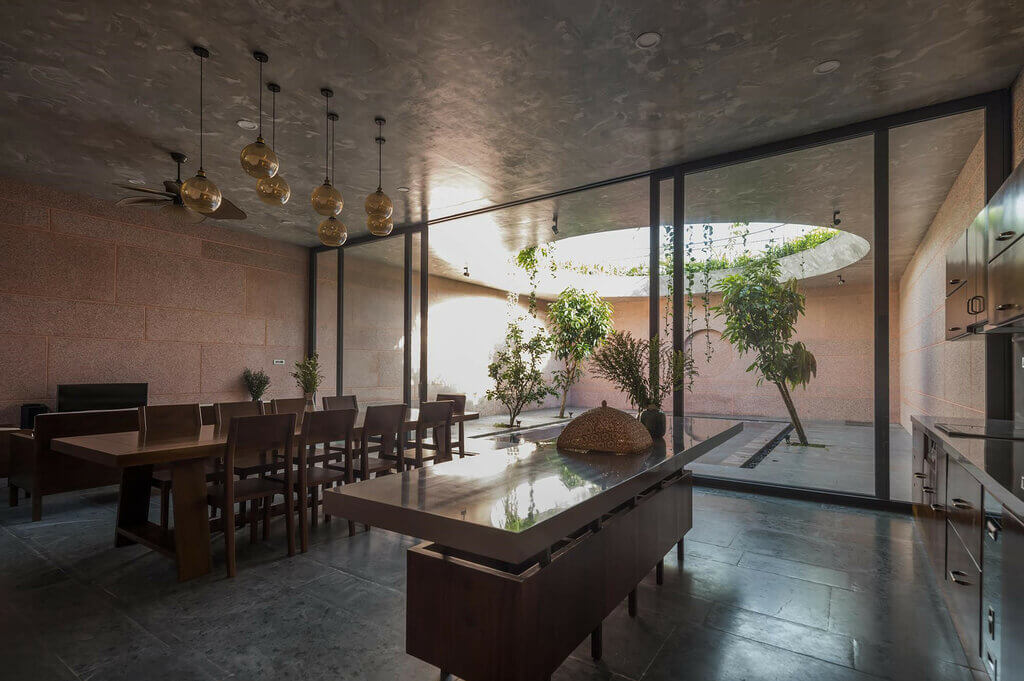
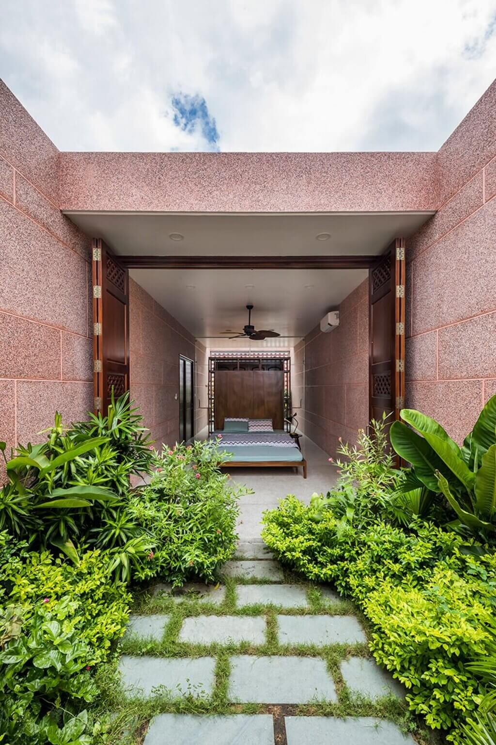
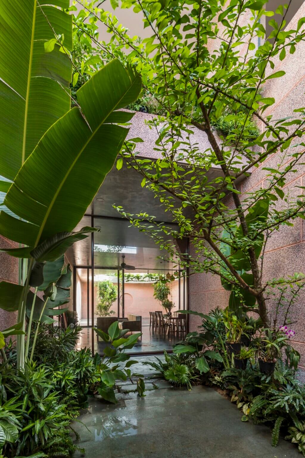
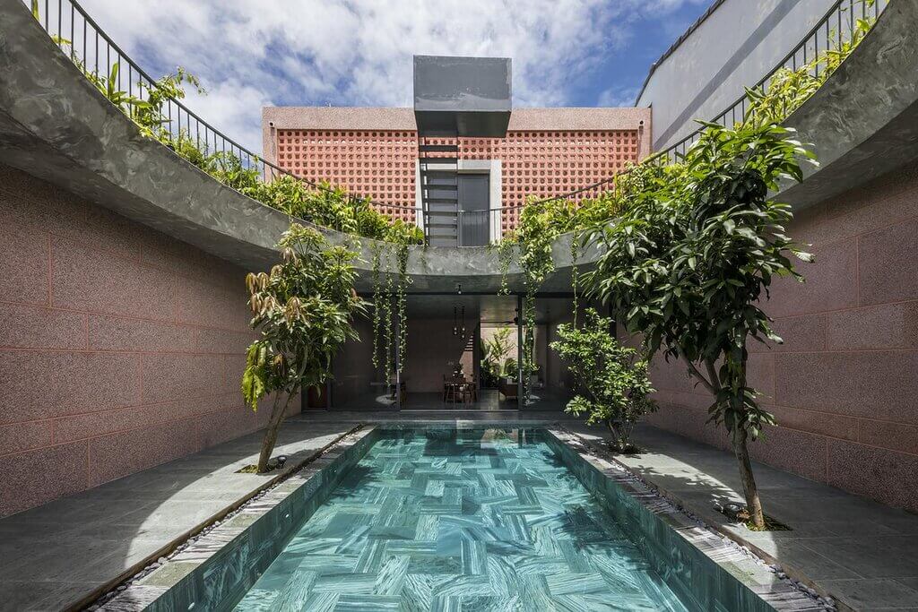
With a lively context of rice fields and cottage lifestyle, the space in this residential project is divided with patches of green trees scattered throughout this pink house, along the living and relaxation areas. The gaps created by these tree filters create a pleasant atmosphere for the apartment as they maximize air circulation.
The design is intended to meet the needs of hostesses and sisters. The main ideology is to take advantage of the light and the transformations of the contemporary living environment.
Proximity – privacy and security, expansion – exploration, serene living, and spatial sensations continue to evolve in this house.

Source: worldarchitecture.org
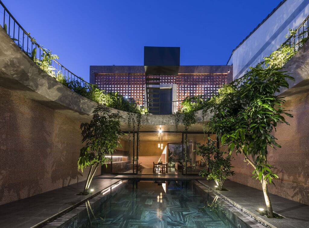
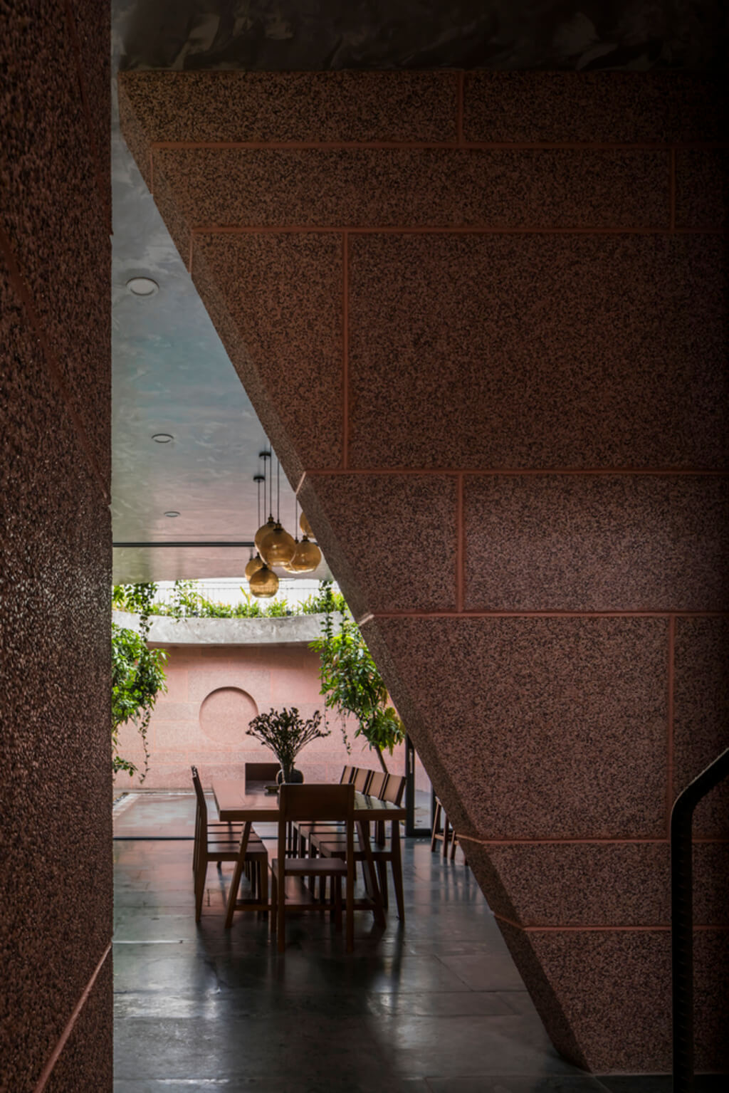
The living room is connected to the kitchen, both of which open the whole view to the pool, where the light transmission from day to night takes place. This project is organized along the vertical axis of the plan.
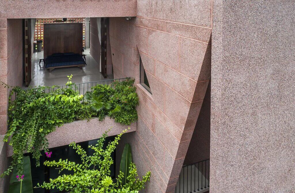
Each bedroom gets its own space and ambiance. Every nook and cranny in this pink house is a haven for contemplation and appreciation of the natural environment.
Thinking about organization and a place to live, we are always obsessed and preoccupied with notions of serenity, silence and intimacy. A space planned and designed with a specific function can perform many other roles that cause a neutral scene to be operated by the user.
This is where the ambiguity and ambiguity in definitions come in terms of dimensions, area ratios, and usage in the image.

Source: adsttc.com
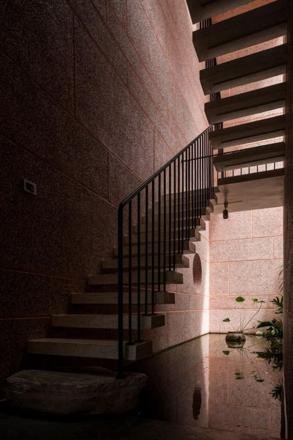
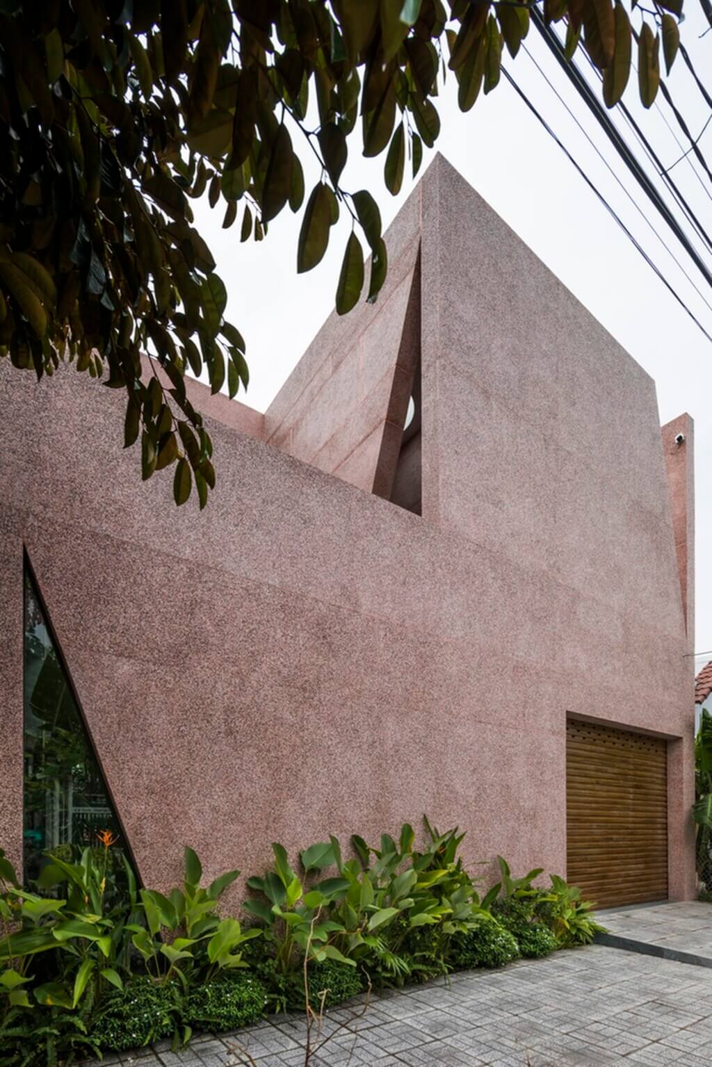
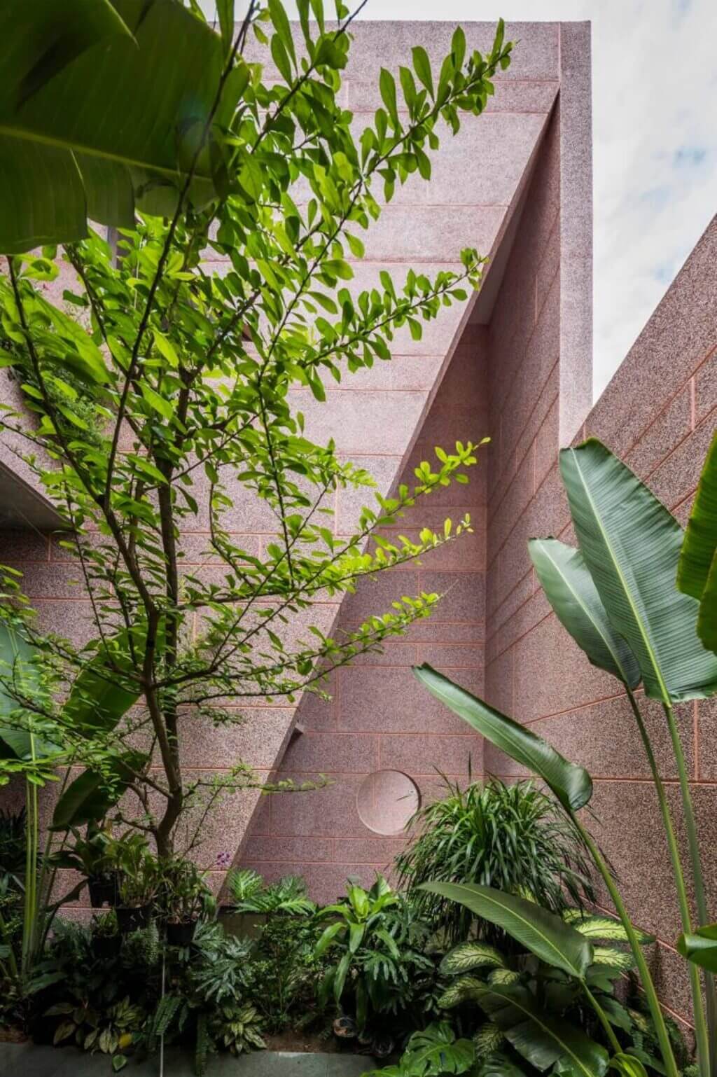
The subject of the project and the environment surrounding the subject is a solid form, while the space is divided into several layers by a homogeneous material – the wash stone (granite) used inside, as well as outside, blurs the boundary between the two.
The space is calculated and allocated based on the intended use and every activity that takes place in that specific area.
As a cover and basis for the life that develops around it, architecture has a certain physical relationship with human existence. The figurative and emotional meaning of the big aperture with a space between the sky and the temple is the small image of man in front of the great nature. A solid mass of functional spaces was compressed.
The light consists of zones that divide the space directly and indirectly into distinct components: light, matter, transmission, calm, and temperature, resulting in a serene and familiar environment with the ambiance of traditional East Asian living spaces in this area. People are drawn together by the serenity of the space, which allows them to truly experience themselves.

Source: twimg.com
“When thinking about architecture, I’m always obsessed with serenity, silence, and intimacy”
23o5studio defined its approach to architecture. Their ideology is to serve up entertaining, fun and personalized user experiences. The studio’s design team carefully examines and uses recognizable aspects of local architecture. These factors are taken into consideration throughout the architectural design process.
According to their design concepts, the idea of calm and stillness leads to architecturally built environments that foster a stronger bond between humans and nature, as well as with themselves.
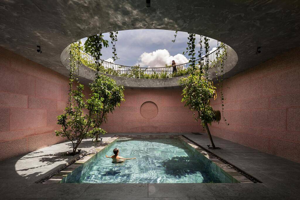
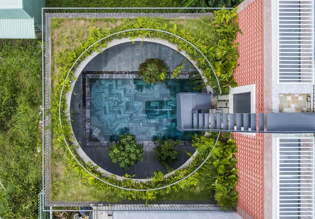
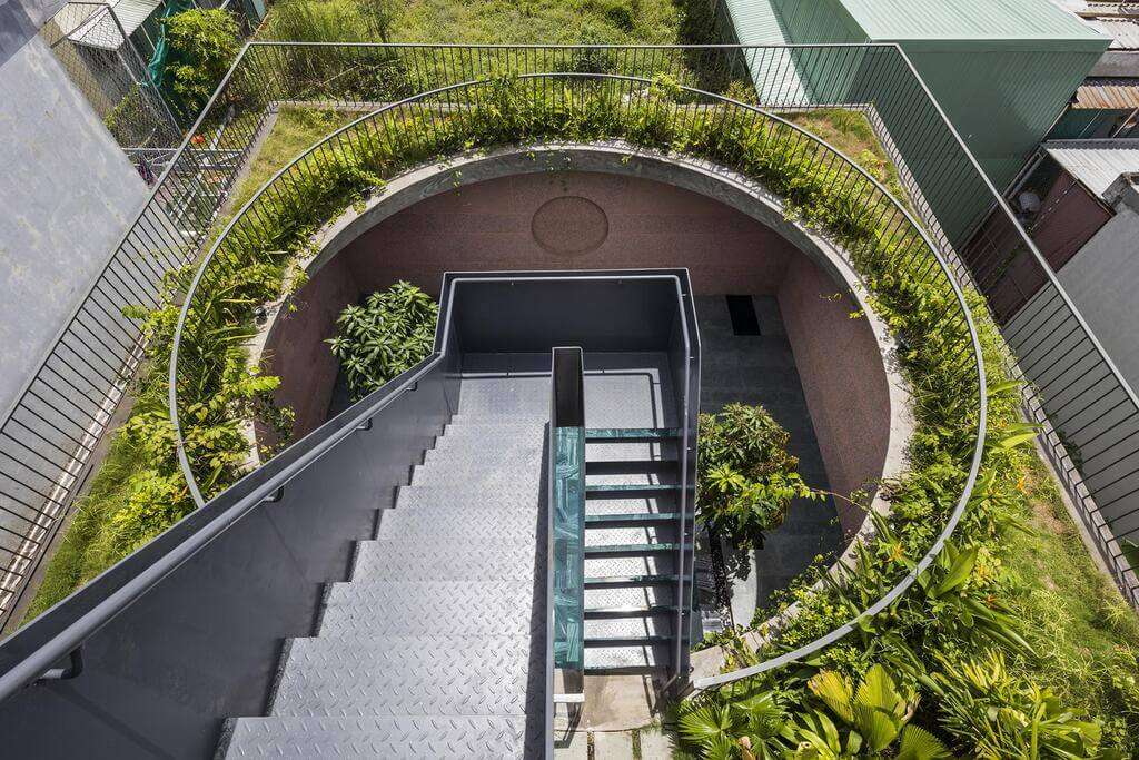
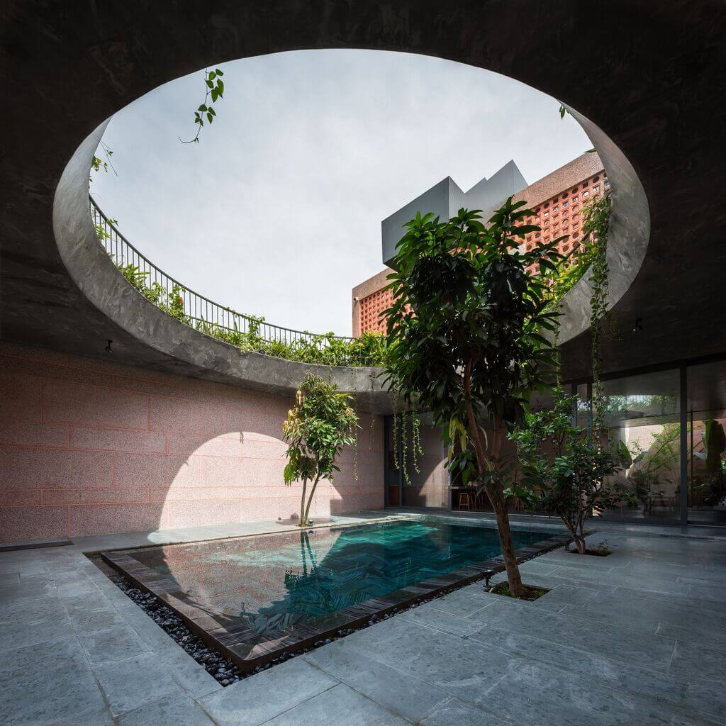
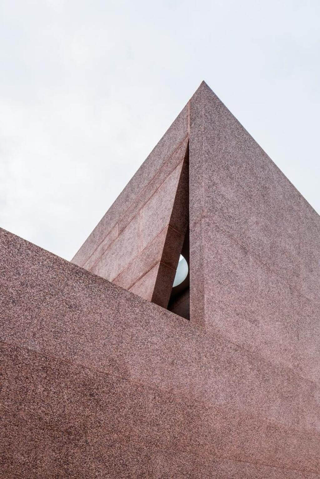
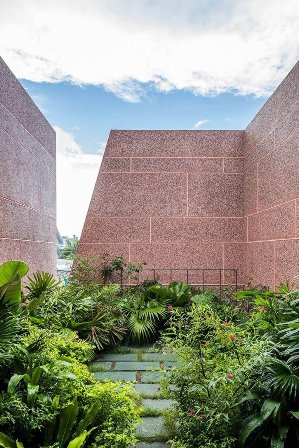
The project is designed in such a way as to create an internal and external relationship between the spaces. The solid and angular mass of the walls is perfectly balanced by the large circular opening that looks out into the sky.
This opening creates a scenic view that frames the transitions of the sky in every home of the day. From daylight to dramatic sunset, different shades of the sky are captured and made visually available through this frame.
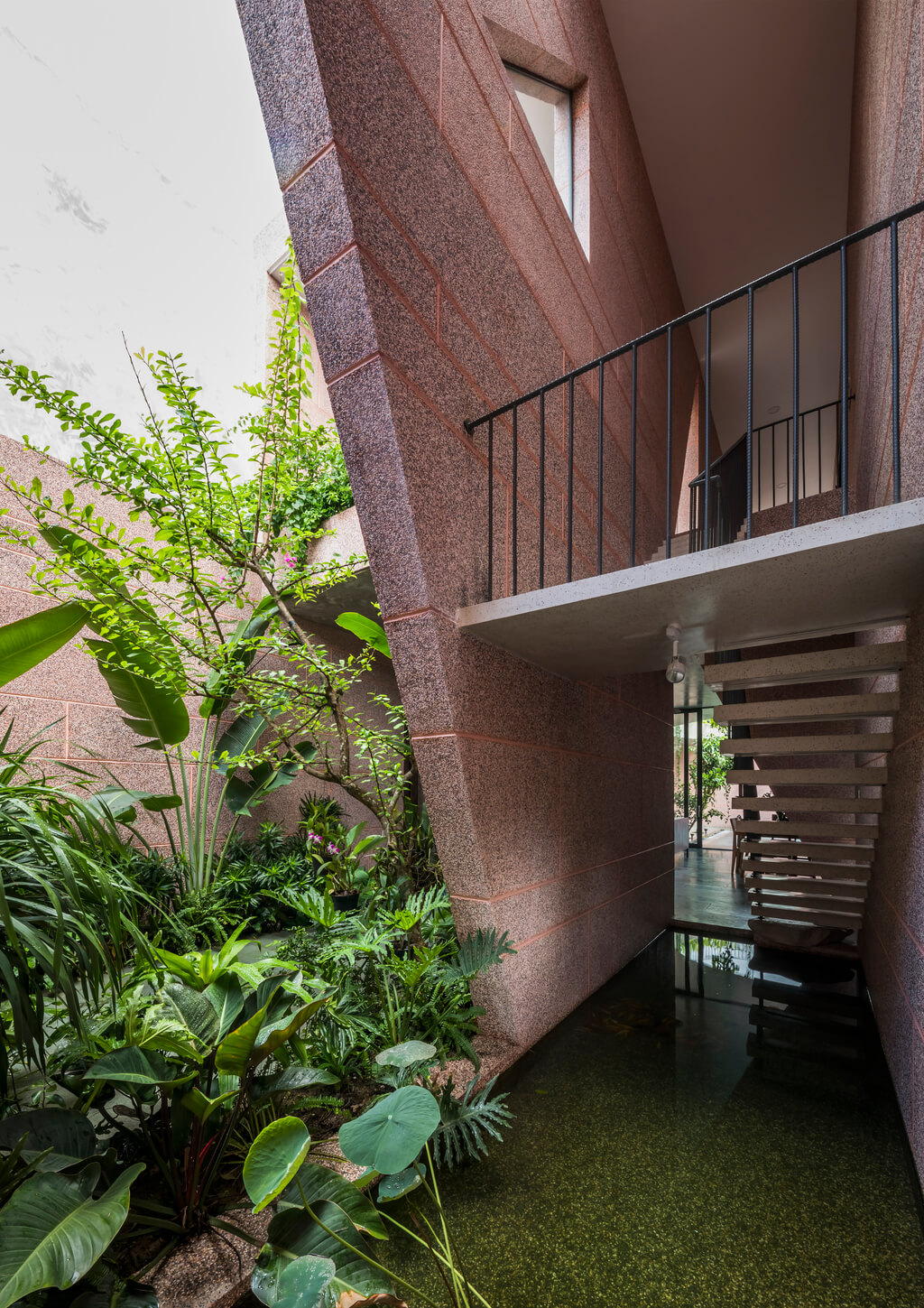
Landscaping with natural vegetation and man-made water features improve the quality of the built environment. These architectural elements are both physically and psychologically beneficial to the users.
The composition of the traditional Vietnamese house follows symmetry and balance, principles that go back to ancient religious beliefs. Each house is a basic unit with rooms and a house plan in the form of geometric shapes such as rectangles, squares, etc.

Source: dantri.com
This project follows a geometric harmony with a perfectly balanced combination of different geometric shapes. The house retains the concept of symmetry and balance in terms of the built environment and the natural environment as well. Both covers are woven together to perfection to form spaces that exude a sense of relaxation.

Source: worldarchitecture.org
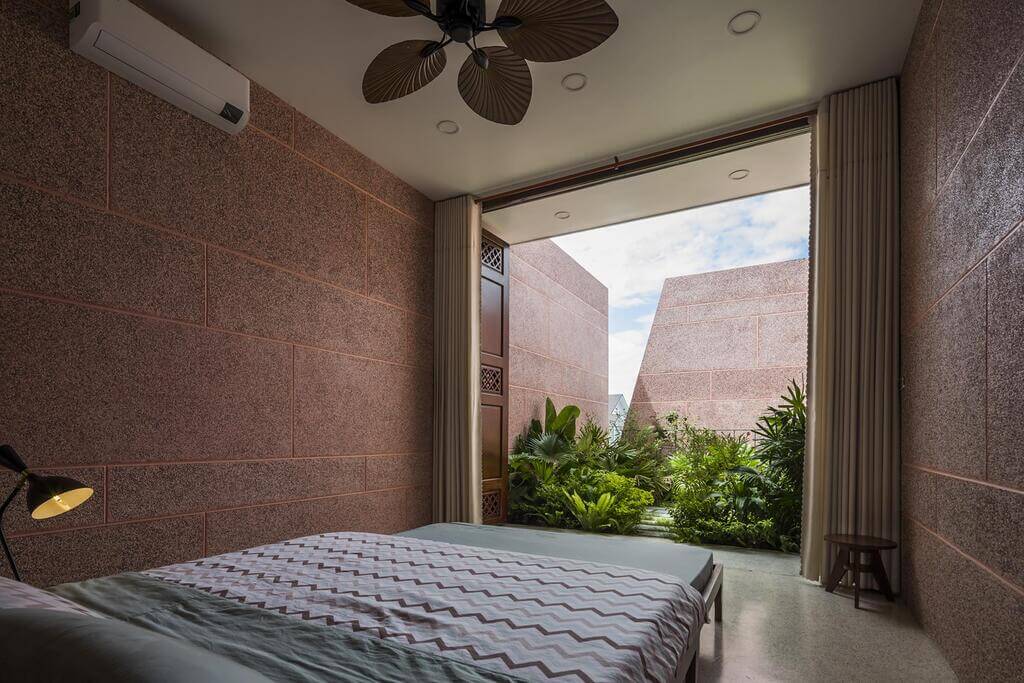
The spaces are planned in such a way that each interior space gets an abundance of natural light and overlooks the landscape. Each bedroom features wooden bi-fold doors, giving a distinctive view of the natural setting. It looks like a frame for a landscape.
The design team used a limited color palette and materials that add simplicity to the home. Using the same wash stone (granite) makes the space feel continuity and maintains uniformity throughout the entire project. This delicate material is enhanced by a contrasting green landscape.

Source: arch2o.com
This is an example of an exceptionally advanced vision in design and architecture, in which the architect followed ancient local principles of design and enhanced them with a modern approach.
Water feature i.e. the pool brings the outdoors indoors bringing in natural light and at the same time allowing plants and small trees to grow around it. The project can be classified as sensory architecture because careful attention to the organization of the spaces allows the design to interact with the users.

Source: worldarchitecture.org

Source: arch2o.com

Source: twimg.com

Source: coidesign.net

Source: kienthuc.zadn.vn

Source: tienphong.vn

Source: rgb.vn

Source: twimg.com

Source: twimg.com

Source: twimg.com

Source: twimg.com

Source: twimg.com
The design encourages better lifestyle outcomes for occupants because it is concerned with how people perceive the space. In this project, apart from enhancing the user’s real-time experience, the architect also carefully crafted the after-the-moment result for the users.
The sensual design approach of Pink House makes it interact with users and enhances user experiences through nature and its intimate relationship with the interior spaces.
