

🌟 Welcome to ARCHUP, where architectural passion meets purpose! As an architecture addict and PR professional, I’m dedicated to building a vibrant community of Architects and design enthusiasts, all committed to capturing the excellence of this field. Discover our exclusive Architectural Competitions and bilingual content showcasing the latest trends shaping the future of Architecture. Join us in celebrating the art and impact of design. 🏛️✨

TRY IT1: Download and install Adobe Aero 2: Open the QR code below (or open this link) 3: Place the experience in front of your favorite tree 4: Take a picture and share it on social …

In close collaboration with the design team at reMarkable, Norwegian packaging studio Goods has designed a range of packaging for reMarkable 2.The recently launched device is the world’s thinnest tablet — it's only 4.7mm thick, and aims to replace your notes and printed documents with a digital notebook that feels like paper. The device is designed to be…

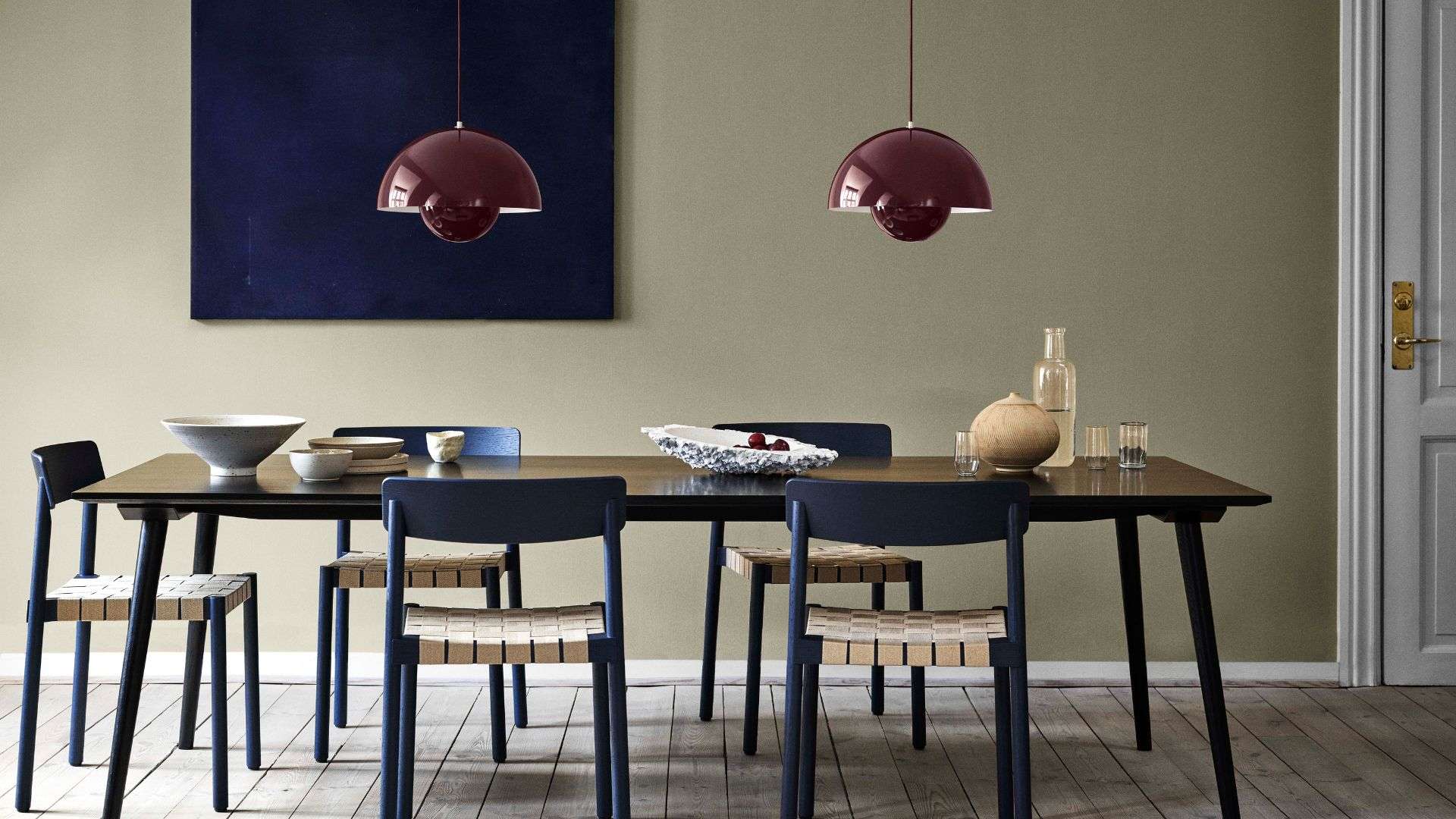
Verner Panton’s Flowerpot pendant lamp by &Tradition will be featured in the exhibition THIS IS DENMARK hosted at Alcova for the Milan Design Week 2023 You need to be brave to work with Verner Panton’s designs. Such an iconic figure who envisioned the coming of a brand new era in home decoration deserves a lot of

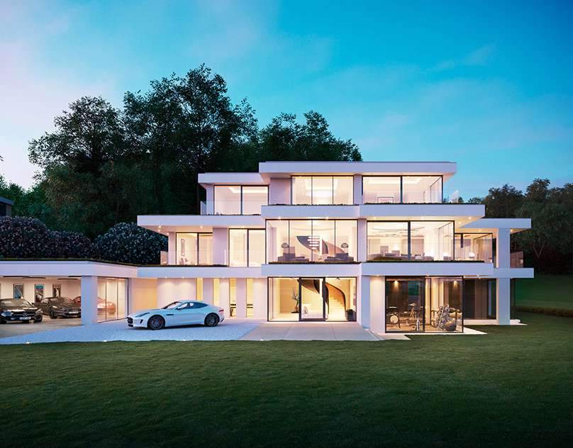
ANCONACGI Visualisations by Recent SpacesClient: EcoMansions | Architect: OnArchitecture | Location: Hythe, UKThe full set of images can be viewed at: recentspaces.comThe full set of images can be viewed at: recentspaces.com

Palace overlooking the river Visually open, every corner of the aura stains people to immerse themselves in their own space. The subtle and exceptional mood reveals the calm and elegant artistic form of the space. The base color of the…

Madrid-based Zooco Estudio has crafted a remarkable restaurant within the Cantabrian Maritime Museum in Santander, Spain, showcasing and honoring the building’s brutalist architectural heritage. Set within a striking vault of concrete paraboloids, unearthed during the museum’s renovation, and complemented by…