How can architecture be a force for good in our ever-changing world? During Future Fest, we’ll pose this question to some of the world’s best architects. Launching in September, our three-week-long virtual event will be 100% free to attend. Register here!
Too often architects overlook the box shape as unremarkable and unsophisticated; too simplistic to be considered for any interesting building. Yet it is the very simplicity of a boxy shape that makes it an easy building ‘block’ for much more ambitious projects. Their sturdiness, adaptability and equilibrium mean that some of the most complex, gravity-defying structures can be built with them. (Think of how long a game of Tetris can last!)
These 2022 A+Award winners bring new excitement to cuboid forms. Whether by stacking them up or taking them away, stretching or twisting them, using them as a base or suspending them in the air, these seven projects are showing that box shapes are worthy of our attention.
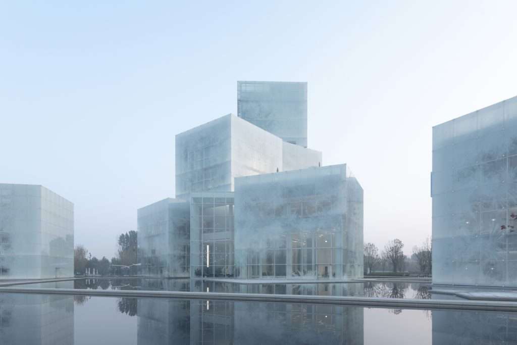
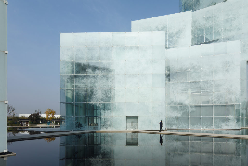
Jury Winner and Popular Choice, 10th Annual A+Awards, Architecture + Glass
Popular Choice, 10th Annual A+Awards, Cultural & Expo Centers
If the new Cultural Tourism Center in Xinxiang, China doesn’t evoke a wintry atmosphere, we’re not sure what does. These nine superimposed “ice cubes” house the facilities for a variety of winter sports, including an indoor ski slope. The texture of the glass façades is composed of translucent ice crystals that filter and blur the light from the inside, giving the surfaces a chilly feel. Fortunately, unlike real ice sculptures, these cubes shouldn’t melt anytime soon.
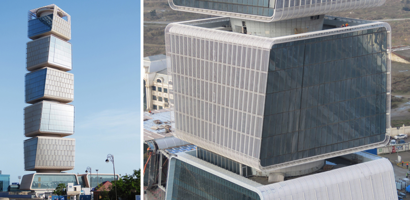
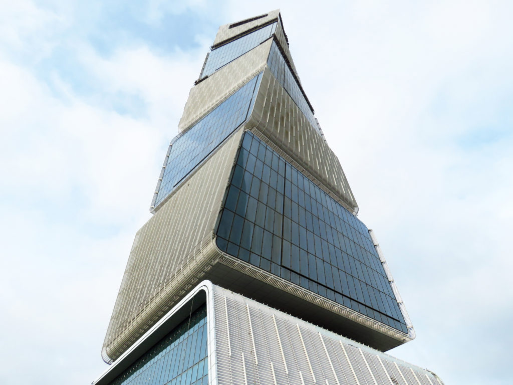
Jury Winner, 10th Annual A+Awards, Office – High Rise
The new Ministry of Taxes building in Baku, Azerbaijan consists of five stacked cuboids that are tapered and rotated upwards. Each box is independently cantilevered from a circular central core, while each floor is rotated 1.2 degrees from the floor below, creating a smooth spiraling curve up the tower. Meanwhile, the gaps between the blocks offer ample terrace space for five “sky gardens”.
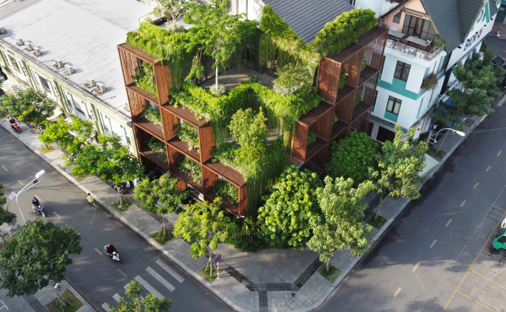
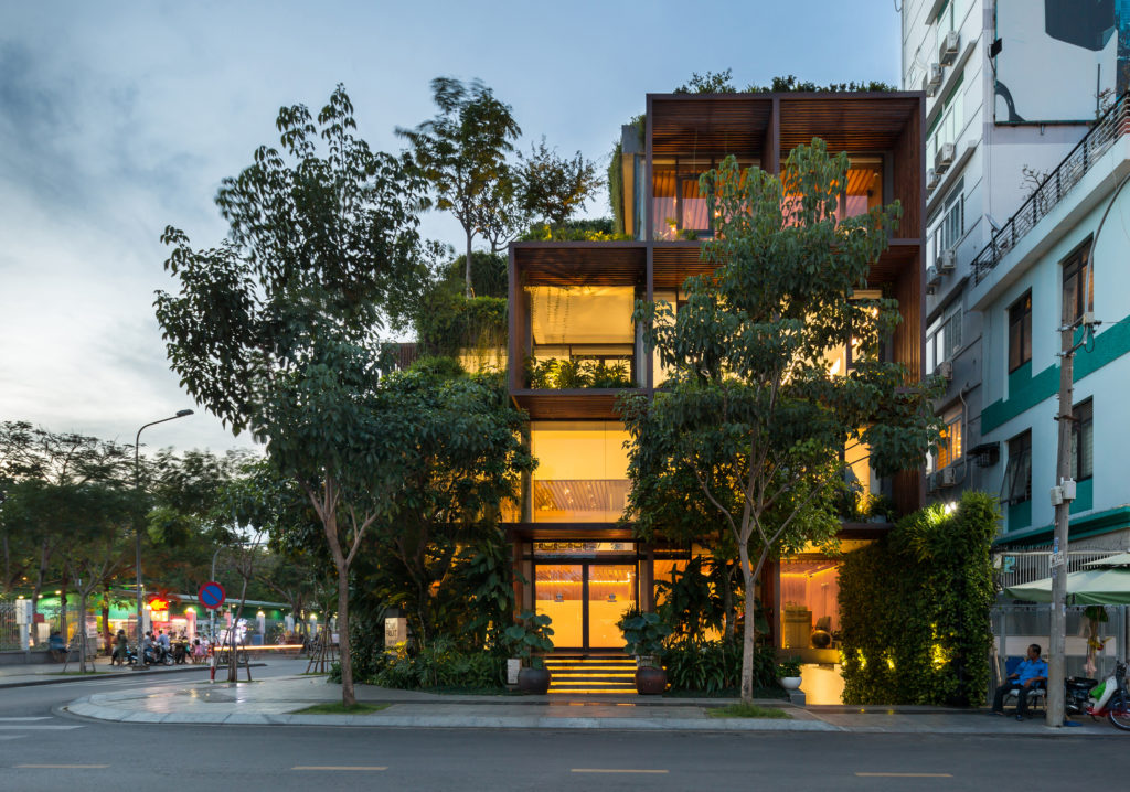
Jury Winner, 10th Annual A+Awards, Office – Low Rise
The biggest challenge with this office building in Ho Chi Minh City was that the two street-facing façades would receive direct sunlight from dusk till dawn, potentially causing important overheating problems. The architects’ solution was to superimpose wooden panels, constructed in connected square shapes, over the building’s glass exterior. This new structure is generously blanketed by plants, which are accessible from all the windows; they also offer a vibrant counterpoint to the brown tones of the wooden exterior.

Jury Winner, 10th Annual A+Awards, Retail
This new IKEA store in central Vienna is completely enveloped by a scaffolding-like structure. The white steel beams double as a series of shelves, which offer shade and a glimpse of what the store has to offer.
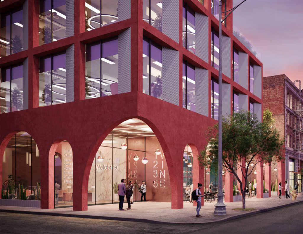
Jury Winner, 10th Annual A+Awards, Unbuilt Commercial
Hawkins\Brown call their new commercial project — located on an underused block central Hollywood and expected to be completed in 2024 — “a star among stars”. The mixed-use building of glass, white and pink-pigmented concrete and perforated metal cladding probably won’t land a deal for a blockbuster movie. But it will certainly draw eyes and camera flashes.
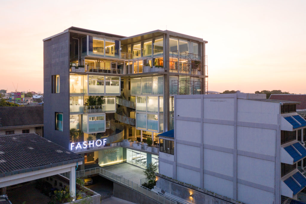
Jury Winner, 10th Annual A+Awards, Mixed Use
This 7-story building in western Bangkok combines commercial and residential with a boxy design that maximizes outdoor exposure with all facets of the structure. The separate box-shaped designs have numerous advantages. For instance, the design considerably reduces energy consumption because the lighting and AC systems are independently controlled by each module. The protruding pattern of the modules also invites more natural light into the spaces, with occasional opportunities for green terraces. This modular design nestles a large spiraling staircase, which finds itself neither entirely on the inside, nor fully on the outside but finds the right balance between both.
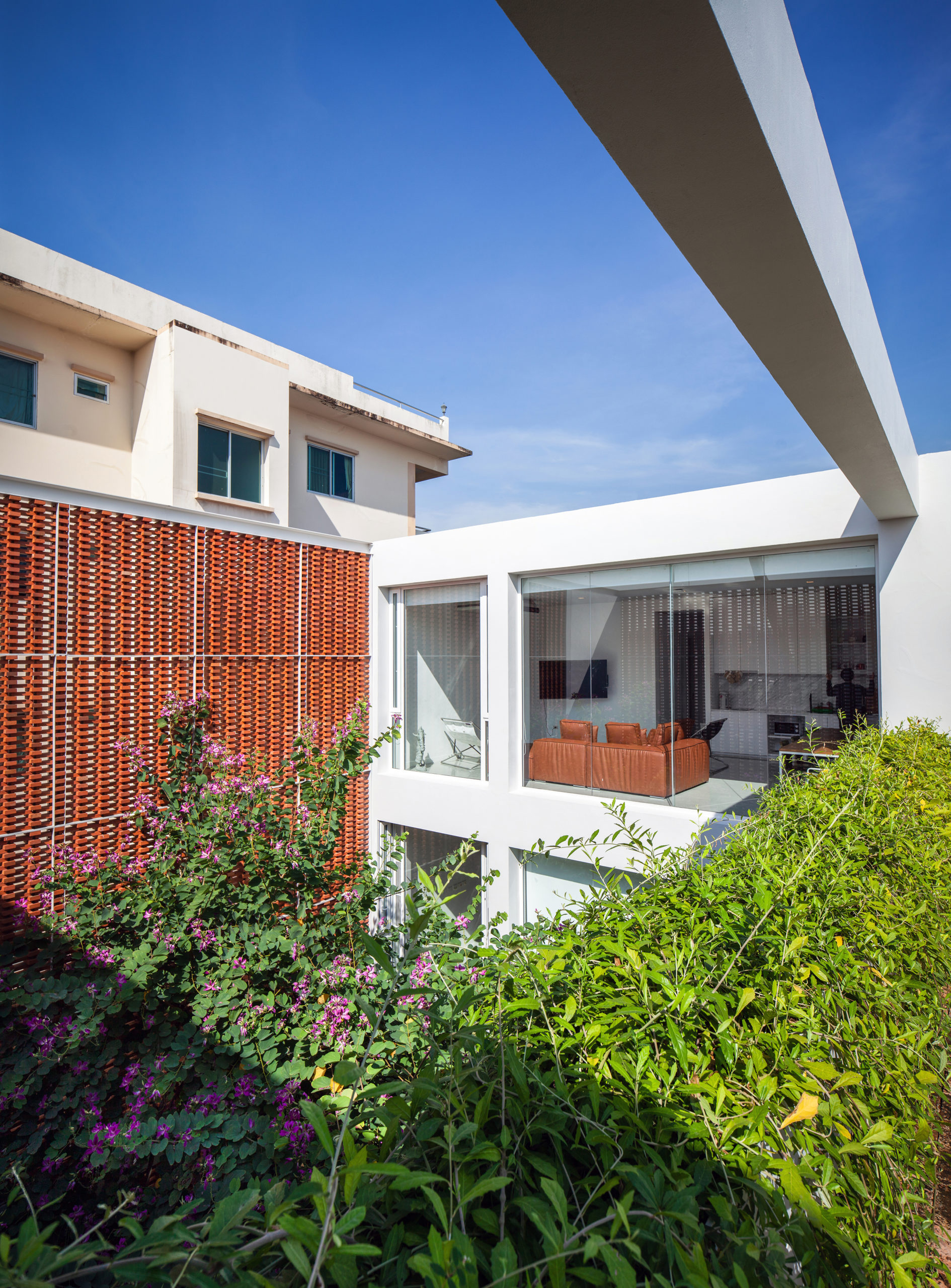
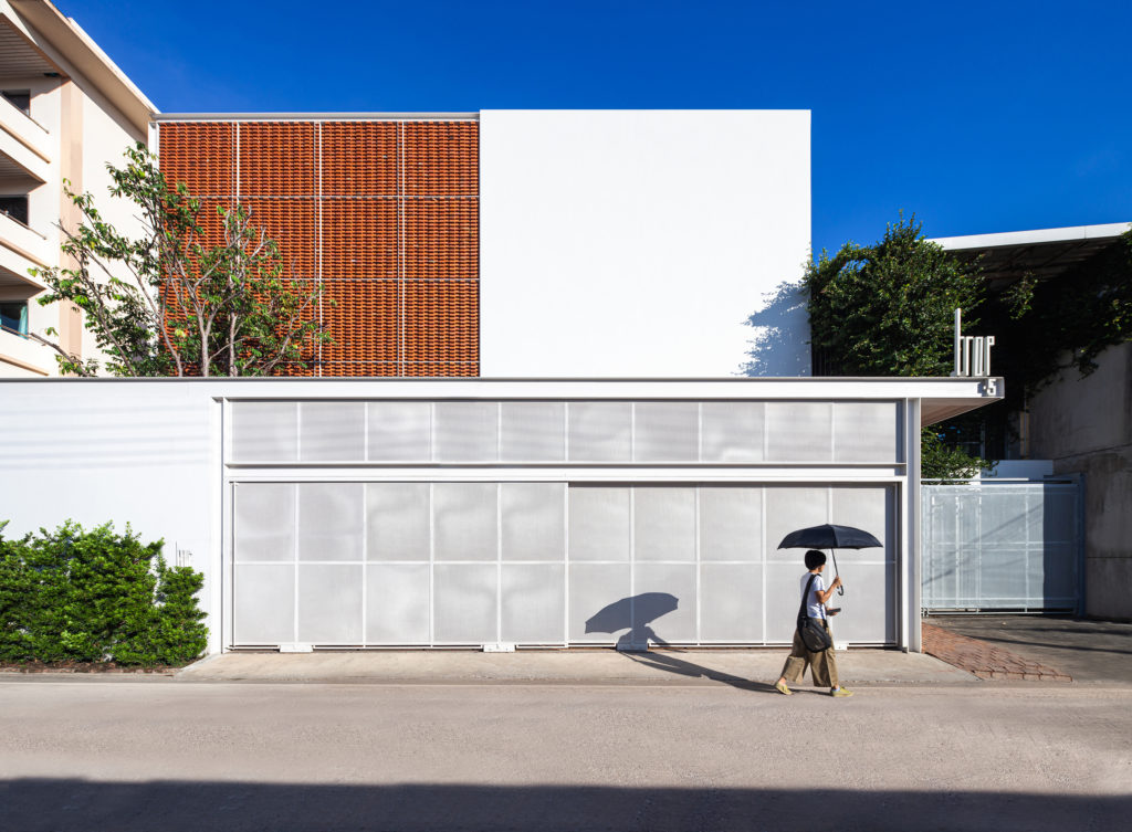
Popular Choice, 10th Annual A+Awards, Office — Low Rise
The understated cubic design of this new office space in Bangkok, Thailand is barely distinguishable from neighboring buildings. But it’s the subtle external details — brick patterned brise-soleils, thinly perforated steel sheets, roofless walled-in spaces — that help create outstanding shading patterns inside. The intimate play between external and internal surfaces, interwoven with lush greenery throughout, should make the occupants of this building, a firm of landscape designers, proud of their new home.
How can architecture be a force for good in our ever-changing world? During Future Fest, we’ll pose this question to some of the world’s best architects. Launching in September, our three-week-long virtual event will be 100% free to attend. Register here!

