Banema’s concept store shines a new light on wood
Designed Campos Costa Arquitetos, the space is intended as an ideas lab that celebrates the origins of the brand
Banema is one of Portugal‘s leading manufacturers of wood products and derivatives. As such, the concept store focuses on the alluring diversity of timber.
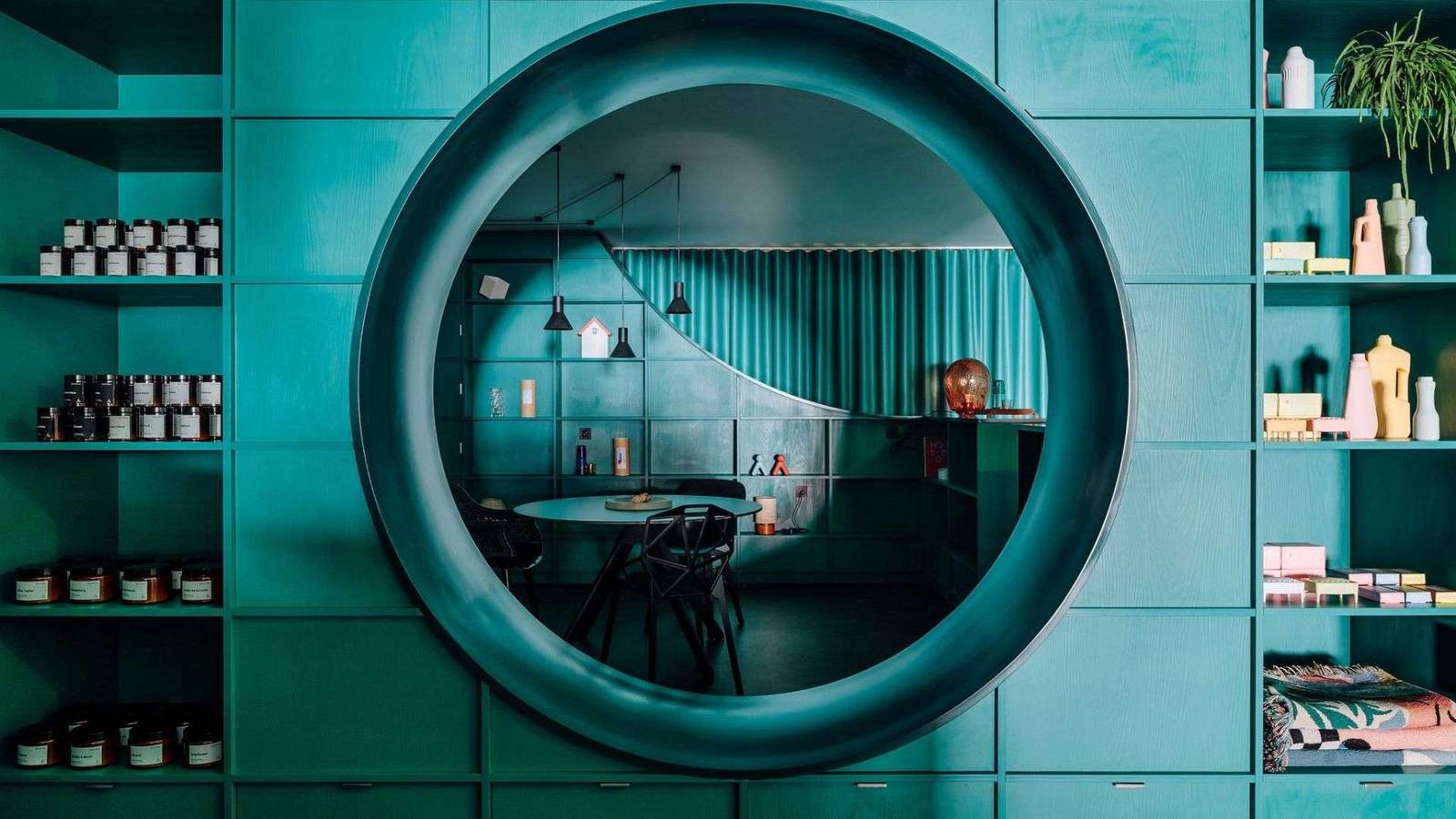
From the street, two large windows serve as miniature gallery-like spaces for highlighting products, either with or without curtain backdrops.
Either way, the eye-catching turquoise shades work to pull people in from off the street.
Meanwhile, a pastel-hued seating area at the front of the store sets the tone for a relaxed and inviting retail experience designed by local studio Campos Costa Arquitetos.

An open-plan layout helps to blur the distinction between the creative lab, gallery, and concept store. Resulting in a vibrant interior that is part showroom and part lounge.
“The space is organized along a piece of wooden furniture that meanders through the space,” the architects explain.
“[This is] designed from a module that is repeated, creating areas for sharing both activities, meeting spaces,s and exhibition niches.”

Geometric shapes formed of green melamine have been cut out of its wooden panels. Drawing the eye down and slowly revealing each space.
They also provide a pop of color to the otherwise muted color palette of brown cement flooring, exposed concrete walls,s, and white ceilings.
Meanwhile, the showroom’s display wall is continuous and takes advantage of the entire store. Allowing flexibility in organizing and the disposal of large products.

Simple, ambitious, and agile
With a window display not much larger than 1.5 sqm in size, the architects and the brand have done well to make every item within the store feel elevated as if it were a piece of artwork on display.

This is thanks to smart features including the curtains on the display wall, which pick up the green hue of the store’s display structure while allowinguserss working in the space to separate displays into smaller areas.


