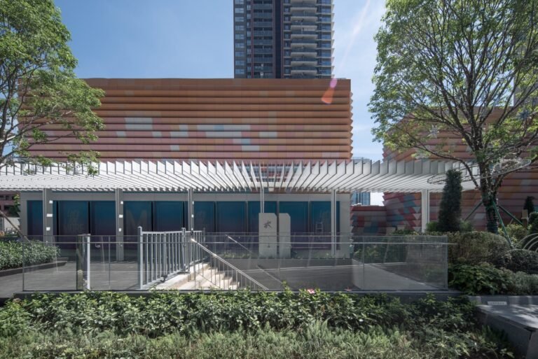
How Storefronts Shape the Soul of a City
While walking through one of the older districts, I stopped in front of a small bookstore. It wasn’t grand or flashy, but its storefront caught my eye: a calm color palette, minimal typography, balanced lighting. It felt like this shop belonged to the city — not as an ad, but as part of its story. That moment made me realize how deeply design decisions influence our experience of a place.

Public Taste: More Than a Matter of Style
Public taste isn’t just about what looks good — it’s an essential component of how we design livable, pleasant cities. Storefront design plays a crucial role in this context; a storefront is not just a signboard; it’s a first impression, a handshake between place and people. Without thoughtful design, these spaces can turn city streets into chaotic visual noise.
Who Shapes Public Taste?
Defining what’s appropriate in a city’s visual landscape isn’t the job of one group — it’s a collaboration between policy, design, and everyday users.
| Stakeholder | Role in Shaping Public Taste |
|---|---|
| Local authorities | Set visual codes and enforce compliance |
| Architects & designers | Translate rules into meaningful, aesthetic solutions |
| Business owners | Choose coherence over excessive attention-seeking |
| The public | Provide feedback and demand visual improvement |
| Media & cultural platforms | Promote positive examples and highlight visual pollution |

Bad Storefronts Aren’t Harmless
Poorly designed facades do more than just hurt the eyes. They damage the city’s identity, reduce real estate value, and even make public spaces feel overwhelming or unsafe. The visual mess leads to emotional fatigue — a phenomenon well documented in environmental psychology.
Cities That Got It Right
Several global cities have taken serious steps to control storefront design — and the difference is visible, both in aesthetics and public perception.
| City | Key Design Principles |
|---|---|
| Copenhagen | Ban on excessive neon and light pollution in historic areas |
| Kyoto | Color schemes must align with the city’s traditional aesthetics |
| Amsterdam | Standardized typefaces and signage sizes in protected districts |
| Singapore | Pre-approved storefront design templates in residential zones |
What’s Needed for Visually Balanced Streets?
- A unified visual code for commercial facades based on street types.
- Promoting simple, coherent design over bold, aggressive signage.
- Community design review panels to evaluate storefront applications.
- Financial incentives for shop owners to redesign their facades thoughtfully.

Final Thoughts
Designing storefronts is not about suppressing creativity — it’s about respecting the shared spaces we all move through. A single well-designed facade can uplift an entire street, while a careless one can ruin the harmony.
Public taste is a collective responsibility. It lives at the intersection of planning, design, execution, and awareness.
✦ ArchUp Editorial Insight
This article explores how storefront design shapes public taste, offering a visual reading of often-overlooked urban layers. It reflects on global examples using color, lighting, and spatial proportion as visual anchors. However, the piece avoids deeper engagement with regulatory mechanisms or on-ground realities, limiting its structural critique of visual governance. Can visual discipline alone foster cohesive urban identity? Still, the inclusion of comparative tables and actionable design suggestions adds clarity, making the article a practical prompt for rethinking how visual order reflects collective values in design culture.
Explore the Latest Architecture Exhibitions & Conferences
ArchUp offers daily updates on top global architectural exhibitions, design conferences, and professional art and design forums.
Follow key architecture competitions, check official results, and stay informed through the latest architectural news worldwide.
ArchUp is your encyclopedic hub for discovering events and design-driven opportunities across the globe.


