ICA Stop: Reinventing the Shopping Experience
In the heart of Täby, Sweden, a transformation is underway at the local ICA Stop supermarket. Swedish studio Westblom Krasse Arkitektkontor, in collaboration with design agency Snask, has undertaken a remarkable renovation project aimed at revitalizing the store and elevating the shopping experience to new heights. The result? A vibrant and inviting space that blurs the lines between supermarket and culinary paradise.
Revamping the Retail Landscape
The project aimed to provide the supermarket with a fresh and cohesive design direction, unifying various additions made over the years into a harmonious whole. The 2,200-square-metre store, part of Sweden’s ICA supermarket chain, received a much-needed facelift, breathing new life into its interior spaces.
Themed Stations and Market Hall Vibes
One of the standout features of the revamped ICA Stop is the introduction of multiple themed stations, each offering a unique culinary experience. From a pink juice and smoothie bar to a vegan butchery station, a seafood and champagne bar to a delicacies bar, the supermarket now resembles a bustling market hall rather than a conventional grocery store. These themed areas not only add visual interest but also enhance the overall shopping journey for customers.
A Focus on Aesthetics and Functionality
To create a visually pleasing and functional interior, rounded shapes were incorporated throughout the store. This design approach not only ensures clean sightlines but also provides ample space for both products and shoppers. The use of ribbed fruit counters and perforated metal shelving adds textural interest while maintaining a cohesive aesthetic.
Unconventional Materials and Color Palette
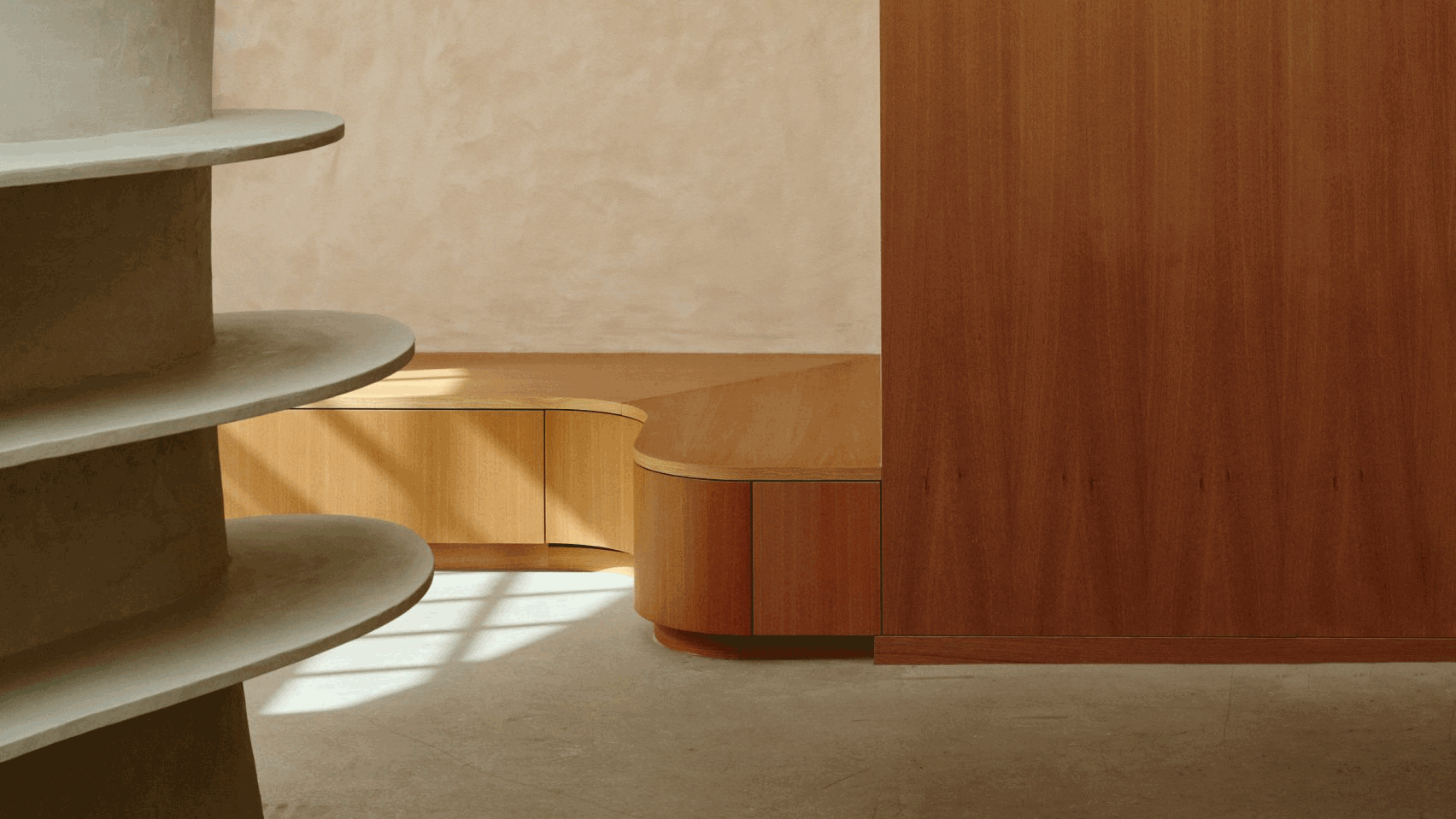
In a departure from traditional supermarket design, the interior of ICA Stop features materials typically not associated with grocery stores. Terrazzo tabletops, lacquered wood, stainless steel, and pastel hues dominate the space, creating a visually striking environment. These unconventional choices contribute to the store’s unique identity and set it apart from its competitors.
Branding and Identity
In addition to the interior redesign, Snask also worked on rebranding ICA Stop, giving it a fresh and contemporary identity. The logo was redrawn, and a new symbol was added to enhance brand recognition. Bold colors, typography, and design elements were employed to create a cohesive brand image that reflects the store’s vibrant atmosphere.
Customer Reception and Controversy
Since its reopening, the revamped ICA Stop has garnered mixed reactions from customers. While many appreciate the transformation and the enhanced shopping experience it offers, others have expressed reservations about the unconventional design choices. However, this polarizing response is a testament to the project’s success in challenging traditional norms and pushing the boundaries of supermarket design.
Conclusion: A Culinary Wonderland
In conclusion, the transformation of ICA Stop in Täby represents a bold and innovative approach to supermarket design. By incorporating themed stations, unconventional materials, and vibrant aesthetics, the store has been reimagined as a culinary wonderland that delights and inspires shoppers. Despite divided opinions, the project underscores the power of design to transform everyday spaces into extraordinary experiences.
As customers navigate the colorful aisles and explore the diverse offerings of the supermarket, they are invited to embark on a culinary journey like no other. And while the design may not appeal to everyone, its impact is undeniable, sparking conversation and redefining the role of supermarkets in shaping our everyday lives.
In the ever-evolving landscape of retail, ICA Stop in Täby stands as a shining example of creativity, innovation, and the limitless possibilities of design.
Finally, find out more on ArchUp:


