Innovative Renovation: The Portal House Transformation
The Portal House, a stunning renovation project in Toronto, reflects the creative vision of local architecture and art studio Svima. Tasked with revitalizing the home for a couple with divergent aesthetic preferences, Svima skillfully combined elements of “tenebrous minimalism” and “bright French country kitchens” to achieve a harmonious design.
Design Harmony Amid Divergent Tastes
The homeowners had long desired to update their residence, but their contrasting style preferences presented a challenge. Svima’s innovative solution involved marrying dark oak accents with clean white surfaces to create a sense of “denlike cosiness” throughout the ground-floor spaces.
Architectural Details: Brass-Edged Portals and Curved Elements
One of the standout features of the renovation is the asymmetric portals connecting the kitchen and dining areas. Lined with brass ribbons, these portals serve as elegant transitions between spaces, seamlessly blending functionality with aesthetics. The curved design of the portals enhances circulation and creates a sense of flow within the home.
Kitchen Innovation: Curved Cabinetry and Bespoke Details
In the kitchen, Svima’s attention to detail shines through in the handmade curved oak doors, crafted by a skilled cabinetmaker. These unique doors, bent using a special jig, add a touch of craftsmanship to the space. Additionally, the contemporary Delft porcelain-inspired tiles on the backsplash introduce subtle pops of color, complementing the neutral palette of the kitchen.
Seamless Connectivity: Portal Pass-Through and Functional Spaces
The two portals connecting the kitchen and dining room serve dual purposes: one acts as a traditional doorway, while the other functions as a convenient pass-through for serving food and drinks. This thoughtful design feature enhances the practicality of the space while maintaining visual continuity between the two areas.

Living Room Tranquility: Mid-Century Furnishings and Curved Millwork
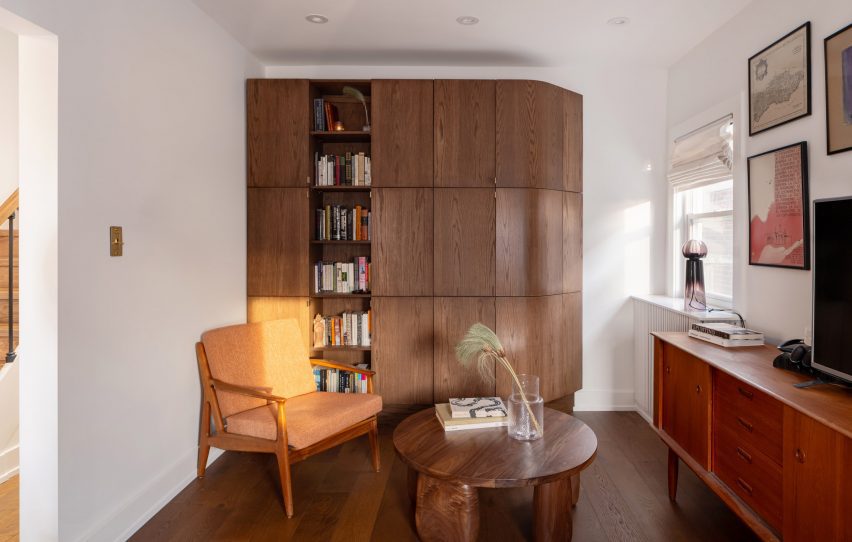
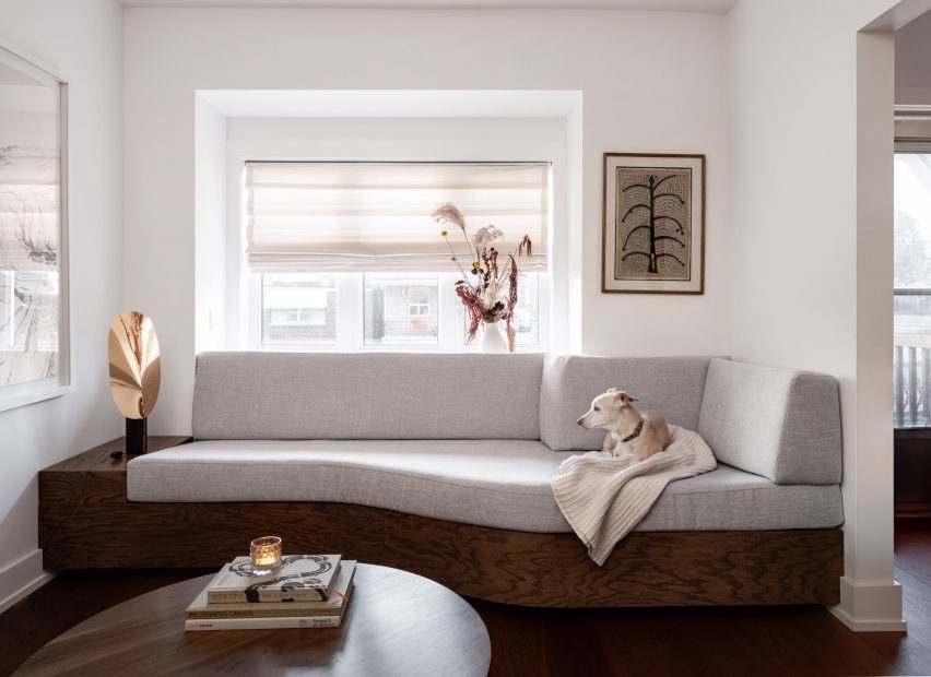
In the living room, Svima’s design ethos is evident in the integration of mid-century furniture pieces, such as chairs and a media console, which add warmth and character to the space. The curved millwork, echoed from the kitchen design, creates visual interest and maximizes functionality, as seen in the built-in sofa beneath the bay window.
Architectural Cohesion: Matching Millwork and Thoughtful Details
Consistency is key in Svima’s renovation, with dark oak flooring extending throughout the ground floor to match the other millwork elements. This cohesive approach ties the various spaces together, creating a sense of unity and continuity.
Creative Problem-Solving: Adapting to Tight Floor Plans
Svima’s ability to innovate within tight floor plans is evident in the Portal House project. By leveraging clever design solutions, such as curved cabinetry and filleted millwork, the studio successfully optimized space utilization while maintaining a sophisticated aesthetic.
Conclusion: Svima’s Design Legacy
In conclusion, Svima’s transformation of the Portal House exemplifies the studio’s commitment to innovative design and meticulous craftsmanship. Through a thoughtful blend of contrasting styles, bespoke details, and functional considerations, Svima has created a space that not only meets the diverse needs of its occupants but also elevates the art of home renovation.

The photography is by Scott Norsworthy.
Finally, find out more on ArchUp:
Adapting Al-Qatif’s Architectural Styles for Modern Use: Preserving Cultural Identity


