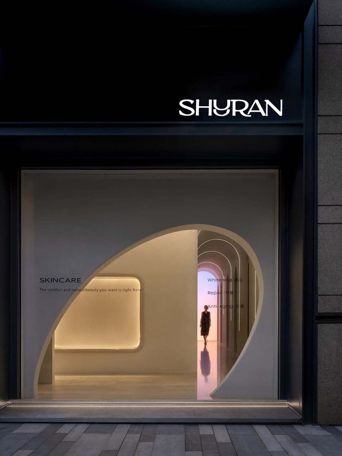
Smooth corners and rounded walls make up a spa and wellness center in China
Smooth corners and rounded walls are used by E Studio to form a cave-like spa and wellness center in Shenzhen, China.
Design Features
Named Shuran Massage Commercial, this 110 square meter design features rounded walls dividing the functional program, which focuses solely on the needs of the guests inside.
Design contents
The space includes a single room, a double room, a VIP room, an office,
as well as a shower room, dressing room, lobby, as well as a bathroom, storage and chat room.
While more space is devoted to the message room with curved walls,
other functions are placed in another rectangular space.
In this project, the studio aims to explore the clash between craftsmanship and exploration,
as the team has always thought about depth and uniqueness.
The designers reinterpreted the Shuran brand and translated the brand logo into a comfortable living space focused on people’s holistic needs called “Shuran”.
Based on different functions, the team has divided Suran into two parts: Shuran Wellness described as ‘time-cave’ and Shuran Skincare described as ‘time shift’.
The studio defines “time cave” as “a place where time pauses and pauses to release physical and mental stress.”
On the other hand, “temporal shift” deals with the reversal of time,
which means that the condition of the skin and body can undergo a transformation.
The design takes cues from the concept of ‘time caves’, with the aim of providing a naturally serene space.
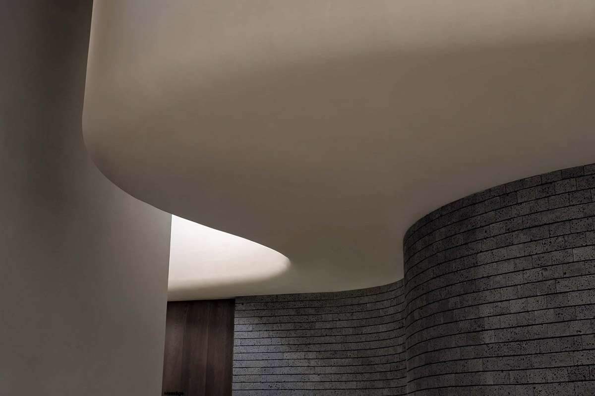
Using the form of space, the studio has built ‘Pure Land’ – transforming the space into a vehicle that quietly carries people in search of inner freedom.
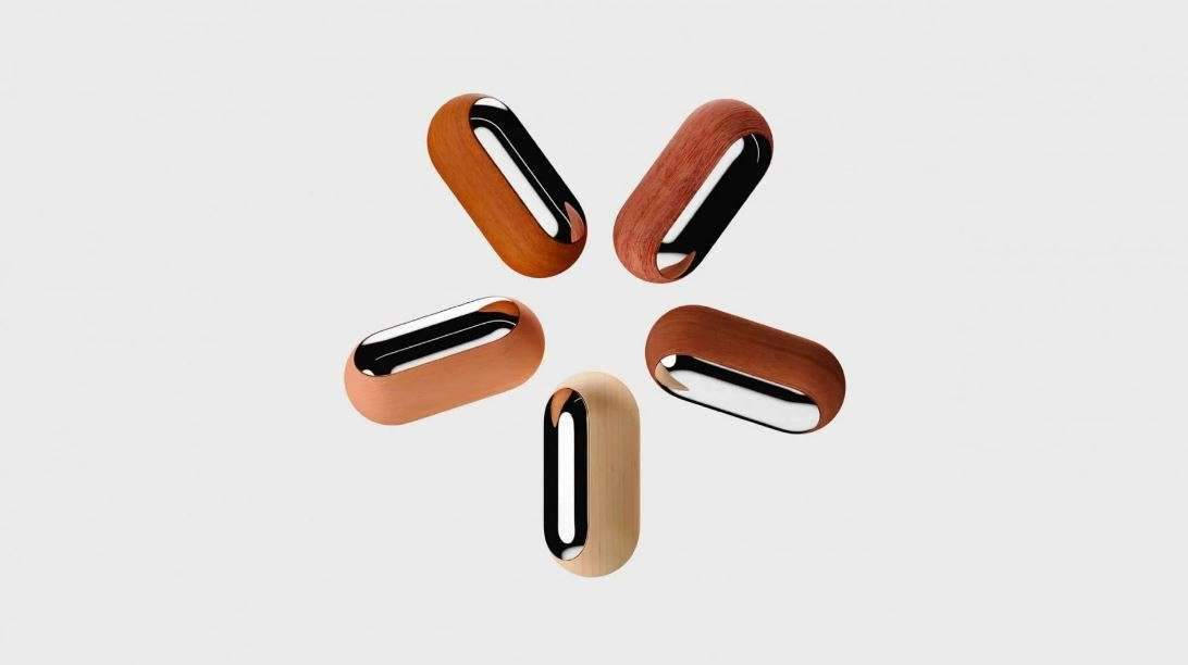
While they highlighted the letter “U” in the name as the main axis of the brand image, highlighting its shape and pronunciation.
The overall brand image is also promoted to create a connection between nature, body and mind.
Design shape
The interior space surrounds people with a relaxed atmosphere and simple surroundings,
while the upper and lower blocks are independent – but both spaces echo and complement each other.
The soft curved shape of the space was reinterpreted as a seamless integration between the two masses.
In the materialistic approach, the studio paid attention to the selection and arrangement of materials to emphasize the individual features of each block.
Smooth corners and rounded walls make up a spa and wellness center in China
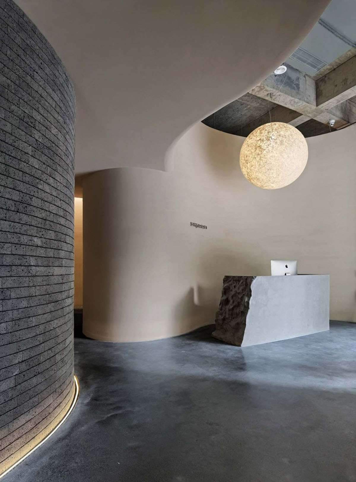
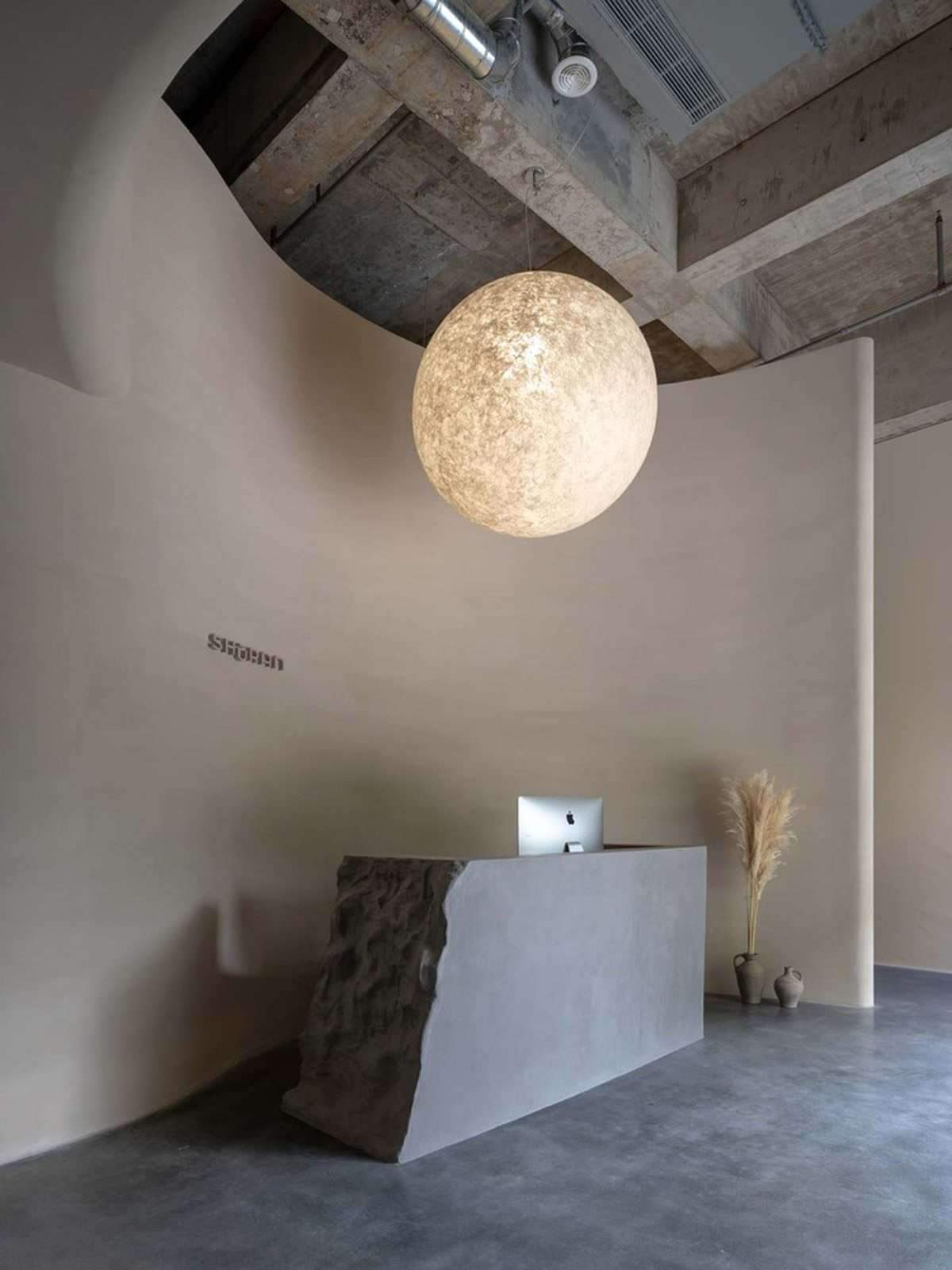
The lobby also provides a cozy feel that invites people in,
and the ragged surface of the reception desk is made of cast-in-place concrete, which visually resembles stone and has a more artistic feel.
The studio also added a globe-shaped lamp that sends out warm light and blends in as if you were taking a sun bath.
And there is no specific pattern for the curves of the wall, which makes people feel unfettered.
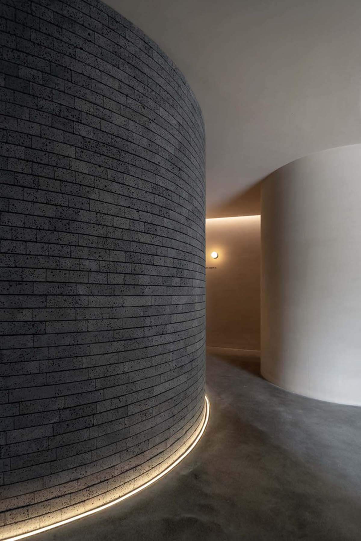
The volcanic rocks are cut into irregular slices and placed horizontally in a haphazard manner.
The studio has intentionally expanded the space visually by using black tape along the curved wall.
Curved walls have also been used to block daylight from entering the space to avoid any distractions and bring peace and silence,
however the dim lights in the public massage area indicate the comfort of dusk.
The public massage area is divided into two areas with sliding wooden doors,
massage chairs and soft yellow woven walls create a secret place
where people can temporarily away from the hustle and bustle of city life.
Tunnel connecting all rooms
A tunnel connecting all rooms to maximize the number of beautiful rooms and simplify the flow of traffic.
The mysterious aurora borealis appears at the end of the long-distance tunnel with its gradient lights and colors,
quietly pushing people away from reality as if they are walking through time.
The tunnel wall lights also create a time scale through an extended “U” shape, just like a time travel transformation.
The studio also has a built-in smart lighting system that is controlled via a chromatographic panel
that allows the lighting of the space to be adjusted for different cosmetic procedures.
Each cocoon varies depending on the experience, and Schoran wants clients to define their own.
The designers design the makeup room as a quiet semi-open space, and the tower-shaped walls form a symmetrical corner that makes people become the center of the space.
For more architectural news
افتتحت مكتبة بروكلين العامة موقع فرع بروكلين هايتس الجديد الذي صممه جينسلر

