Architects: Want to have your project featured? Showcase your work through Architizer and sign up for our inspirational newsletter.
We might evaluate our time at a restaurant in terms of the quality of cuisine, but we often tend to forget that our social experience is just as important. Half the fun of going to the restaurant consists in the great conversations and memories that we make as we’re waiting for our plates to arrive. Of course, there’s no definitive science for what will create the best dining atmosphere — the music, the number of fellow dinners, and the organization of tables can all be factors to consider. But for a surefire great time, why not go to a restaurant that is as interesting as our company?
The seven restaurants below eschew the minimalist aesthetic for something more expressive. Be it with elaborate patterns or color schemes, generous greenery or unique adornments, these restaurants offer plenty to talk about at the dining table.
Prado Restaurant
By Arkstudio, Lisbon, Portugal
Photos by Rodrigo Cardoso
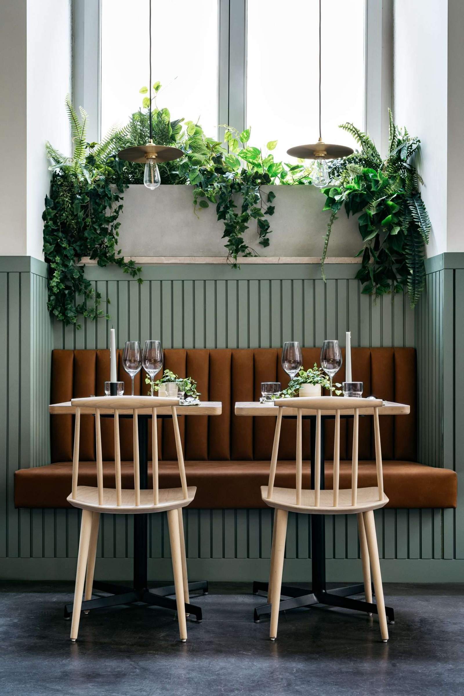
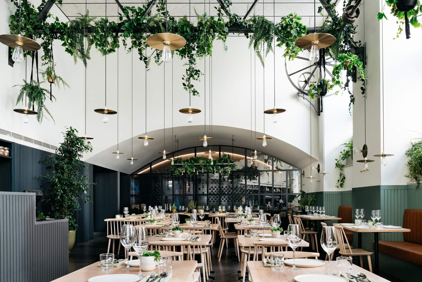
In another life, this new restaurant in Lisbon stood as a 19th century factory. Before arriving at its current state, the space lay abandoned for over 20 years and had been overtaken by vegetation. The new owners of the building were inspired by this accident of fate, choosing to renovate the interior into a lush garden overflowing with ferns and philodendrons. The restaurant retains some of its industrial heritage as well, which are enhanced by industrial aesthetic decisions such as the overhead bare lightbulbs and a refurbished pulley system that intermingle above customers’ heads.
Tribeca
By LINEHOUSE, Shanghai, China
Photos by Dirk Weiblen
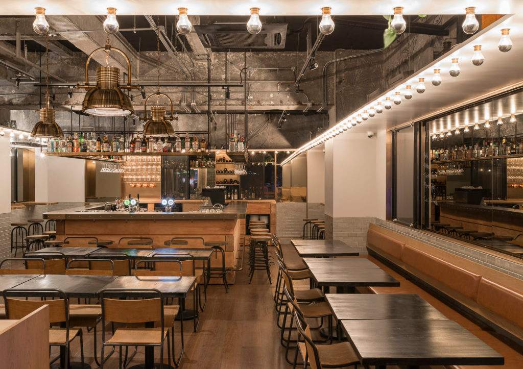
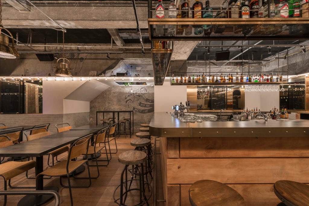
True to its name, the new restaurant brings a flair of New York to a Shanghai street otherwise populated by dark and industrial bars. The main design goal for LINEHOUSE was to juxtapose old and new within the gastropub — raw and polished design elements — to create a balance between authenticity and sophistication. Central to this aim was the incorporation of a white datum, which, populated by a straight single file of bare lightbulbs, wraps around the entire restaurant.
The datum serves as a metaphorical division of the space between the gritty, industrial ceiling replete with bronze lighting fixtures above and the refined eating space below, defined by warm tones of grey and brown. It also doubles as a shelve, where dozens of novelty items have made their home. Adding to the fun are caricature drawings painted on the concrete walls throughout, evoking the brawling energy of a Roaring ‘20s New York bar scene.
Wan Wea Restaurant in Chengdu Fortune Center
By Design aesthetics, Chengdu, China

Photos by Zheng Yan
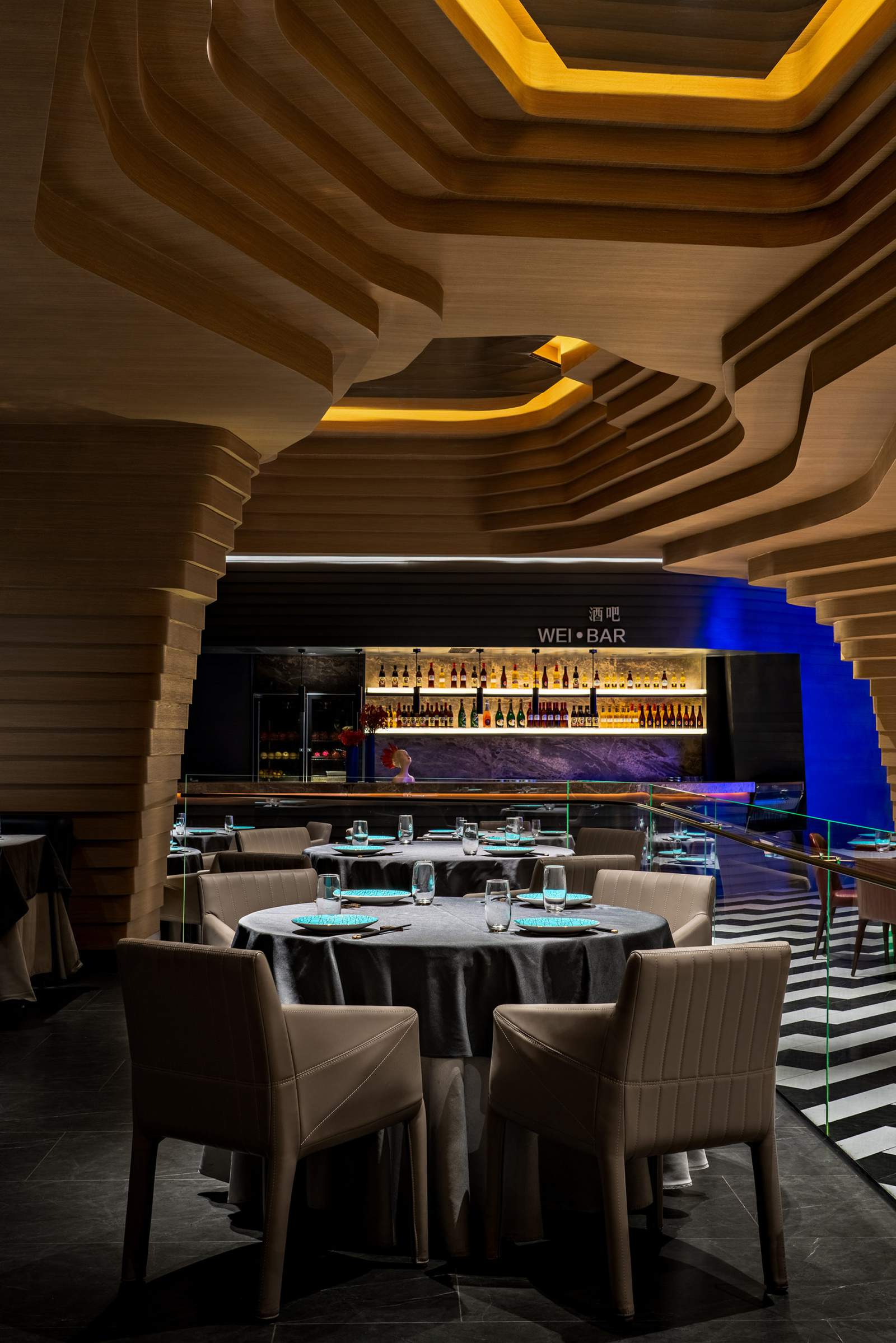
The architecture firm Design aesthetics wanted to commemorate the snowcapped mountain chains visible from Chengdu and located a mere 240km away into the fabric of this new restaurant. Their final design achieves this in an original way thanks to a staggered and stacked wooden structure that wraps around the walls and the ceiling. The bold curving and straight lines give the restaurant a sense of topography, an original iteration of the alpine aesthetic that is both elegant and organic.
Project 281 Cafe
By Splinter Society Architecture, Brunswick, Australia
Photos by Tom Ross
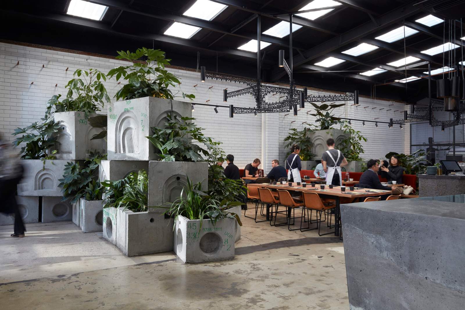
This new café in Brunswick inhabits the shell of a formerly deteriorating warehouse building. Splinter Society Architecture chose to embrace this idea of decay, designing a café that seems reclaimed by nature. Piles of oversized cinder blocks punctuate the large space and give the impression that the elegant dining experience is located post-apocalyptic industrial wasteland.
Farmers Fishers Bakers
By GrizForm Design Architects, Washington, DC

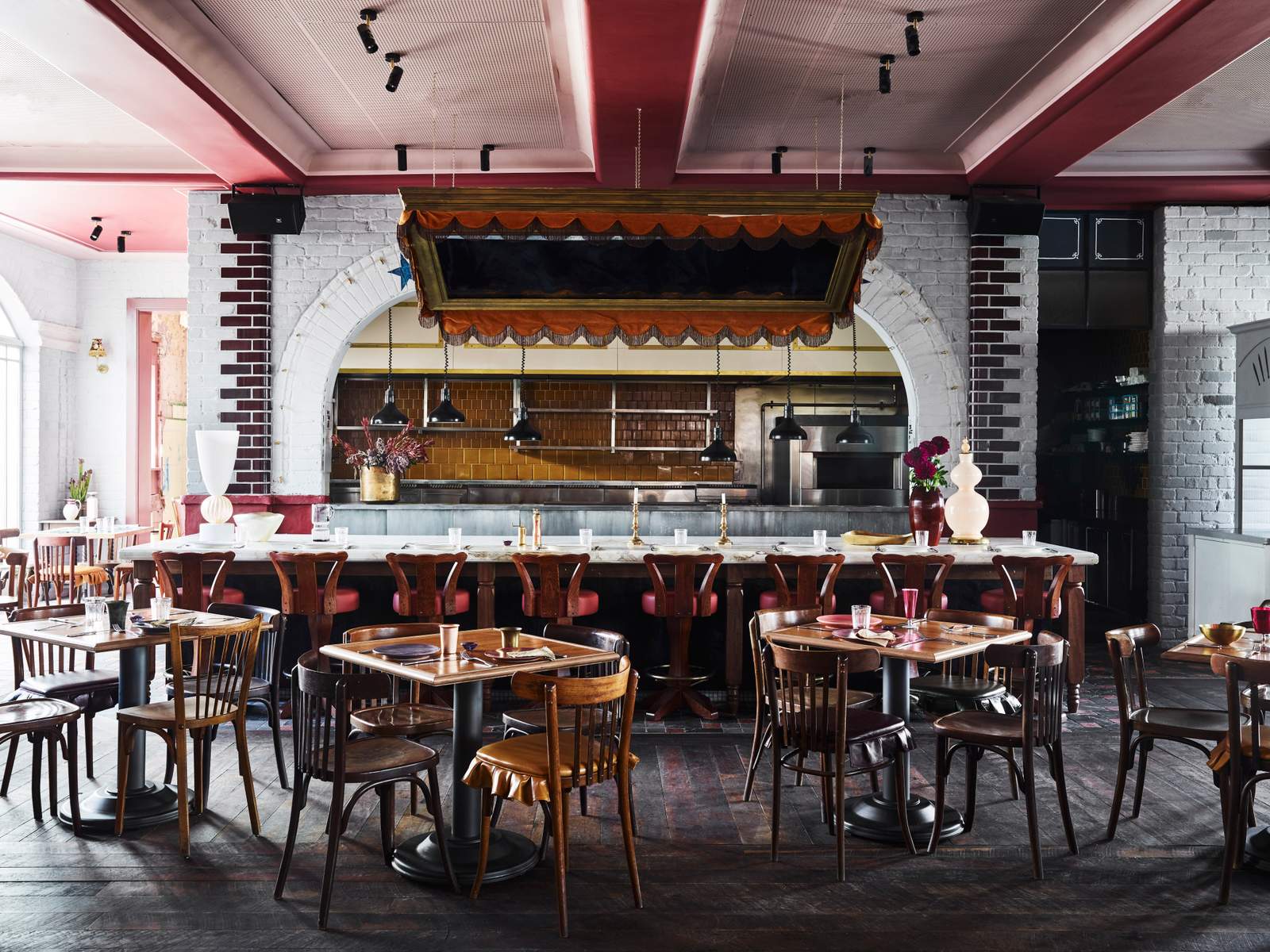
Imperial Hotel
By Alexander &CO., Sydney, Australia
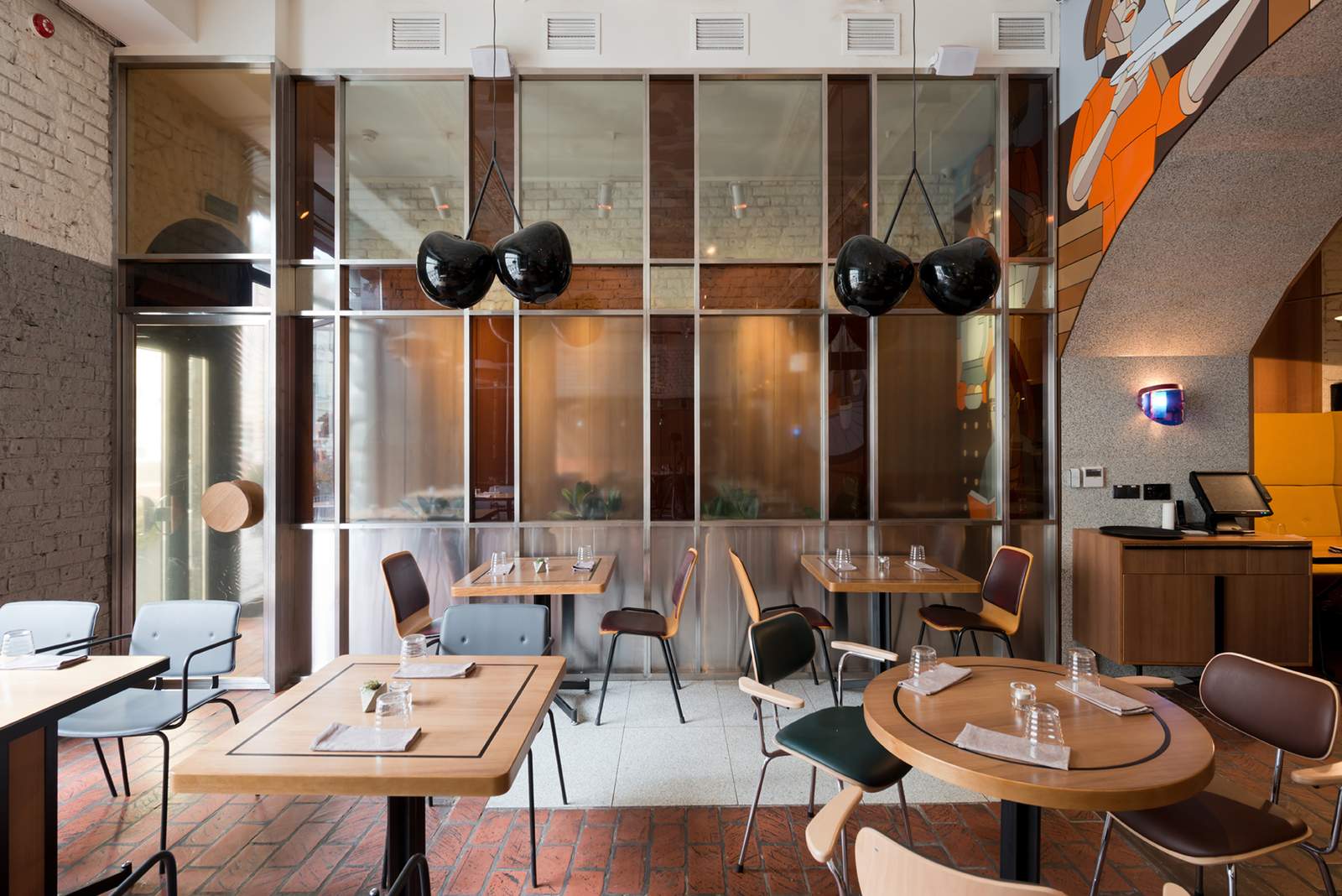
Tehnikum Bistro
By Form Bureau, Moscow, Russia
Architects: Want to have your project featured? Showcase your work through Architizer and sign up for our inspirational newsletter.

