A facade influenced by modernism adds dimensionality to ETH Zurich’s campus
Architect: Boltshauser Architekten
Location: Zurich
Completion Date: October 2022
Zurich-based Boltshauser Architekten turned to modernist influences when designing ETH Zurich’s GLC Research Building. The structure is located near the city center on the ETH’s main campus, which is anchored by a main Neoclassical building expanded with 20th-century additions. The GLC is part of the first phase of realizing a 2014 master plan, which reenvisioned the university district, developed by the canton, city, the ETH, and the University of Zurich.
Blotshauser was awarded the project following a 2010 competition, with the project to be built on the perimeter of the now former VAW Building, which was home to the Laboratory of Hydraulics, Hydrology and Glaciology. Demolition of the VAW Building began in 2015, and foundational work of the GLC Building began the following year and construction completed in October.
The new building spans 110 meters (360 feet) in length and forms a courtyard with existing adjacent buildings, including the historically-protected Scherrer Lecture Hall. This layout is consistent with the larger typology of the university district. The building, according to the ETH, when fully occupied later this year, will be home to “the departments of Health Science and Technology (D-HEST) and Information Technology and Electrical Engineering (D-ITET), as well as interdepartmental platforms.” The building will house 12,000 square feet of office, laboratory, and seminar spaces, “further expanding ETH Zurich’s existing activities in medicine and build on the university’s leading role in medical technology.”
The main entrance leads to an atrium and double main staircase, with professors’ offices located on the Gloriastrasse-facing main side of the building. The staircase leads to upper floors that slope up the building’s site and are home to lab spaces. On basement floors, laboratories are protected by a retaining wall that is detached from the building.

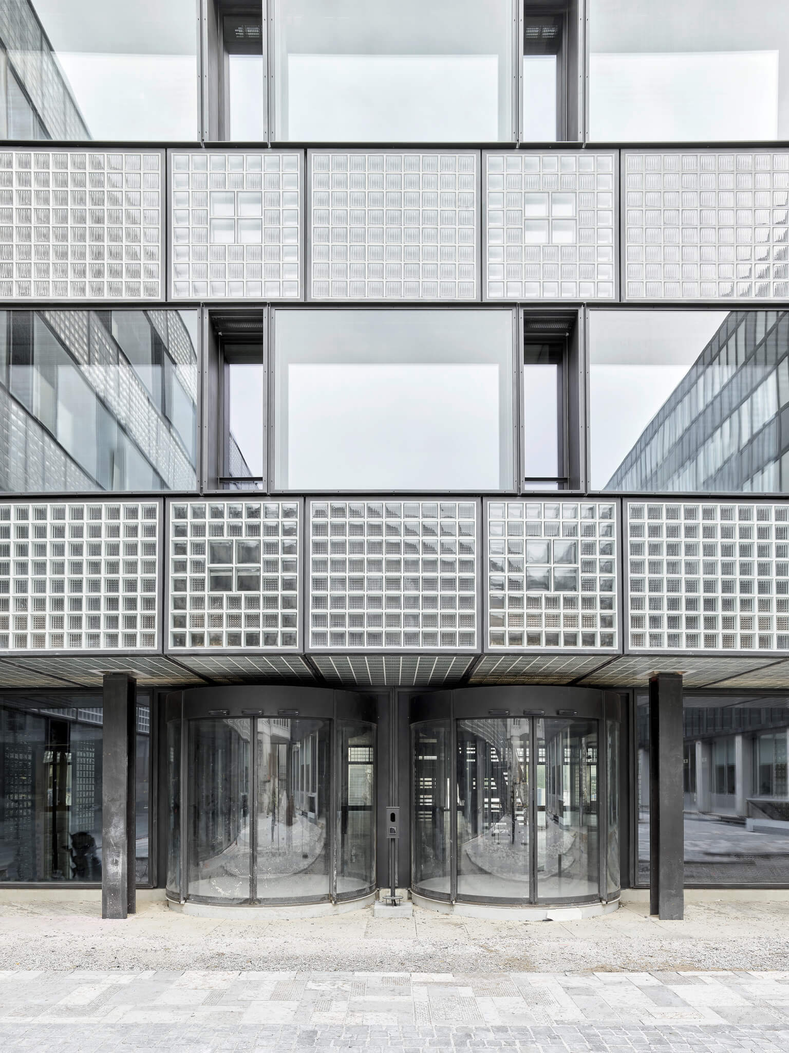
The facade was constructed with stone and glass blocks, which Boltshauser described as following “the long tradition of glass block facades in modernist industrial and university buildings.” While appearing contemporary, the architects were cognizant of how a ground-up building would fit in with both the established campus and the district’s ongoing masterplan. In distinguishing the facade from neighboring structures, the design team sought “a dignified gravity as well as three-dimensionality.” The building’s structure was built with a steel and reinforced concrete skeleton, set atop a foundation approximately 27 meters (88 feet) below the existing grade.


The envelope was designed as a double-skin construction, with the glass blocks joined by coffers. Glass block parapets and strip windows formed the horizontal lines of the building, which was “superimposed,” by the verticality of the recessed casements. The facade was further divided into rectangular and square by steel frames, with the square sections staggered by verifying infill forms and structures. As the architects explained, “the larger blocks in the middle establish a link with the casements, thus strengthening the verticality within the horizontal strip.”
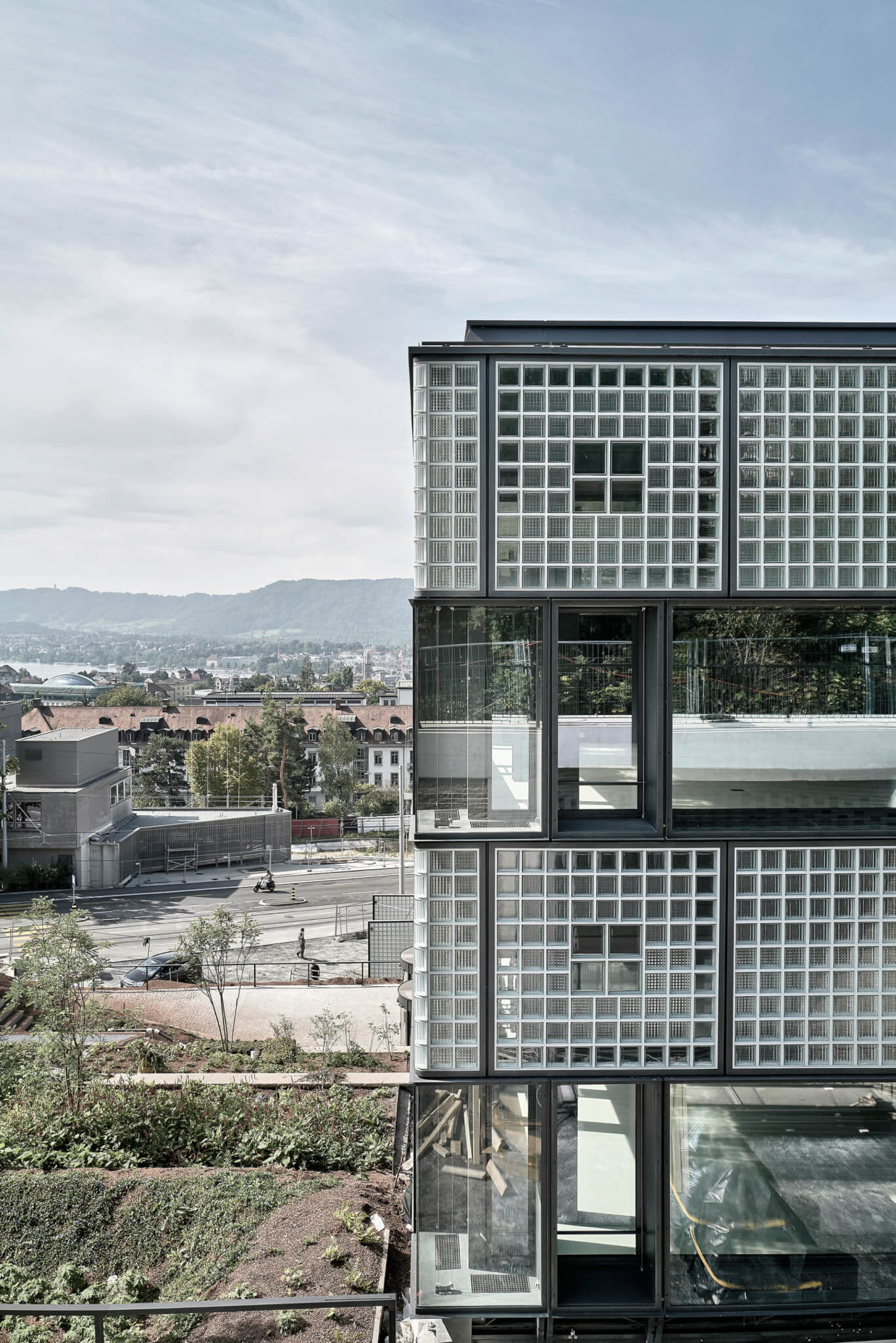
The glass portions of the facade were also designed to act as a brise-soleil, with varying levels of light transmission serving the range of interior needs. The interspace in the double skin design was designed to be climate-controlled, with air flowing through in the summer and buffered in the winter.”
On the facade that rests on the site’s slope, the glass facade faces a load-bearing stabilization structure, which was “conceived as an arc segment-shaped retaining wall that transitions into diaphragm wall slabs anchored in the bedrock.” The 18-meter (59-foot) curved wall allows the main structure more flexibility in how it bears loads, and does not add shear forces to adjacent buildings. Cavities in the wall take in fresh air through ventilation systems, and when coupled with additional strategies that include the recovery of waste heat from technical plants, reducing the building’s overall energy consumption.
This technical approach to an otherwise cleanly-expressed facade continues inside. Boltshauser designed “a hierarchically graduated visibility of conduits and building service elements… defining the character of the spaces.” While the entrance space and corridors remain free of these elements, they become “defining” in lounge and work spaces. This is extended to a specially-developed LED lamp system in which fire alarms, motion sensors, and additional technical systems can be incorporated into the lamps. Much of the interior is shaped by exposed concrete, with muted finishings, save the partially red-painted steel columns.
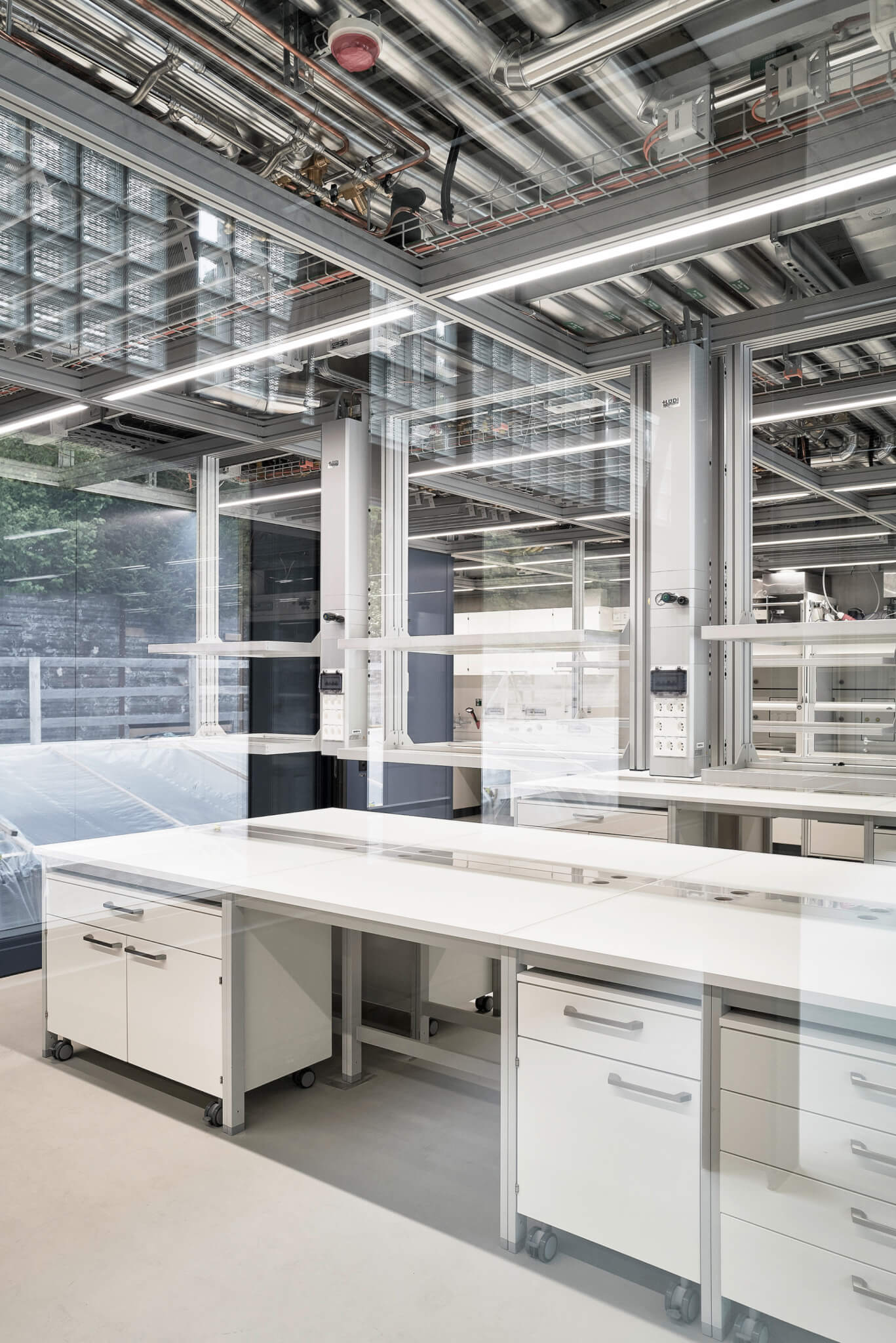
With the rectilinearly-aligned facade leaving the technical expression to the interior—and when combined with its gray glass palette—the building contains a consistency with its urban context while adding the architects’ desired dimensionality. The groupings of blocks add a dynamism to what would otherwise appear as a more standard rectangular prism on some facades, with aluminum-framed windows mediating the facade pattern.


