A Serene Coral Gables Lake House Transformation: Blending New York Sophistication with Coastal Ease
When a pair of New York doctors relocated to Coral Gables with their young son, they sought a home that balanced urban sophistication with coastal tranquility. The result? A breathtaking gut renovation by boutique design studio Andreea Franca, transforming a dated lakefront house into a light-filled sanctuary where modern elegance meets relaxed warmth.
Before & After: A Home Reborn
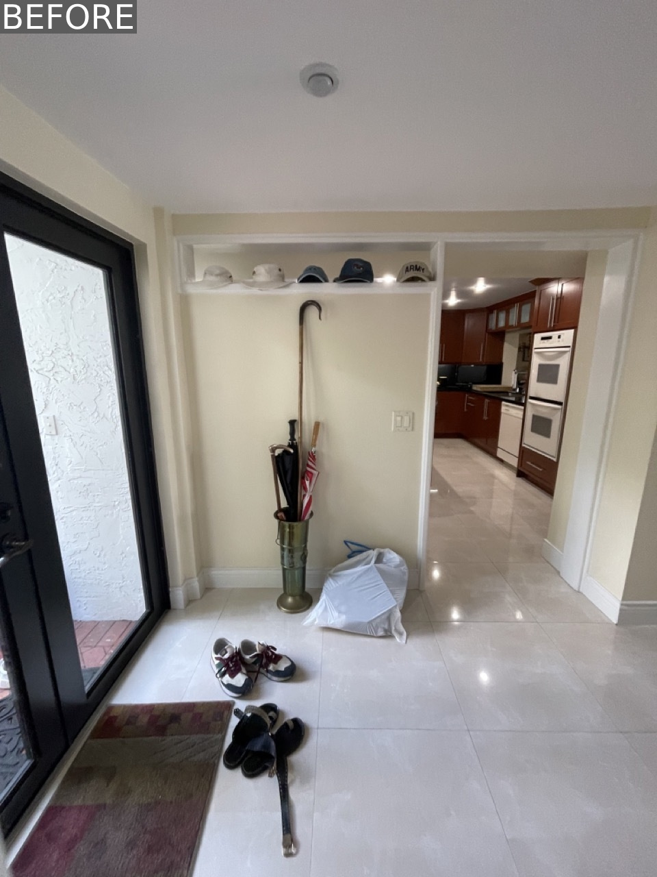
The Entryway: First Impressions Matter
Before: The original entryway was a nondescript transitional space with no storage or defining character a missed opportunity to welcome guests.
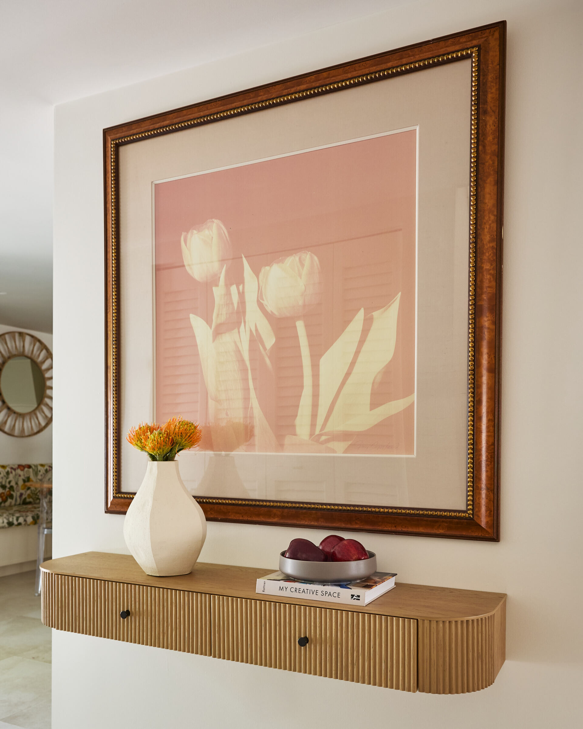
After: Now, the updated entryway subtly sets the tone with organic textures and curated details. A fluted floating wood shelf holds a tulip print and vibrant orange blooms, while a small tray of fruit and stacked books add lived-in charm. The design proves that even compact spaces can make a statement with thoughtful minimalism.
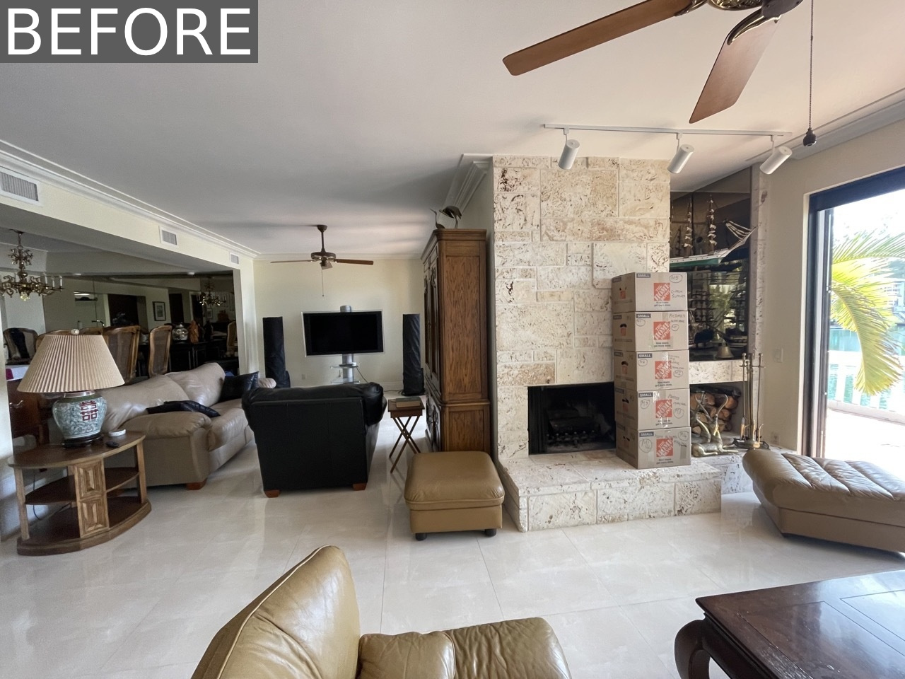
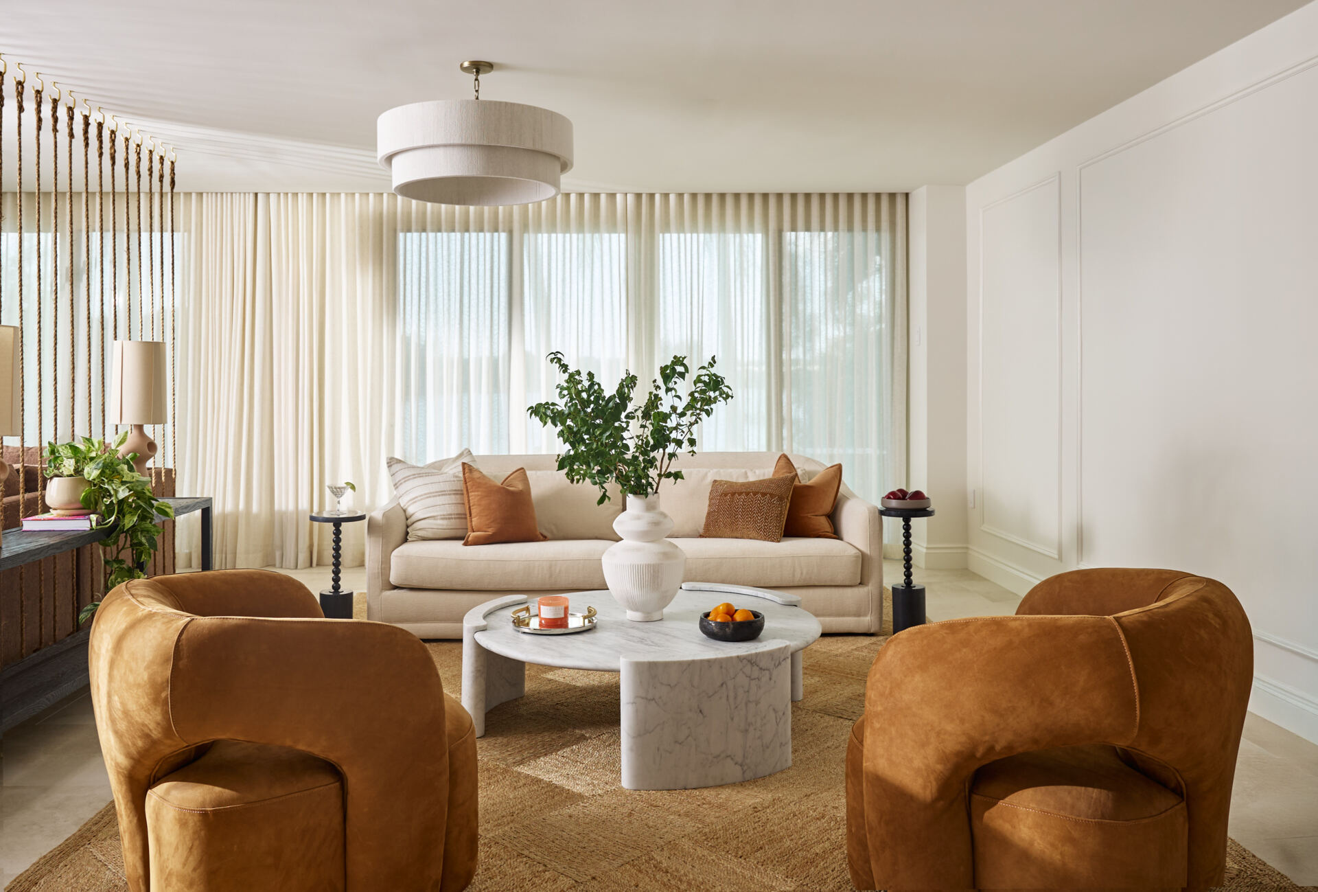
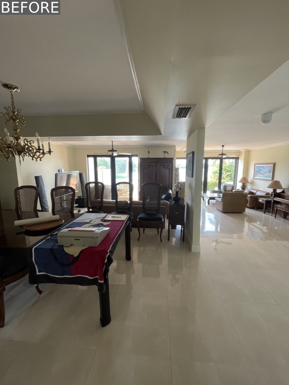
Living Room: Dual Zones, Unified Design
Before: A tile-clad fireplace and bulky shelving divided the room, creating a choppy, disconnected feel.
After: The redesigned living room now features two distinct yet harmonious zones:
- A Formal Sitting Area A sculptural cream sofa paired with caramel velvet chairs and a white marble coffee table creates a modern sanctuary. Sheer drapes filter soft light, enhancing the airy elegance.
- A Relaxed Lounge Corner A deep brown sectional, rust-toned pillows, and a fiddle leaf fig in a woven basket invite casual comfort. Floating wood shelves display art and ceramics, adding personality.
The pièce de résistance? A floor-to-ceiling raw rope partition that visually separates the spaces while maintaining an open, organic flow.
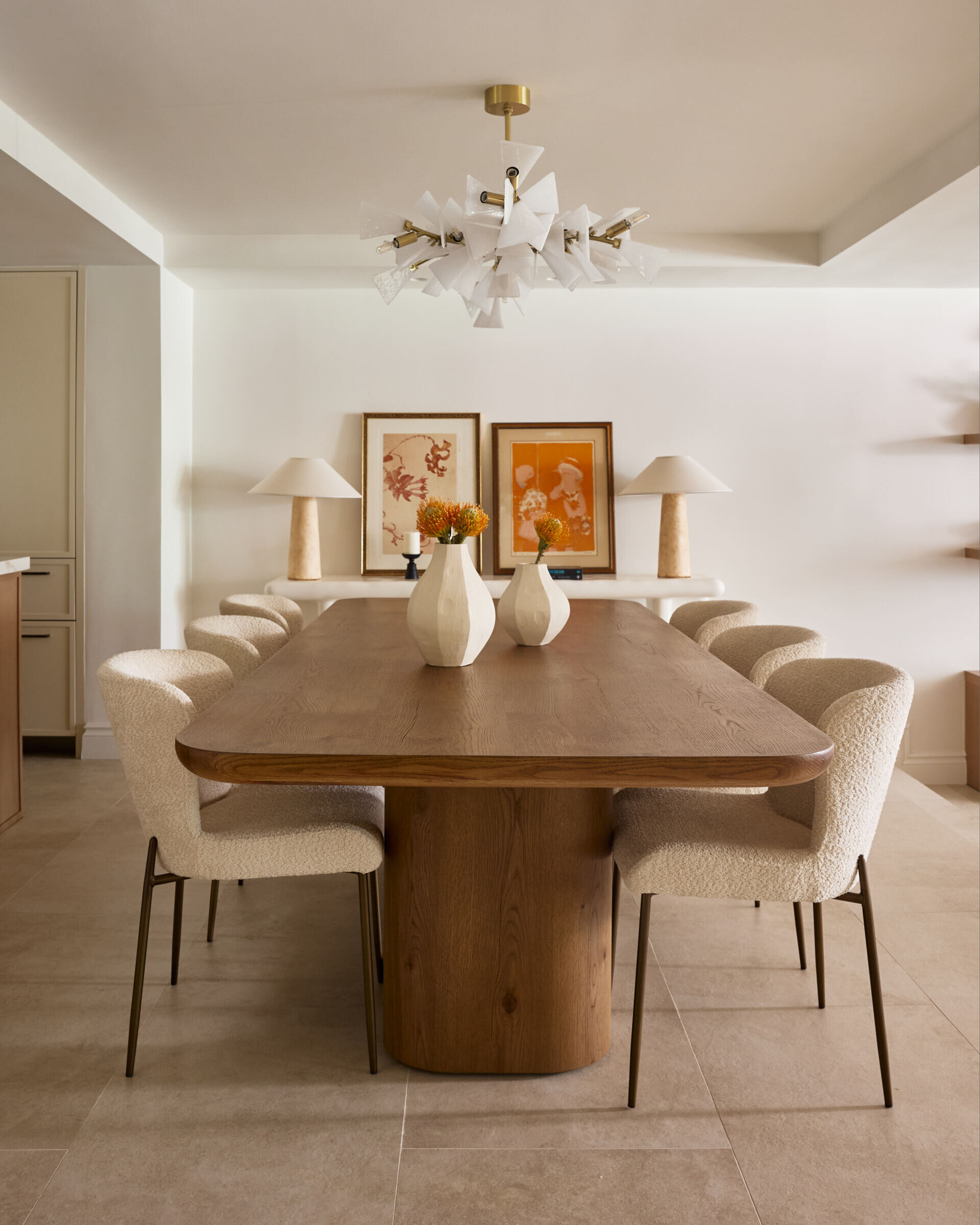
Dining Room: Sculptural Balance
Before: Oversized dark furniture and a mirrored wall made the space feel heavy and imposing.
After: The new dining room is a masterclass in contrast:
- A rounded-edge oak table grounds the space.
- Bouclé chairs introduce softness and tactility.
- A dramatic layered chandelier adds artistic flair against the neutral backdrop.
A sculptural white console with sandy stone lamps and terracotta artwork completes the look, blending organic modernism with personal touches.
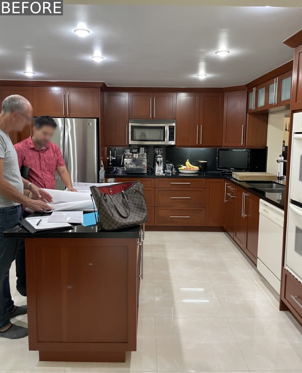
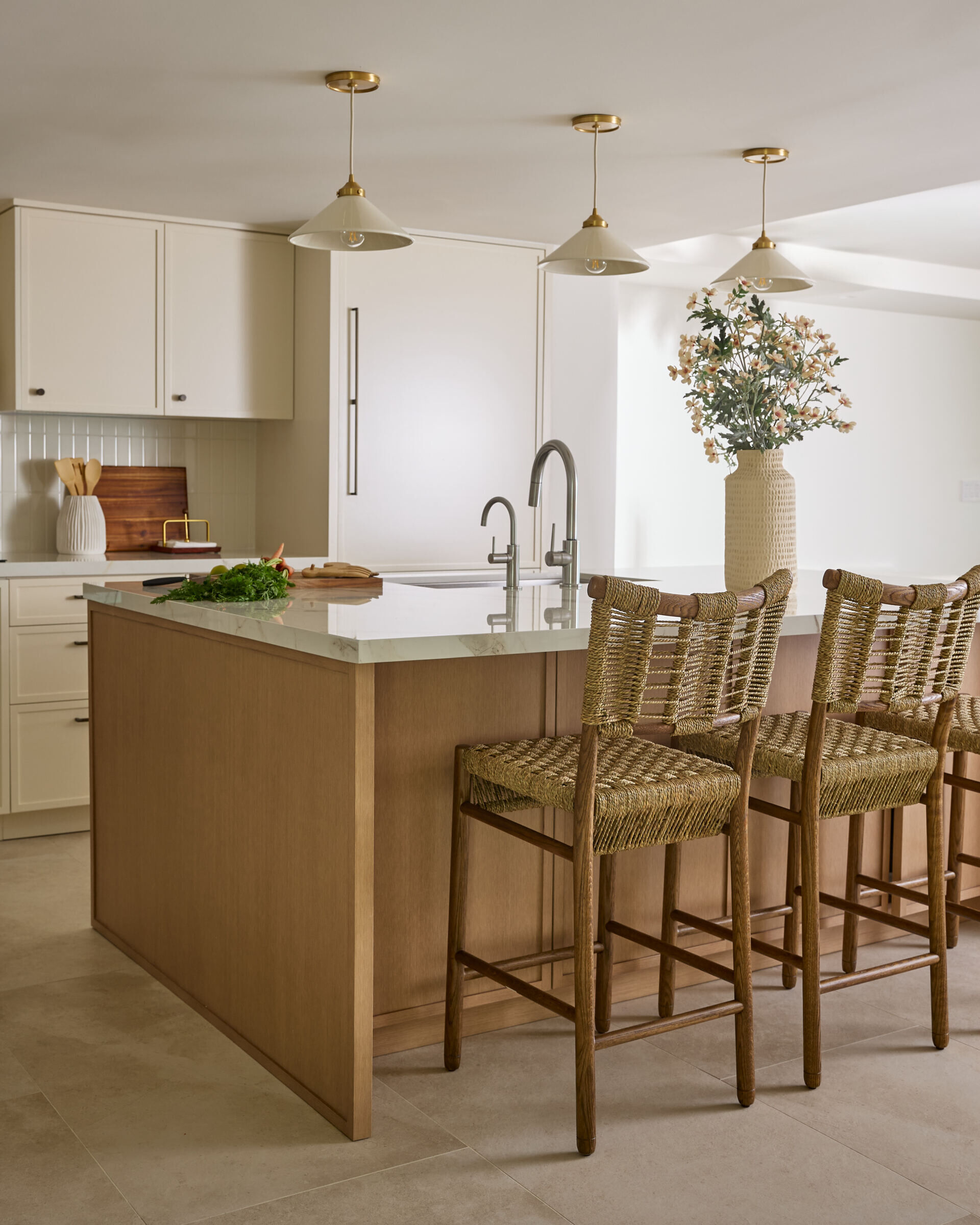
Kitchen: Practical Elegance
Before: Dark cabinetry, mismatched appliances, and black countertops made the kitchen feel cramped and disjointed.
After: The renovated kitchen is a study in calm functionality:
- Creamy cabinetry with dark bronze hardware and vertical zellige tiles adds depth.
- A custom oak island with Dekton stone offers warmth and workspace.
- Brass and ceramic pendant lights infuse a vintage-inspired glow.
Adjacent, a sunlit breakfast nook features a built-in botanical-print bench and ghost chairs, balancing playfulness with the kitchen’s refined palette.
(Keyword focus: “zellige tile kitchen,” “warm modern kitchen design”)
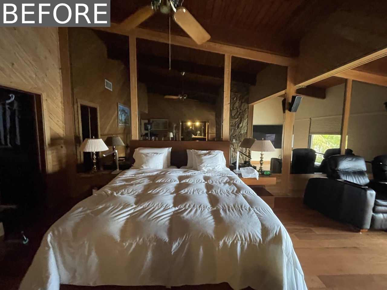
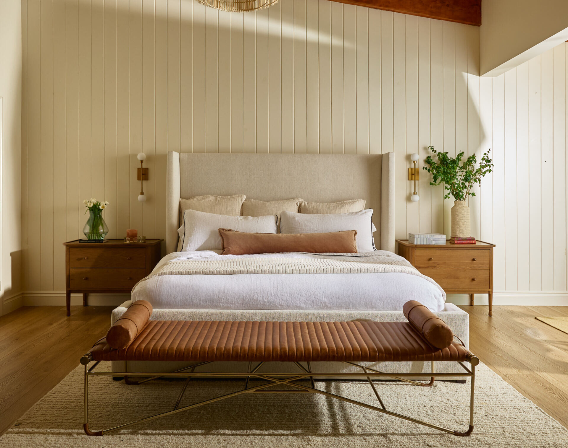
Primary Suite: A Serene Retreat
Before: The bedroom felt dark and dated, dominated by a mirrored wall and bulky leather recliners.
After: Now, it’s a textural haven:
- A tall upholstered wingback bed anchors the room.
- Vaulted ceilings with exposed beams add rustic warmth.
- A window-side seating area framed by drapery invites lake views and relaxation.
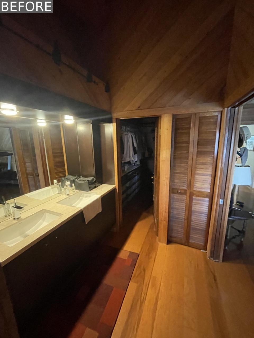
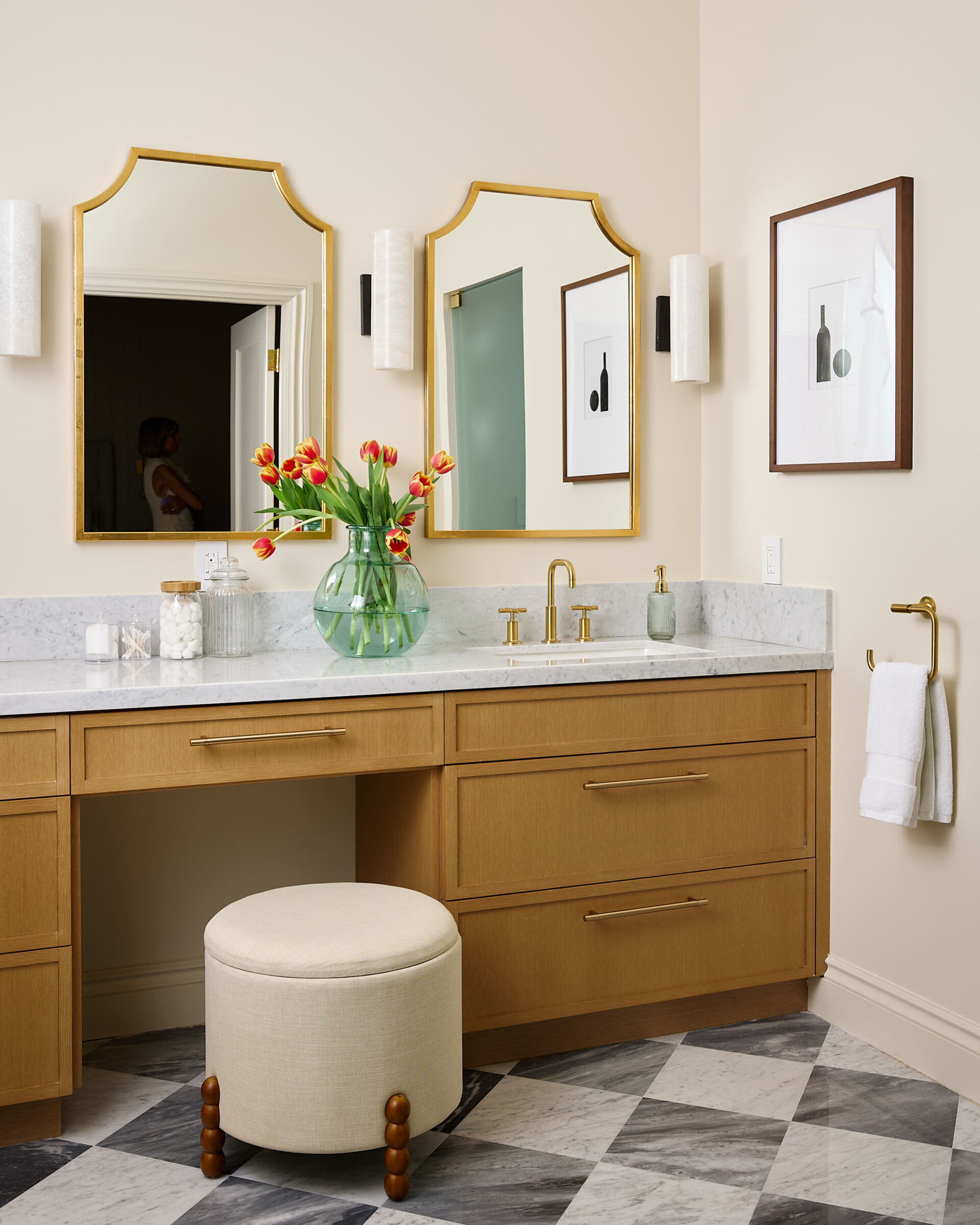
The Primary Bath: Quiet Indulgence
Before: Heavy wood paneling and dim lighting created a cave-like atmosphere.
After: The new bath is a spa-like escape:
- Checkerboard marble floors contrast with creamy wall tiles.
- A freestanding tub basks in natural light.
- The oak vanity with honed marble and brass fixtures exudes timeless luxury.
Final Thoughts: A Home That Tells a Story
Studio Andreea Franca’s renovation masterfully blends New York polish with Coral Gables’ coastal ease, proving that great design is equal parts beauty and livability. Every detail from the organic textures to the intentional layouts reflects a home crafted for both style and comfort.
Project Credits:
- Photography: Abigail Mair
- Architecture: DGO Architecture
- Interior Design: Studio Andreea Franca
- General Contractor: The Arko Group
✦ ArchUp Editorial Insight
This project presents an inspiring model for transforming historic spaces into modern homes without losing their original identity. What stands out here is the clever use of natural elements (wood, light, plants) to create a balance between luxury and everyday comfort. The success of this design lies in the small details, such as the choice of bronze door handles or the ficus plant in the living room corner, which add layers of narrative depth. This is not just a home renovation, but a redefinition of how a modern family can live in harmony between aesthetics and functionality. Most importantly, it proves that good design doesn’t have to be expensive just thoughtfully considered.
Explore More with ArchUp
ArchUp documents the evolving profession of architects worldwide, from career insights and research to project profilesand industry news. Our editorial team publishes global salary trends, career advice, and opportunities for emerging talents. Learn more on our About page or Contact us to collaborate.