Blue Bottle Coffee’s First Kiosk by I IN: A Prefabricated Stainless-Steel Landmark in Santa Clara
Japanese studio I IN has introduced a new milestone in coffee architecture by creating Blue Bottle Coffee’s first kiosk in Santa Clara, California. Known for its minimalist yet striking design language, the project represents a significant moment for the brand, which already operates in Asia and the United States. This kiosk, however, differs from previous ventures by adopting a prefabricated stainless-steel structure that redefines flexibility, sustainability, and brand identity.
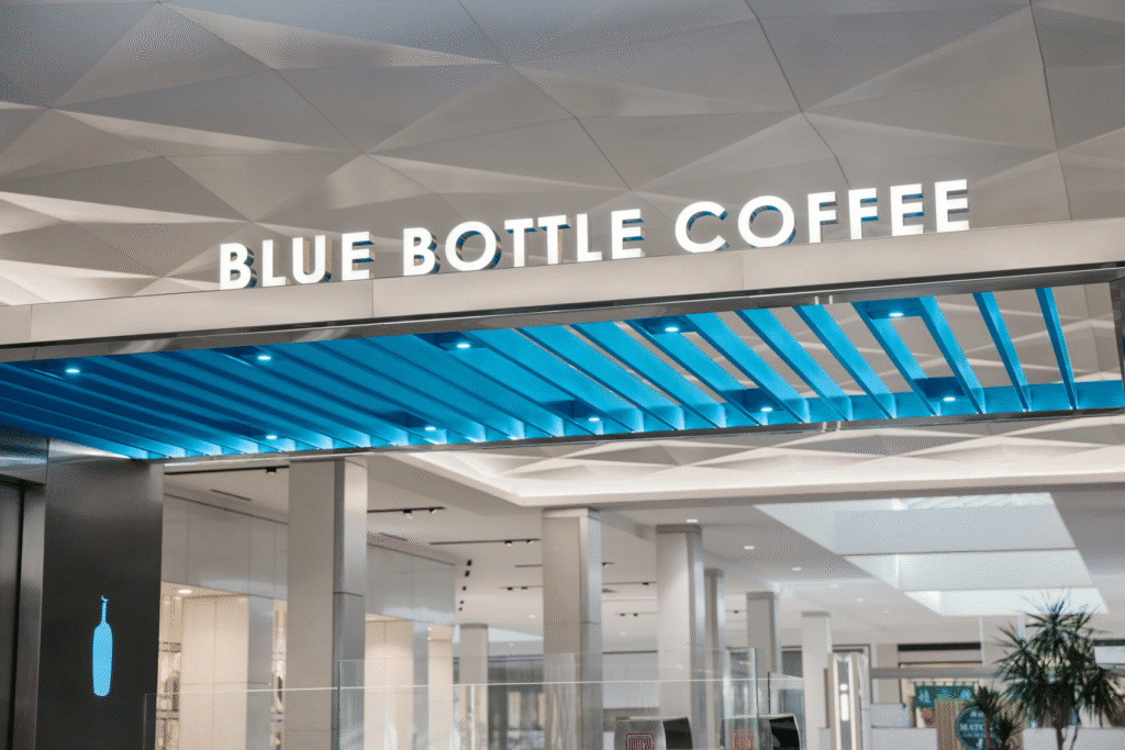
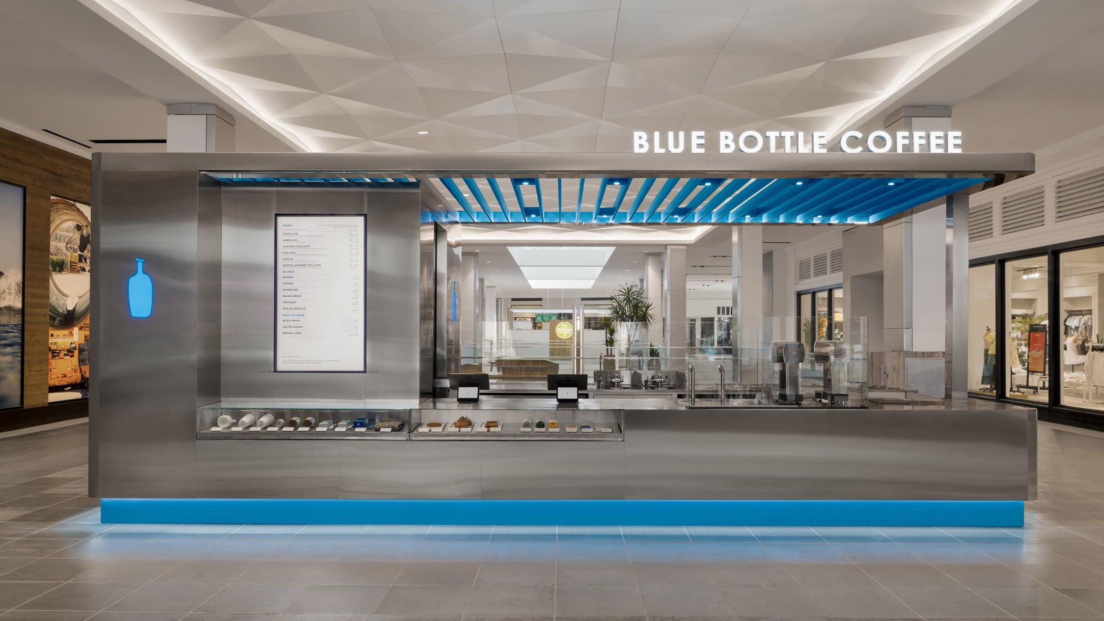
The kiosk is not just a retail point; it is a conceptual exercise in branding and material efficiency. Its modular design allows for assembly in any location, making it an adaptable solution for urban spaces. Prefabricated stainless-steel components, complemented by subtle yet powerful blue elements, set the tone for the design. The cool industrial feel of the stainless steel is softened by reflective surfaces and contrasted by Blue Bottle’s signature blue, appearing in the logo, the illuminated base, and the louvred canopy above.
This pioneering project demonstrates how architecture can reinforce a brand’s visual identity while embracing modular construction and sustainability. For Blue Bottle Coffee, it offers a consistent, recognizable presence across multiple locations, while for I IN, it shows how architectural language can bridge continents and adapt to diverse contexts. More than a kiosk, it represents a new architectural prototype for retail in the twenty-first century.

Design Vision and Concept
The Blue Bottle Coffee kiosk is conceived as a structure that expresses clarity of brand in any environment. The challenge was to craft a design that balances industrial rigor with emotional resonance. Stainless steel was chosen not only for its durability but also for its reflective qualities, which integrate the kiosk into its surroundings. At the same time, the signature blue provides sharp contrast, ensuring brand recognition even from a distance.
Prefabrication and Modularity
A key design decision was to use prefabricated stainless-steel components. This modular system enables rapid assembly and reduces construction waste, making the kiosk an efficient model for replication. I IN emphasized that this method reduces both time and resource consumption, aligning with contemporary sustainable practices. The modularity also allows the design to be adapted to different locations without compromising the integrity of the brand.
Material Palette
Stainless steel dominates the exterior, creating a minimalist and industrial character. Its reflective finish subtly dissolves the structure into its context, softening its presence. Blue accents appear in carefully curated locations: the canopy above, the glowing base below, and the Blue Bottle logo. These limited yet powerful interventions ensure that the brand identity remains clear without overwhelming the environment.

Lighting as a Design Element
The kiosk employs lighting both as function and as identity. The glowing blue base creates a striking visual anchor at night, while the canopy’s louvres filter daylight in ways that animate the surfaces. According to I IN, light was treated as a fundamental material—capable of connecting emotionally with visitors while enhancing visibility and clarity under all conditions.
Program and Layout
Despite its compact scale, the kiosk accommodates multiple functional zones: a food counter, preparation spaces for coffee and food, a till section, and a staff area. Prefabrication allowed these to be integrated seamlessly, ensuring that operational efficiency was not compromised by the compact footprint. Lighting from above and below highlights these zones, guiding both customers and staff through a clear spatial experience.
| Design Element | Description |
|---|---|
| Structure | Prefabricated stainless steel modules |
| Signature Color | Blue Bottle’s signature blue used in canopy, logo, and glowing base |
| Lighting | Illuminated base and canopy with louvred ceiling filters |
| Program | Food counter, coffee prep, till, staff zone |
| Contextual Strategy | Reflective surfaces to integrate with surroundings |
Balancing Consistency and Creativity
While individuality in design has aesthetic appeal, I IN emphasizes the value of consistency across multiple retail locations. This kiosk embodies that philosophy by creating a design that is both unique and replicable. The modular approach allows future kiosks to maintain brand identity while adapting to different contexts, reinforcing the brand’s presence without redundancy.

Architectural Narrative
The kiosk speaks a language of contrasts: cool stainless steel against vibrant blue, industrial rigidity softened by reflective dissolution, compact footprint expanded by prefabricated efficiency. It is an architectural object that transcends its commercial role to become a prototype of how small-scale retail spaces can achieve both function and visual resonance.
| Challenge | Architectural Response |
|---|---|
| Global Material Sourcing | Selection of mass-produced stainless steel for consistency |
| Sustainability | Prefabrication reduces waste and construction time |
| Brand Identity | Strategic use of signature blue to ensure visibility |
| Spatial Efficiency | Compact yet comprehensive layout with clear circulation |
Architectural Analysis
The design logic of the kiosk rests on three pillars: material clarity, modularity, and brand articulation. Stainless steel provides neutrality and durability, while blue accents create recognition. The prefabricated system allows for efficient construction and replication, an approach increasingly vital in global retail. Contextually, the reflective surfaces prevent the kiosk from appearing intrusive, while the canopy and lighting strategies introduce dynamic qualities to a compact form.
Critically, while the design achieves clarity and repetition, one might question whether excessive consistency risks diluting the individuality of place. Yet, by embracing reflection, light, and modular flexibility, the project avoids monotony and instead presents a prototype adaptable to varied environments. It is a thoughtful balance of standardization and contextual integration.

Project Importance
This project teaches architects the value of modular construction in retail design, demonstrating how prefabrication can reduce waste, increase efficiency, and ensure brand consistency across geographies. It contributes to architectural thinking by reframing the kiosk not as a secondary retail typology but as a legitimate architectural prototype. The work highlights how material selection and brand articulation can shape both customer experience and construction logic.
In today’s globalized retail market, the project is relevant because it proposes a sustainable and repeatable model that does not compromise design quality. It reflects broader architectural shifts toward modularity, prefabrication, and sustainability, setting a precedent for how future small-scale commercial spaces might be designed.
✦ ArchUp Editorial Insight
Blue Bottle Coffee’s first kiosk in Santa Clara, California, designed by studio I IN, introduces a striking approach to modular retail architecture. Constructed entirely from prefabricated stainless steel components, the kiosk presents a minimalist industrial aesthetic. Signature blue accents in the louvred canopy, illuminated base, and discreet branding create a visual dialogue with the cool metallic surfaces, while natural light enhances both texture and identity.
Although the design communicates clarity and strong brand expression, it raises questions about sustainability and user experience within such a compact setting. Stainless steel offers durability, but its environmental cost is tied to manufacturing and transport. The modular process reduces waste and accelerates construction, yet the limited interior may challenge comfort and the potential for deeper spatial interaction. The tension between precision and atmosphere is evident.
Still, the kiosk succeeds as a forward-looking experiment in material expression and adaptability. It points toward a flexible model for future urban retail that unites efficiency with distinctive identity.

Conclusion
Blue Bottle Coffee’s first kiosk, designed by I IN, is a compelling study of how retail architecture can embody modularity, sustainability, and brand clarity. Through the use of prefabricated stainless-steel components, the project sets a new standard for efficient, repeatable construction. The signature blue interventions provide a strong brand presence without overwhelming the minimalist palette, achieving a balance of industrial rigor and emotional resonance.
Beyond its function as a kiosk, the project represents a prototype for future retail architecture. It shows how compact forms can be both visually striking and operationally efficient, addressing challenges of material sourcing, waste reduction, and global consistency. For architects, it offers lessons in balancing brand identity with contextual integration, while for designers, it highlights the potential of prefabrication as a creative rather than restrictive approach.
As Blue Bottle Coffee prepares for future kiosk rollouts, this project signals a broader architectural shift toward modular sustainability and design consistency. It redefines the kiosk as an architectural object that matters—not only in retail, but in the evolving conversation about global design, efficiency, and sustainable construction practices.
Explore the Latest Architecture Exhibitions & Conferences
ArchUp offers daily updates on top global architectural exhibitions, design conferences, and professional art and design forums.
Follow key architecture competitions, check official results, and stay informed through the latest architectural news worldwide.
ArchUp is your encyclopedic hub for discovering events and design-driven opportunities across the globe.
Brought to you by the ArchUp Editorial Team
Inspiration starts here. Dive deeper into Architecture, Interior Design, Research, Cities, Design, and cutting-edge Projects on ArchUp.


