
Buildings That Look Worse Than a College PowerPoint
In every field, there are works that impress—and others that leave you scratching your head. Architecture is no different. While many buildings showcase breathtaking designs and brilliant craftsmanship, some stand out for all the wrong reasons. They resemble last-minute college PowerPoint presentations: chaotic, clumsy, and oddly disconnected.
When Ambition Turns into a Visual Disaster
Creativity is essential in architecture, but when it’s not grounded in design fundamentals, the results can be jarring. You’ll find windows placed with no logic, color palettes that clash aggressively, or shapes and structures that simply don’t make visual sense. These buildings don’t just challenge expectations—they confuse and overwhelm.
Real Examples That Spark More Confusion Than Admiration
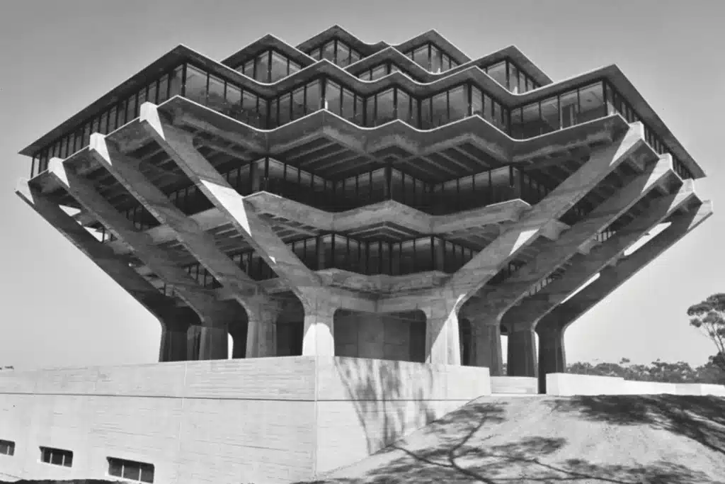
Here are some well-known examples of buildings that have become infamous for their design missteps:
| Building | Location | Design Flaw | General Impression |
|---|---|---|---|
| Picasso Tower | Madrid, Spain | Flat, uninspired facade | Feels like staring at a blank slide. |
| The Longaberger Basket | Ohio, USA | Entire building shaped like a basket | Feels more like a joke than architecture. |
| Ryugyong Hotel | Pyongyang, North Korea | Massive structure with no clear detail | Huge, but soulless. |
| National Library | Minsk, Belarus | Overcomplicated geometric design | Like a Rubik’s Cube gone wrong. |
Who’s to Blame: The Architect or the Concept?
Architecture is more than just drawing bold lines. It’s a responsibility—toward people, cities, and environments. Some designers get carried away with ambition, ignoring the human experience entirely. What’s left is a building that looks interesting on paper, but offers little comfort or practicality in real life. It often seems like these structures aim to make a statement, not serve a purpose.

What Can We Learn From These Projects?
When designers forget the people who’ll actually use a building, the results can be more than disappointing—they can be damaging. Poorly designed buildings may look awkward, but their real issues go deeper: poor ventilation, high maintenance costs, and uncomfortable living or working conditions. Good architects know that beauty means little without usability.

✦ ArchUp Editorial Insight
This article examines a series of buildings marked by design disorder—materials, colors, and spatial forms clash without clear intent. The imagery reflects jarring massing, rigid geometry, and visual tension that disrupts spatial coherence. Still, does such architecture reflect experimentation or a loss of conceptual direction? The piece offers a critical reading of structures that lack contextual or human grounding, questioning the architect’s role in visual identity. Yet, it succeeds in highlighting the value of learning from flawed precedents, positioning bad design as a foundation for future architectural awareness.
Explore the Latest Architecture Exhibitions & Conferences
ArchUp offers daily updates on top global architectural exhibitions, design conferences, and professional art and design forums.
Follow key architecture competitions, check official results, and stay informed through the latest architectural news worldwide.
ArchUp is your encyclopedic hub for discovering events and design-driven opportunities across the globe


