Cheetos Cheesy Verse: Redefining Brand Experience in an Interactive Space
Interactive Brand Experience in Physical Spaces
In July 2024, Mexico City hosted an interactive event titled Cheetos Cheesy Verse, aimed at exploring how brand identity can be translated into a direct spatial experience. The event was based on the idea of engaging the audience within an explorable environment, rather than relying solely on traditional visual communication.
Spatial Design as a Narrative Tool
The installation consisted of ten distinct rooms, each designed to reflect an independent visual and experiential character. This diversity was not arbitrary; it served as a means to narrate a multi-dimensional story about the products, using lighting, colors, and interactive elements as key storytelling tools.
Visual Diversity Reflecting Varied Experiences
Some rooms relied on strong visual patterns and saturated colors to create a direct sensory impact, while others drew inspiration from cultural references such as cinema or sports. This contrast helped maintain visitor interest and established a dynamic rhythm as they moved through the spaces.
Evaluating the Experience and Its Impact
From an analytical perspective, the project stands out as a model for how interior and exhibition design can foster a deeper connection between a brand and its audience. This approach received professional recognition, winning an A’ Design Award in both interior and exhibition design, reflecting the quality of execution and the strength of the concept.
Visual Density as an Attraction Tool
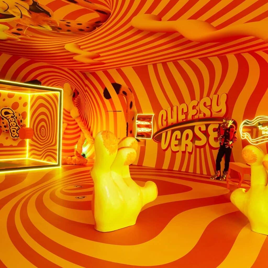
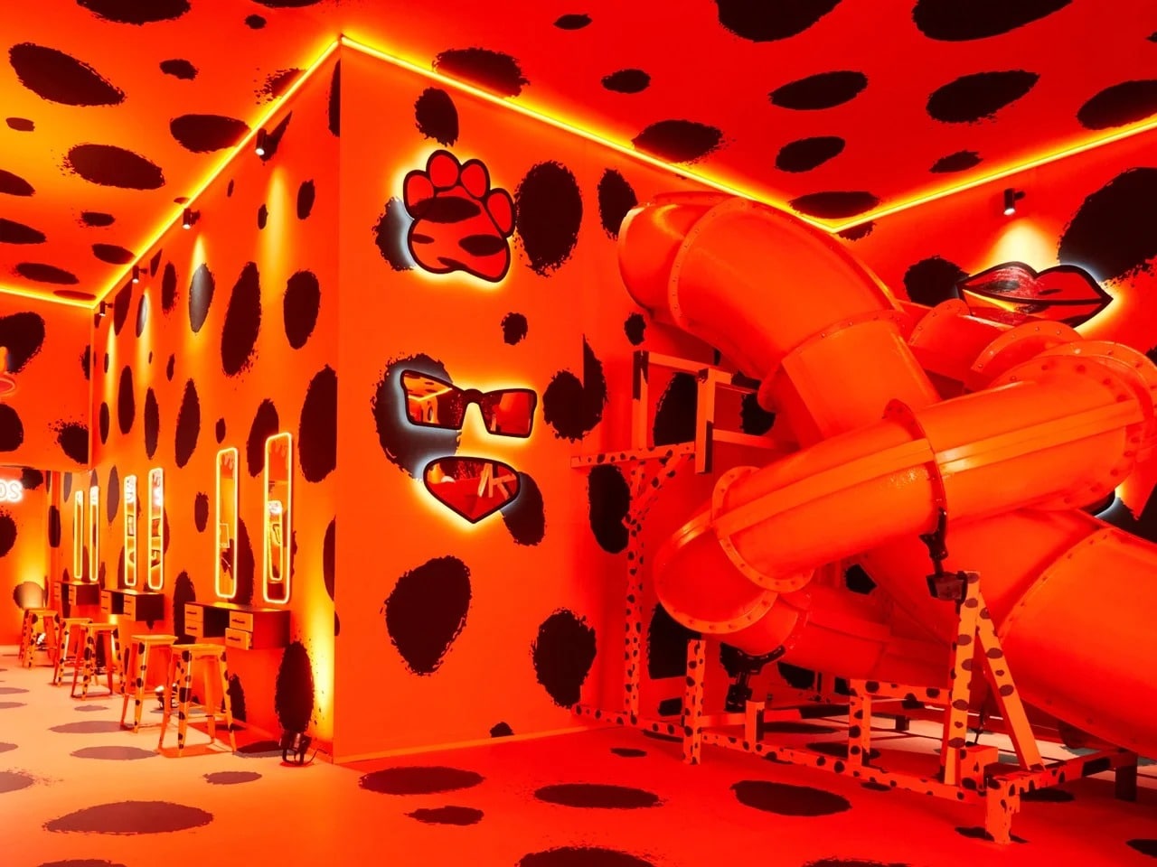
The design relies on a high visual density that asserts itself immediately upon entering the space. Saturated shades of orange cover various surfaces, complemented by undulating forms with a tactile quality and bold patterns inspired by leopard skin. This visual layering leaves no neutral space, instead creating a complete, self-contained environment.
Creating a Space Detached from the External Context
As a result, visitors experience a clear separation from the outside world, as if they have entered an independent visual scene governed by its own rules. This sense of immersion is not incidental; it stems from precise design decisions aimed at fully controlling the user experience within the space.
Design in Service of Shareability
From an analytical perspective, the experience was designed to serve as a ready-made backdrop for photography and social media sharing. This approach is not merely superficial but a deliberate functional goal, intelligently integrated into the visual language of the space, reflecting an awareness of how audiences engage with contemporary environments.
The Challenge of Embodying Product Personality
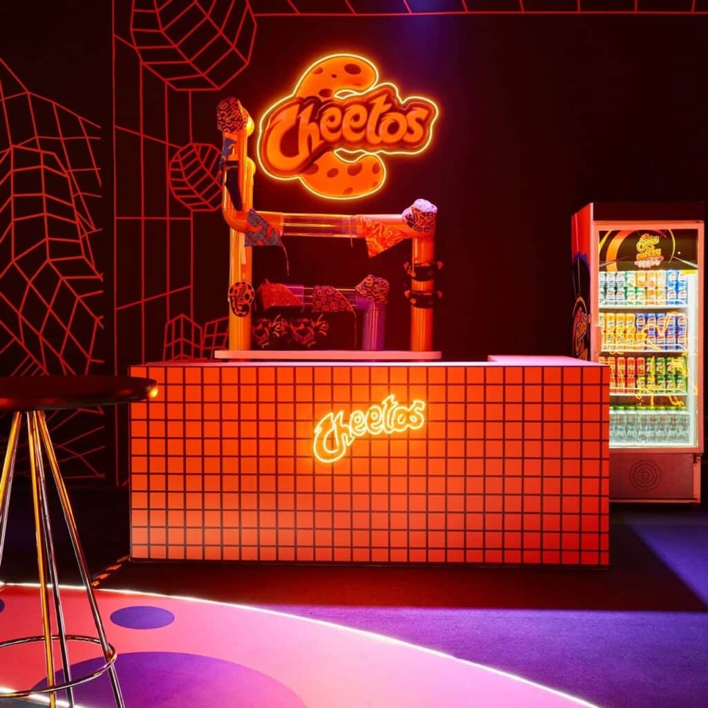
Transforming a visual mood board into a tangible physical experience is one of the most challenging stages of design, and many brands struggle at this point. Having visually appealing ideas does not guarantee their success in reality, while achieving harmony between a product’s personality, such as Cheetos Poffs, and the physical space, without appearing artificial or forced, requires precision and a deep understanding of visual identity.
Connecting Spaces to Cultural References
The design team successfully overcame this challenge by linking each room to a clear and strong cultural reference, creating a meaningful context for the visitor. The visual content is not seen as mere decoration but as part of a coherent narrative that connects the product to a broader world.
Practical Example: “Palomitaswood”
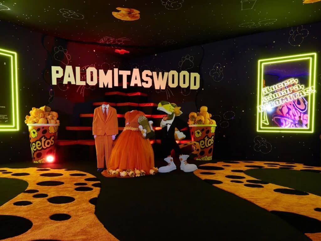
The “Palomitaswood” room provides a clear example of this approach; it is a popcorn-themed space inspired by Hollywood, offering immediate and clever cues for the visitor. This type of thoughtfully constructed world adds an extra dimension to the experience, transforming the project from a visually attractive space into a fully integrated experience with a clear, memorable identity. Projects like this showcase innovative ways to merge events with spatial storytelling.
Digital Interaction as an Extension of Design
The precision of the design thinking is evident in the small details that shape the visitor experience. Upon entering the space, visitors take photos against carefully designed backdrops and share them across social media platforms, effectively becoming an active part of the brand’s daily strategy, without the need for direct traditional marketing.
Utilizing Targeted Visual Symbols
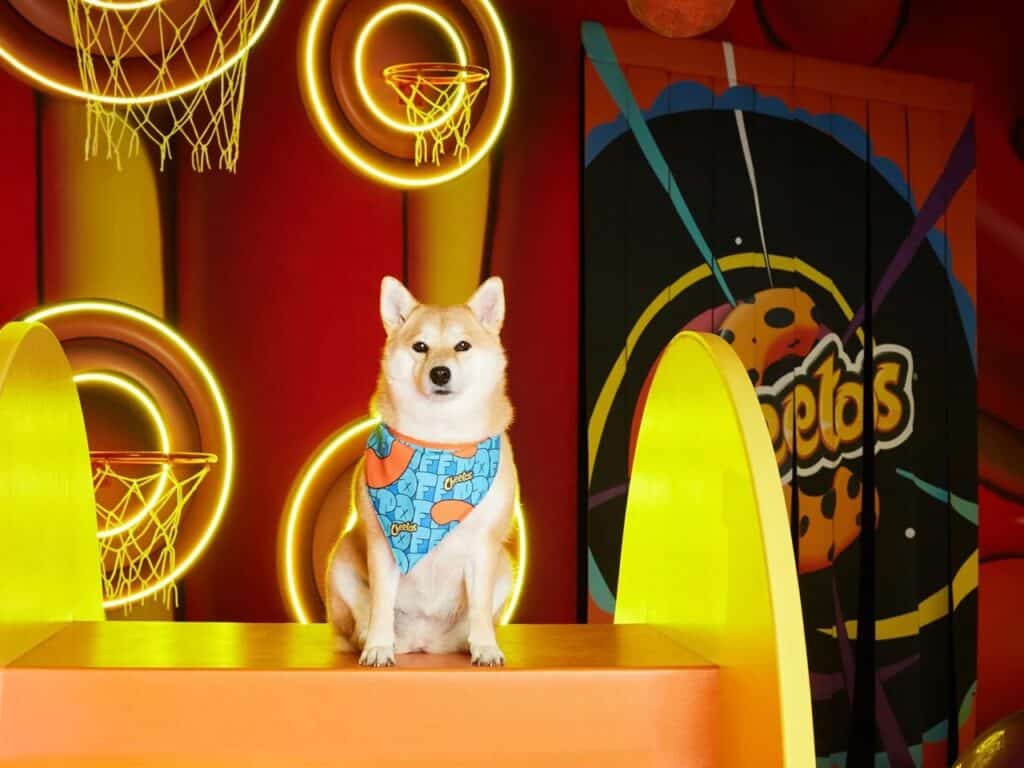
For instance, the image of a Shiba Inu dog serves as a deliberate nod to internet culture, aimed at a specific audience segment. This choice reflects a deep understanding of how visual trends propagate and influence digital audience behavior, connecting with Architectural News on emerging trends in audience engagement.
An Integrated Marketing System
This approach highlights that modern marketing has become a holistic system, where visual awareness intersects with social interaction, turning the design itself into a strategic tool that reinforces investment in the brand experience. Such strategies can be studied further in Research on interactive spaces and audience behavior.
✦ ArchUp Editorial Insight
The project can be appreciated from the perspective of creativity in transforming a brand’s visual identity into an architectural space. The design of diverse rooms provides opportunities to understand how interactive elements can be integrated with visual aspects. From this standpoint, the experience serves as a valuable reference for studying the interaction between spatial design and audiences, especially in projects that rely on sensory immersion and interactive experiences.
However, the project raises some questions from a more traditional architectural perspective. The high density of visual elements and saturated surfaces may create visual clutter and interrupt the natural flow of the architectural experience, reducing the visitor’s ability to focus on fine design details. Additionally, the strong reliance on cultural references or digital symbols from internet culture makes some rooms less accessible or meaningful outside the context of the project or the target audience.
From another angle, this model can be leveraged in educational or research settings to understand how visual identity can be transformed into a tangible space, and to study the impact of colors and cultural symbols on visitor behavior, while carefully balancing visual density with movement and architectural immersion. In this way, the project remains an important reference for studying the relationship between design, social interaction, and user experience, while acknowledging that its elements are not always directly applicable to all traditional architectural contexts.
★ ArchUp: Technical Analysis of the Interactive Store Concept as Immersive Marketing Space
Technical Analysis of the “Cheetos” Interactive Store:
This article presents a technical analysis of an interactive store design for the “Cheetos” brand, as a case study in transforming a visual identity into an immersive architectural space oriented toward digital marketing.
1. Design Concept: Immersive Visual Saturation
The core architectural strategy is the creation of a high-density visual environment. Surfaces are covered with hypnotic wave patterns and bold textures inspired by cheetah skin, using saturated orange tones occupying approximately 95% of the visual field to generate immediate disconnection from the external context.
2. Marketing Strategy: Architecture as Content Engine
All rooms are designed as Instagram-ready backdrops, each linked to a clear cultural reference (e.g., the Hollywood-inspired “Palomitaswood” room). This transforms the visit into shareable digital content, targeting a social media engagement rate exceeding 70% of visitors.
3. Interactive Performance: Embedding Digital Culture
The space integrates digital-native symbols (like the Shiba Inu dog icon) as direct references to internet culture. This approach redefines the interior from a product container to a strategic tool for generating organic marketing content and reinforcing brand identity in the digital space.
Urban Sparkle: An Architectural Exploration of Light, Geometry, and Spatial Flow





✅ Official ArchUp Technical Review completed for this article.