Copic: Between Tradition and Innovation – An Analysis of a New Packaging Design that Captures the Brand’s Spirit
The Importance of “Copic” Pens in the Creative World
Copic pens are essential tools for a wide range of artists and designers. Their high-quality manufacturing and significant flexibility make them ideal for drawing techniques such as blending, gradients, and fine-line work.
Packaging Design Flaw: Between Tradition and Recommendations
Despite the effectiveness of these pens, their packaging hasn’t seen a real update in years. The pens are still designed to be stored vertically, while technical recommendations suggest they should be stored horizontally. This is to ensure even ink distribution inside the pen. This discrepancy raises questions about the feasibility of updating the old packaging.
Redesign Project: Attempting to Keep Up with the Times
In this context, designer Saniya Gupta’s project emerged as an attempt to reimagine the classic Copic pen packaging in line with modern design trends. The project aims to address practical issues while preserving the brand’s identity.
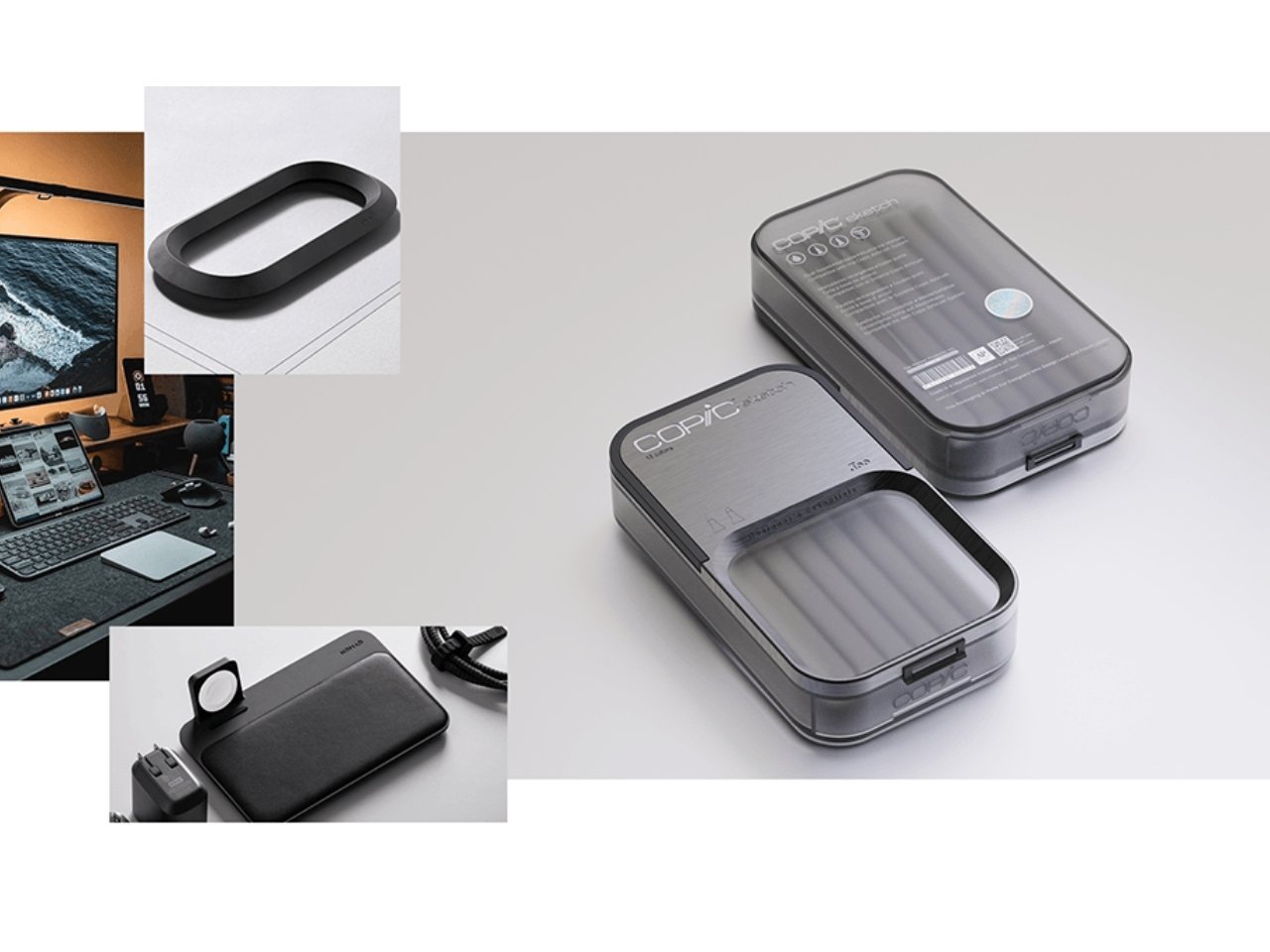
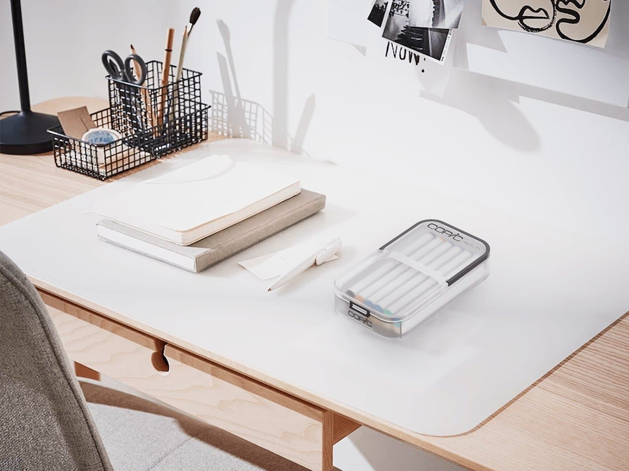
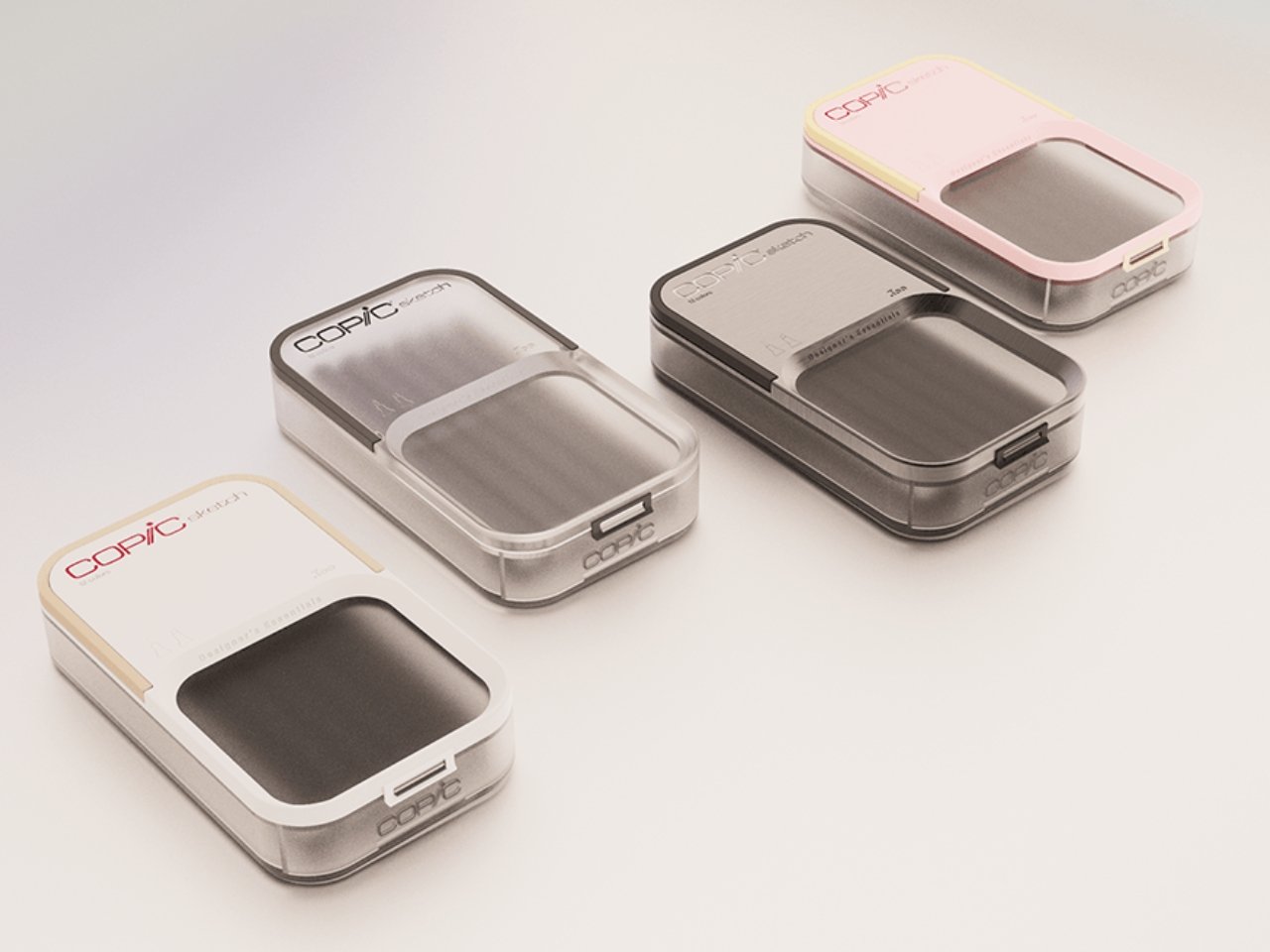
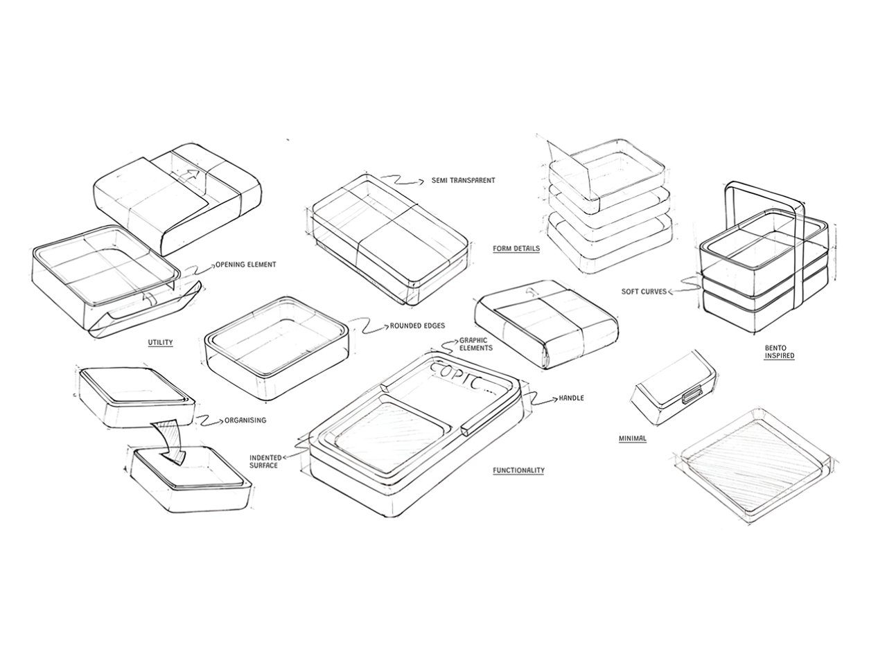
Features of the New Design: Thoughtful Simplicity and Preserved Identity
The new design is based on simplicity, with clean lines and a calm colour palette. A matte finish, along with transparent details and curved lines, was used. This gives the packaging a modern appearance without clashing with the familiar character of the product.
Functional Design: Ease of Use and Practical Organization
When considering an update to a product packaging used daily, focusing on usability becomes crucial. Therefore, the new design for the Copic pen packaging stands out with several practical advantages. These make it easier for users to organize their tools flexibly. It features an internal compartmentalisation system allowing pens to be arranged according to each user’s needs.
Furthermore, the box is designed to seamlessly blend into office environments and includes space for sticky notes. This enhances functionality and integrates the product into the user’s daily reminder system.
Environmental Responsiveness: Sustainable Materials Without Compromising Quality
With growing environmental awareness, it was essential for the modern design to incorporate an eco-friendly dimension. Sustainable materials were chosen to reduce the environmental impact of production, while maintaining durability and quality. This balance reflects the increasing awareness among designers of the need to align innovation with environmental responsibility.

Preserving Visual Identity: A Balance Between Modernity and Tradition
Although the proposed design is still in its conceptual stage, its execution reflects a deep understanding of the Copic brand’s identity. Designer Saniya Gupta considered visual details familiar to users, from traditional colour palettes to the placement of the logo. She created a familiar impression and reinforced the brand’s continuity even amidst aesthetic updates.
Visual Continuity Enhancing Loyalty
These subtle visual cues serve the aesthetic aspect and reinforce the user’s sense of attachment to the product. The new design, despite its modern character, does not sever ties with the past. Instead, it reintroduces the product with a fresh spirit without abandoning its roots.
Design as a Tool for Reviving Classics
What distinguishes this project is not just its new appearance, but its profound vision. It demonstrates how design can be a means of reviving a classic product. By respecting traditions and integrating innovation, the design becomes a tool connecting generations. It redefines the relationship between the user and the product.