Exotrail, end-to-end space mobility – Brand identity
A new visual identity, for an ambitious vision of logistics in space
Exotrail is an end-to-end space mobility provider pioneering a new era of logistics. Since its foundation, Exotrail has always had the ambition to become a leader in space logistics. Its vision is that space mobility is the next frontier of logistics. Like on Earth at the end of the 20th century, where logistics leaders emerged shortly after the rise of globalised trade, Exotrail predicts that the current boom in the space sector will give rise to a new world of mobility in space.
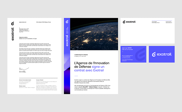
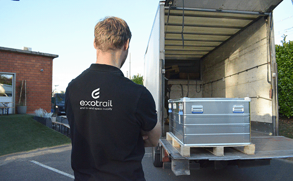
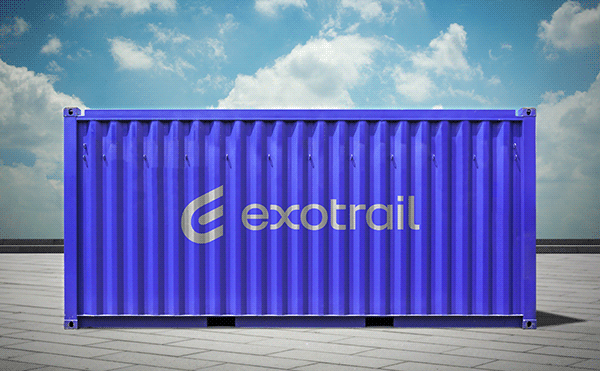
Graphéine worked with Exotrail on the evolution of its visual identity. We created a new logotype and redesigned the brand architecture of products and services to provide the Exotrail brand with a comprehensive graphic guidelines.


A new Exotrail emblem to launch the brand into space logistics
We wanted to capture that global, end-to-end logistics and space mobility vision in a new, refreshed visual identity. That's what the new logo and colors are all about: logistics.
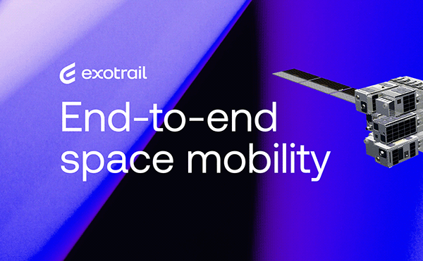
The old logotype was designed to symbolise the idea of propulsion, which is the historical service of Exotrail. Visually this idea was materialised by a graphic intervention on the letter O with a central dot and a “propulsion plasma plume” in the form of three blue lines. The new ambition embodied in the tagline “End-to-end space mobility” required a move away from propulsion to symbolise a 360° service.
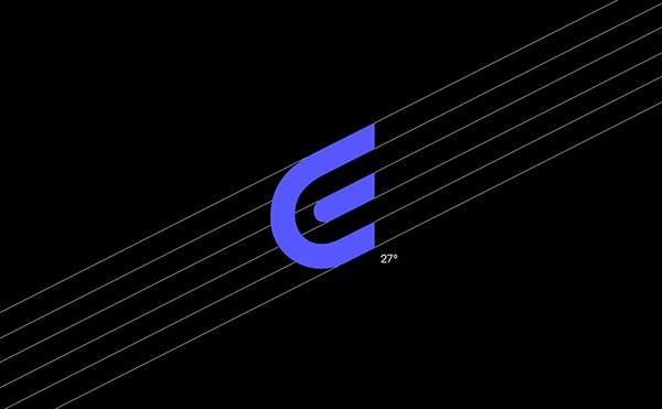
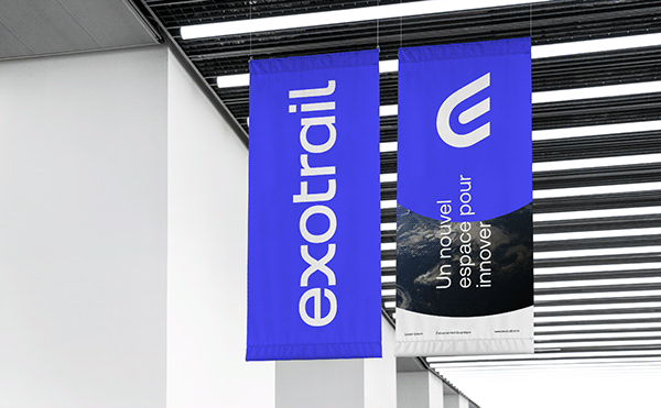
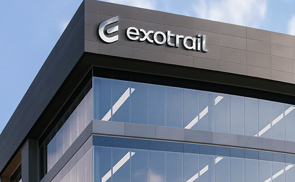
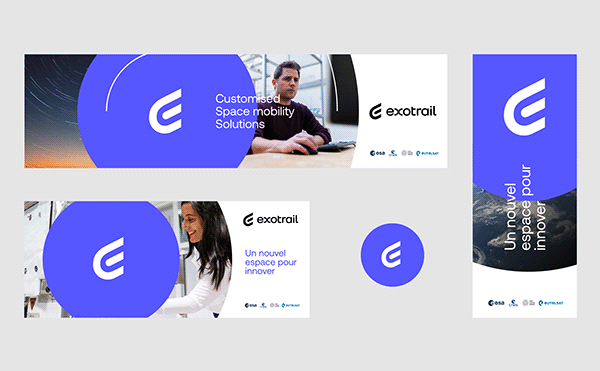
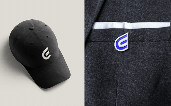
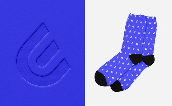
The new emblem merges the power symbol and the wings of Hermes into an asymmetrical sign that suggests upwards movement. The constituent elements of the old emblem are reused in a monogram icon that now stylises the first letter of the brand name.
This new emblem, independent from the name, allows the brand to label and trademark its creations. This opens the way for a new brand architecture.


A redesigned brand architecture to embody Exotrail’s new vision
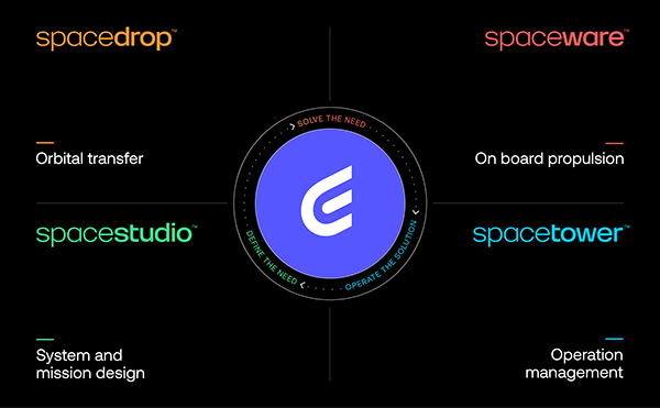
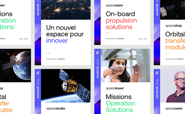
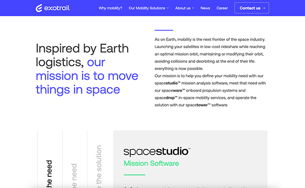
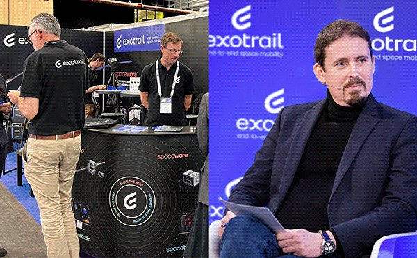
Exotrail recently revealed its MobilityHub™ – a portfolio of end-to-end mobility solutions. To create consistency and distinction these solutions were renamed and branded as new logotypes.
– ExoOPS™ becomes spacestudio™, the tool for designing space missions.
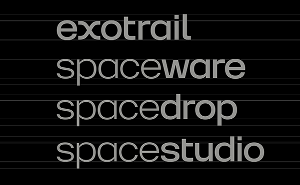
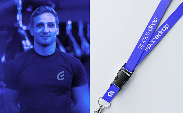
– SpaceVan™ becomes spacedrop™, Exotrail’s launch and deployment service.
– ExoMG™ becomes spaceware™, a family of flexible and high-thrust propulsion systems for satellites.
– ExoOPS™ becomes spacetower™, the platform for operating space missions.
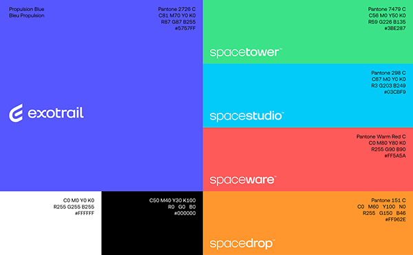
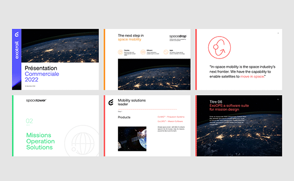
We have drawn a new wordmark for each of the products and services. These sub-logos are designed to be both elegant and robust in order to make them consistent with the Exotrail logotype. A dedicated colour scheme completes the visual distinction between the communication of each division in the “Mobility Hub”.


A solid graphic system that asserts the brand elegantly
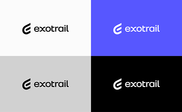
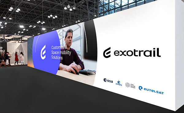
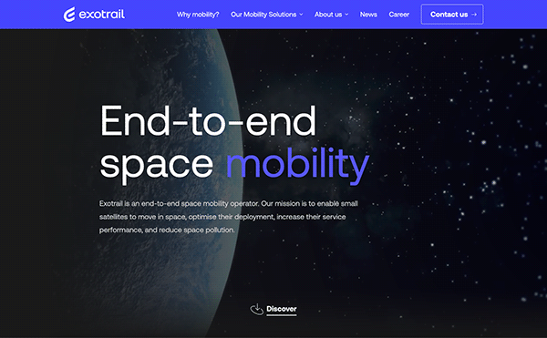
We created brand guidelines that include a strategic use of the colour palette. The main brand color, Propulsion Blue is the central color of the identity. However all the colors are used sparingly to accentuate the visuals with a major presence given to black and white.
“Aeonik” from the CoType foundry was chosen as the official brand typeface. This typeface works harmoniously with the new logo and wordmark because of its details — the tail of the Q, the horizontality of the terminals in the lowercase t, a, j and y. Not only does this horizontality correspond with the design of the Exotrail wordmark, but it is also a contemporary take on the NASA worm aesthetic.
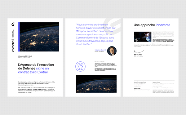
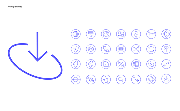
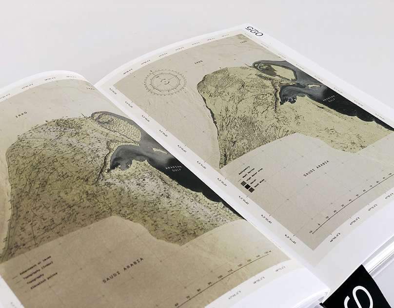
All the brand elements are tied together by a modular grid system that allows the placement of images, text and brand assets. Colored strips on the edge of applications add an elegant color accent while also identifying the sub-brand of the product/service.


Representing the pioneering vision of Space Logistics
Just like on earth, logistics have become a crucial need in space. Space logistics operators need to provide an end-to-end solution: Software/Hardware/Services. Exotrail is on a mission to become the hub for all-round space logistics solutions. This new visual identity captures this mission as well as Exotrail’s values and vision, opening up a new chapter in its history.
See more :
[EN] https://www.grapheine.com/en/portfolio/exotrail-end-to-end-space-mobility-brand-identity
[FR] https://www.grapheine.com/portfolio/exotrail-end-to-end-space-mobility-identite-visuelle
If you found this article valuable, consider sharing it

