How to use colors in your home interior design
Over the years, there have been many different lines of thought and no right answer as to how to use color in your interior design.
However, there have been many trends; we’ll explore some of the most popular below:
Bauhaus (1919)
The Bauhaus School is credited with inspiring the modernist movement. The school appeared in 1919 and focused on bringing craft and art together.
As well as creating repeatable shapes, and prioritizing function, as for their color theory, one of the school’s teachers, Johannes Itten, named seven basic categories of contrast:
Hue, light vs. dark, cool vs. warm, complementary colors (opposites on the color wheel), like colors (three sides – colors side by side on the color wheel), saturation, and stretch.
The Bauhaus’ emphasis on simple forms and functions had a lasting impact on design.
De Stijl (1917)
The De Stijl movement was founded by a group of artists in the Netherlands in 1917.
De Stijl, meaning “pattern,” the movement was characterized by an emphasis on simple geometric shapes and primary colours.
De Stijl artists believed that art should be functional and visually appealing, seeking to create a sense of harmony between form and function.
One of De Stijl’s most famous works is the “Red and Blue Chair” created by Dutch architect Gerrit Rietveld in 1918.
The chair is built with basic color geometric shapes and illustrates De Stijl’s philosophy of simplicity and function.
Another notable artist of De Stijl is Piet Mondrian.
The period from the sixties to the seventies
The 1960s was a time of color experimentation, as new dye technology allowed for brighter, more vibrant colours.
This concept continued into the 1970s, encountering innovations in technology towards the end of the decade.
The rise in popularity of technology and the capacity for mass production to meet demand has led to the emergence of industrial metals and synthetic materials in interior design.
Metals are often left exposed, and the design era favored simplicity and functionality.

The eighties and nineties
Memphis design was a movement that began in 1981 in Milan, Italy.
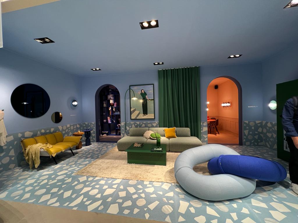
Memphis design embraced vibrant and drastic colours, abstract shapes, rich spaces, materials like terrazzo and laminate, and new prints like Ettore Sottass’s Bacterio, in response to 1970s minimalism.
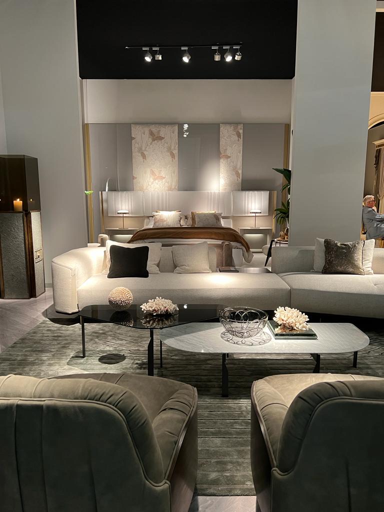
The mid-1980s also saw a return to opulence (intricate fabrics,
tasseled furniture and window treatments) in the United States.
The color was used in moderation or in softer shades, but the boom in opulence was short-lived with the tightening of the economy in the 1990s.
Opposition to conspicuous consumption formed in the 1980s, and design became more modest and sustainable.
You may like: The effect of color style on the mood of interior design
https://injarch.com/how-color-flows-throughout-your-home-and-relates-to-the-color-of-the-furniture/

