Interior Design of Occhiolino Restaurant: An Unconventional Approach
Industrial Character and the Ability to Preserve History
In the heart of Toronto, near the “Little Italy” neighborhood, lies Occhiolino Restaurant. Its design sets it apart from many other dining spaces. What makes this restaurant special is not only its location in a former mechanic’s shop, but also the unique design approach adopted by the Canadian studio Guido Costantino Projects.
Guido Costantino Studio chose to base their design on a fragmented and interrupted approach. They deliberately opted for a limited material palette to create an environment that resonates with the worn industrial character of the building. But why was this approach selected? The answer lies in the designers’ desire to preserve the building’s historic identity without letting the design fall into typical promotional styling.
Preserving the Industrial Character of the Building
Balancing Past and Present in Design
According to Guido Costantino, the studio’s founder and creative director, the main objective of the project was to “keep the building’s industrial character as part of the story.” It was essential to retain the historic essence of the space while avoiding excessive alterations. The Guido Costantino team aimed to honor the honesty of the original structure. They wanted to avoid making the design appear unnatural or artificial.
Transforming a Mechanic’s Shop into a Contemporary Restaurant
The Idea Behind Material and Decor Choices
One of the main challenges faced by the designers was turning a simple industrial space into an environment suitable for modern restaurant-goers. The carefully selected limited materials played a key role in the design process. The idea of using closely related materials in a restrained manner helped highlight the deep history of the place. This maintained a contemporary touch that suits the restaurant’s casual atmosphere.
Innovative Design: Blending the Old and the New in Occhiolino Restaurant
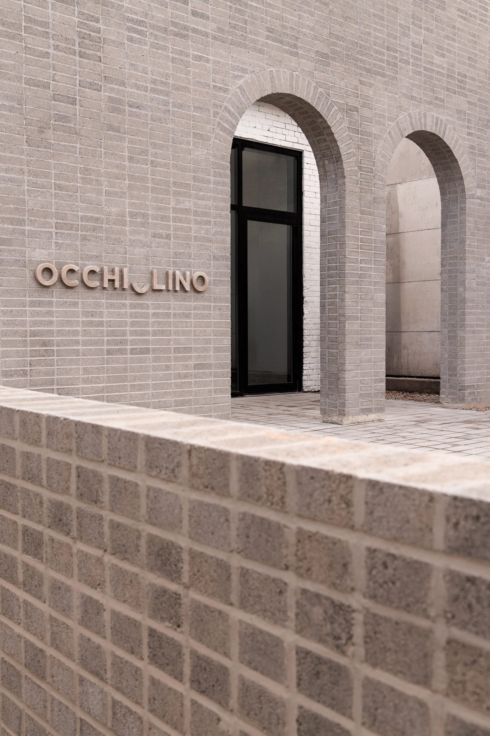
Gray Brick: A Divider of Eras
One of the standout elements in the design of Occhiolino Restaurant is the precisely aligned gray brick wall positioned in front of the original building. This wall serves not only as a visual feature but also clearly defines the boundary between past and present. It creates a striking contrast between the historical structure and the modern renovations added to it. The design reflects the concept envisioned by Guido Costantino Projects: honoring the past while embracing the future.
The restaurant’s branding was developed by Field Design Office. This contributed to a unique identity that highlights the space’s authenticity and charm. The engraved wall adds a distinctive character, embodying the project’s core idea—revitalizing the space without severing its historical roots.
Interior Design Elements: Unity Through Materials
Using Brick as a Central Theme in the Interior
The same type of gray brick was used to build the facing white bars inside, along with many other partitions. These contribute to a unified spatial experience. This repeated use of gray brick goes beyond aesthetics. It reflects a design philosophy focused on “stitching” the material throughout the entire space. As the design team noted, the aim was to reduce excessive material variety while achieving visual cohesion that enhances comfort and harmony within the restaurant.
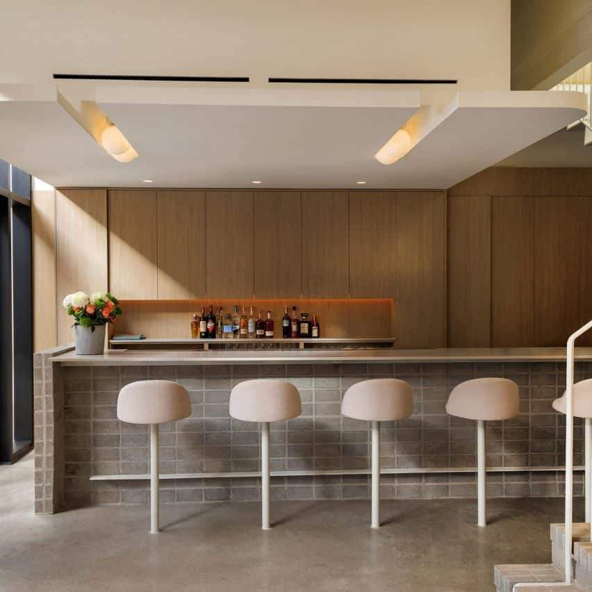
Additional Details: Minimalist Stools and Modern Storage
Simplicity and Elegance in Interior Design
As for the furniture, fixed minimalist stools were chosen as part of the front design. These are neatly lined up along the main bar. This choice aligns with the overall style of the restaurant, which favors simplicity and practicality. Behind the bar, oak wood was used to form a creative storage unit, adding a touch of functional elegance.
The ceiling was designed to allow light to filter through. It features spherical lighting that casts a warm and intimate ambiance, perfectly matching the restaurant’s casual setting.
Transition from Brick to Metal: A Material Gradient
The Staircase as a Divider Between Zones
One of the key aesthetic elements in the design is the staircase. Its base is made of brick, gradually transitioning into white metal as it leads toward the main dining area. This material shift symbolizes the movement from the old industrial space to the contemporary restaurant setting. The design helps establish a visual separation between different zones within the restaurant. Yet, it maintains an overall sense of fluidity and cohesion.

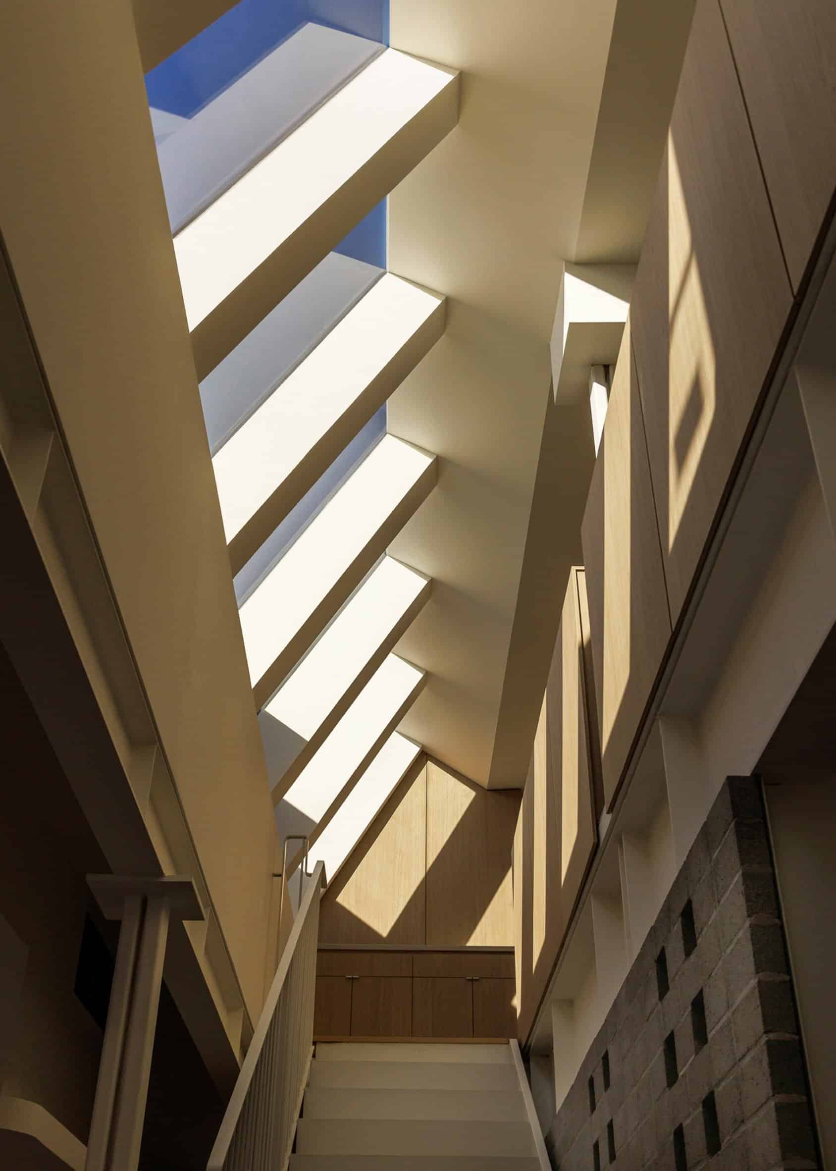
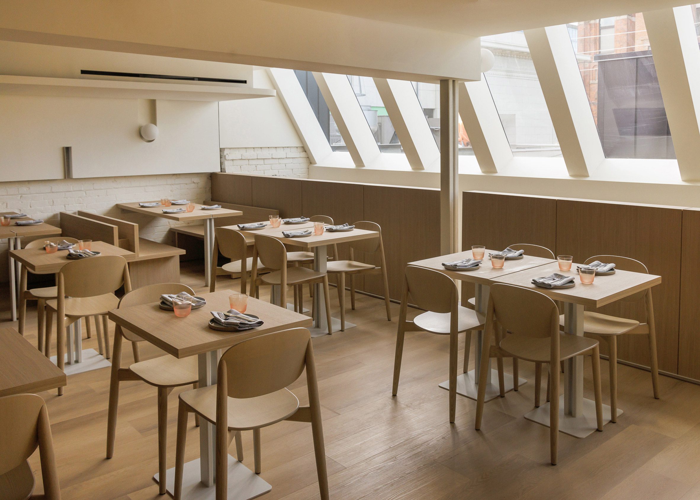
Natural Light: The Impact of Clerestory Windows
Designing with Daylight
In the design of Occhiolino Restaurant, clerestory windows play a central role in uniquely illuminating the space. A row of these windows is installed high along the vertical skyward section of the building. This allows natural light to enter the space from an angled position. This design approach enhances the feeling of openness within the restaurant. It gives guests a sense of direct connection to nature, which is essential in creating a warm and welcoming atmosphere.
Preserving Historical Character: A Second Skin Around Exposed Brick
Maintaining the Original Structure While Adding New Layers
The design studio aimed to retain the building’s original structure as much as possible, preserving its historical character. To achieve this, a “second skin” was constructed around the exposed brick of the building. This allowed for necessary updates while respecting the original appearance. This approach strikes a balance between authenticity and the integration of contemporary architectural elements.
Wooden Furniture and White Accents
Simplicity in Material and Color Choices
Looking at the furniture and new architectural elements on the upper floor, they are crafted from the same pale wood. This introduces a sense of warmth and comfort into the space. The remaining surfaces are finished in a soft white, enhancing simplicity and bringing a touch of serenity to the overall atmosphere. These material and colour choices help balance the building’s industrial heritage with the restaurant’s modern design.
Unconventional Lighting: Globe Lamps
Lighting as a Surprising Design Element
One of the unique touches in the design is the use of globe lamps. These are cleverly embedded into wall niches and mounted in unexpected places—including the end of a beam facing the staircase. This unconventional lighting adds a layer of visual interest to the space, creating an ambiance that feels both cosy and slightly mysterious. It also highlights the architectural features in a subtle, indirect way.

Design Philosophy: Simplicity and Humility
Steering Away from Luxury in Design
According to the design team, one of the project’s core goals was to avoid luxurious materials and excessive ornamentation. As they put it: “There was a clear intention and discipline in avoiding luxurious materials and ornate decoration, which felt entirely inappropriate to the spirit and blue-collar history of the building.” This approach reflects the overall philosophy of the project—centred on simplicity and humility. It aimed at preserving the authenticity and historical soul of the place.

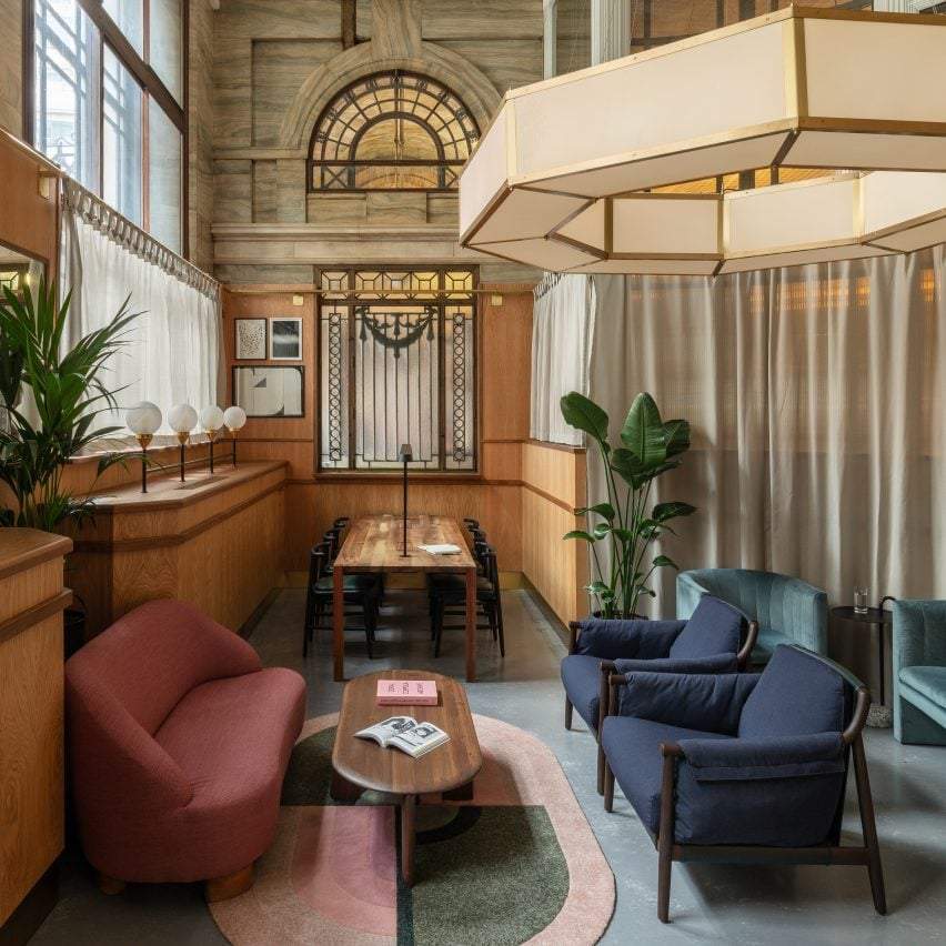
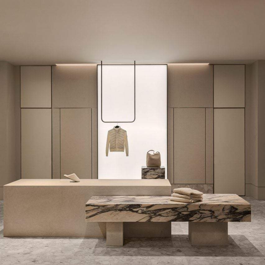
Osteria Giulia Restaurant Design: A Subdued Tone and a Renewed Style
Interiors That Tell a Story
In Guido Costantino’s projects, a subdued tone is embodied within the interiors of Osteria Giulia in Toronto. This design is part of a project that was shortlisted in the Restaurant and Bar Interior category at the 2022 Dezeen Awards. It reflects a contemporary style that merges minimalism with an appreciation for authenticity and simple materials. The space displays a balance between elegance and humility, with a design that is architecturally thoughtful and visually expressive of the place’s essence.
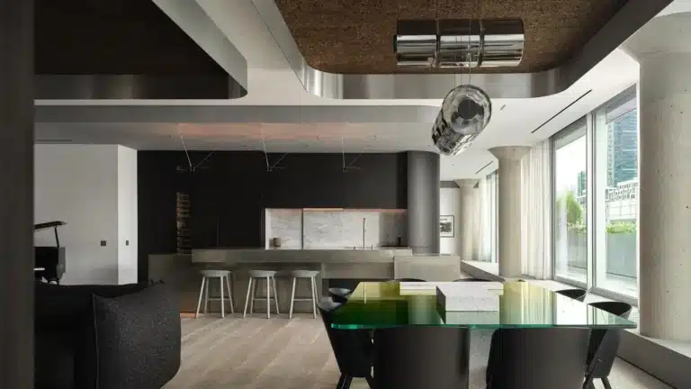
Competing Designs in Toronto’s Dining Scene
Other Flavorful Spaces in the City
When speaking of exceptional interior design in Toronto, Daphne—designed by Studio Paolo Ferrari—also stands out, earning a place among the shortlisted projects for the 2024 Dezeen Awards. Another highlight is Seafood Prime, designed by Omar Gandhi Architect, offering a distinctive architectural approach that blends comfort with luxury. These establishments are prime examples of the diverse architectural languages found across the city, while maintaining their own unique identities.
Conclusion: Design Trends in Toronto
A Balance Between Simplicity and Sophistication
What distinguishes Guido Costantino’s designs is their ability to strike a harmony between simplicity and refined detail, as seen in Osteria Giulia. This design philosophy is echoed in other Toronto-based projects like Daphne and Seafood Prime, where elegance meets comfort through a contemporary lens. Interior design in Toronto continues to be a dynamic expression of modern architectural trends, celebrating the individuality of each project.