Japanese Studio I IN Designs Blue Bottle Coffee Takanawa with Stone Gate Inspiration
A Gateway Concept Rooted in History
Japanese studio I IN, led by Yohei Terui and Hiromi Yuyama, has completed the design of a Blue Bottle Coffee cafe in Takanawa Gateway City, Tokyo. The project draws inspiration from the area’s rich historical significance as the former entrance to Tokyo—once known as Edo—and the site of Japan’s first railway.
The 1,340-square-metre cafe sits at the intersection of office spaces and a commercial zone, blending heritage with contemporary design.
“Blue Bottle Coffee Takanawa Cafe embodies the notion of passage, of crossing thresholds and entering new worlds,” said the designers. “Each moment within the cafe – from ordering to pickup to the act of drinking – is framed by symbolic ‘gates’, gently detaching the visitor from the outside world.”
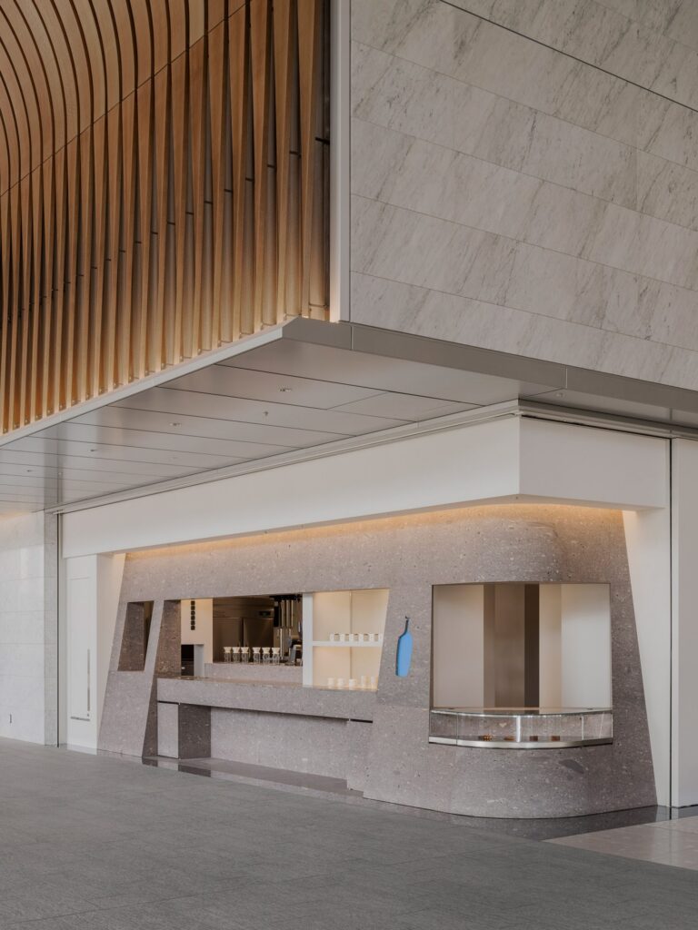
Evoking Historic Railway Gates
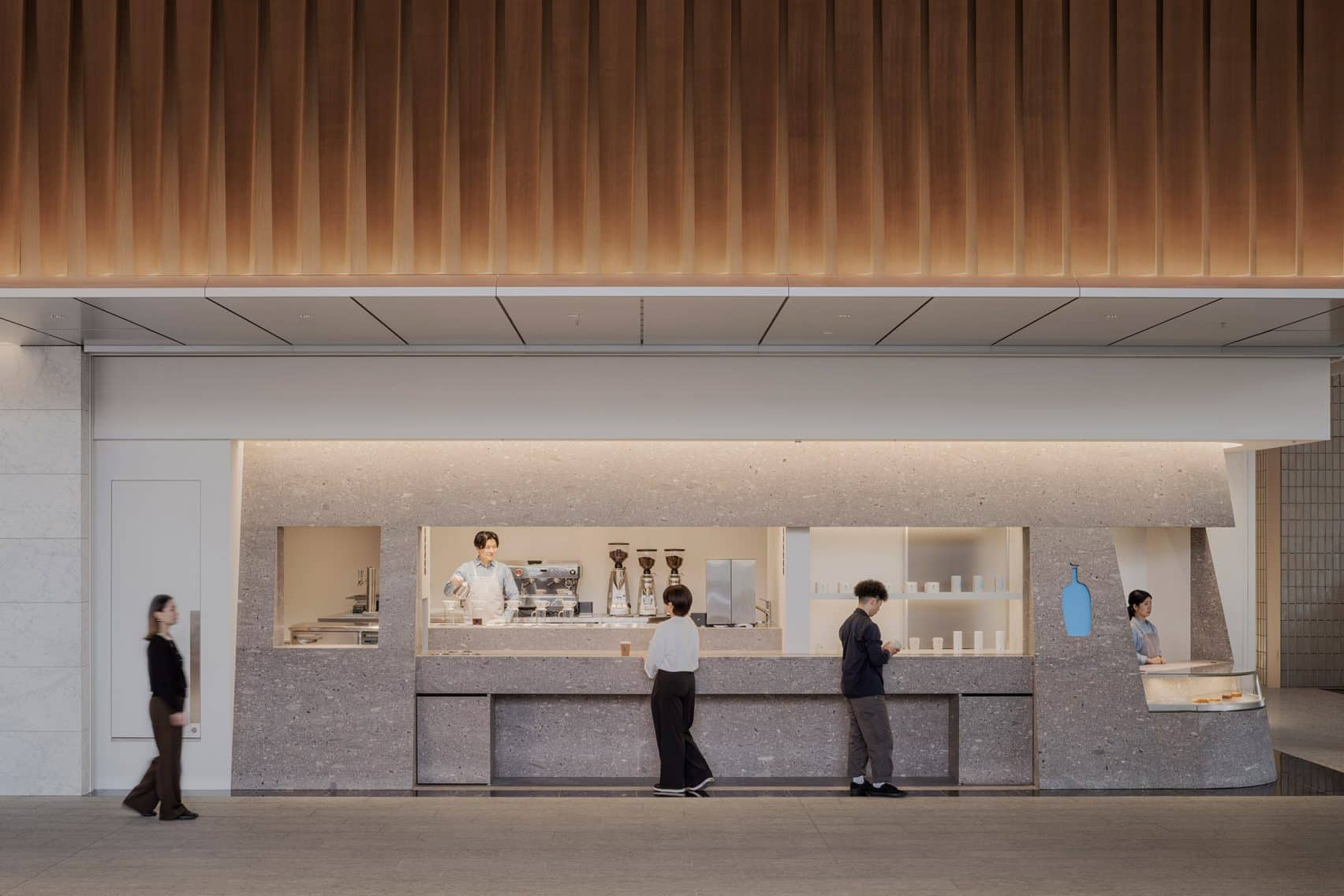
This concept is most evident in the 49-square-metre ordering booth, which features a monolithic, sloped design reminiscent of the old railway gate once found at the site. The service counter is crafted from volcanic tuff stone, known for its terrazzo-like pattern and deep local history.
“By carefully selecting the same kind of material and recreating the original form, we’ve succeeded in carrying the essence of history into the present – and forward into the future,” Terui told Dezeen. “We believe stone is a timeless material, and conveying history through it represents a new approach to sustainable design.”
Architectural Elements to Encourage Human Connection
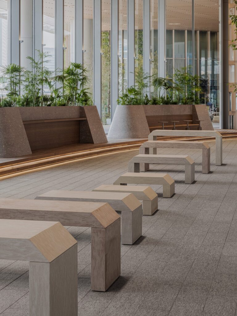
The seating area emphasizes interaction, with sculptural stone benches and planters designed in shapes inspired by traditional portals. The cafe is situated in a mixed-use development that includes residential towers, a museum, and three major train stations: Shinagawa Station, Takanawa Gateway Station, and Sengakuji Station.
“In today’s world, people often prioritize their phones or online interactions,” I IN commented. “What we propose for the future is a return to genuine human interaction. By dividing the space and creating distinct gateways for each function, customers are encouraged to engage more deeply – with the space, the experience and especially with the brand.”
More on ArchUp:
Natural Flow and Tiered Seating
Further enhancing the organic feel, I IN incorporated tiered wooden seating with undulating forms, meant to echo riverbanks and the stone embankments that once characterized the site. The shapes draw influence from the flow of water, symbolizing the area’s strong natural connection.
Branding in Stone
Instead of bold signage, the Blue Bottle logo is subtly integrated: a blue-colored metal plaque embedded into the stone wall, creating a quiet yet powerful brand presence.
“We aimed to allow customers to encounter the logo through a carved stone surface, making it feel as though the branding naturally emerges from within,” the designers explained.