Kingsville house remodel
RK-D was engaged for both the design and project management of this job which lasted two years from concept to completion

Planning
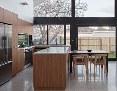
A federation workers cottage with a crude, 1990s lean-to was extensively demolished and extended into a two-level, contemporary house. The property grew from 85m2 to 185m2.
The existing gable end roof line was extended through to the rear, to reference the buildings original architectural character.
We utilised the generous roof height and proportions to add in a Mezzanine level. We also took advantage of the council’s zoning plans, to lower an existing floor level and increase the amount of usable height.
The house has a mix of private, social and work spaces. The front portion of the house is retained as Bedroom and “adult” Living space. A central spine corridor connects the old part of the house to the new. Additional bedrooms, bathroom, mud room / Laundry, lead onto a double height, open-plan kitchen, dining and “social” living room at the rear. A feature staircase connects to a large mezzanine study and en-suite.
Large sliding glass doors connect ground floor to a compact rear garden space.
The spine corridor ceiling was kept low to create a sense of anticipation as you travel through and enter the rear space, with a dramatic increase in scale, proportion and light.

Sustainability
Sustainability was a key driver for this project and it follows passive-house design principles.
By remodelling and refurbishing this aging property, we have maximised it’s potential and extended its lifespan by another century.
An east facing double glazed wall at the rear of the property captures morning light and eliminates northerly summer sun. Deep overhanging eaves prevent solar-gain. A polished concrete floor captures the heat of the morning sun and slowly releases it throughout the day. Cross-ventilation is promoted through the house with carefully located louvred windows and skylights that encourages air-flow and releases excessive heat built-up. A 3000 litre water tank collects rainwater for reuse in toilet cisterns and watering the garden. LED lighting is used throughout and external lighting is operated by PIR detectors. We used eco-friendly insulation throughout the building’s exterior and internal walls and ceilings. An underfloor hydronic heating system provides a sustainable heating solution.
We installed an evaporative cooling system to alleviate excessive summer heat. This is more energy-efficient than traditional AC systems.

Heritage
We were required to retain the front portion of the property due to its proximity in a Heritage zone.
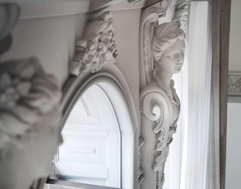
We restumped the floor and sensitively restored the front portion of the house. Original interior features were retained and integrated into the design. We carefully instated new elements to harmonise with the older rooms of the house. A feature double-sided fireplace, was refurbished and adapted into the design of a bedroom and Living room.
Damaged period features were skilfully copied and instated, to marry up with the original.

Light
The manipulation of light was also an important component of the design. The main east facing, glass wall, drinks in natural light during the day. Deep overhanging eaves protect from solar heat gain.
We carefully positioned skylights to draw natural light into otherwise darkened areas, reducing the cost of artificial lighting.
The artificial lighting was based on a 2-tier principle with indirect uplighting at high-level and task lighting at low-level. This provides both an even distribution of light and creates an intimate atmosphere in the evenings. We like lighting to be tucked-away and as inconspicuous as possible. Most all the lights are dimmable to add additional control.

Materials
Externally – We wanted to stay true to the original building and retain as much of its unique character. The external weatherboard cladding was copied and extended through to the new portion. We mimicked the original slatted sun shades, situated on the heritage front, to create a new feature canopy for the side entrance. The east facing, double height glazed wall is set into a timber framework and cladding, all finished in a dark stain.
Internally – Warm and natural finishes juxtapose the monochromatic architectural features. The cabinetry is a mix of warm timber with dark stained veneer in private quarters. Carrara marble benchtops are used to provide natural, robust surfaces. A feature linear pendant light is finished in an antique brass patina.
A sand coloured, polished terrazzo floor sweeps throughout all the new portion of the house and compliments the interior and architectural finishes. A mix of earthy coloured tiles and carpet are used in utility rooms, Bedrooms.


If you found this article valuable, consider sharing it


