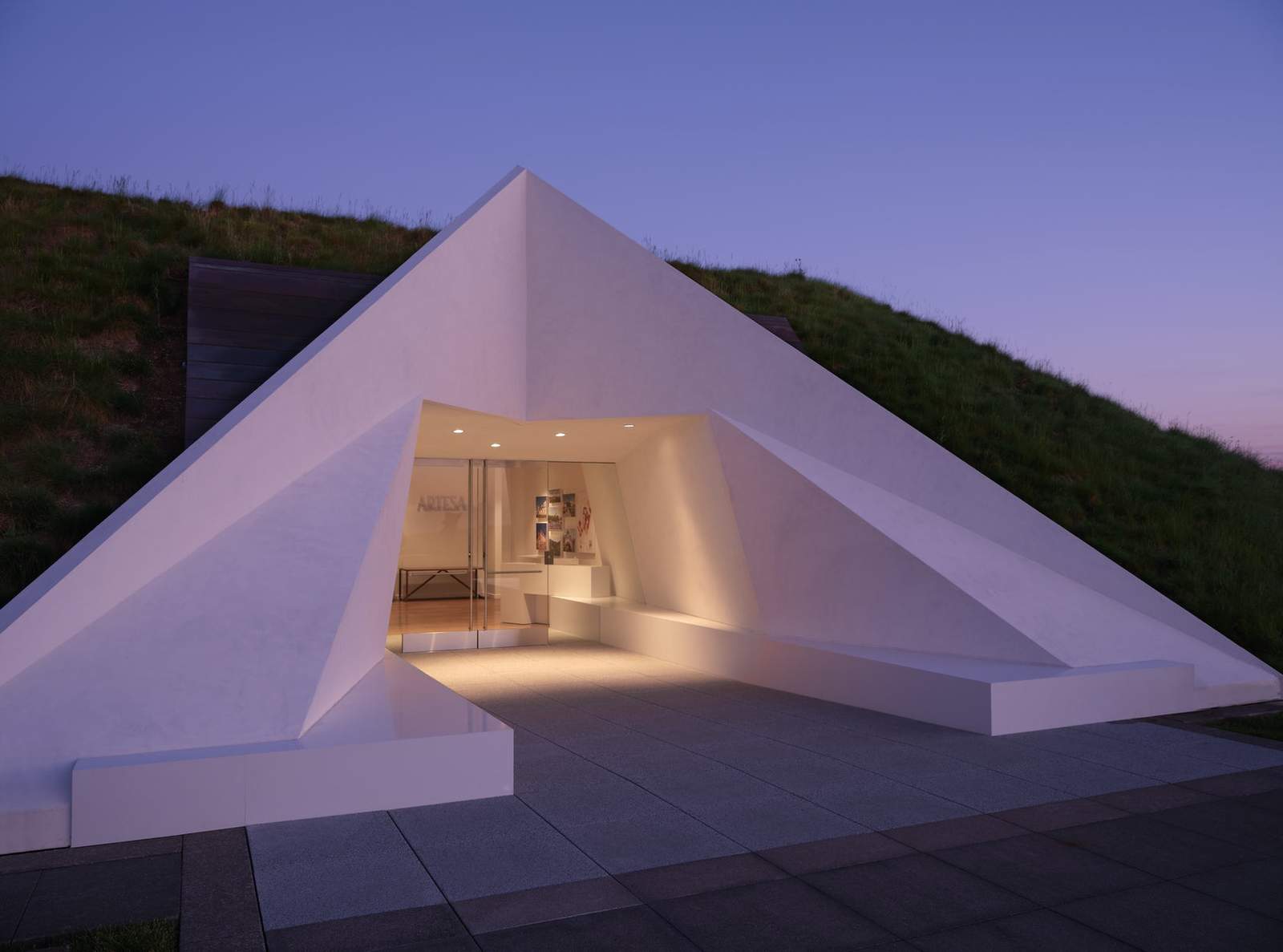
Artesa Tasting Room Renovation – The vision for this project was to reimagine this unique wine tasting experience for the owners, one of the oldest wine making families in Spain, elevating the tasting experience and creating a visual expression of their passion for wine, art and architecture. The existing hospitality space – set entirely underground – was dramatic, but the entry portal and interior spaces were stark and uninviting. Inspired by the family’s roots in Barcelona, Signum reconceived the interiors to create light-filled, exuberant spaces that subtly reference the traditional artisanship of Barcelona and redesigned the portal to invoke the winery’s newly redesigned brand.
Architizer chatted with Juancarlos Fernandez, Partner at Signum Architecture to learn more about this project.
Architizer: What inspired the initial concept for your design?
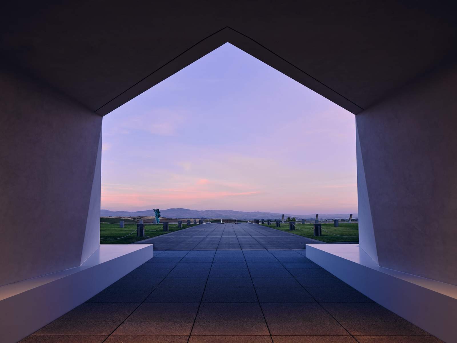
Juancarlos Fernandez: Our goal was to reflect the history and culture of this family, one of the oldest wine making families in Spain. The renovation of the tasting spaces and the winery’s brand identity took place in tandem, allowing each to reinforce each other. The renovation took place in two phases, starting with the renovation of the interiors. We began by painting the entire interior white, which brightened up the spaces and provided a clean background for our clients’ unique art collection. The all-white interiors also are a perfect foil for the brightly-colored, custom-designed tiles from Barcelona. In the second phase, we resigned the entry portal, which had been stark and imposing, and replaced it with a new, 24-foot-high portal – all in white. Set into the hillside, the portal appears folded, like a piece of delicate origami, echoing the “A” that is the centerpiece of the winery’s new brand design

© Signum Architecture
What do you believe is the most unique or ‘standout’ component of the project?
The most unique component of the design is the new entry portal. It is a simple and monochromatic, but iconic, presence set into the hillside. Two factors determined our direction for the design of the new portal. First, it reflects the identity of the brand in its subtle reference to the upper-case “A” that is central to the brand design, but in a way that is architecturally derived. Second, we wanted the portal to comfortably coexist with the angles of the existing volume next to it, which is composed of walls of glass in the shape of an inverted “V” set into the hillside. We played with the angles and the shape of the letter “A,” merging the two into a solution that is simple and impactful.

© Signum Architecture
What was the greatest design challenge you faced during the project, and how did you navigate it?
The greatest design challenge was reworking the layout and circulation within the limitations of the existing space. By creating a portal that immediately engages visitors, drawing them into a gallery-like space where the spaces progress naturally from one to another, we were able to improve not only the flow but the tasting and hospitality experience as a whole.

© Signum Architecture

© Signum Architecture
How did the context of your project — environmental, social or cultural — influence your design?
Our clients are patrons of the arts, with a strong commitment to art from their native Barcelona. Their passion for art and wine provided the context for our design solution. The interior spaces, with their natural flow and sense of light, form spaces that act as galleries for their original artwork. Artesa’s bottles, decorated with works of art commissioned to express the distinct personality and story of each wine, and pay tribute to classic Spanish artisans, are an important part of the artwork on display.

© Signum Architecture
What drove the selection of materials used in the project?
Like the overall design direction, the selection of materials reflect our goal of creating a neutral, light-filled gallery space, so that the artwork, wines and tiles hand-crafted in Barcelona could take center stage. The walls are white, the tasting bars are topped with neutral oak, and bar seating is similarly neutral, forming a background that allows the colorful artwork and artisan tilework to stand on their own.

© Signum Architecture
What is your favorite detail in the project and why?
I’m happy with the success of the central tasting bar. The overall shape of the bar and the graceful proportions of the central display really work. The way people gather around the circular bar when it is busy it is fun to see. It’s convivial, and the shape invites conversation. It turned out to be a really good solution.
In what ways did you collaborate with others, and how did that add value to the project?
To create the custom-designed tiles for the face of both the public and VIP tasting bars, we collaborated closely with artisans in Barcelona. Our clients and the brand design team gave us the tools – the shapes and angles used in the new brand identity. We played with the shapes, working with repetition and how the patterns fit together to create three different tile designs, then collaborated with the artisans in Barcelona on colors and proportions. It was a truly collaborative effort. The close connection between the design of the brand identity and the design of the architecture has resulted in a cohesive project that truly expresses the family’s passion for both their native Barcelona and their adopted home in the Northern California wine country.

© Signum Architecture
How have your clients responded to the finished project?
They love finished hospitality spaces, which form a perfect envelope for their artwork and wine. Just as importantly, the new design achieved the goals they were looking for: an improved sense of identity, an enhanced visitor experience, a better entry and circulation flow that created more functional spaces, all of which have resulted in improved wine sales.

© Signum Architecture
Credits / Consultants
Construction: Cello & Maudru Construction Company
Photography: Douglas Sterling
For more Artesa Tasting Room Renovation, please visit the in-depth project page on Architizer.
Artesa Tasting Room Renovation Gallery


