
“>
“>
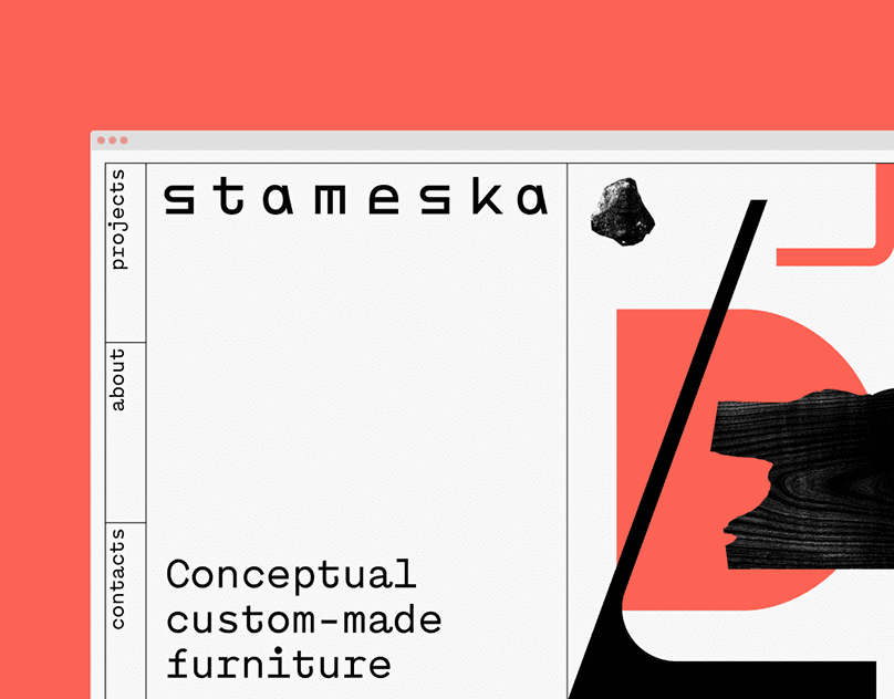
Web-design: Alena Melnikova
facebook | instagram | linkedin

“>
“>
If you found this article valuable, consider sharing it
Welcome to ArchUp, the leading bilingual platform dedicated to architects, designers, and urban planners. I am Ibrahim Fawakherji, a licensed architect with over a decade of professional experience since 2011, specializing in architectural content curation, digital publishing, and industry insights.
As Chief Editor at ArchUp, I am committed to delivering reliable, expert-driven content that enhances architectural knowledge and fosters a trusted community of professionals. Our mission is to document, analyze, and share the latest developments in architecture news, architectural research, and ArchUp.
Join us in exploring verified, in-depth design knowledge that shapes the future of architecture.

Official blueprint for Tokyo Cross Park Vision revealed by PLP Architects, Architectural firm PLP, a vision for the Tokyo Cross Park Master Plan, has designed a new area redevelopment in the prestigious Uchisaiwaicho 1-Chome district in Tokyo, Japan. …
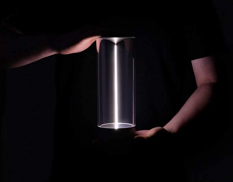
Auge Light Fila Night Mood Light2022-June design 0-1 Design StudioDesigner: Li WenkaiCustomer service: HANGKEAuge Light, A Chinese original Design lighting brand, was founded in 2003 and has a history of 20 years. Focusing on advanced technology and flexible lighting methods, AL is the world's leading creative lighting brand with 135 patented technologies and has won many international…
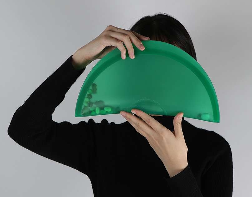
CalzoneReddot Design Award 2021iF Design Award 20212020Reusable Folding PlateCalzone is an original product made to explore BDCI’s attitude towards design and lifestyle. Calzone is a silicone made tableware inspired by Itay’s traditional oven baked crescent folded pizza.The mission is to contribute to a sustainable lifestyle through delightful and fanciful characteristics of Calzone’s design.The product can…
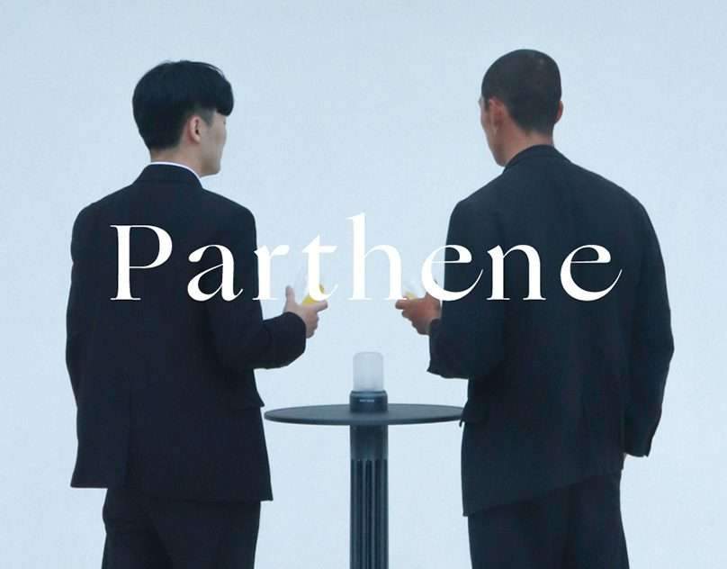
P A R T H E N EParthene is a new concept outdoor heater. Conventional heaters in a situation with a large floating population consume a lot of heat and consequently waste a lot of heat. However, the Parthene is a design that can warm the maximum number of people with the least amount of heat in…
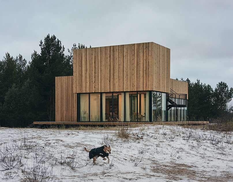
LIVING ROOM PAVILIONProject by RhizomeLocation: Priozersk, RussiaYear: 2018Publications: ArchdailyPhotographs: Dmitrii Tsyrenshchikov

Tips to enhance the visibility of your architectural company, After setting up your architecture firm, you have to make it able to discover the right clients, to become a successful firm in the first place. Marketing is the first step;…

Official blueprint for Tokyo Cross Park Vision revealed by PLP Architects, Architectural firm PLP, a vision for the Tokyo Cross Park Master Plan, has designed a new area redevelopment in the prestigious Uchisaiwaicho 1-Chome district in Tokyo, Japan. …

Auge Light Fila Night Mood Light2022-June design 0-1 Design StudioDesigner: Li WenkaiCustomer service: HANGKEAuge Light, A Chinese original Design lighting brand, was founded in 2003 and has a history of 20 years. Focusing on advanced technology and flexible lighting methods, AL is the world's leading creative lighting brand with 135 patented technologies and has won many international…

CalzoneReddot Design Award 2021iF Design Award 20212020Reusable Folding PlateCalzone is an original product made to explore BDCI’s attitude towards design and lifestyle. Calzone is a silicone made tableware inspired by Itay’s traditional oven baked crescent folded pizza.The mission is to contribute to a sustainable lifestyle through delightful and fanciful characteristics of Calzone’s design.The product can…

P A R T H E N EParthene is a new concept outdoor heater. Conventional heaters in a situation with a large floating population consume a lot of heat and consequently waste a lot of heat. However, the Parthene is a design that can warm the maximum number of people with the least amount of heat in…

LIVING ROOM PAVILIONProject by RhizomeLocation: Priozersk, RussiaYear: 2018Publications: ArchdailyPhotographs: Dmitrii Tsyrenshchikov

Tips to enhance the visibility of your architectural company, After setting up your architecture firm, you have to make it able to discover the right clients, to become a successful firm in the first place. Marketing is the first step;…

Official blueprint for Tokyo Cross Park Vision revealed by PLP Architects, Architectural firm PLP, a vision for the Tokyo Cross Park Master Plan, has designed a new area redevelopment in the prestigious Uchisaiwaicho 1-Chome district in Tokyo, Japan. …

Auge Light Fila Night Mood Light2022-June design 0-1 Design StudioDesigner: Li WenkaiCustomer service: HANGKEAuge Light, A Chinese original Design lighting brand, was founded in 2003 and has a history of 20 years. Focusing on advanced technology and flexible lighting methods, AL is the world's leading creative lighting brand with 135 patented technologies and has won many international…

CalzoneReddot Design Award 2021iF Design Award 20212020Reusable Folding PlateCalzone is an original product made to explore BDCI’s attitude towards design and lifestyle. Calzone is a silicone made tableware inspired by Itay’s traditional oven baked crescent folded pizza.The mission is to contribute to a sustainable lifestyle through delightful and fanciful characteristics of Calzone’s design.The product can…

P A R T H E N EParthene is a new concept outdoor heater. Conventional heaters in a situation with a large floating population consume a lot of heat and consequently waste a lot of heat. However, the Parthene is a design that can warm the maximum number of people with the least amount of heat in…

LIVING ROOM PAVILIONProject by RhizomeLocation: Priozersk, RussiaYear: 2018Publications: ArchdailyPhotographs: Dmitrii Tsyrenshchikov

Tips to enhance the visibility of your architectural company, After setting up your architecture firm, you have to make it able to discover the right clients, to become a successful firm in the first place. Marketing is the first step;…