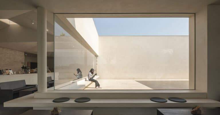
The Color Conversation: Decoding the Emotional Palette of Salone del Mobile 2025
As visitors drift through the expansive halls of Salone del Mobile 2025, a silent yet unmistakable dialogue is taking place—not through form or function, but through color.
From the softest pastels to earthy reds and mossy greens, this year’s design language is chromatic, tactile, and intensely emotional.
But as ArchUp’s editorial team moves from one booth to the next, a question quietly emerges: Are designers merely following parallel intuitions, or is there a deeper current synchronizing the design world’s palette?

A Unified Visual Language?
What struck us from the opening day was the visual coherence across hundreds of stands.
There is no single “official” theme imposed on exhibitors, yet somehow, brands from Milan to Copenhagen and Tokyo to São Paulo seem to be speaking in harmonized tones.
Dominant hues include:
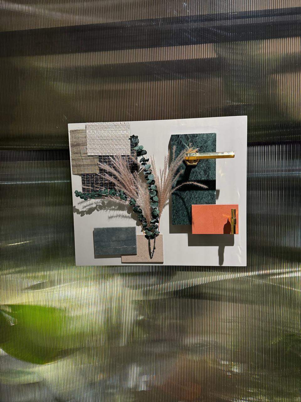
Terracotta and burnt sienna — signaling warmth, grounding, and an embrace of imperfection.
Dusty rose, blush pink, and mauve — offering softness and emotional nuance.
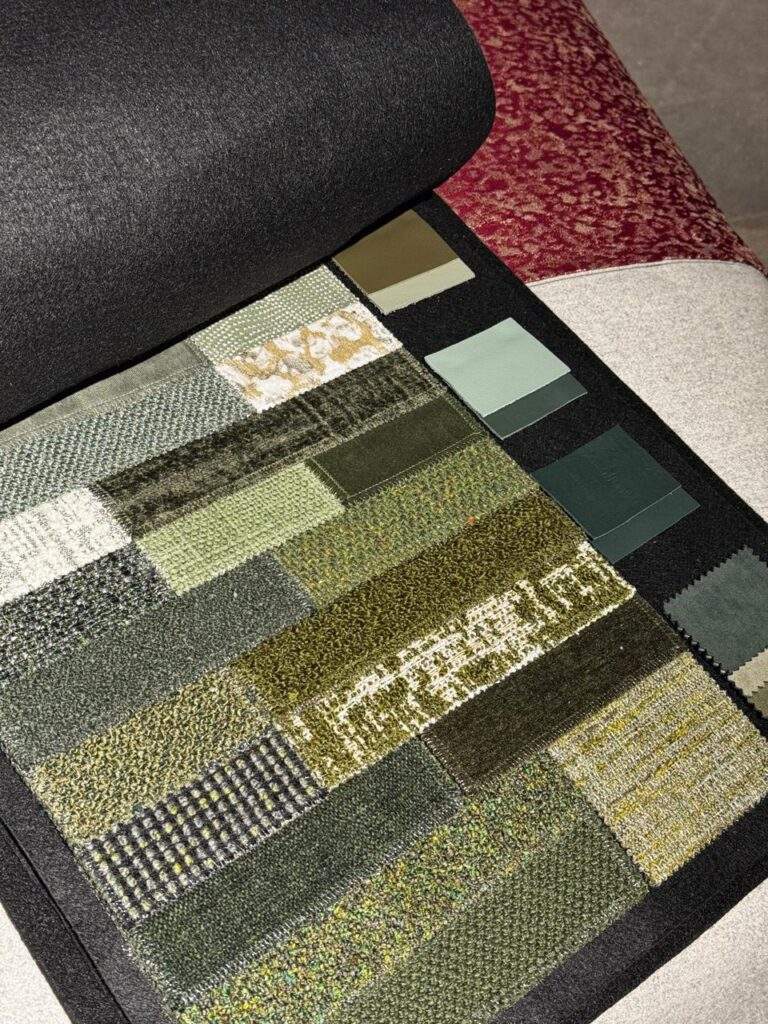
Olive, sage, and pistachio greens — evoking calm, biophilia, and slowness.
Turquoise-leaning teals — introducing subtle vibrancy without aggression.
Deep aubergine and wine tones — hinting at luxury and introspection.
Material Echoes: Where Color Meets Texture
These hues aren’t just splashed on walls or fabrics. They’re embedded in the very materials used—clay-finished ceramics, matte lacquers, velvets, brushed metal, and recycled wood.
The tactile quality is just as important as the tone. The color is meant to be felt, not just seen.
The effect? Spaces that feel sensual, grounded, and psychologically comforting—a reaction, perhaps, to years of overstimulation, crisis, and hyper-functionality.
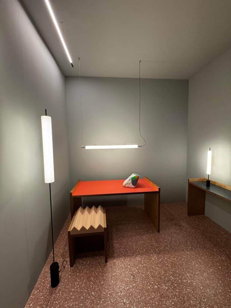
Is There a Hidden Hand?
The consistency has led us to explore the possibility of a guiding influence. Agencies like WGSN, Coloro, and Pantone publish color forecasts that ripple through fashion, interiors, and product design.
For 2025, the keywords have been “calm boldness,” “tactile optimism,” and “emotive grounding.”
And yet, beyond industry forecasts, there’s something else: an emotional alignment. Designers across continents seem to be responding to a shared psychological climate—one that seeks warmth, resilience, and familiarity.
Could the true designer behind these hues be the global collective mood itself?

Cultural Reflections and Regional Adaptations
While these palettes feel universal, their application varies. In Nordic stands, dusty greens are paired with pale woods and cool greys. In Southern Europe, terracotta is embraced unapologetically across furniture and architecture.
In Asian designs, the blush tones intersect with minimalism and modular flexibility.
This opens a path for reflection: How might designers in the Gulf or the wider MENA region reinterpret these hues in ways rooted in local culture, climate, and material tradition?

Final Thought
Color is never just decoration. At Salone del Mobile 2025, it is narrative, philosophy, and even quiet rebellion. As we continue our coverage, ArchUp invites you to read between the lines—and hues—of this year’s most emotional design stories.


