Color is often the hardest part of a room for an interior design enthusiast, that’s because colors are fickle.
And there are a lot of shades to choose from and they need to be combined in the right proportions.
Otherwise, they won’t work together in harmony, and fortunately, there are some color rules you can use to make sure your color palette stays balanced every time.
We’ve listed them below, read on to master color in interior design once and for all.

The 60-30-10 rule
The 60-30-10 rule is an interior design lover’s best friend, no matter what your personal aesthetic is or what you want your room to look like,
You can use this rule to help make sure your color palette stays balanced.
In this setup, you’ll use three colors, where 60, 30, and 10 denote the percentages of the design that each of them will be, and here’s how it works:
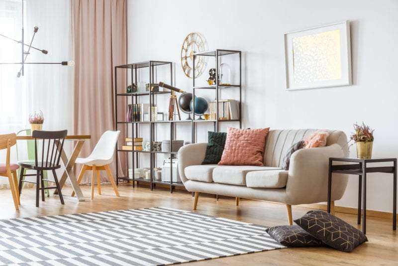
First, you will choose one shade to be the dominant shade and take up approximately 60% of the room.
Typically, this will be a neutral color or some sort of subdued color, which can take up a lot of space without feeling overwhelming.
Next will be the secondary color, which is usually bolder and takes up about 30% of the space.
Finally, your accent color and your boldest shade should make up the remaining 10%.

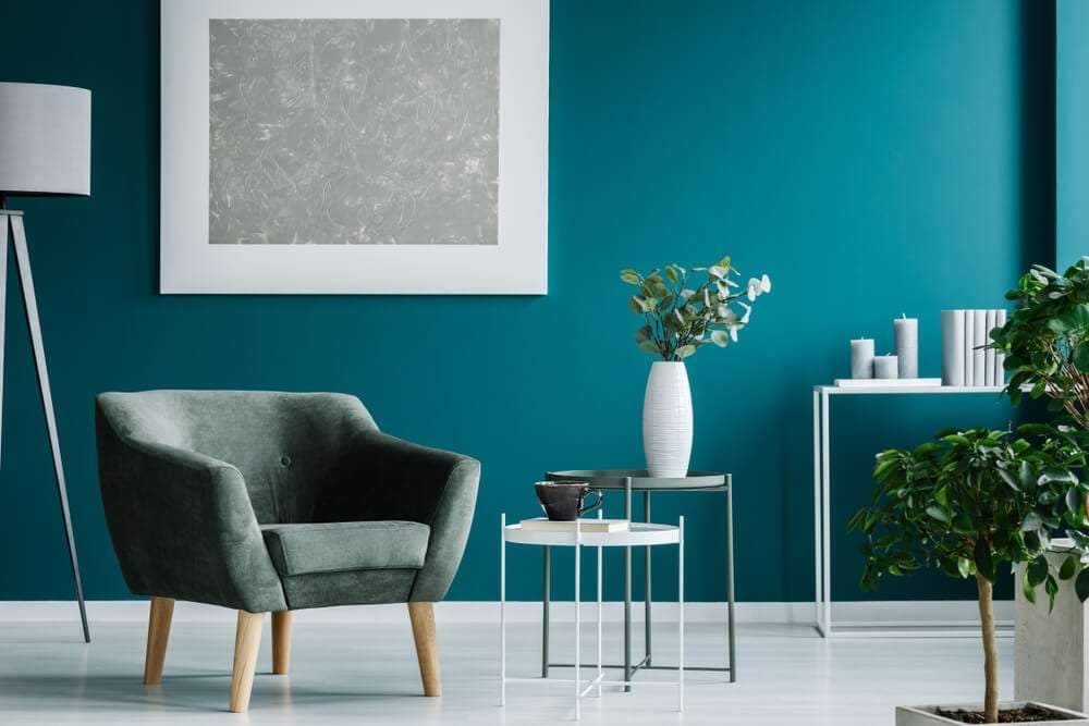
Warm colors vs. cool colors
The phrase “warm colors versus cool colors” refers to where certain shades fall on the color wheel.
Traditionally, shades such as red, orange and yellow are seen as warm colors because they are more vibrant.
However, neutral colors such as brown and tan are also included in the mix, and on the other side of the spectrum are cool colors, or blues, greens, and purples.
As well as gray, and the choice of warm or cold colors affects the energy of space.
And since warm colors tend to bring an upbeat and welcoming feel to a room, they are best in entertaining spaces.
Consider using these shades in the dining room or kitchen, on the other hand, cool colors are more subdued.
They work best in bedrooms and office spaces.

Complementary color scheme
Of all the color rules used by interior designers, the complementary color scheme is often thought of as the simplest.
That’s because this color scheme only includes two shades, in particular, it uses two shades that sit directly opposite each other on the color wheel,
Which means you get combinations like blue, orange, yellow, purple, or red and green.
Similar color scheme
If you have trouble navigating the color wheel, a similar color scheme might be for you.
For this color, all you have to do is choose a central color,
and then use the colors on either side of it as well.
Here, two will be primary colors and the third will be a mixture of the two.
For example, red, orange and yellow or red, purple and blue.
And since you’re using three colors in this color, proportion will come in handy to make sure the space looks balanced.
And you may want to incorporate the 60-30-10 rule again to keep your ratios in check.
remember, you can always use different shades of the same color as another way to create visual variety. Interestingly, if you’re not a huge fan of vibrant colors,
You can also make a similar color scheme using neutrals.
Usually, this is referred to as a monochromatic color scheme,
and all you have to do here is mix black, pastel, and gray together to create a sleek and modern look.
Addressing moisture problems in walls and floors


