

>


>
Welcome to ArchUp, the leading bilingual platform for trusted architectural content.
I'm Ibrahim Fawakherji, an architect and editor since 2011, focused on curating insightful updates that empower professionals in architecture and urban planning.
We cover architecture news, research, and competitions with analytical depth, building a credible architectural reference.

With the task of promoting Adris on another Weekend Media Festival in Rovinj, Brigada took the idea of growth, through identification and nurturing of the potential, and transformed it into living, organic installation with growing grass. Unlike the previous Adris promotional stands at the WMF in Rovinj, where the pavilion was primarily a visual experience, this time…

Kitchen materials greatly affect the appearance of your kitchen, the ease of cleaning and the overall results of your kitchen.Therefore, you need to create unique materials for ease of use in the kitchen such as tablecloths, kitchen towels, and baking…

GAME BOY ALARM CLOCK———————————————————————————DESIGNED & MANUFACTURED BY MUID IN AMOY . 2022https://www-ccv.adobe.io/v1/player/ccv/8FTYxNWIF-j/embed?api_key=behance1https://www-ccv.adobe.io/v1/player/ccv/PmbyTomrIYx/embed?api_key=behance1

(2022)with: potter Junhee ParkDesign by (Small Splash)ceramic130 x 130 x 180 is an experimental work on the new formative possibilities of ceramic products.We focused on multiple pieces of molds from slip casting techniques and made it possible to connect molds of various shapes.In this product, four kinds of products…

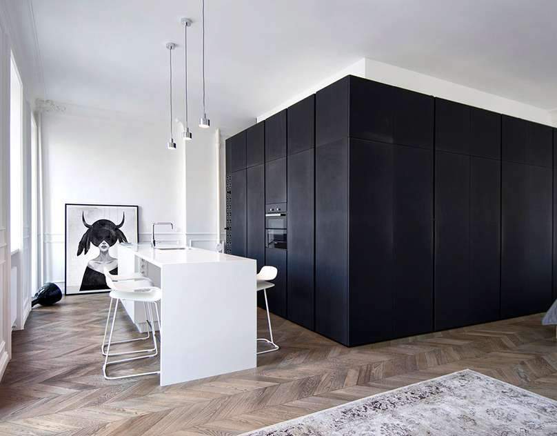
МЕСТО: МОСКВА, РОССИЯ ПЛОЩАДЬ: 56 м2 ГОД: 2016СТАТУС: РЕАЛИЗАЦИЯОПИСАНИЕ: Квартира расположена в доме дореволюционной постройки. “Оболочка” выполнена с отсылкой к французской неоклассике – белые стены, высокие потолки, окна до пола, натуральный паркет, гипсовые карнизы, буазери, деревянные ставни… Белый цвет стен…

Willet (2023)Willet is a solution for those who struggle to manage their leisure time due to a lack of self-control. With Willet, users can charge their productive time while working and then use this earned time as leisure time, like a digital coin. Willet helps users to not only reward themselves for their efforts, but also…

With the task of promoting Adris on another Weekend Media Festival in Rovinj, Brigada took the idea of growth, through identification and nurturing of the potential, and transformed it into living, organic installation with growing grass. Unlike the previous Adris promotional stands at the WMF in Rovinj, where the pavilion was primarily a visual experience, this time…

Kitchen materials greatly affect the appearance of your kitchen, the ease of cleaning and the overall results of your kitchen.Therefore, you need to create unique materials for ease of use in the kitchen such as tablecloths, kitchen towels, and baking…

GAME BOY ALARM CLOCK———————————————————————————DESIGNED & MANUFACTURED BY MUID IN AMOY . 2022https://www-ccv.adobe.io/v1/player/ccv/8FTYxNWIF-j/embed?api_key=behance1https://www-ccv.adobe.io/v1/player/ccv/PmbyTomrIYx/embed?api_key=behance1

(2022)with: potter Junhee ParkDesign by (Small Splash)ceramic130 x 130 x 180 is an experimental work on the new formative possibilities of ceramic products.We focused on multiple pieces of molds from slip casting techniques and made it possible to connect molds of various shapes.In this product, four kinds of products…

МЕСТО: МОСКВА, РОССИЯ ПЛОЩАДЬ: 56 м2 ГОД: 2016СТАТУС: РЕАЛИЗАЦИЯОПИСАНИЕ: Квартира расположена в доме дореволюционной постройки. “Оболочка” выполнена с отсылкой к французской неоклассике – белые стены, высокие потолки, окна до пола, натуральный паркет, гипсовые карнизы, буазери, деревянные ставни… Белый цвет стен…

Willet (2023)Willet is a solution for those who struggle to manage their leisure time due to a lack of self-control. With Willet, users can charge their productive time while working and then use this earned time as leisure time, like a digital coin. Willet helps users to not only reward themselves for their efforts, but also…

With the task of promoting Adris on another Weekend Media Festival in Rovinj, Brigada took the idea of growth, through identification and nurturing of the potential, and transformed it into living, organic installation with growing grass. Unlike the previous Adris promotional stands at the WMF in Rovinj, where the pavilion was primarily a visual experience, this time…

Kitchen materials greatly affect the appearance of your kitchen, the ease of cleaning and the overall results of your kitchen.Therefore, you need to create unique materials for ease of use in the kitchen such as tablecloths, kitchen towels, and baking…

GAME BOY ALARM CLOCK———————————————————————————DESIGNED & MANUFACTURED BY MUID IN AMOY . 2022https://www-ccv.adobe.io/v1/player/ccv/8FTYxNWIF-j/embed?api_key=behance1https://www-ccv.adobe.io/v1/player/ccv/PmbyTomrIYx/embed?api_key=behance1

(2022)with: potter Junhee ParkDesign by (Small Splash)ceramic130 x 130 x 180 is an experimental work on the new formative possibilities of ceramic products.We focused on multiple pieces of molds from slip casting techniques and made it possible to connect molds of various shapes.In this product, four kinds of products…

МЕСТО: МОСКВА, РОССИЯ ПЛОЩАДЬ: 56 м2 ГОД: 2016СТАТУС: РЕАЛИЗАЦИЯОПИСАНИЕ: Квартира расположена в доме дореволюционной постройки. “Оболочка” выполнена с отсылкой к французской неоклассике – белые стены, высокие потолки, окна до пола, натуральный паркет, гипсовые карнизы, буазери, деревянные ставни… Белый цвет стен…

Willet (2023)Willet is a solution for those who struggle to manage their leisure time due to a lack of self-control. With Willet, users can charge their productive time while working and then use this earned time as leisure time, like a digital coin. Willet helps users to not only reward themselves for their efforts, but also…