
A Harmonious Blend of Warmth and Modernity: Kema Studio’s 1985 Kitchen Renovation
In the tranquil Bairro da Liberdade neighborhood, a 1985 home originally designed by architect Nuno Leonidas has been meticulously reimagined by Kema Studio. This renovation respects the home’s modernist roots while introducing contemporary elegance through natural textures, curved forms, and functional simplicity. The result? A space that balances warmth, movement, and refined minimalism.
The Vision: Preserving Heritage, Enhancing Flow
Kema Studio approached the project with a light touch, reorganizing key areas like the kitchen, laundry, and bathrooms without altering the original structure. Their goal: better circulation, more natural light, and a design that honors the home’s history.
Before & After: The Transformation
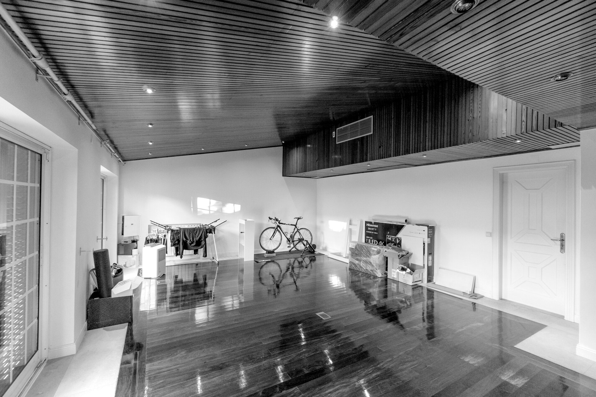
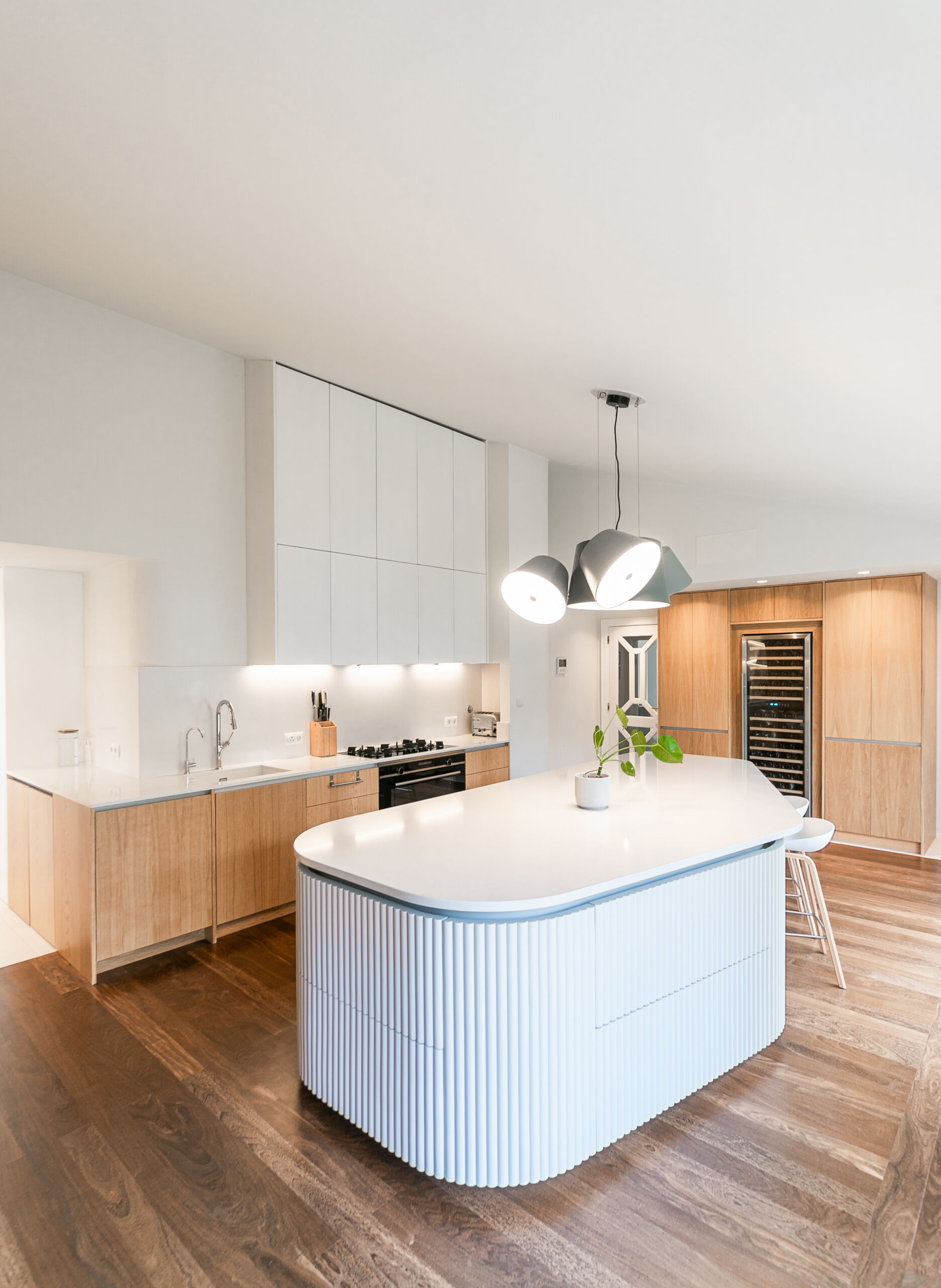
1. The Kitchen – From Wasted Space to Functional Heart
Before:
A vast room with original hardwood floors and a high ceiling felt underutilized, lacking purpose or definition.
After:
- Sculptural Island: A ribbed wooden island anchors the space, serving as both a workstation and a decorative centerpiece. Its curves mirror the home’s exterior architecture.
- Warm Minimalism: Simple wooden cabinetry contrasts with the island’s tactile texture, while organic curves soften the clean lines.
- Natural Light: Strategic layout changes maximize sunlight, enhancing the wood’s natural grain and creating a cozy yet modern vibe.
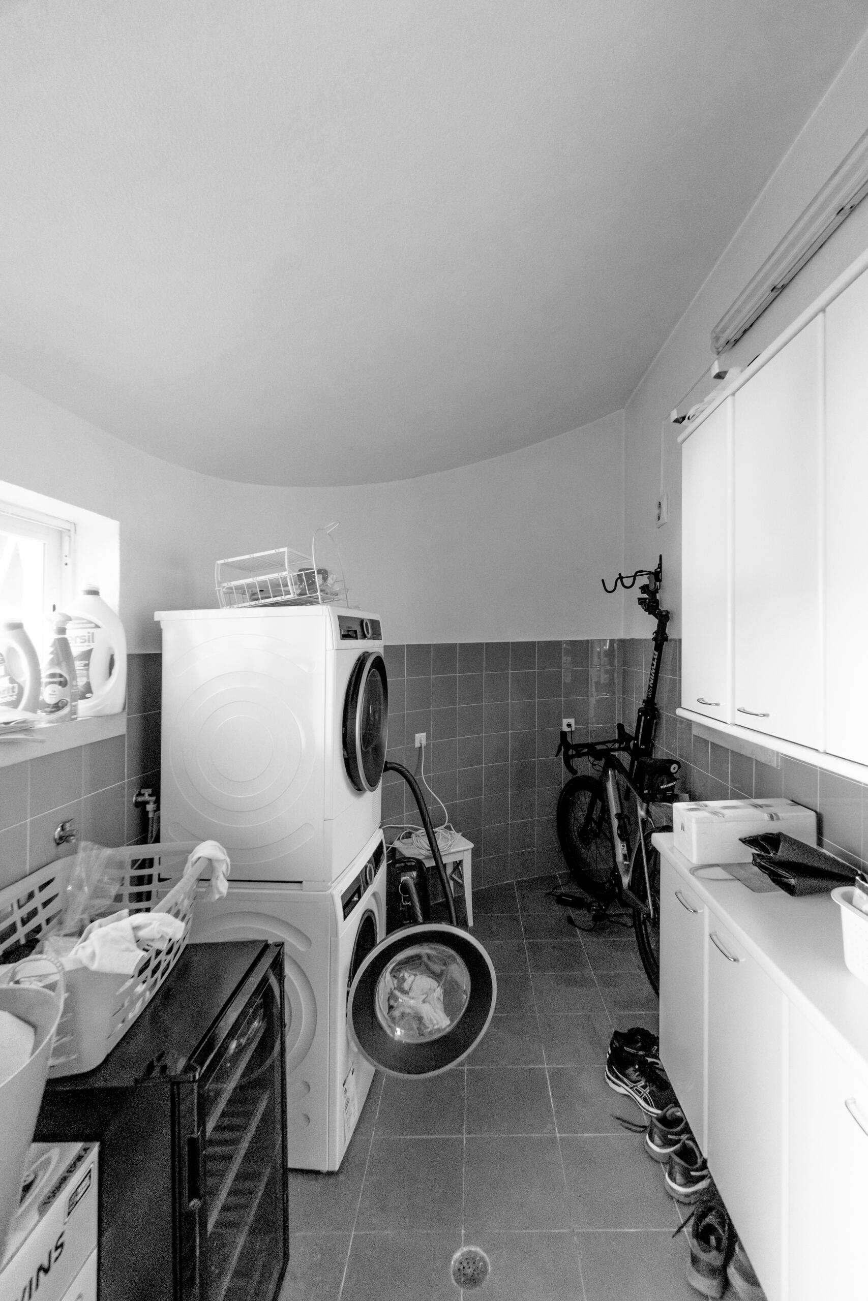
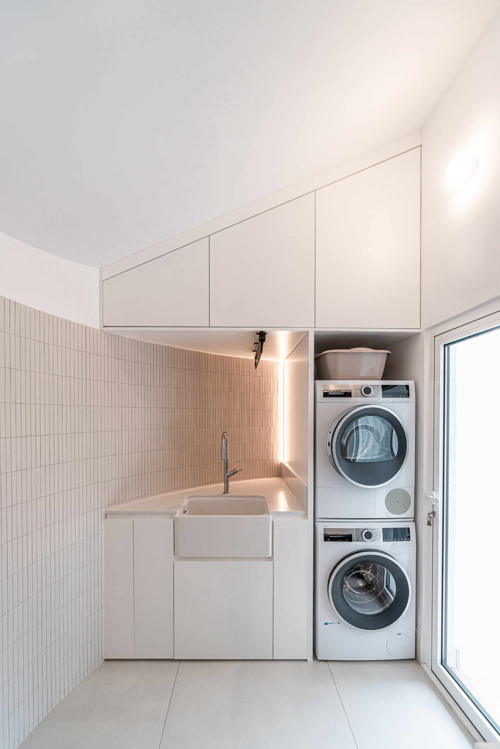
2. The Laundry Room – From Utilitarian to Serene
Before:
A disconnected, dimly lit area that felt like an afterthought.
After:
- Cohesive Flow: Integrated into the home’s circulation plan, it now feels calm and intentional.
- Improved Functionality: Better spatial organization and enhanced lighting align it with the home’s renewed balance.
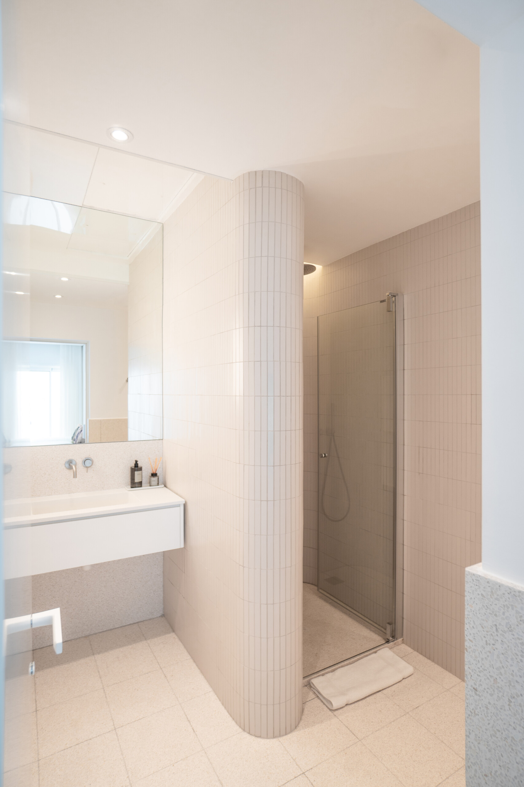
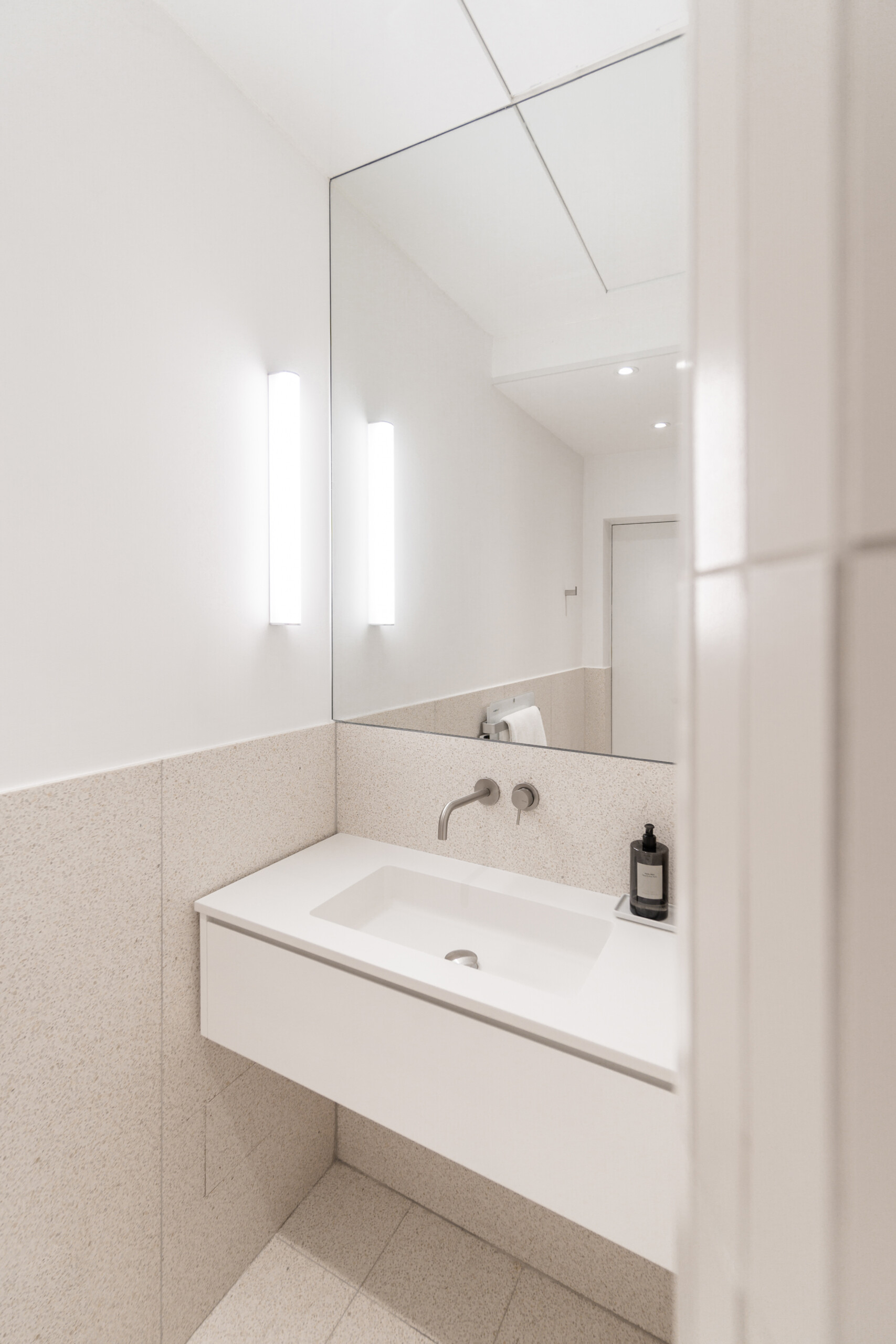
3. The Bathroom – Curves Take Center Stage
- Soft Geometry: Rounded walls, indirect lighting, and a large mirror visually expand the space.
- Subtle Luxury: Neutral tiles and integrated niches prioritize both aesthetics and practicality.
Key Design Takeaways
- Respect the Original: Kema Studio proved that structural preservation and modern upgrades can coexist.
- Texture & Contrast: The interplay of ribbed wood, smooth curves, and clean lines adds depth.
- Light as a Tool: Enhanced natural light transforms functionality and mood.
✦ ArchUp Editorial Insight
This renovation masterfully bridges past and present, celebrating the home’s 1985 bones while infusing contemporary sophistication. The kitchen’s ribbed island and curved motifs create visual harmony, though a bolder material contrast like matte black fixtures could have heightened the modern appeal. That said, the restraint in palette and form ensures the design feels timeless, not trendy. Ultimately, Kema Studio’s work is a testament to how thoughtful minimalism can breathe new life into heritage spaces.
Brought to you by the ArchUp Editorial Team
Inspiration starts here. Dive deeper into Architecture, Interior Design, Research, Cities, Design, and cutting-edge Projectson ArchUp.


