
A Sunlit, Vertical Oasis: How a Sunken Kitchen and Central Tower Transformed an 85-Year-Old Amsterdam Home
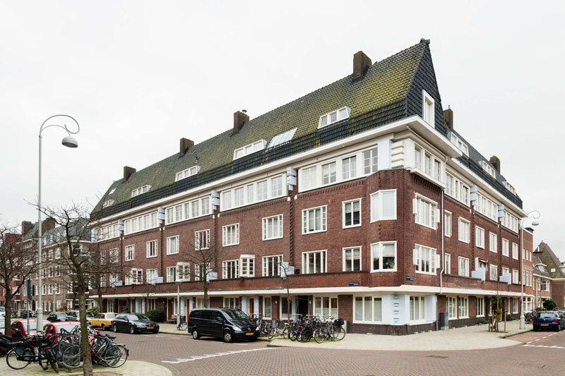
When a Japanese couple and their two children set out to renovate their duplex in Amsterdam, their goals were clear: maximize sunlight and enhance connectivity throughout their home. The 85-year-old apartment, redesigned by Mamm Design, now features smart spatial planning and thoughtful architectural interventions that reflect the family’s lifestyle and cultural background proving that clever design can outshine square footage.
Breaking Barriers: From Compartmentalized to Open
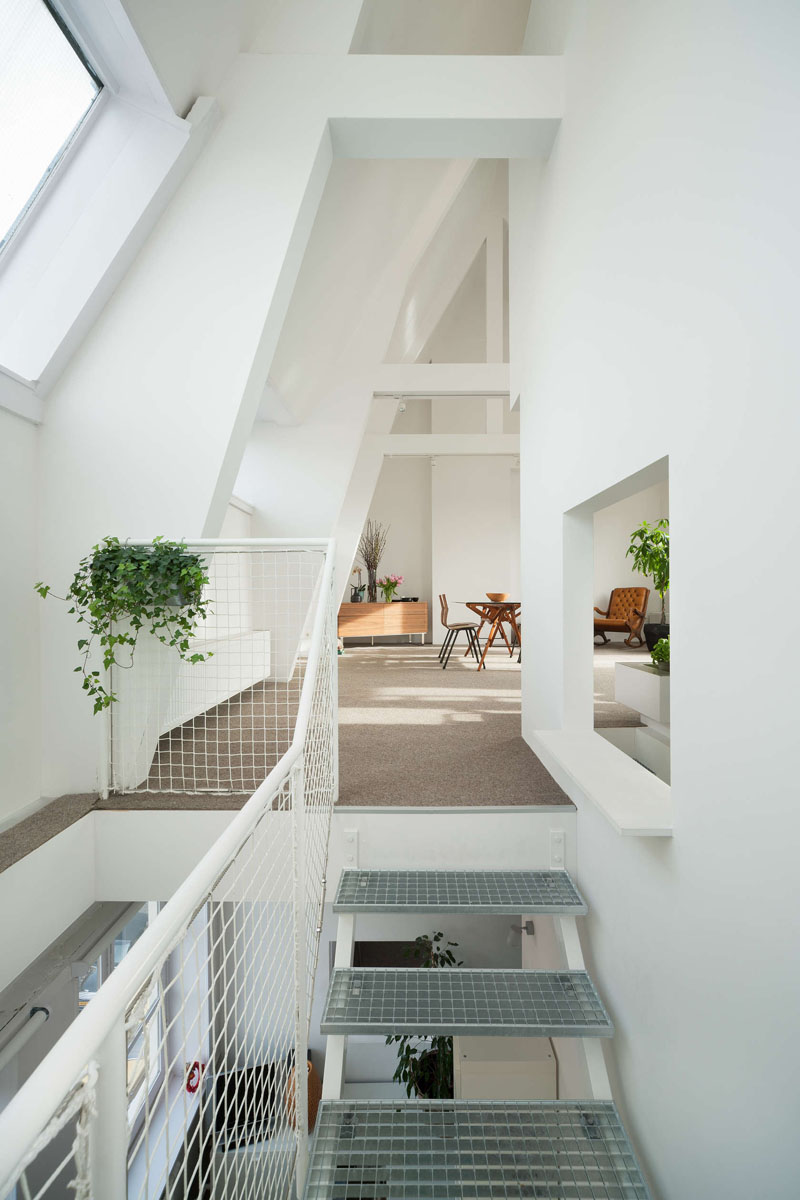
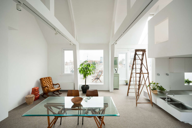
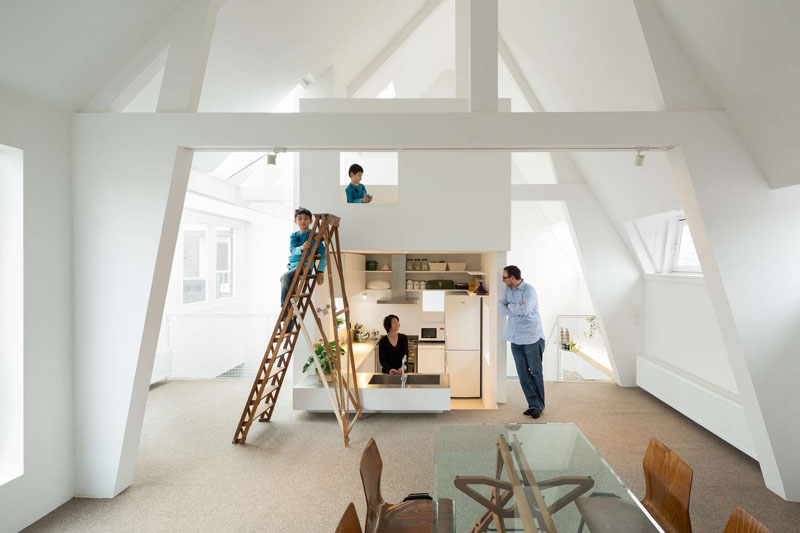
The original layout suffered from compartmentalization: walls, staircases, and split-level floors fractured the space, blocking natural light. The designers’ bold solution? Remove nearly everything. By tearing down walls, relocating the staircase, and even cutting away part of the upper floor, they created a vertical void a central atrium that floods the home with light and creates visual connections across floors.
The Tower: A Vertical Hub of Functionality
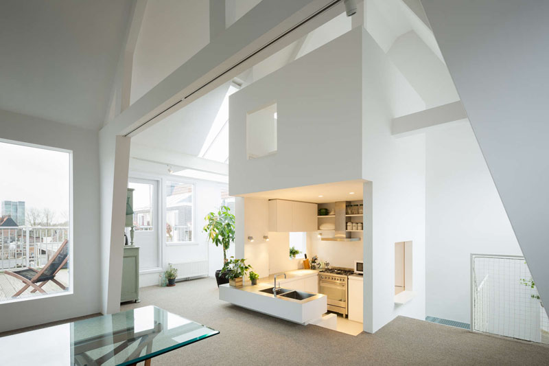
At the heart of the renovation stands a two-story tower, ingeniously consolidating plumbing, the kitchen, bathrooms, and storage into a single vertical unit. Wrapped by a mesh-clad staircase, the tower becomes both a functional core and a sculptural centerpiece. Its transparency preserves sightlines, ensuring light penetrates every corner.
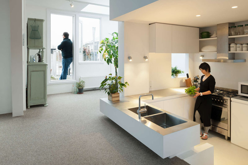
The Sunken Kitchen: A Stroke of Genius
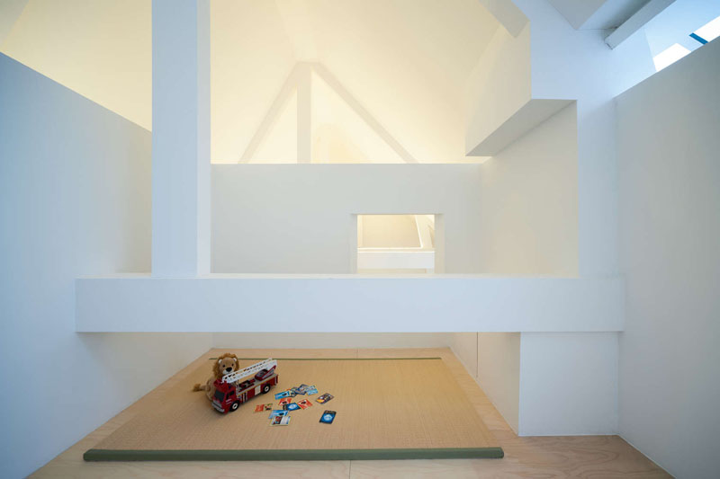
Instead of a conventional kitchen, the designers opted for a sunken layout, subtly separating it from the living area without walls. Above it, a lofted play nook for the children leverages verticality for family interaction. This layered approach transforms the kitchen into a dynamic, multi-level space that fosters connection while maintaining distinct zones.
Amplifying Light: The Power of White
To amplify the new atrium’s effect, every interior surface was painted white. This choice bounces sunlight deep into the home, softening even the gloomiest Amsterdam days and fulfilling the couple’s dream of a brighter, airier environment.
Smart Design Over Square Footage
This renovation proves that spatial quality trumps quantity. By carving out volume rather than merely dividing floor space, Mamm Design delivered a home that feels larger than its footprint. Every element from the open void to the strategic tower works to connect the family and harness natural light.
✦ ArchUp Editorial Insight
This Amsterdam home transformation masterfully rethinks verticality, using a central tower and sunken kitchen to dissolve boundaries without sacrificing function. The design’s emphasis on light and connectivity is commendable, though the reliance on an all-white palette risks feeling sterile over time warmer textures could soften the modernity. Yet, the true triumph lies in its spatial intelligence, proving that even compact homes can feel expansive when every centimeter is intentional. A lesson in doing more with less.
Brought to you by the ArchUp Editorial Team
Inspiration starts here. Dive deeper into Architecture, Interior Design, Research, Cities, Design, and cutting-edge Projectson ArchUp.


