Beige: Neutrality or a Tool of Visual Control?
Introduction
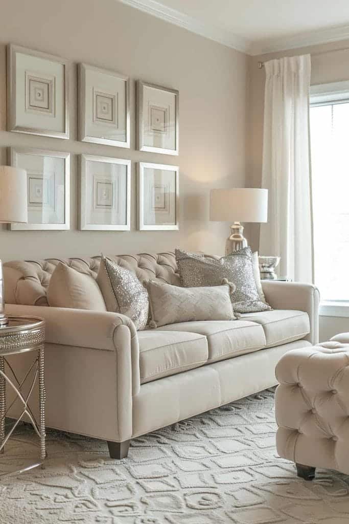
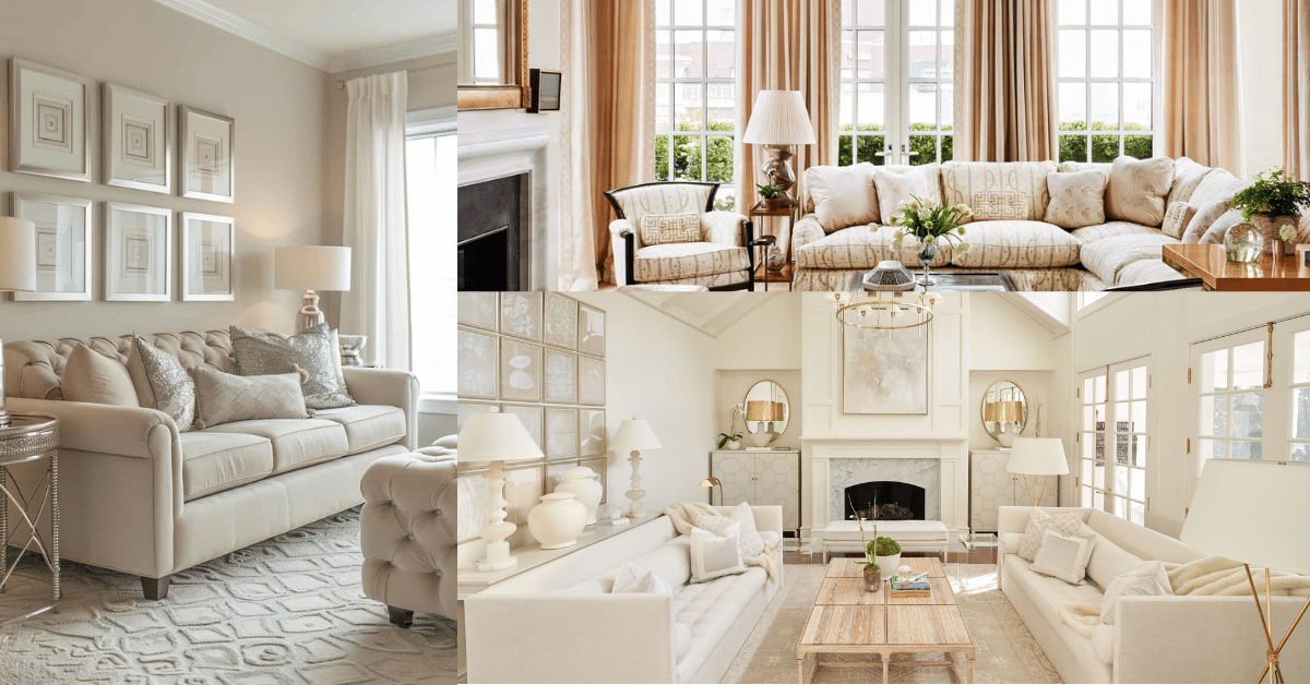
Beige is everywhere—on our walls, in offices, wardrobes, and even sidewalks. It’s often seen as calming and inoffensive. But is that the only reason for its dominance? Or is there something deeper than just popular taste?
In this article, we explore how beige came to dominate our surroundings, what it really does to our minds and environments, and whether its widespread use is as innocent as it seems.
Why Is Beige So Ubiquitous?
Beige is considered a “safe” choice. It doesn’t clash, it doesn’t stand out, and it doesn’t offend. For designers, that’s often exactly what they’re looking for—especially in banks, offices, and hospitals.
But this visual silence can be deceptive. Beige doesn’t just blend in—it dampens energy. It’s as if it’s there to keep things calm… and people calmer.

| Element | Effect of Beige | Effect of Other Colors |
|---|---|---|
| Mental stimulation | Low | Medium to high |
| Focus and attention | Limited | Noticeably higher |
| Expression of identity | Minimal | Stronger and more vibrant |
Beige and Our Mental Space: Comfort or Numbness?
Yes, beige can reduce stress—but only to a point.
In spaces like workplaces, too much calmness can actually lead to mental fatigue and disengagement. It doesn’t provoke thought or encourage interaction. It simply sits there, quietly dulling the atmosphere.
Who Benefits from This “Neutrality”?
Big institutions love beige, and not by coincidence.
- In corporate offices: it helps create visual uniformity.
- In hospitals: it keeps emotional responses under control.
- In public spaces like malls and airports: it doesn’t distract from branding or signage.
But with time, beige becomes a tool for minimizing individuality, enforcing a subtle, uniform order that may feel suppressive to some.

Are There Better Alternatives?
Absolutely. Plenty of other shades offer calmness without dulling the senses.
| Color | Psychological Impact | Suitable Spaces |
|---|---|---|
| Light gray | Sleek, balanced | Corporate or formal workspaces |
| Soft blue | Calm, creativity-friendly | Classrooms, clinics, quiet zones |
| Muted green | Natural, refreshing | Homes, hallways, indoor gardens |

✦ ArchUp Editorial Insight
This article presents the Mesonía Suite as a layered exploration of chromatic identity within hospitality design. The images reflect a controlled palette of deep reds, earth tones, and soft lighting that convey cultural depth. Yet, while the spatial language is expressive, the article omits discussion on functionality or environmental relevance. As a conceptual showcase, it offers aesthetic value but limited future-proofing for long-term design strategies. Nonetheless, the personal narrative behind the project enriches its experiential appeal and makes it a distinctive case in boutique spatial storytelling.
Explore the Latest Architecture Exhibitions & Conferences
ArchUp offers daily updates on top global architectural exhibitions, design conferences, and professional art and design forums.
Follow key architecture competitions, check official results, and stay informed through the latest architectural news worldwide.
ArchUp is your encyclopedic hub for discovering events and design-driven opportunities across the globe.


