Brava Tower Blends Newspaper History with Modern Luxury
Residential towers have a standardized appearance. Enter a lobby with a polished white stone floor and you could be in Philadelphia or Phoenix. However, Brava Tower, a 46-story structure designed by MaRS Culture and Munoz + Albin Architecture & Planning in downtown Houston, defies the norm. It has a feeling of location, something that most modern towers don’t.
Interiors head and MaRS principal Kelie Mayfield feels that a concept can only be compelling if it has a backstory. According to her, “it has to do with the location, the context, and the nature of the location.” “It’s just a beautiful place if it has no soul or purpose.” Mayfield begins every project by crafting a story that guides every choice made in terms of design.
Brava and her colleagues drew inspiration from the building’s past—the site was formerly owned by The Houston Chronicle—to create interiors that pay homage to the newspaper’s physical shape as well as the tales it contained.
Brava, which is situated in the center of the artists area, sticks out due to its thin, diagonally oriented rectangle shape. To optimize views for the 373 rental units, the building architect, Munoz + Albin, turned the structure 45 degrees, giving it a dynamic appearance. Brava Tower needed to be a showpiece with unique features because the developer, Hines, had its headquarters across the street. Similar to a proscenium in a play, a white aluminum frame projects in front of a black perforated screen on the podium that houses the parking and shop spaces.
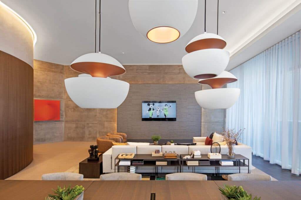
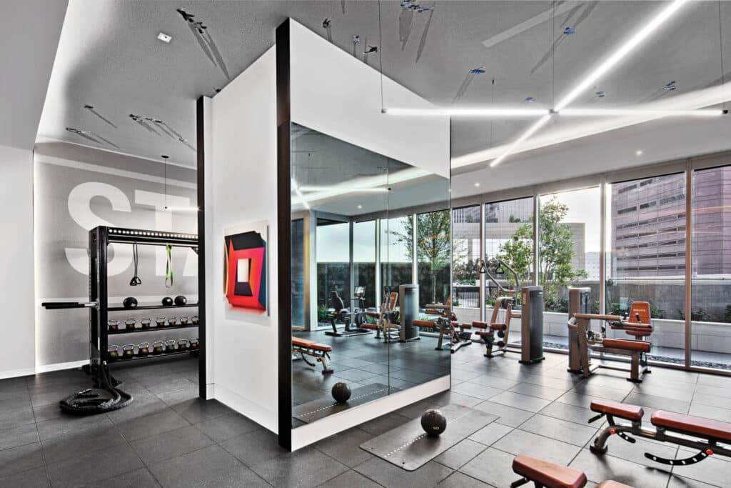
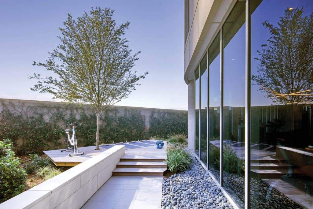
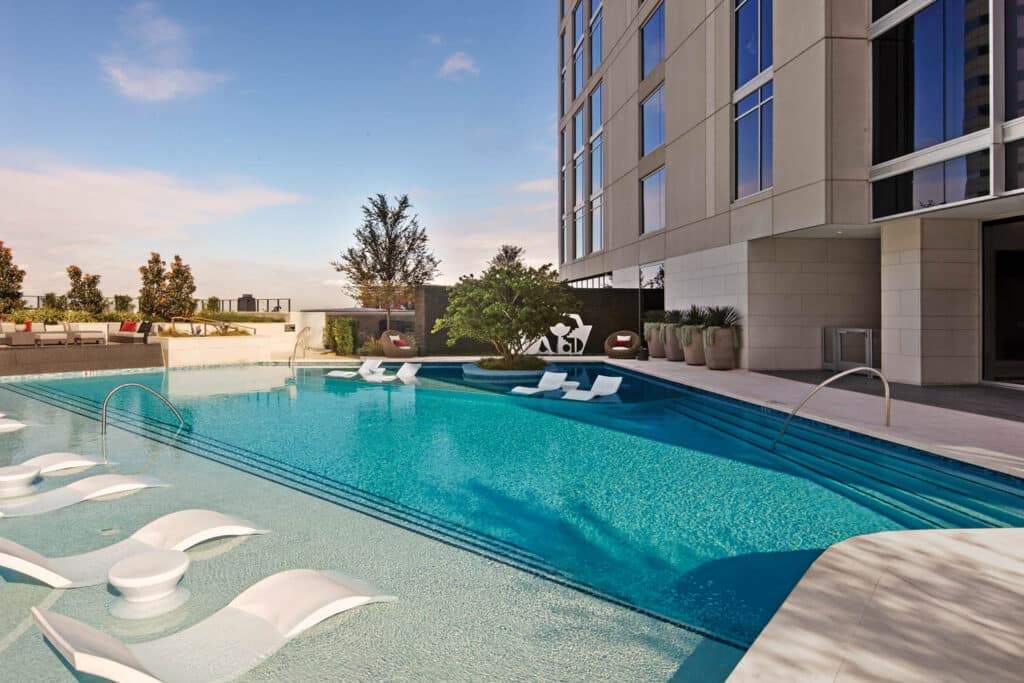
Munoz & Albin erected a sky lounge with a patio on the 46th floor and dedicated level 10 to features including an outdoor pool, fitness center, entertainment kitchen, and coworking space.
Read All About It: How Newspapers Shaped the Interior Design
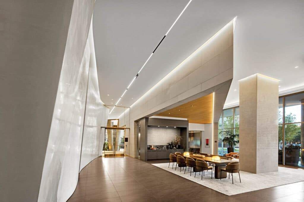
MaRS, which oversaw the 20,00 square foot public spaces and the two model apartments, sought to create a seamless interior design. With the odd geometry and massive structural columns, this was a challenging project. The latter was used by the designers into wavy plaster walls that were modeled after newspaper folds. According to Mayfield, “this helped us create something seamless while integrating the structure.” She views the folds as a type of choreography that pays homage to the dancers that perform in the nearby theaters, drawing you in and giving the impression of movement.
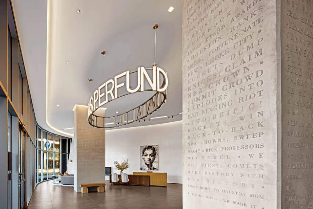
The concept continues in the columns that may still be seen: 1908 Chronicle front page headlines are imprinted on them. The most current headlines, which range from “Thousands Out to Greet President Taft in Houston” (1909) to “Thousands Jam the Streets to Celebrate With Astros” (2017), are located upstairs on the amenities level, while the oldest ones are located in the lobby. Using a specially designed stencil, a local muralist painted the inscription on manually troweled concrete.
Local Art Enlivens Public Spaces in the Modern Luxury Building
Even while they don’t exactly refer to newspapers, many of Brava’s forty-five artworks do. Spanish artist Sergio Albiac created a digital portrait collage for the lobby that is displayed at reception using Chronicle clippings. A circular fixture above references press freedom by spelling out a Latin phrase that means “Freedom will flood all things with light.” A big vinyl image of a picture of a local rescue dog who made headlines of his own hangs in the pet spa.
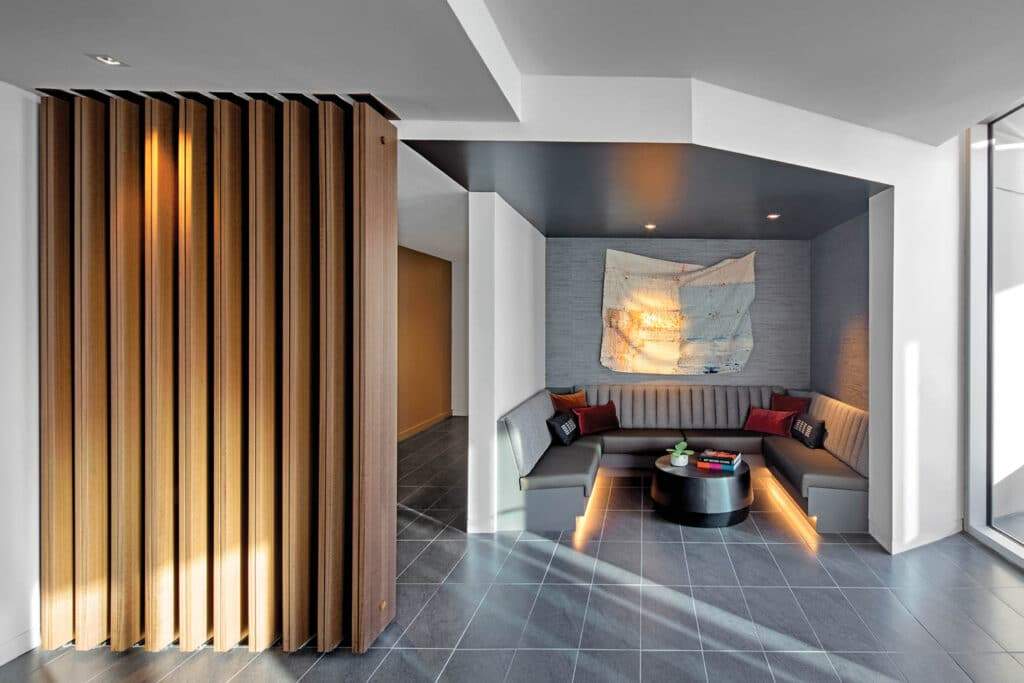
The color and material palette are complemented by the art collection. Mayfield quips, “What’s black and white and red all over?” Warm tones, such as natural paper with a black contrast, and vibrant colors that are reminiscent of the color blocking utilized in the newspaper’s early years were employed.
Vibrant elements, such as a red acrylic circle on canvas created by Jaime Domínguez, stand out against a muted backdrop of walls veneered with eucalyptus and gray tile floors. More subdued sections counterbalance them: MaRS combined another striking Domínguez with woven copper-mesh sculptures by D’lisa Creager on the amenities floor.
Additional references to ink on paper can be seen in wallcoverings made from recycled newspaper and carpets with a scribble-like design in tenant corridors. But the story never takes precedence over the design. Mayfield says, “We kept simplifying it to make it serene and timeless.” The lobby’s Pierro Lissoni seats, the leasing lounge’s smoked-oak tables, and the amenity kitchen’s Neri&Hu lighting all contribute to the setting’s continued modernity, making it feel more like a boutique hotel than an apartment complex. Mayfield believes that developers of residential real estate are at last adopting local character into their buildings by learning from the hospitality industry. The end of the boring skyscraper? That would be excellent news, now.
Finally, find out more on ArchUp:


