Brixen Public Library is like a sensitive organism in Italy
Brixen Public Library is like a sensitive organism in Italy,
Italian architecture studio Carlana Mezzalira Pentimalli has designed a public library that functions
like a “sensitive organism,” that can constantly adapt to the needs of the site and project in Bolzano, Italy.
Named after the Brixen Public Library, the project covers an area of 3,013 square metres,
with angular roofs and large bay windows that command views of its surroundings.
Brixen’s new public library, designed by Carlana Mezzalira Pentimalli, is a stone’s throw from the Duomo.
It is a public institution established in 1984, which, with its legacy of more than 36,000 books, is a landmark for the entire Isarco Valley.
With the completion of this public library,
the studio provides the community with a contemporary space for learning and sharing, and a welcoming urban living room.
While it reinforces the local cultural identity, the library instills a strong sense of social cohesion.
Design features
Architects Michele Carllana, Luca Mezzalera and Curzio Bentimali said:
“This is not a library meant to be a large enclosure for books – quite the opposite.”
“It is a project deeply rooted in its context, designed to welcome and generate human relationships and exchanges,
intertwining cultures, practices and people of different ages,” the architects added.
The overhaul of the unit complex includes a new building,
restoration and annexation of the existing buildings of Ex Finance,
part of the Ex Court (first two levels) and part of the Ex Prison (part of the ground floor and first floor).
After a thorough analysis of the site,
the studio devises a meticulous intervention plan with the redefinition of the existing outdoor spaces,
and the addition of two pedestrian access areas to the north and south,
of the Ex Finance building, and the adjacent park of Via Bruno, which was once private and owned by the roofers.

While the new library building positions itself silently and very respectfully in its surroundings,
the intervention is located south of the former courthouse,
In the resulting void between two existing buildings, where much of the parishioners had been prior to demolition.
The new building creates a real connection to the existing buildings through its strong structural expression,
resembling a ‘tree’ whose concrete ‘branches’ tend toward the Ex Finance and Ex Court buildings.
According to the studio, it establishes a lasting relationship between the old and the new,
inspiring the architects to rename the project as “Kulturbaum, the Tree of Culture”.
The studio follows a particular analogy at the plan level, dictated by the need for great flexibility and adaptability to contemporary public library spaces.
Far from adopting the classic shelving system,
the building has a double perimeter envelope sandwiched between the outer concrete walls
and the wood paneling covering the interior, which houses most of the serving spaces:
From vertical distribution to restrooms, to furniture with bookcases, benches, tables and more.”
This shell envelops space, completely freeing it from any functional obligation.
Versatility leads to direct management
The versatility of environments also guides management and intended use of the library,
and by controlling some strategic access points.
In fact, the complex can be fully or partially accessed to the different floors.
In this way, buildings and related external dependencies can each serve as standalone components to be used independently, to perform multiple functions and events at different times.
The links that are created between the new building and the existing buildings are envisioned,
in a tangible way so that they can meet formal, functional and distributive needs.
While the final mass of the new building is derived from deformations,
through contractions and expansions in order to reconfigure it according to the surrounding spatial measurements.
The project is far from self-referential and has the ability to adapt to different and changing needs in the future.

To resolve the slight differences in height between the three buildings,
the studio used new “branches” that compensate for changes in height through slight slopes.
The new volume has two vertical links with different characteristics,
and the closed fire escape, in addition to serving all floors of the court as an emergency exit,
acts as a staircase connecting the ground floor to the attic of the new building.
The open staircase is positioned centrally to the functional masses,
which develop along the different levels.
Structurally and functionally, both ladders are integrated into the “shell”,
while the pre-existing Ex Finance star base is mainly intended for the use of the service.
The complete continuity guaranteed between the exteriors has been enhanced,
with the introduction of bespoke furniture elements, and the interiors of the new library.
The interiors of the new library
This aims to function as a true public space. Entering the new building is like entering a part of the city Centre.
Access to the new building from the ground floor is also provided through the financial information.
From here, a large quadrangle, occupied by the reception area, provides access to the lifts.
To the south, there is a newspaper library that can be made independent,
ensuring excellent flexibility. On the first floor, the fantasy area is designed as an open space providing access.
Through a second reception area – to the activities in Ex Court and Ex Finance or to the upper floors via stairs and lift.
The second floor is mainly occupied by the physical area,
which is directly connected to the Ex Finance building, to extend this function.
On the third floor, an additional reception area serves as a meeting point between the multi-purpose room and the literary events area.
Toilets, cleaning rooms, storage areas and information desks are evenly distributed on different levels.
The renovation of other existing buildings has enhanced their old character and a high degree of flexibility,
to accommodate the various activities open to the public.
The Ex Finance building is configured as an access point to the new intervention with the main façade, facing Piazza Duomo.
On the ground floor, in addition to the north (main) and south (secondary) access points,
there are information, a check-in and return area, and toilet spaces.

Division of floors in the library
The first floor houses the internal offices of the library,
while the second and third floors contain spaces for non-fiction books,
dissertations, and a multipurpose room.
Access is also granted through designated independent staircase and lift.
The ground floor of the Ex Court building houses the service areas: automated warehouses,
24-hour check-in and return area, outside counter, toilets and technical rooms.
The first floor passes through the children’s area, the children’s area,
Music department with archives, a games room and a multi-purpose room.
The entrance is located on the first floor from the south of the building; the children’s area is located on the east side of the corridor, while the games room is located on the west.
The multipurpose room is to the east and the music archive to the west,
continuing along the corridor, before the room of the frescoes.
To the north, the children’s area is in a more secluded place,
with two separate rooms and a large space that can also be divided with furniture containing books and games.
A corridor hallway and adjoining ancillary room were built in the former prison building.
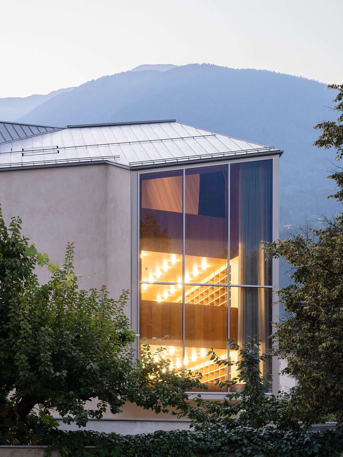
Particular attention has also been given to natural lighting,
which is essential not only for reading, but also for the maintenance and preservation of books.
As for the south wall of the building, devoid of interesting views,
it was deliberately blinded to prevent direct light from entering,
and it was equipped from the inside with a “cabinet wall” that occupies the entire height of the building.
While key components of the context are reinterpreted in a contemporary key,
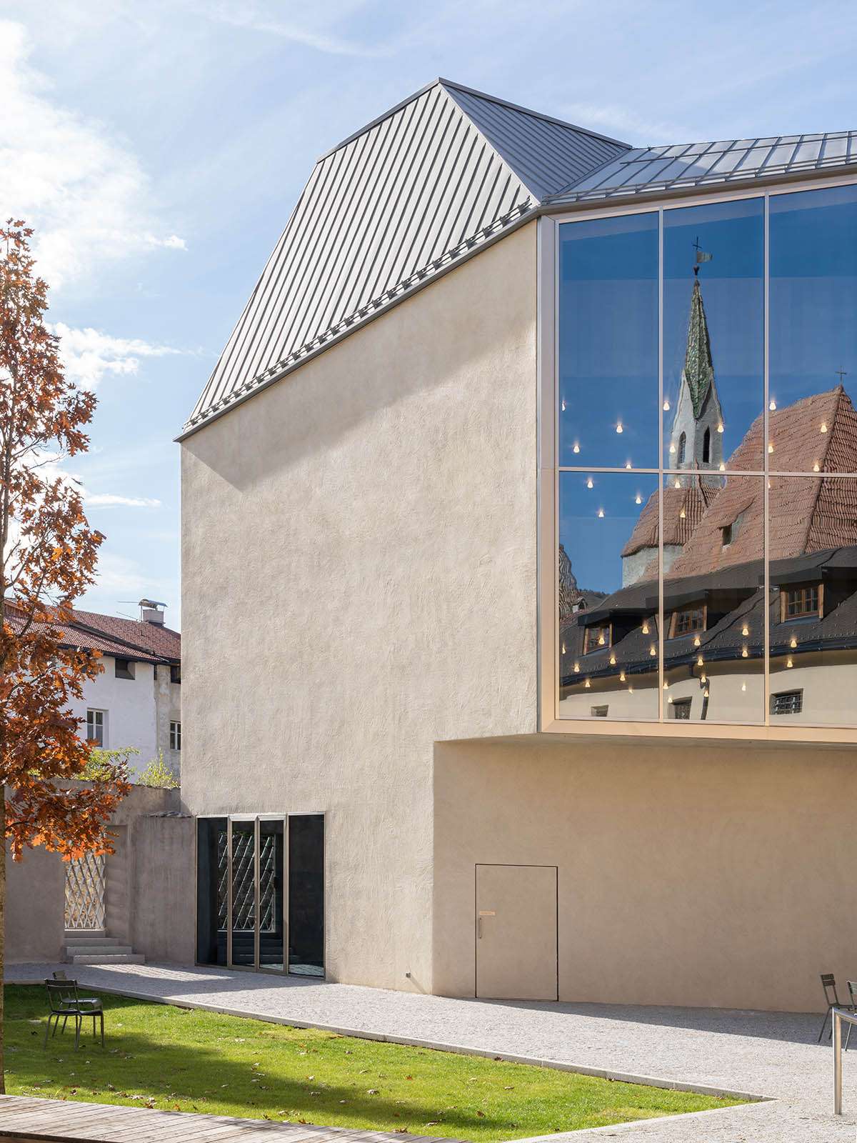
such as the characteristic “erker” – arch windows typical of the historic centre.
And two of these, of gigantic order, favor strategic views:
The building overlooks two main areas of Brixen,
the white tower and bell tower of the cathedral on one side, and the bishop’s palace on the other.
Formally, the two creepers on the outside are an extension of the building’s volume,
recreating a space typical of Nordic culture, forming alcoves ideal for reading or enjoying the scenery.
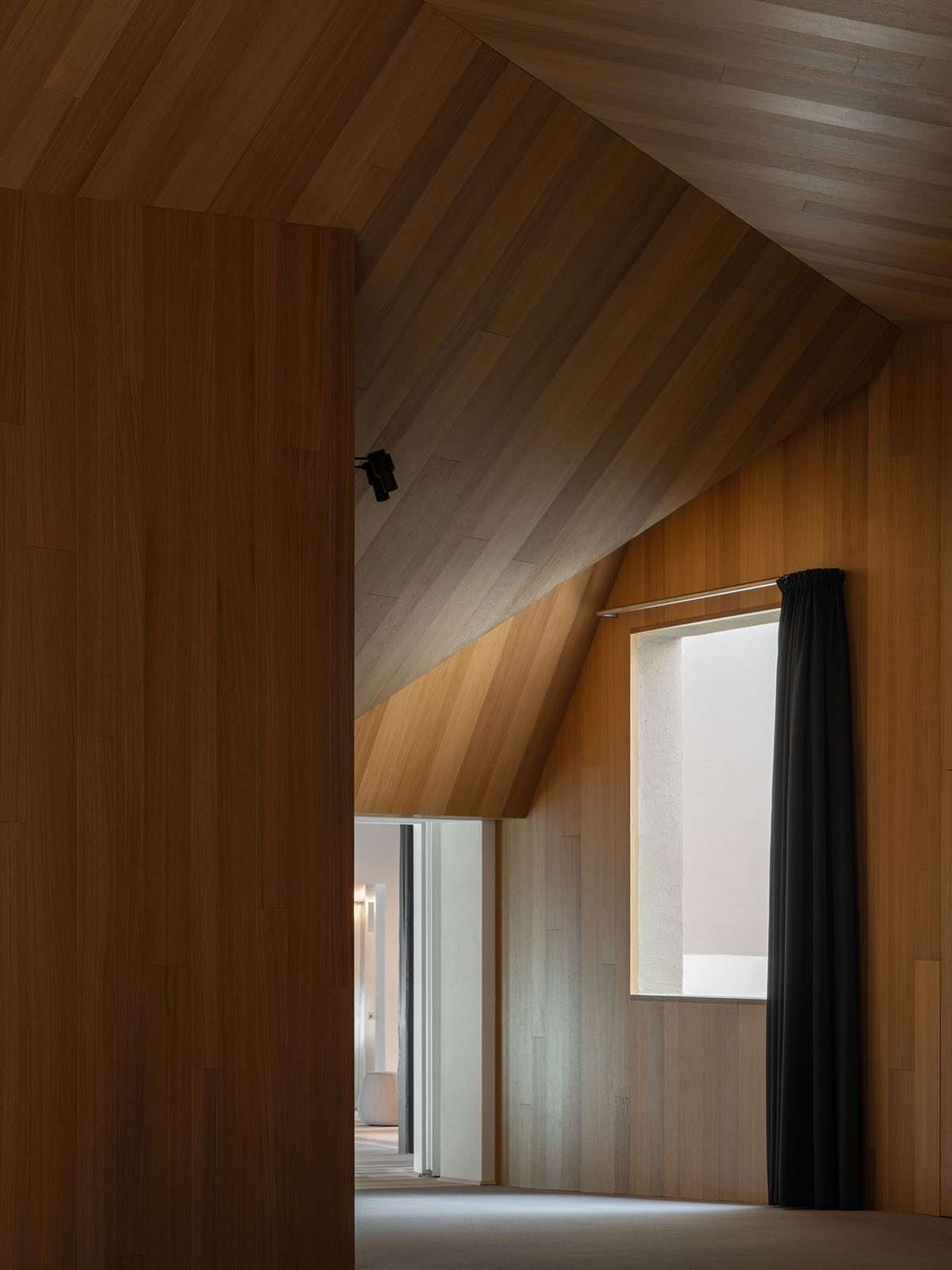
Design of outlets and skylights in the building
The large windows, which demarcate the boundary between the inside and the outside,
are designed to favor indirect light at the points where there is the greatest flow and concentration of people.
Finally, two large skylights positioned at the top of the complex pitched roof allow sunlight to cross the entire height of the building and reach the ground floor.
This is thanks to an articulated pull-down system for the different decks,
which plays an essential role in the introspection system between them.
Each interior profile, in which everything is custom designed,
is different because of the geometric intricacy and sheer scale of the building, camouflaged from the outside with clean,
essential lines that blend perfectly with the pre-existing structures.
For more architectural news


