Camille Walala: colorful aesthetic to the max in self-designed studio
Camille Walala: a colorful aesthetic to the max in a self-designed studio
The seventh-floor space attracted Walala and her studio manager Julia Jomaa with its sweeping views.
Knowing they would be in no hurry to vacate, the duo took their time with the design, working side by side in the studio for over a year while adjusting the position of their space-dividing furniture until they arrived at a layout with the perfect functionality for them.
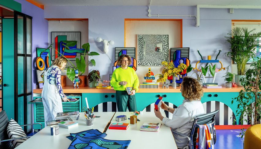
Once they decided to embark on the interior design, it was not a given that they would embrace Walala’s signature bold color palette, as they worried about it potentially clashing with future work.
“We were like, how colorful should we go?” Walala told Dezeen. “Should we keep it quite simple or should we go for it?”
But ultimately, she says the desire to feel inspired by their workspace and “inhabit the aesthetic fully” won out.
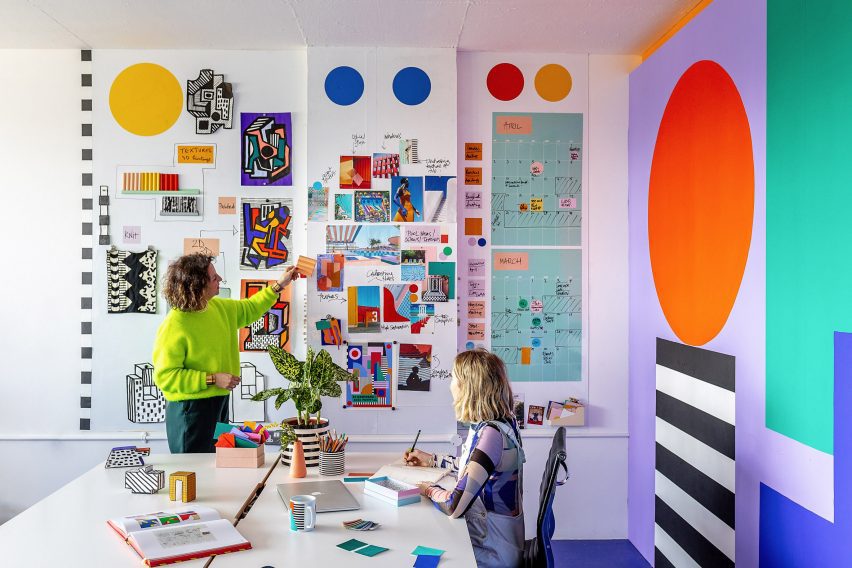
The studio is divided into two rooms – one for “clean” computer-based work and the other for “messy” activities such as painting and model making.
Walala and Jomafavoritea 3D model of the interior in SketchUpspecializingging in their favorite carpenters” Our Department – a studio realizes living in design and fabrication for the creative industries – to realize the design.
The duo of Simon Sawyer and Gustave Andre built all of the colors in the space with a focus on achieving clean lines and pure block colors along with maximum functionality.
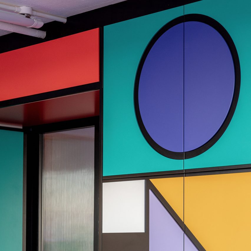
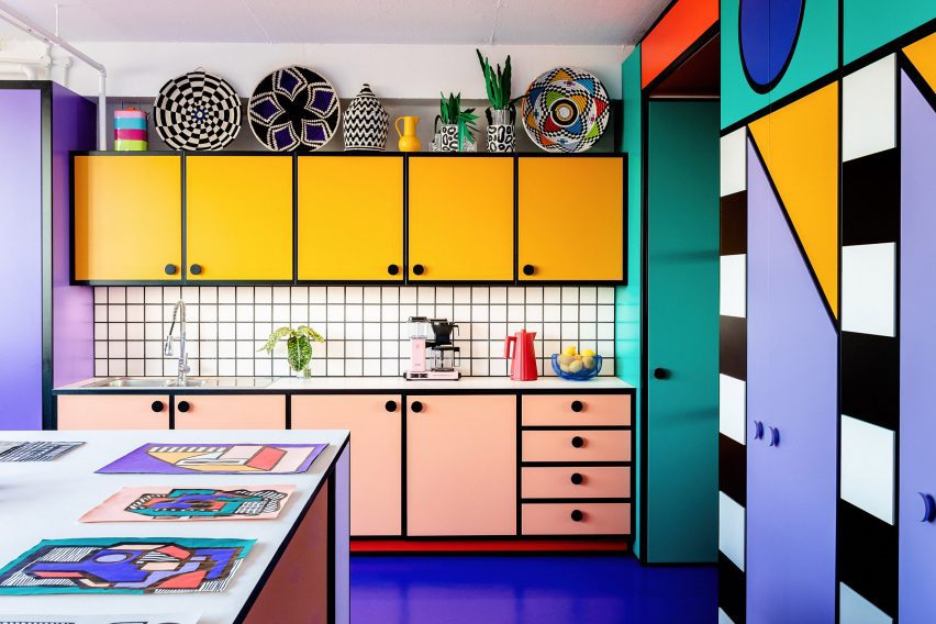
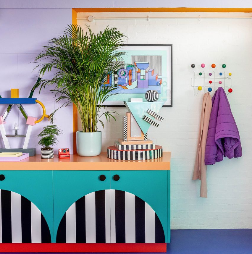
For the cabinetry, they used doors made of melamine-faced medium-density fibreboard (MDF) and applied a decorative technique they had used on previous Walala projects.
This involved CNC-cutting shapes out of thin MDF, before spraypainting and precisely gluing them onto the doors to create a graphic pattern while avoiding the fuzzy lines that can sometimes come from painting directly onto surfaces.
In the kitchen, the group worked together to exaggerate proportions as much as possible, with Walala saying she dreamed of achieving a “Bart Simpson kitchen” through elements such as chunky handles and bold grout.
“We designed the Lego House a few years ago, this colorful house,” she explained. “Especially the kitchen in that space was quite bold and almost like a cartoon, and we thought we should do something similar in our studio.”
By contrast, a more subtle feature is the double sliding door between the studio’s two rooms, which consists of a transparent fluted screen set within a black frame.
While it may be less attention-grabbing, Jomaa says the mesmeric effect of the fluted panels sliding against each other is like a “little animation of color.
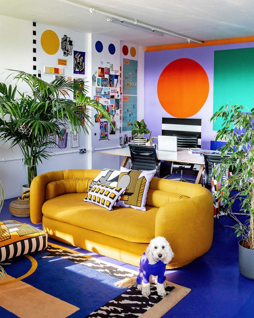
There are also a few natural wood elements throughout the interior such as tulipwood desk legs to balance the liberal use of color.
As with all residents of Regent Studios, Walala will need to return the rented space to its original condition when her studio eventually leaves, so there are no permanent fixtures and everything is designed to be dismantled.
Even the central “wall”, which contains floor-to-ceiling storage on one side, is freestanding. But the team used kitchen-unit feet to wedge them against the ceiling for stability.
Finally, Read more on Archup:


