
Colors and their role in choosing materials in interior design
For an interior designer, the challenge is often not determining the decorative style, the right pieces, or meeting what the client is looking for.
The challenge is getting the colors right, as they are a fundamental and unstable element whose tones vary so much that they need to be used in the right proportions, otherwise, they risk ruining the whole harmony of the space.
From the color of the walls to the color of the furniture, even textiles or small decorative details, colors define spaces, create sensations and feelings, value or destroy light, attract or push us away.
So, this is the essential subject that any interior designer must master.
The importance of color in the context of interior design
Have you ever thought about the power of color? How do you feel about a completely white room or a room full of dark colors? In fact, the sensations and feelings will be different.
Colors are stimuli. Physical stimuli are perceived by sight and decoded by the brain.
More than a purely visual language, colors can evoke sensations and emotions and even influence the human brain’s perception of the environment.
Therefore, the ‘simple’ use of color can profoundly change the atmosphere of the space and the message it aims to convey.
More than using color, predominance, group, color circle, tone, saturation, and how the light will fall on it.
All of these factors change our perception of space in terms of size, weight, and temperature. Also, it is essential to remember that they arouse emotions, create moods, and stimulate or alter behaviors.
Using color psychology in interior design is a way to ensure that the environment conveys the sensations desired by the client, but also:
A guarantee of function, with a synergy between space purpose and color
Create a connection when the color symbolizes the client’s goals
Area estimation
In this way, when creating an interior design project, it is necessary to take into account the preference of those who will enjoy this environment and to adapt the color to the intended atmosphere.
Ensuring a harmonious and pleasant color combination that matches visual communication is a challenge for an interior designer.
Learn how to create a mood board, as it’s the first step to guiding the color selection process for a successful interior design project.

Interior design and color psychology
Color psychology is a powerful tool, as we have seen, colors play a vital role in the message and feeling we want to convey in a room.
In this field of study, the effect of colors on the sensations of the human body is evaluated to understand why certain tones trigger certain feelings.
Such as love, anger, anxiety, creativity, joy, sadness and comfort, among others.
By applying the psychology of color in interior design, you will compose an environment of pieces responsible for certain emotions, only thanks to the correct use of colours.
Let’s understand the effect of specific colors on our feelings.
yellow
It is a color that stimulates creativity, promotes joy, brings energy, prosperity, and optimism to the environment, and is also a tone that encourages logical thinking, enlightenment, and communication.
blue
The deepest shades of blue, such as navy blue, express trust, loyalty, and success.
On the other hand, lighter tones emit a sense of calm and serenity. It is also a color that encourages communication and is commonly used in offices.
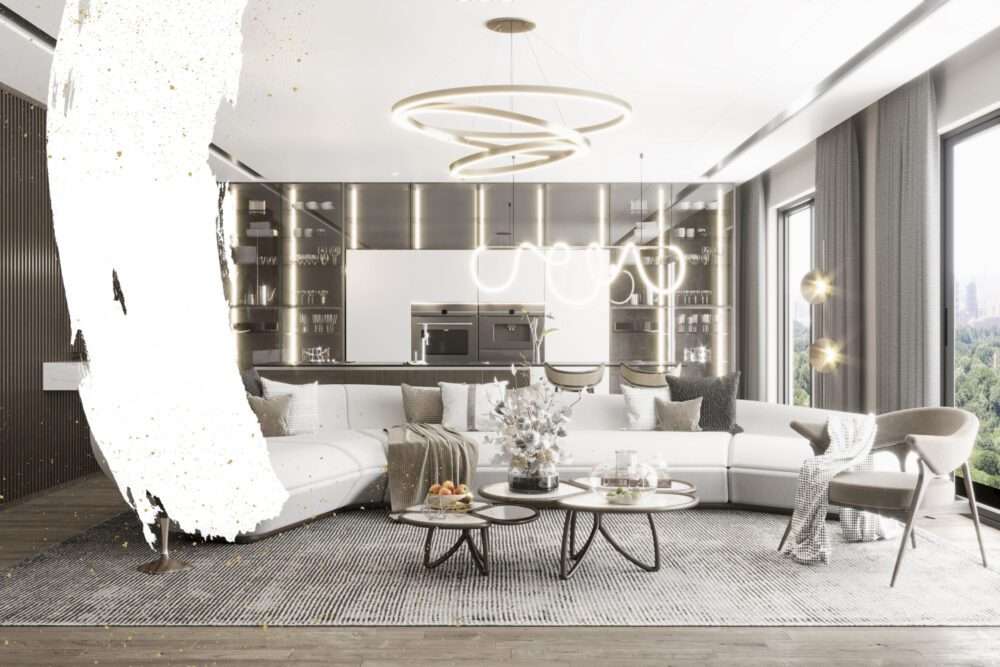
the White
It is the color associated with wisdom, peace and cleanliness, as it can convey calm and simplicity,
but when used excessively, it can generate a feeling of emptiness and isolation.
the Red
It is one of the most vibrant and stimulating colors because it is dominant and dynamic. It also transmits energy and passion and causes intense emotional reactions.
But if it is used excessively, it can speed up the metabolism.
Sometimes it’s a demanding tone to blend in, but it can be used in accent details,
like the Harlequin armchair from ALMA DE LUCE,
Which has a dot in the tone of Red Dress that sets it apart.
the green
It denotes balance, health, renewal, tranquility, security, stability, and serenity.
Unlike red, it is a relaxing eye color that we associate with nature, and as such, has a relaxed and calm vibe.

Brown
Associated with rest and relaxation as a symbol of support and stability,
it is also a color that encourages organization and refers to nature.
Thus, it is one of the main color trends in recent seasons.
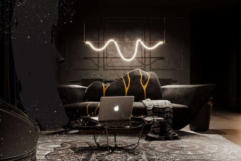
black
Black is a neutral tone that ensures sophistication, modernity and elegance in the room.
It is a color that is widely used in modern environments, but if it is used in excess,
it can generate a hostile environment.
Orange
It is an exotic, penetrating, stimulating, and uplifting color associated with success, creativity, and enthusiasm.
For more architectural news


