Dental clinics: step inside these 5 extraordinary spaces
Dental clinics: step inside these 5 extraordinary spaces
To create a pared-back health space, today designers are harmoniously weaving together neutral, minimalistic, sustainable, and calming interiors with a Scandinavian aesthetic as an antidote to traditional dental clinics – from Norm Architects to Francesc Rifé Studio, Natasha Thorpe Design, JCPCDR Architecture, and i29.
Innovatively balancing the practical medical requirements of dentists with an open, inviting area where patients felt relaxed – these designers want us to imagine a space where the patient attending a much dreaded medical appointment would turn into a guest, enjoying a moment of self-care in a warm and welcoming atmosphere.
For instance, Norm Architects seamlessly designed a spa-like dental clinic for Dentology+ – “what we surround ourselves with simply has a great impact on our mood and behavior, which is why working with natural materials in architecture and design is a simple way to enrich our surroundings and enhance our quality of life!” shares Jonas Bjerre-Poulsen, Norm Architects Co-founder.
On the other hand, meditation spaces effortlessly informed the minimalistic interiors of the Swiss Concept clinic by Francesc Rifé Studio – “mainly inspired by eastern aesthetics and meditation, this clinic was conceived following notions of lightness and calm, a deep approach which has been achieved through very simple means!” Francesc Rifé says.
Additionally, Natasha Thorpe’s Design utilized timber to beautifully soften the mood at Go Orthodontists – “in the context of a clinic, sensitivity to visitor experience is essential, as feelings of anxiety are often present. The use of natural materials and open-plan layout was essential to creating a feeling of ease and comfort!” explains Thorpe.
JCPCDR Architecture further used oak wood throughout Paris Dental Studios and “the oak was chosen for its sustainability – compared to walnut for example, which grows very slowly, oak is easily renewable thanks to responsibly managed forests!” Jean-Christophe Petillault, Chief Architect JCPCDR Architecture shares.
Lastly, i29 created soothing color-block interiors for Dentista – “our design strategy was to bring together a clean, fresh medical environment and a wellness experience!” says i29.

Contrary to what a dentist appointment usually is, these eclectic but one-of-a-kind dental clinics aren’t intimidating – scroll to know more!
1. Norm Architects for Dentology+
Aiming to defy traditional, more clinical designs – smooth concrete and warm oak are among the materials that Copenhagen-based Norm Architects utilized to create the interiors for Dentology+, a private dental clinic in Antwerp.
Spread over a cavernous basement area and a ground-floor level, it’s been clad in a light-toned material palette that was designed to evoke a sense of calm.
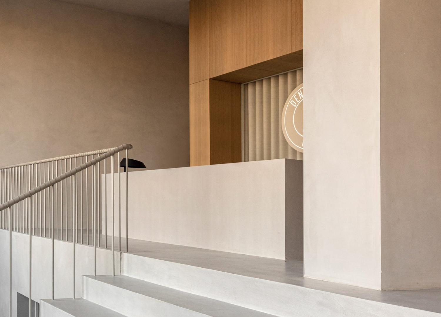
To make it look as if the rooms were carved from a block of concrete – this clinic’s basement is made up of a set of dusty gray corridors.
The concrete volumes are interrupted only by carefully selected earthy-hued minimalistic design elements such as geometric alcoves.

Additionally, while maintaining the clinic’s overall neutral theme – Dentology+’s upper level was further created to be brighter and airier than its basement where cubes of light oak form the walls and doors.
The choice to design its interiors using materials that might be considered unusual for medical spaces was made in an attempt to enhance patients’ well-being – “the need to dwell and retreat to intimate nooks is a basic human requirement that we cannot dismiss when shaping living spaces!” shares Jonas Bjerre-Poulsen, Norm Architects Co-founder.
2. Francesc Rifé Studio for Swiss Concept
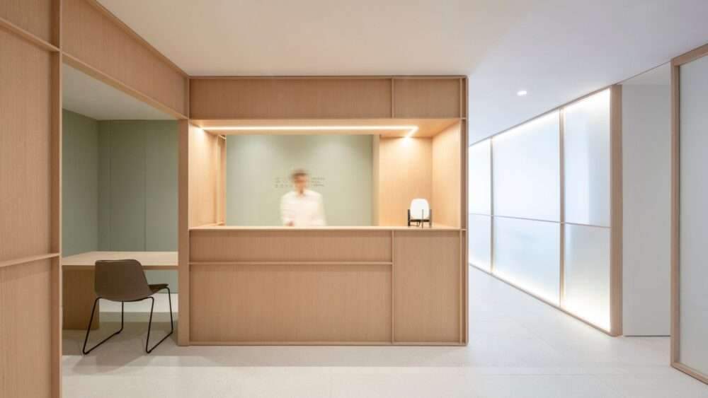
Ashwood surfaces translucent glass screens, and brass feature inside Swiss Concept – a serene facial and dental clinic in Valencia that Barcelona-based Francesc Rifé Studio has designed about Asian meditation rooms.
Embodying colors and materials that are typically applied throughout meditation spaces in Asian countries such as Japan – clients arriving at the clinic are greeted at a softly lit, ash-paneled reception desk that’s backed by a wall painted sage green.
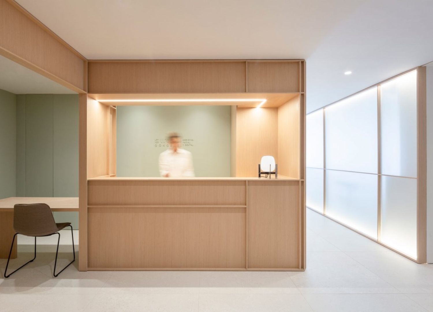
Adjacently runs a white walkway lined with panels of backlit frosted glass – these glowing glass panels conceal the treatment rooms that sit at the core of the clinic, blurring the figures of doctors and patients behind.
Additionally, each treatment area comprises two doors – one at the front of the room and another at the rear.
The waiting area is integrated into the clinic’s rear corridor, where a series of timber-framed windows are covered with translucent screens to soften daylight streaming through from the outdoors.

A laboratory, sterilization room, bathrooms, and consultation area are further set around the perimeter of the clinic, distinguished from the rest of the space by their all-white fit-out.
Lastly, strips of sulphurised brass have been used to line the edges of bookshelves and to craft slim door handles.
“This project demonstrates our ongoing focus on achieving the most with the least!” Francesc Rifé, the studio’s eponymous founder says.
3. Natasha Thorpe Design for Go Orthodontists
Slatted wood panels and ambient lighting are intended to make visitors feel more at ease at Go Orthodontists, an orthodontist practice in Quebec, Canada by designer Natasha Thorpe.
Natasha Thorpe’s Design utilized timber to add a sense of lightness and comfort to the otherwise mechanical and hygienic environment.
To create a cohesive feeling – Douglas fir is additionally used as the primary material throughout this space.

Made to be welcoming, a central reception area forms the focal point of the main area where a circular desk is lined with slatted wooden boards in a vertical arrangement.
The treatment rooms are visible just beyond the reception desk, while the waiting room encompasses large windows and wall-mounted benches with low backrests.

“Putting visitors at ease – the palette favors light natural tones that showcase materials at their best and no seat is turned with its back to the entrance which reduces apprehension!” explains Thorpe.
Benches and tables are made from lightly stained Russian plywood to match surrounding timber designs – the low tables can be reconfigured, overlapped, and tucked away to create more space.
Treatment areas further carry a similar soft aesthetic to help soothe nervous patients – “the area most associated with fearful experiences in dental offices is often the X-ray chamber. When placed inside the all-fir environment, the X-ray machine becomes altered by its context, it seems less scary and machine-like!” Thorpe adds.
4. JCPCDR Architecture for Paris Dental Studios
A curved wooden panel runs throughout Paris Dental Studios by Paris-based architecture studio JCPCDR Architecture.
Located on the ground floor of a courtyard in Paris – the designers inserted a single, curving oak panel-clad wall along the length of the studio, from the lobby right through to the last consultation room.
“We chose to work with wood as this material immediately brings a sense of homeliness and comfort!” shares Jean-Christophe Petillault, Chief Architect JCPCDR Architecture.
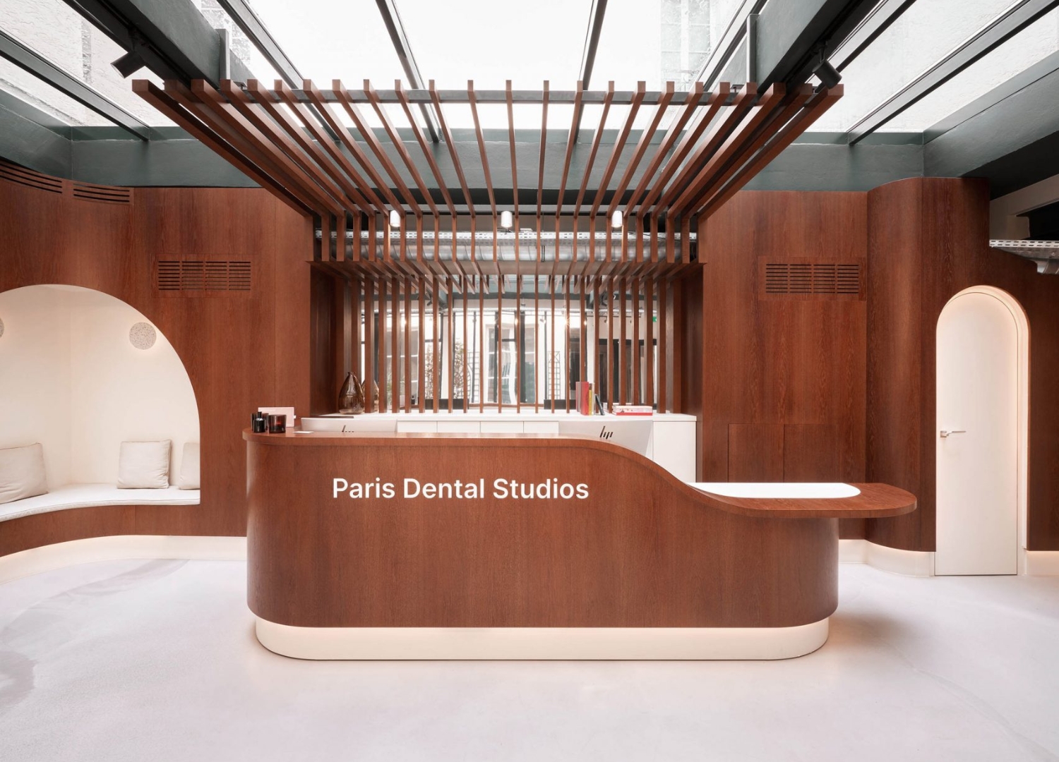
They sourced the wood from eastern France where it was then assembled and dyed with a natural tone to make its deep, warm hue – the designers then wrapped the walls in the lobby and adjoining corridor in the solid oak wood.
“The solid wood was tricky to shape and we had to find design solutions that would make our idea functional and affordable!” Petillault adds.
Additionally, the same wood also features on the reception desk, over the arched doors and alcoves as well as inside the four consultation rooms.

Neutral furnishings, white doors, and skylights were further added to the interiors to help fill the studio with light and counter the dark color of the wood.
Contributing to the relaxed atmosphere – lots of the dental equipment was hidden from the patient’s view.
5. i29 for Dentista
Khaki-green communal areas are contrasted with fresh white treatment rooms inside the Dentista dental clinic in Amsterdam, designed by local studio i29.
Upon entering this space with its timber-clad facade – patients find themselves in a waiting area that houses a few chairs and a tall wooden box seat.
While the majority of the room is rendered in white, the immediate area around the help desk is finished in khaki green – from the furniture to the ceiling, walls, and floors.
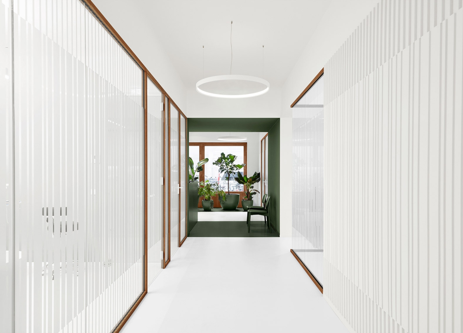
A strip of flooring that runs alongside the clinic’s front windows has also been painted green and decorated with an array of tall, leafy plants in khaki-colored pots that help obscure the interior from passersby.
Additionally, a white corridor leads to the rear of the clinic where eight treatment rooms encircle a planted open-air courtyard.
Helping to maintain patients’ privacy while letting in light – each room is fronted by timber-framed glass panels with semi-opaque stripes.
Apart from a khaki-green feature wall, the treatment areas have further been painted completely white – “which intuitively refers to medical professionalism!” says i29.
Read more on Archup:

