How to properly manage the design process
Classical and digital designers alike harness design principles to shape their work,
building on design elements to give cohesion to their pieces.
When used successfully, these principles have the power to transform designs,
both aesthetically and functionally.
Achieving unity
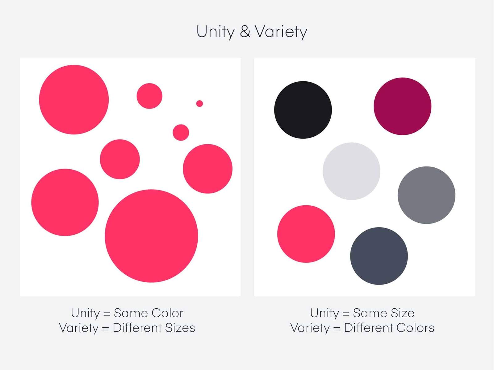
Unity is a force that operates within a design and gives it the appearance of unity or precision,
to ensure that no one part is more important than another.
Achieving visual unity is the main goal of graphic design.
When all elements agree, the design is considered unified.
While using design elements to apply unity to your business is a powerful way to bring a brand concept to life.
Let’s say a sports brand like Nike or Reebok has an intense campaign.
The campaign may use big, bold fonts, bright colors,
and highly stylized images to convey intense training emotions.
On the other hand, a company like Casper might use a more subdued color palette with crisp white tones and light, airy lines to simulate a restful night’s sleep.

Balance
Objects in design carry weight just as they do in the physical world, but it is called visual weight.
So the visual weight of the design must be balanced, it’s like putting two objects on a seesaw:
if one side is too heavy, the viewer’s eye goes straight to the heavy part.
If weighed, all things being equal,
the hammock will hang perfectly with neither side touching the ground.
Balance can be indicated through size, shape, or even contrast.
While symmetry or equality can be utilized, balance can also be achieved through asymmetry.
Just think of asymmetry as the opposite of reflection:
instead of seeing reflection, you see something that evenly distributes the elements.
For example, three small objects can offset the visual weight of one large object.
Or a small, dark, shaded object can offset the visual weight of a larger, lighter item.
Hierarchy
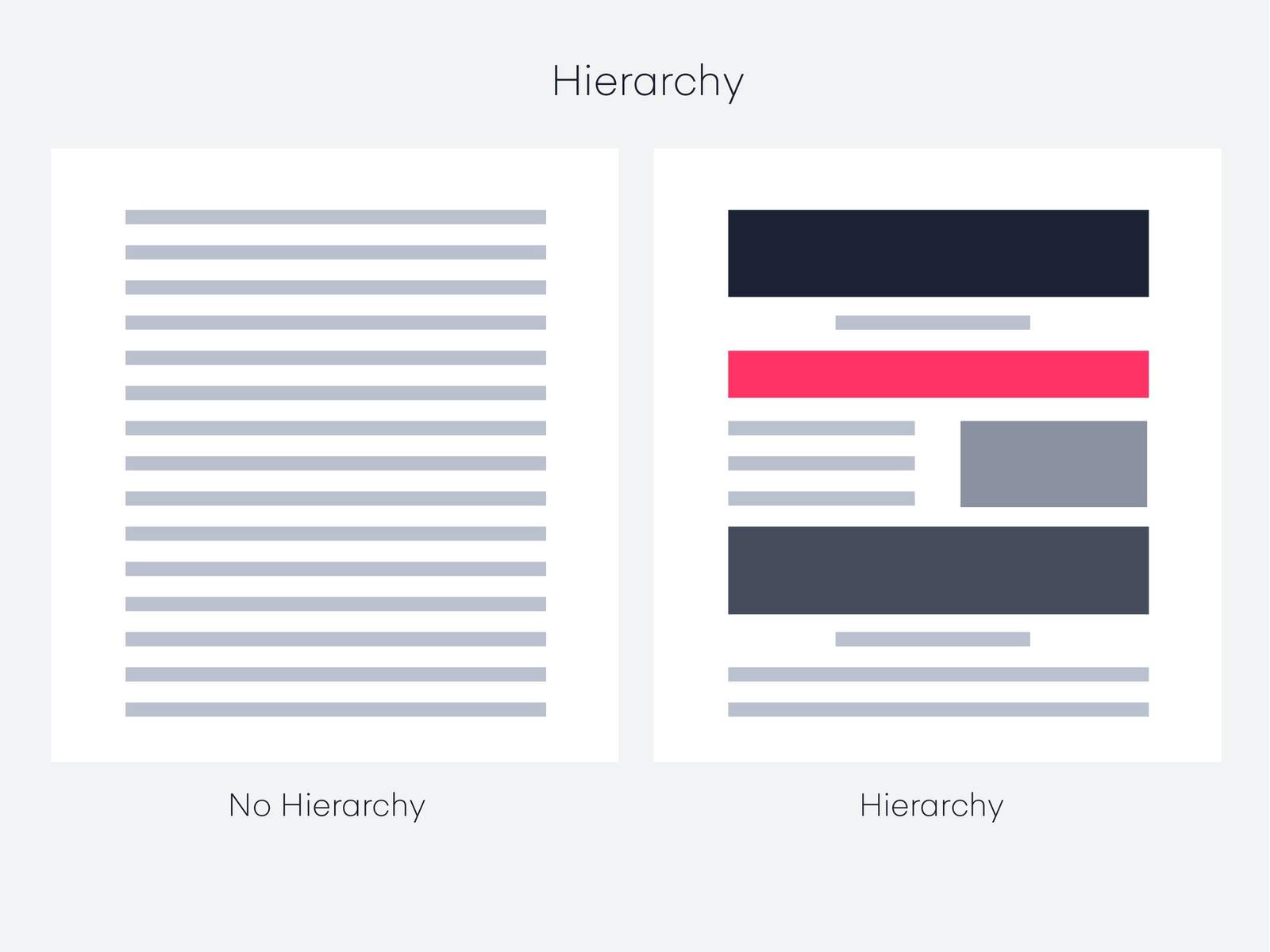
One of the most important principles in design is hierarchy, which is a way to visually classify design elements.
The hierarchy is not based on design patterns, but on the order of importance.
Good design leads the eye through each area in order of priority.
A good example is the homepage: there’s usually a navigation bar and a logo,
some sort of large header image, or text with a call to action.
Most importantly, the logo tells the user where they are;
Site navigation shows the user how to get around the site;
A call to action forces the user to do something.
Most often, the call to action is the largest or boldest element on the page,
followed by the logo and navigation.
It is designed to help the user complete an action or comprehend information.
Thus a good rule of thumb for hierarchy is that the most important elements should be the most prominent.

Contrast
The difference between two or more objects in design is referred to as contrast.
The difference in objects can be light and dark, thin and thick, small and large, bright and dull, etc.
Contrast is commonly associated with readability, clarity, and accessibility.
Like a hierarchy, the most important element in a design should have the greatest amount of contrast.
A bright blue button on a stark white background with lots of white space is considered high contrast.
If the button is roughly the same color as the background or is within 1 pixel of fill,
its contrast will be lower.
Text-based design can be high contrast using black text on a white background.
To reduce contrast, you can use gray text on a white background.
An easy reminder is to think of a black and white image.
If the image contains a full range of white, gray and black, it has high contrast.
If the image goes from off-white to just dark grey, it is a low-contrast image.

Emphasis
Emphasis can be created by size, weight, position, color, shape and style.
Concentration is sometimes referred to as dominance,
and it may look similar to contrast, but it is not exactly the same.
Contrast deals with the difference between two objects, and focus deals with the effect of the object.
To make things even more confusing,
you can use contrast to support focus on an object – such as placing a solid black sphere on a white background.
This represents high contrast with focus: the viewer’s eye is drawn directly to the heavy form.
While adding focus to an object creates a focal point that attracts the audience’s attention.
It’s where you want the viewer to look first,
but it doesn’t overpower the rest of the design (otherwise it would be unbalanced).
Scale
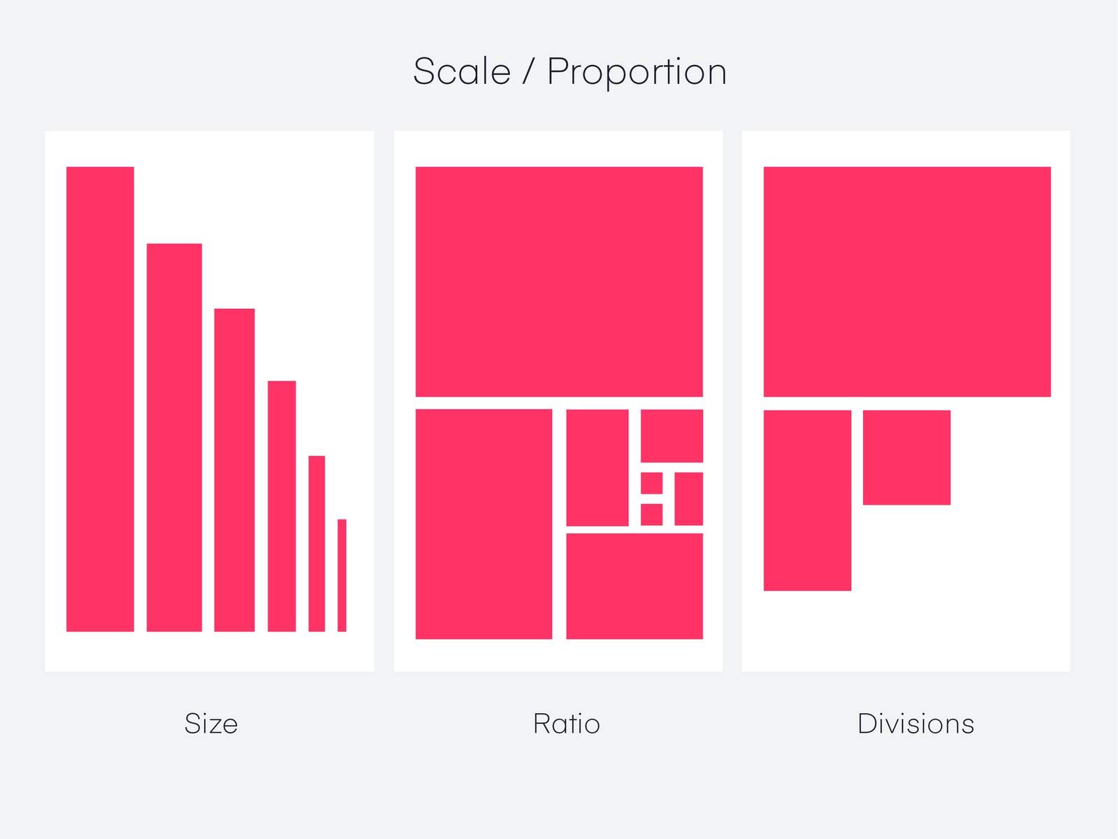
Scale is the sizing of items or standard of measurement.
It can be used with other principles such as focus to draw the viewer to a focal point,
and helps us understand designs or images.
If something is drawn to scale, it shows an object of an exact size (although it may be smaller or larger than its actual size).
Which creates a way of portraying objects as larger than life,
or bringing a large object down to fit on a piece of paper.
In digital design, scale can also refer to the pixel dimensions of the device you are designing for.
Retinal devices are sometimes two or three times as dense as their non-retinal counterparts, and require a specific sized canvas.
Depending on the device, this could be double or triple the screen size.
For example: A 400 pixel wide square still displays as 400 pixels on a retina device,
but it is twice as dense.
So you can design on a canvas that is 800 pixels wide because it is x2 the density of a non-mesh device or x1.
https://archup.net/school-for-blind-and-visually-impaired-children-sealab/
Repetition
Repetition is the repetition of a design element, commonly used in patterns or textures.

Repetitive elements can be used in conjunction with other principles to create a design that leads the user’s eye to a focal point, has continuity, or flow.
The recurring element can also be repeating lines, shapes, shapes, colors, or even design elements.
https://archup.net/bespoke-bim-manager/

