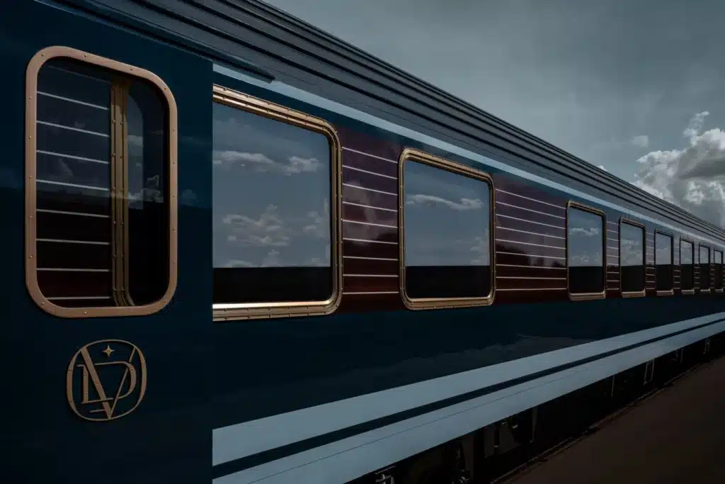
Interior of Suite at La Dolce Vita Orient Express
Reconstructing Memory: A Design Narrative Rooted in Cinematic Luxury
Dimore Studio’s interior design for the La Dolce Vita Orient Express exemplifies a curated dialogue between nostalgia and contemporary material expression. Positioned as the first of several luxury experiences under the revitalized Orient Express brand, the train represents a meticulous reinterpretation of the golden age of travel rather than a reproduction.
Referential Modernism: Italian Design of the 60s and 70s as Conceptual Foundation
Influences from Italian masters such as Cini Boeri, Claudio Salocchi, and Mario Marenco are not arbitrarily aesthetic. They are deeply embedded in the design’s spatial logic and tactile language. Dimore Studio extracts the emotional residue of that design era—its confidence, its warmth, and its theatricality—and adapts it to the kinetic spatial constraints of train interiors.
This is not pastiche; it’s an architectural fiction carefully composed to evoke both recognition and intrigue.
Cinematic Space-Making: Time as a Material
The concept of cinematic space is not metaphorical here—it governs the entire design language. Each compartment, each corridor, each upholstered curve is a “scene” in an imagined journey. This technique of spatial storytelling aligns with what Dimore Studio calls a “journey through memory and imagination,” where the passenger becomes both viewer and participant.

Material Syntax: Velvet, Brass, and Walnut as Narrative Devices
The use of lacquered wood, smoked glass, patinated mirrors, and polished brass is not simply decorative. These materials, drawn from a canon of luxury interiors, operate here as a form of atmospheric storytelling. Velvet, particularly, is deployed to slow down visual perception—absorbing light, muting sound, and evoking intimacy.
The choice of reflective versus absorptive materials is strategic. Brass and glass expand; velvet and walnut compress. This spatial rhythm is critical in balancing continuity and differentiation across the train’s linear sequence.
The Bar Car: A 1970s Mise-en-Scène
In the bar car, the undulating velvet seats and harlequin-patterned wall form a spatial tableau that captures the theatricality of 1970s Milanese design. The chromatic selection—cream, orange, blue—aligns more with emotional tone than brand coherence, a deliberate move to prioritize experience over graphic identity.

Here, Dimore Studio resists uniformity in favor of narrative fragmentation, allowing passengers to inhabit a space that feels curated yet unpredictable.
The Cabins: Tension Between Modesty and Opulence
Spatial constraints are reframed as opportunities in both the deluxe (7 sqm) and suite (11 sqm) cabins. In the smaller units, abstract-patterned textiles introduce motion within static geometries. Wood-panelled walls serve both thermal and psychological insulation, deepening the sense of retreat.
The suites, clad in red velvet, push the material envelope further. Paired with cold steel tables, the palette teeters between sensual and ascetic—highlighting the designers’ skill in producing tension, not balance.
More on ArchUp:
Dining Car: Metal, Leather, and Ritualized Hospitality
The dining carriage operates as a transitional threshold—a hybrid between public sociality and private indulgence. Rounded banquettes in orange leather contrast the angularity of brass and steel detailing. These moves are subtle reinforcements of the train’s overarching thematic interplay: formality softened by sensuality.
Brown-toned carpeting grounds the experience, anchoring movement and echoing the chromatic sensibility of 20th-century Italian restaurants. It’s an understated nod to architectural rituals of dining.
Chromatic Strategy: Emotional Resonance Over Brand Logic
The chromatic direction draws from the atmospheric decay of old photographs—smoky greys, mustard yellows, jewel-toned reds. The intention is not to mirror vintage palettes but to borrow their emotional charge. This is a project concerned with memory, not replication.

In essence, the color strategy serves as a form of temporal displacement, allowing passengers to psychologically exit the now and enter a designed past.
External Branding and Internal Continuity
Externally, the train retains its iconic profile, but the interior narrative supersedes brand nostalgia. This is not a reproduction of the historical Orient Express; it is a new myth constructed from its fragments. Dimore Studio’s refusal to yield to literalism allows for a contemporary project that acknowledges its lineage without becoming its prisoner.
Conclusion: A Project Suspended Between Time, Memory, and Motion
The La Dolce Vita Orient Express is not just a train interior; it is a sequence of architectural moments in motion. Dimore Studio’s intervention is successful not because it recreates the past, but because it constructs a new spatial fiction from its ruins.
This is architecture as storytelling—emotive, referential, and unapologetically designed.
Photography: Mr Tripper