Chromatic Currents & Textural Shifts: Material and Color Trends at 2025
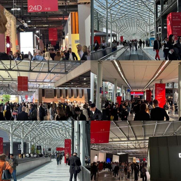
The 2025 edition of Salone del Mobile brought more than aesthetic statements it introduced a chromatic language and material tactility that defined the emotional climate of design today. ArchUp followed this year’s palette and surface story from hall to hall, uncovering not just trends, but signals of how materials, colors, and contrasts are being recalibrated in response to new values of living.
The Dominant Palette: Earthy Warmth and Tinted Calm
This year, the visual landscape of Salone was painted in what can be described as comfort-driven tones. Among the most prevalent colors observed:
- Terracotta / Clay Red:
#B44B33 - Sage and Olive Greens:
#9CAB7C,#708660 - Turquoise-Tinted Teal:
#5FB6B2 - Dusty Rose / Mauve:
#C48CA0,#D8A39D - Warm Beige and Pastel Neutrals:
#E5D4C0,#F6EDE2
These hues were not just on walls or cushions they informed the entire language of the space, merging color with architecture.

The Fabric Focus: Bouclé, Blends, and the Tactile Experience
The prevailing textile this year was bouclé, with its soft, nubby texture that invites touch. Upholstered in desaturated hues from the palette above, it provided depth and softness. But is it a trend or a transition?
Manufacturers pointed to two factors:
- Comfort-driven aesthetics following post-pandemic domestic habits.
- Perceived sustainability, as blended fabrics including recycled content increase in use.
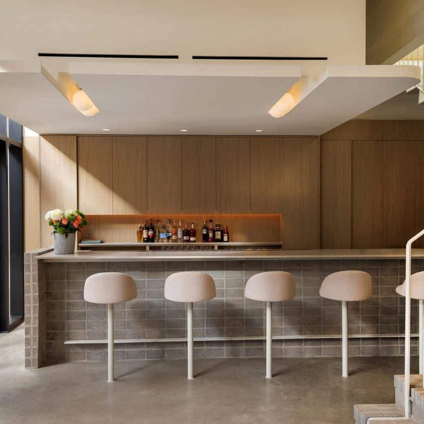
The visual softness of bouclé was often contrasted with ribbed glass (fluted glass) and matte steel frames, creating a textural duality that’s becoming a signature for the moment.
Materials: Transparency, Synthesis, and Subtle Engineering
The glass was everywhere but not as glossy as modernism. Instead, textured glass with light diffusion played with privacy and depth. This was most effectively paired with fabric or muted metal, forming layered compositions in furniture, lighting, and partitions.
Wood usage saw a soft shift:
- Solid wood (especially oak and ash) was present but subdued.
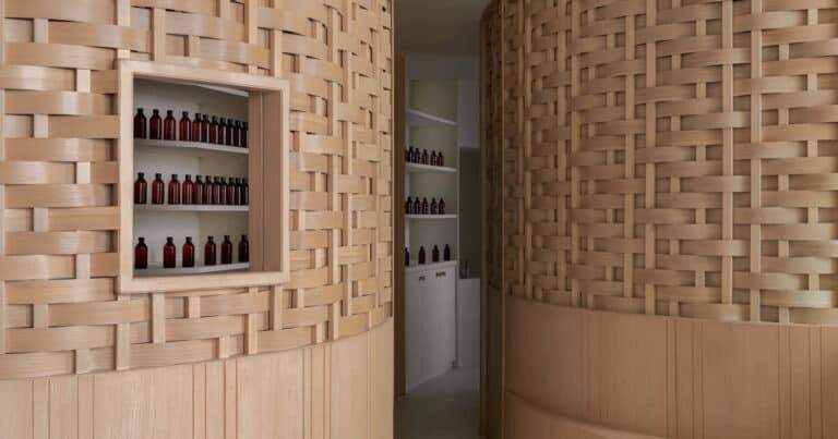
- Engineered wood and laminates were more widely used, especially in modular systems, hinting at cost, logistics, and sustainability considerations.

Color Theory Meets Bold Contrasts
A major shift this year was the pairing of calming palettes with bold intrusions:
- Muted sage met burnt orange.
- Pastel neutrals collided with jet black.
- Clay red was paired with icy blues or deep aubergines.
This tension wasn’t accidental it was strategic, especially among major brands like Molteni&C, Kartell, and Minotti, who used sharp contrast to define product identity.

Form, Surface, and Emotional Connection
What was once decorative is now strategic. Surfaces are being used not just to delight, but to define.
Material combinations reflect new architectural behaviors:
- Hidden joinery, monolithic finishes, and unexpected softness all spoke to a design language more focused on atmosphere than object.
Final Insight from ArchUp
In the end, Salone 2025 wasn’t just about new products it was about the new syntax of material.
At ArchUp, we believe these shifts signal more than trends they represent the evolving relationship between humans and space, where color and material serve as the emotional interface of design.


