Pantone Chooses “Mocha Mousse” as its 2025 Color Of The Year instead of Brat Green
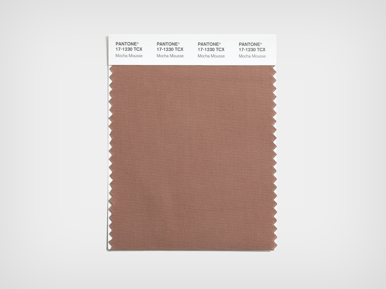
Brat Summer has come and gone and it seems like the color’s cultural impact hasn’t really affected Pantone much. The color company has, as it does every year, announced a color for the year moving forward (something I’ve had my own thoughts about). The 2025 Color Of The Year is Mocha Mousse – a ‘flavorful’ brown shade that aims at neutrality and an alignment with mother nature. “There is a growing movement to align ourselves more closely with the natural world,” Pantone mentioned in an Instagram post while announcing the Color Of The Year “Characterized by its organic nature, PANTONE 17-1230 Mocha Mousse honors and embraces the sustenance of our physical environment.”
The color has received an interesting response from Pantone’s global audience as well as from publications. While there were public calls for a form of Emerald Green to be the color of the year, hat-tipping to summer’s hottest color “Brat” green (thanks to Charli XCX’s album), Pantone made a deliberate choice to follow through on choosing a color that aligns more with its color from 2024 – peach fuzz.
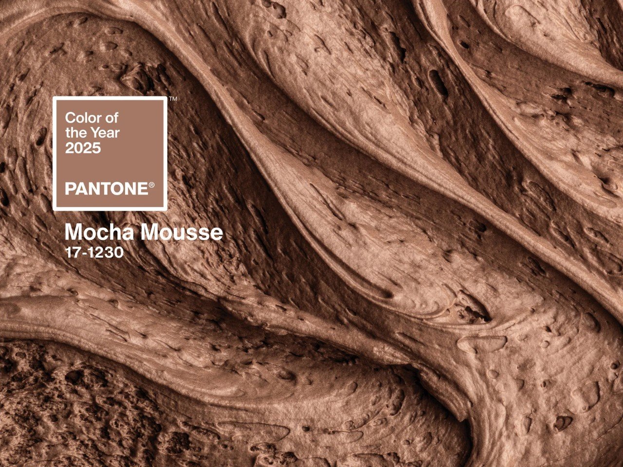
The color hopes to unite people through taste (and even smell), evoking a subliminal reaction that echoes feelings of warmth and comfort – the kind you would as you eat a spoonful of chocolate mousse. “As people continue to seek harmony and balance, there is a shift to focussing on curating moments or experiences that boost our sense of personal comfort and wellness,” said Laurie Pressman, vice president of the Pantone Color Institute.
Browns are a foundational shade, a versatile color that’s both “genderless” and “practical,” says Pressman. “This is a color that’s honest. It’s authentic. We believe in this. It’s a color we see in nature,” she adds. It’s also the first time a shade of brown has been selected as Pantone’s Color Of The Year in its 26-year-long history. Notably, Mocha Mousse is also an existing shade in Pantone’s catalog, as opposed to being a newly minted color as Pantone develops each year for its Color Of The Year tradition.
The color, however, comes at a strangely pivotal time in human history. The Global Peace Index 2024 found that there are currently 56 conflicts worldwide—the highest since World War II, reports TIME Magazine. 2025 is all set to be a pivotal year, with an overwhelming feeling of uncertainty, both political as well as economic. I’m not sure if the color’s supposed to provide a sense of comfort through these unprecedented times, but here’s hoping.
Still, the color itself lacks any inherent social connection. There’s really no ‘right’ or ‘wrong’ color given that it isn’t calculable. Color choices are merely a combination of fashion trends and human emotion, although there’s really no democratic way to pick a Color Of The Year – Pantone does it in its own secretive manner. In a lot of ways, the colors are ‘implemented’ into culture rather than being a reflection of it. Personally, a variant of Brat Green would reflect public sentiment, or maybe a form of green that symbolizes the Palestinian struggle, or the Ukrainian resistance, given that Yellow and Blue (Ukraine’s flag colors) combine to form green. That’s probably just wishful thinking on my part. Mocha mousse, anyone?
🔗 Source: Original Source
📅 Published on: 2024-12-05 20:15:00
🖋️ Author: Sarang Sheth – An expert in architectural innovation and design trends.
For more inspiring articles and insights, explore our Article Archive.
Note: This article was reviewed and edited by the ArchUp editorial team to ensure accuracy and quality.


