




If you found this article valuable, consider sharing it
Welcome to ArchUp, the leading bilingual platform dedicated to architects, designers, and urban planners. I am Ibrahim Fawakherji, a licensed architect with over a decade of professional experience since 2011, specializing in architectural content curation, digital publishing, and industry insights.
As Chief Editor at ArchUp, I am committed to delivering reliable, expert-driven content that enhances architectural knowledge and fosters a trusted community of professionals. Our mission is to document, analyze, and share the latest developments in architecture news, architectural research, and ArchUp.
Join us in exploring verified, in-depth design knowledge that shapes the future of architecture.
Architecture making the cityArchitecture made by the city, the city made by architectureAldo Rossi argued that the type of architecture drawn from the city context could create a new city. The context of the city may appear as physical characteristics…
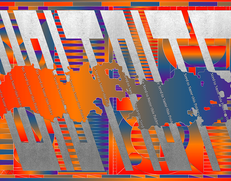
“We Need to Name This Folder”, named in honour of the the original Dropbox folder name that Carl Jones and I shared. The concept behind this personal project was to have a bit of fun creating personas relating to other worldly holy figures or deities. The figures were then paired with prayer totems and a…

NVIDIA Project DIGITS: The Power of AI in a Small Form FactorIn a world where AI is rapidly evolving, NVIDIA is introducing a revolutionary solution that brings supercomputing power to your desk. Project DIGITS is a supercomputer designed specifically for…
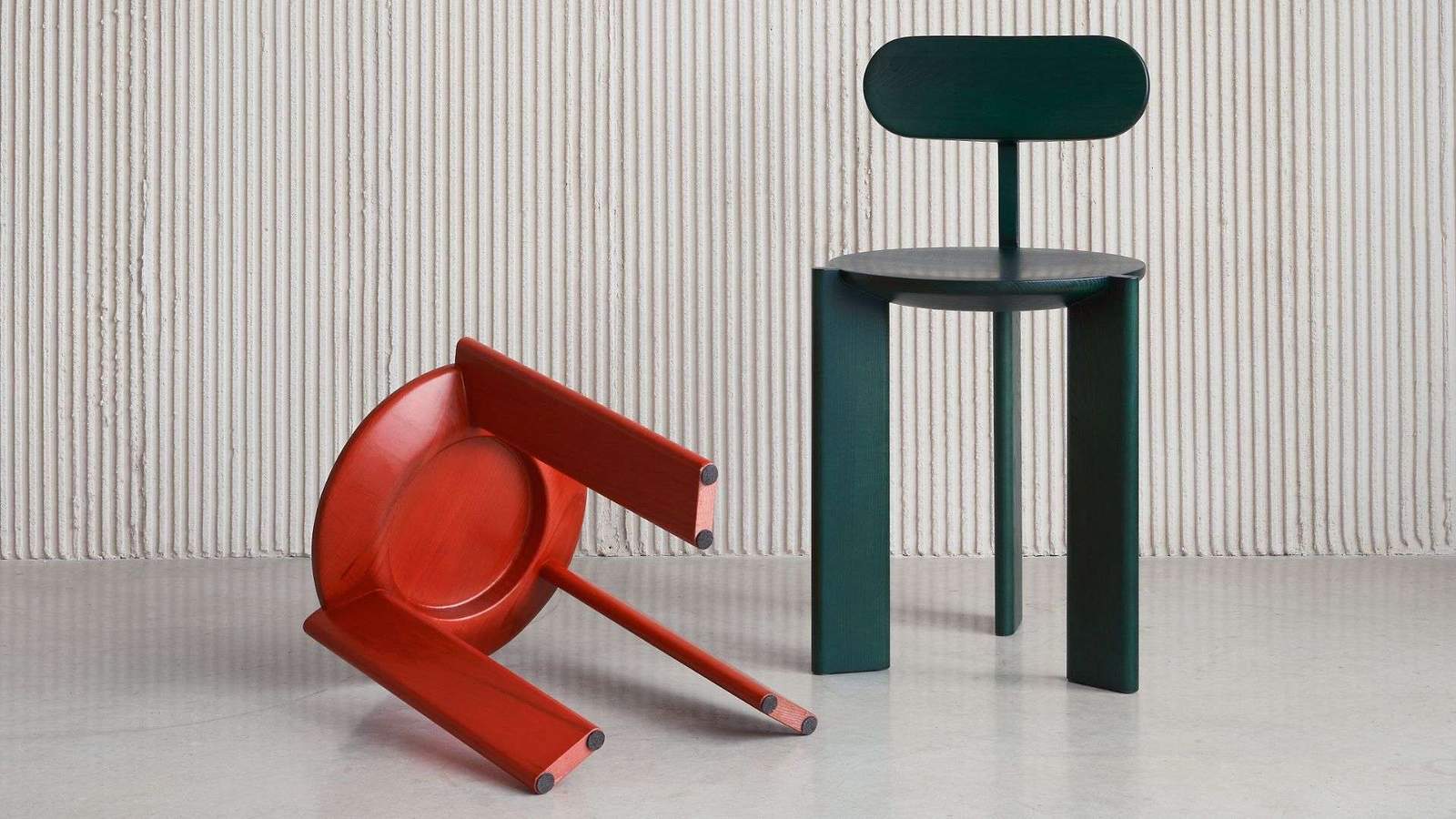
With a successful trajectory and only four years in the market, the Poland-based brand Artu, has paved its way to the home interior and hospitality market with an identifiable style that can be defined as refined, minimalistic and aesthetically pleasing. Artu’s collections of furniture are identifiable through the quality of fabrication and materials, resulting in long
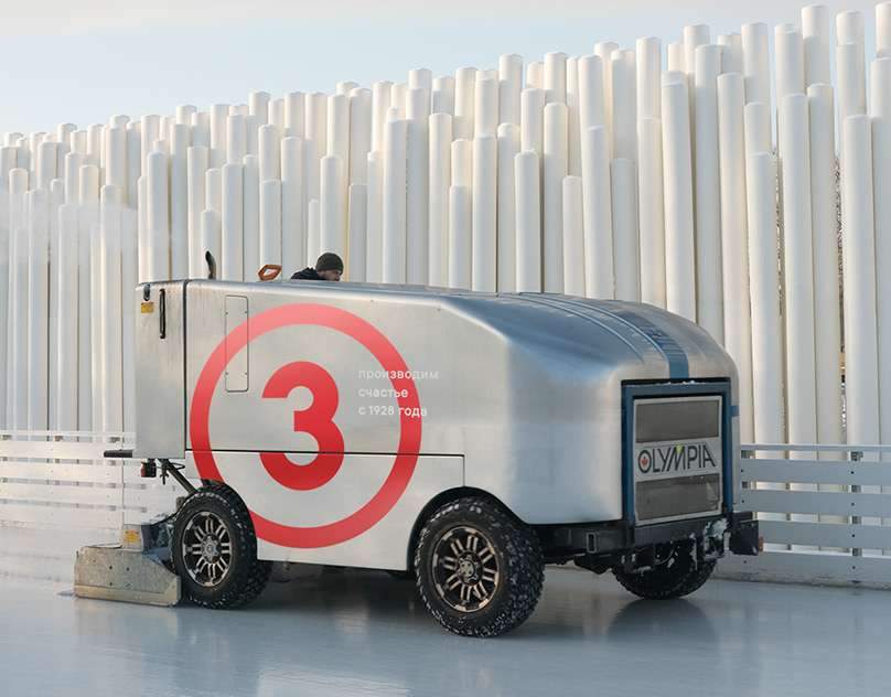
Gorky Park Skating Rink. 2018/19 SeasonThe skating rink in Gorky Park is the main place for winter festivities in the center of Moscow dating back to the 1920s. Every year from November to March, the park’s alleys get coated with ice, and the largest ice rink in Europe opens for everyone. Anything you need is…

Rehabilitation of historical buildings in the Arab world,Historic buildings are an important part of the cultural heritage of communities and stand as a witness to their history and development.However, these buildings may be threatened by neglect, erosion or natural factors.Therefore,…
Architecture making the cityArchitecture made by the city, the city made by architectureAldo Rossi argued that the type of architecture drawn from the city context could create a new city. The context of the city may appear as physical characteristics…

“We Need to Name This Folder”, named in honour of the the original Dropbox folder name that Carl Jones and I shared. The concept behind this personal project was to have a bit of fun creating personas relating to other worldly holy figures or deities. The figures were then paired with prayer totems and a…

NVIDIA Project DIGITS: The Power of AI in a Small Form FactorIn a world where AI is rapidly evolving, NVIDIA is introducing a revolutionary solution that brings supercomputing power to your desk. Project DIGITS is a supercomputer designed specifically for…

With a successful trajectory and only four years in the market, the Poland-based brand Artu, has paved its way to the home interior and hospitality market with an identifiable style that can be defined as refined, minimalistic and aesthetically pleasing. Artu’s collections of furniture are identifiable through the quality of fabrication and materials, resulting in long

Gorky Park Skating Rink. 2018/19 SeasonThe skating rink in Gorky Park is the main place for winter festivities in the center of Moscow dating back to the 1920s. Every year from November to March, the park’s alleys get coated with ice, and the largest ice rink in Europe opens for everyone. Anything you need is…

Rehabilitation of historical buildings in the Arab world,Historic buildings are an important part of the cultural heritage of communities and stand as a witness to their history and development.However, these buildings may be threatened by neglect, erosion or natural factors.Therefore,…
Architecture making the cityArchitecture made by the city, the city made by architectureAldo Rossi argued that the type of architecture drawn from the city context could create a new city. The context of the city may appear as physical characteristics…

“We Need to Name This Folder”, named in honour of the the original Dropbox folder name that Carl Jones and I shared. The concept behind this personal project was to have a bit of fun creating personas relating to other worldly holy figures or deities. The figures were then paired with prayer totems and a…

NVIDIA Project DIGITS: The Power of AI in a Small Form FactorIn a world where AI is rapidly evolving, NVIDIA is introducing a revolutionary solution that brings supercomputing power to your desk. Project DIGITS is a supercomputer designed specifically for…

With a successful trajectory and only four years in the market, the Poland-based brand Artu, has paved its way to the home interior and hospitality market with an identifiable style that can be defined as refined, minimalistic and aesthetically pleasing. Artu’s collections of furniture are identifiable through the quality of fabrication and materials, resulting in long

Gorky Park Skating Rink. 2018/19 SeasonThe skating rink in Gorky Park is the main place for winter festivities in the center of Moscow dating back to the 1920s. Every year from November to March, the park’s alleys get coated with ice, and the largest ice rink in Europe opens for everyone. Anything you need is…

Rehabilitation of historical buildings in the Arab world,Historic buildings are an important part of the cultural heritage of communities and stand as a witness to their history and development.However, these buildings may be threatened by neglect, erosion or natural factors.Therefore,…