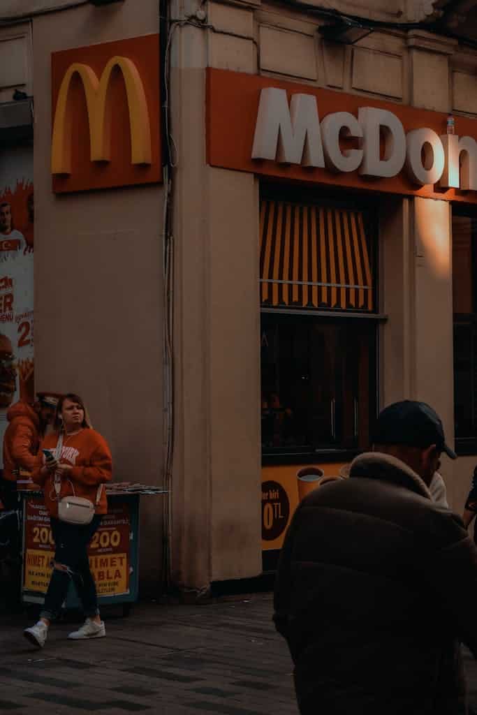
Storefront Signs as Architectural Additions: Rethinking Urban Identity through Commercial Facades
When wandering major cities or historic neighborhoods, the eye is inevitably drawn to the storefront sign—an element that boldly interrupts the cityscape, embodying a spectrum from sophisticated taste to visual chaos. The sign is far more than a functional label displaying a shop’s name or describing its service; it stands as a visual statement that intersects with architecture, constantly redefining the relationship between visual identity and the urban environment.
The Sign as an Individual Expression within a Collective Context
The power of commercial signage stems from its dual nature: an expressive tool for brands and individuals, yet simultaneously a shared urban element with collective presence. In some European cities like Zurich and Vienna, signage is meticulously regulated by urban codes that strictly define dimensions, colors, and typographic styles. There is very little room for randomness—each sign is a carefully considered balance between commercial ego and the city’s visual system.
In contrast, cities like Mumbai or Cairo burst with color and scale, creating a vibrant, even chaotic, visual soundscape that mirrors the city’s open spirit. However, this often leads to a visual clutter that can obscure the very architectural features it inhabits.
Visual Codes and Occupational Identity
Certain professions, either by law or convention, must adhere to strict color symbolism. Many cities require lawyers to use subdued signs—typically limited to black or navy, set in traditional serif fonts, and barred from flamboyant hues. Pharmacies in France employ neon green, a universally recognized sign of healthcare, while barbers’ red-white-blue spirals reach back to medieval surgical traditions.

The Gulf McDonald’s Experience: Visual Standardization as Strategy
When McDonald’s entered the Gulf market in the 1990s, it chose to unify its sign design through a single supplier based in Kuwait. This was not merely a marketing decision, but a conscious architectural and visual strategy. By ensuring all signs adhered to precise measurements, materials, and lighting standards dictated by the Chicago headquarters, McDonald’s established a stable visual identity across diverse urban environments.
Brand and Ego: When the Sign Becomes Visual Authority
Major brands like Apple, Chanel, and Louis Vuitton do not compromise on the size or placement of their signs. Their unwavering design standards can even reshape the envelope of a building itself. This “visual dictatorship” stems from a belief that the sign is integral to the architectural expression of the brand—especially in luxury retail districts, where the sign becomes part of the facade’s DNA.

Visually Disciplined Cities: From Paris to Kyoto
Many world capitals have established rigorous signage codes. In Kyoto, Japan, even global brands like Starbucks are required to forgo illuminated logos in favor of bamboo or washi-paper signs. Meanwhile, Paris restricts commercial sign height to 90 centimeters, with a color palette that harmonizes with the stonework of the surrounding architecture.
Architecture and the Eye: Visual Distances and Physiological Metrics
Urban design research shows that a pedestrian walking at 5 km/h can comfortably read a sign 40–60 centimeters tall from 10 meters away. Motorists traveling at 50 km/h require a sign at least 1.2 meters wide for clear legibility. Thus, storefront facades must distinguish between “signs for pedestrians” and “signs for commuters,” each type tailored to a different visual sense and reaction time.
Architectural Engagement with Signage: Elimination or Integration?
The ultimate ambition is for the sign to become an “architectural extension”—engraved in stone, woven into facade carvings, or seamlessly integrated into fenestration, as seen in works by Peter Zumthor or Aldo Rossi. Here, the sign is not an alien element but born from the building itself.
Conclusion: Can We Redefine Signage as Part of the Urban Facade?
In both architecture and advertising, the balance between individuality and shared structure is at stake. Left to unchecked competition or taste, commercial signs can disfigure a street. But placed with intelligence, they become “visual poetry,” enhancing the city’s identity rather than detracting from it.
At ArchUp, we believe that analyzing such details is essential to understanding how the city transforms—layer by layer, through even its most modest and prominent elements: the sign.
✦ ArchUp Editorial Insight
This article draws welcome attention to storefront signs as a raw, often-overlooked layer of urban visual culture — where typography, material improvisation, and economic pressure collide. By tracing how signage reveals a neighborhood’s identity, ambition, or even neglect, the piece reminds us that design lives not only in masterplans but in everyday façades.
However, the critique could go further in analyzing how signage regulations, gentrification, or digital screens reshape these expressions. What happens when authenticity is replaced by uniform branding? As we approach 2030, sustainable urban aesthetics will require protecting this visual diversity without slipping into chaos. Storefronts aren’t just business markers — they’re architectural micro-narratives that deserve curatorial thought, not just commercial function.
Explore the Latest Architecture Exhibitions & Conferences
ArchUp offers daily updates on top global exhibitions, conferences, and professional art and design forums.
Follow key competitions, check results, and stay informed through the latest news worldwide.
ArchUp is your encyclopedic hub for discovering events and design-driven opportunities across the globe.


