Finding the perfect balance between harmony and diversity is essential in interior design, as creating a delightful and inviting space requires careful consideration of coherence and intrigue.
You can achieve a visually captivating and cohesive design by combining symmetrical elements while incorporating diverse and interesting elements.
Enrolling in an interior design academy or taking interior design courses can provide you with valuable knowledge and skills to learn how to achieve harmony and diversity in your designs.
This article will explore principles and strategies for achieving that delicate balance in your interior design.

Create a cohesive foundation
To create a cohesive design, start by creating a cohesive foundation, and select a unifying theme, color palette, or design style that will act as the backbone of your design.
This foundation will provide consistency and coherence throughout the space, creating a sense of visual unity.
Whether it’s a specific color scheme, design idea, or style, make sure it’s present in key elements such as walls, floors, and larger pieces of furniture.
Creating a cohesive foundation is also vital to creating a well-designed space, as it sets the tone and provides a framework for your design’s aesthetics and atmosphere.
Here are several key steps to help you create a solid foundation:
Define your design concept
Start by defining a clear design concept or theme to guide your choices throughout the project, and keep in mind the style, mood, and overall feel you want to achieve in your space.
Whether it’s modern, rustic, minimalist, or eclectic, having a defined concept will help you make consistent decisions throughout the design process.

Choose a color palette
Choosing a cohesive color palette is crucial to achieving visual harmony. Choose a primary color and some complementary or similar colors that work well together.
Keep in mind the mood you want to remember and the general ambience of the space, for example, earthy tones can create,
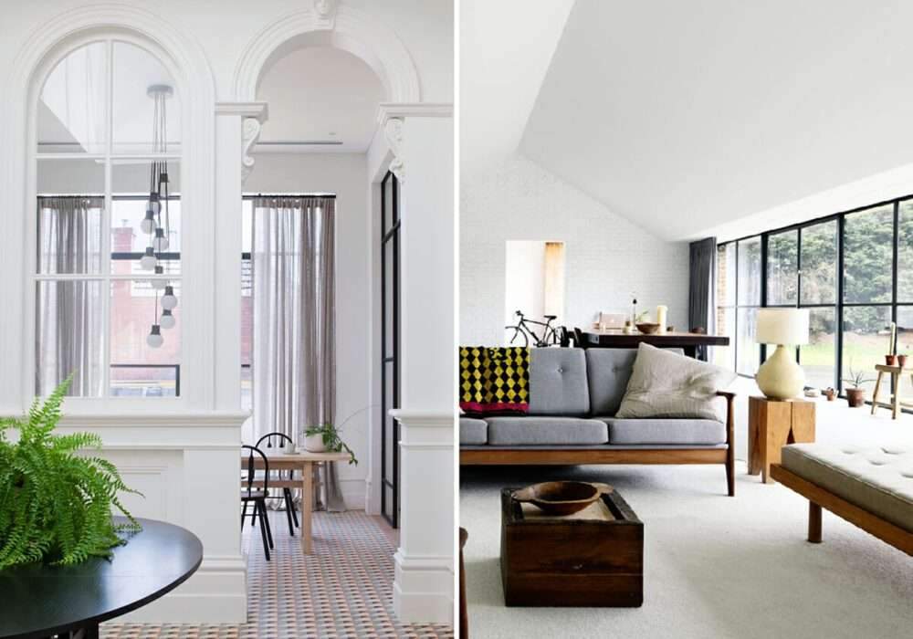
Warm browns, soft greens and sandy neutrals create a calm and natural atmosphere.
layer with contrasting elements
While cohesion is important, incorporating contrasting elements adds interest and makes your design more versatile.
Incorporate contrasting colors, textures, patterns, or materials to create visual interest.
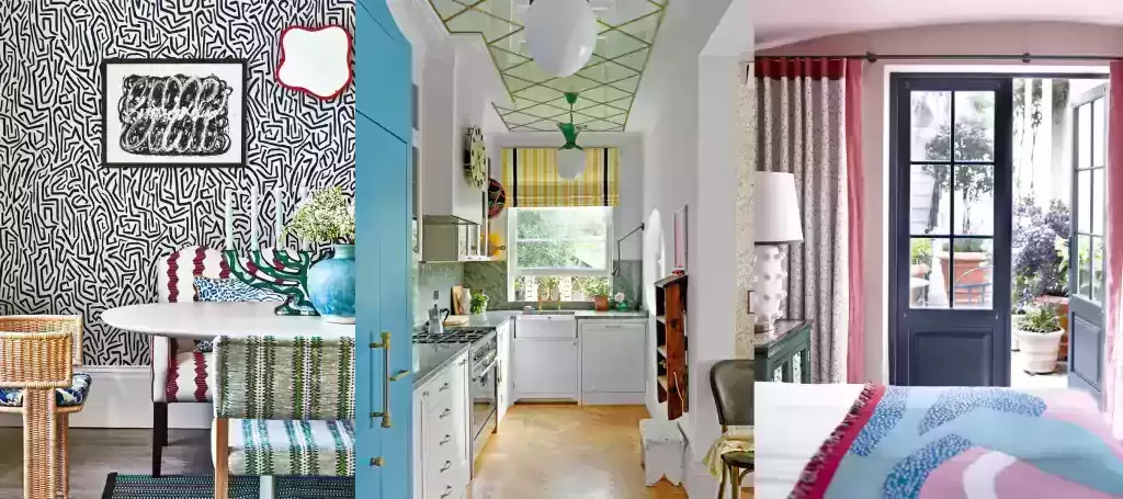
For example, pair smooth, sleek surfaces with textured accents, or combine bold patterns with solid colors,
The interplay of contrasting elements will add depth and dynamism to your design.
Layering with contrasting elements is also a powerful technique for adding depth, visual interest, and personality to your interior design.
The combination of different textures, colors, patterns, and materials also creates a dynamic and inviting space.
Here’s how to use contrast layers effectively:

Textures and materials
Mix and match different textures and materials to create tactile diversity, combine smooth surfaces and textured textures,
Like pairing a chic leather sofa with a woven jute rug.
Also use metal, glass, wood and fabric to add visual and tactile interest.
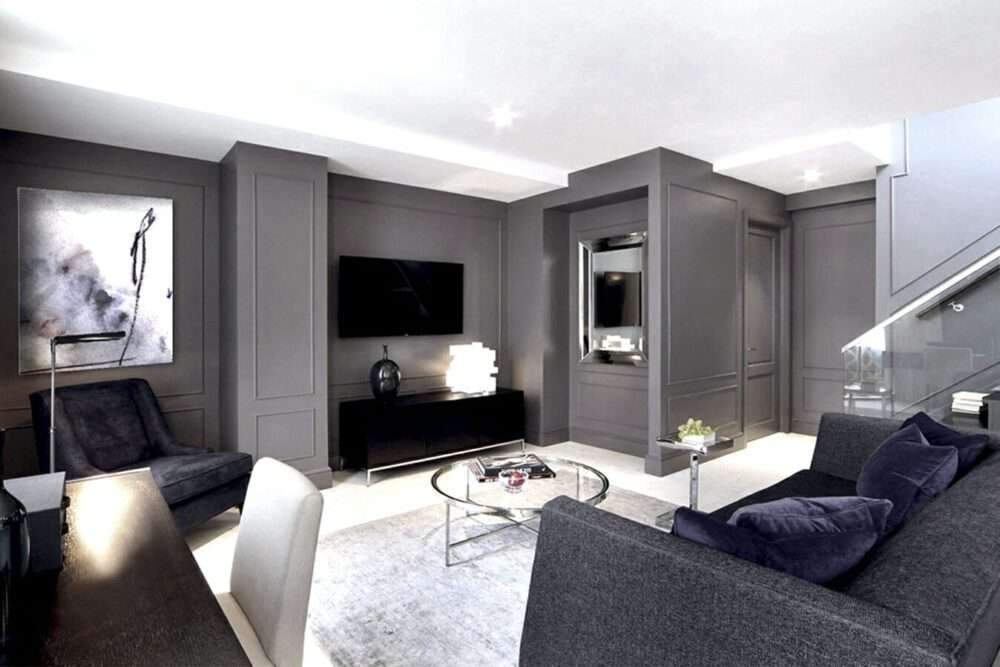
For example, a metallic coffee table paired with a plush velvet sofa creates an interesting contrast.
Colors
Contrasting colors can make a bold statement and enhance the visual appeal of your space.
Where the pairing of complementary colors, such as blue and orange or purple and yellow, creates a lively and energetic atmosphere.
Instead, choose contrasting color temperatures, such as warm and cool tones, to create a sense of balance and visual intrigue.
For example, combine light blue with warm, earthy tones for a captivating color scheme.
The problem of inappropriate furniture and solutions using high quality and comfortable materials
