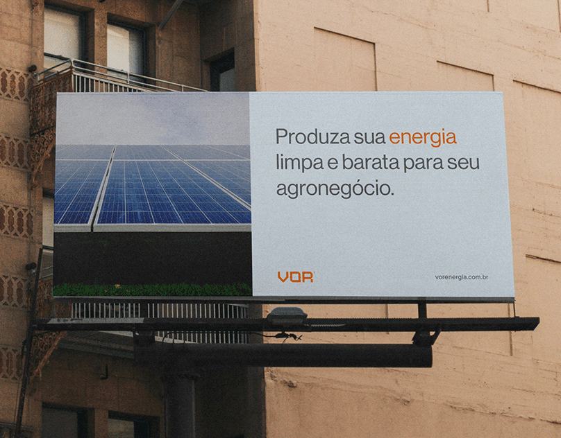

VOR® Energia Solar
Cliente: Henrique Maia | Ano: 2022
Cliente: Henrique Maia | Ano: 2022
ENG
VOR is an engineering, energy and consulting company based in Florianopolis, Brazil. The company focuses its efforts on empowering its clients through solar energy. Since 2018, when it was founded they have been committed to providing a full engineering service – from project analysis and estimated savings to equipment selection and system installation.
Today VOR seeks to make Brazil a greener country and a leader in clean energy production.
Today VOR seeks to make Brazil a greener country and a leader in clean energy production.
PT-BR
A VOR é uma empresa de engenharia, energia e consultoria sediada em Florianópolis, Brasil. A empresa concentra os seus esforços para capacitar os seus clientes através da energia solar. Desde 2018, quando foi fundada estão comprometidos em fornecer um serviço de engenharia completo – desde a análise do projeto e poupanças estimadas até à seleção de equipamentos e instalação de sistemas.
Atualmente a VOR busca tornar o Brasil um pais mais verde e líder na produção de energia limpa.
PROJECT SCOPE / / DEMANDAS ROLE // CARGO
Brand Design – Art Direction Brand Designer – Art Director
Design de Marca – Direção de Arte Designer de Marca – Diretor de Arte
INDUSTRY // RAMO PROFISSIONAL
Solar Energy Bernardo Nascimento
Energia Solar

LOGO GRID & CONSTRUCTION
The goal of the logo construction and shape is to produce the similarity to the square and hexagonal shapes of solar plates and to bring a more modern and concise look.
The goal of the logo construction and shape is to produce the similarity to the square and hexagonal shapes of solar plates and to bring a more modern and concise look.
The logo grid was constructed with square shapes and 45° lines to bring a modern feel and represent the seriousness of the company in a strong logo.
GRID E CONSTRUÇÃO DA LOGO
O objetivo da construção e forma do logótipo é produzir a semelhança com as formas quadradas e hexagonais das placas solares e trazer um aspecto mais moderno e conciso.
O grid do logótipo foi construída com formas quadradas e linhas de 90° e 45° para trazer um toque moderno e representar a seriedade da empresa num logótipo forte.


COLOR PALETTE
The palette in question was chosen to represent the industrial idea in general in we chose colors with cooler tones like gray but also to represent the sun that is key behind the company we chose the sunset orange color that together with the gray tones are the predominant colors of the brand.
The palette in question was chosen to represent the industrial idea in general in we chose colors with cooler tones like gray but also to represent the sun that is key behind the company we chose the sunset orange color that together with the gray tones are the predominant colors of the brand.
PALETA DE CORES
A paleta em questão foi escolhida para representar o a ideia industrial em geral em escolhemos cores com tonalidades mais frias como o cinza mas também para representar o sol que é chave por trás da empresa escolhemos a cor laranja pôr do sol que junto com os tons de cinza são as cores predominantes da marca.


Follow us on instagram
Creative: Bernardo Nascimento
DELIVERABLES
Brand Identity, Graphic Design, Art Direction.
To view everything we can do for you:
helloasurastudio@gmail.com
Thank you!