Home » Design » Cersaie 2026: Six Tile Shifts That Change Specification, Not Just Style

Cersaie 2026: Six Tile Shifts That Change Specification, Not Just Style

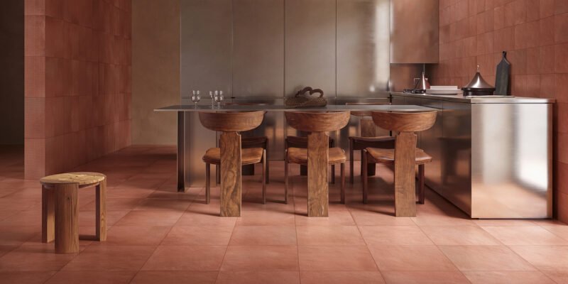
Terracotta-toned ceramic surfaces and furniture-scale tile applications presented around Cersaie 2026
Ceramic surfaces presented around Cersaie 2026. Image rights belong to their respective owners.

Cersaie 2026 showed ceramic moving beyond a neutral finish toward a more active architectural surface. Across the Bologna fair, manufacturers used saturated colour, relief, digital printing, stone effects, large slabs and hand decoration to change how tile manages scale, light and continuity. The useful question is not which trend is newest, but what each asks from specification and installation.

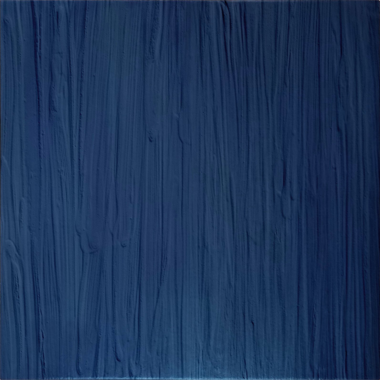
Essenza di Capri by Antiche Fornaci D’Agostino uses saturated colour as a spatial field.
Essenza di Capri by Antiche Fornaci D’Agostino uses saturated colour as a spatial field. Image courtesy of the manufacturer.
A second view of Essenza di Capri shows colour continuing across adjoining surfaces.
A second view of Essenza di Capri shows colour continuing across adjoining surfaces. Image courtesy of the manufacturer.
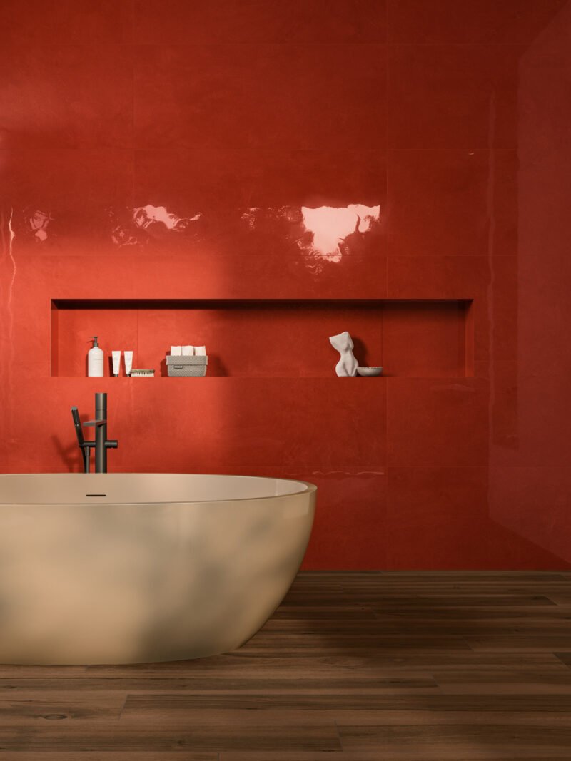
Vivia by Atlas Concorde places deep red within a glazed architectural palette.
Vivia by Atlas Concorde places deep red within a glazed architectural palette. Image courtesy of the manufacturer.

1. Colour becomes a planning tool

Burgundy, brown, terracotta, red and yellow appeared as full architectural palettes rather than occasional accents. Atlas Concorde’s Vivia uses vivid glazed tones, while other collections build families of related densities. Strong colour can identify a wet zone, threshold or wall plane, but batch variation and future replacement need to be considered early when the hue carries the room.

Ossidiana Abisso by Ceramica Fioranese explores a dark mineral green.
Ossidiana Abisso by Ceramica Fioranese explores a dark mineral green. Image courtesy of the manufacturer.
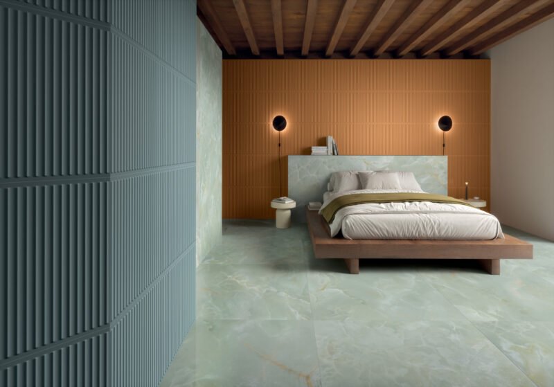
Eterea by Gardenia Ariana combines onyx effects with fluted wall tiles.
Eterea by Gardenia Ariana combines onyx effects with fluted wall tiles. Image courtesy of the manufacturer.
Plinth by Sartoria uses green tones and relief to change with the light.
Plinth by Sartoria uses green tones and relief to change with the light. Image courtesy of the manufacturer.

2. Green connects colour with material memory

Greens ranged from dark mineral tones to pale sage and translucent onyx effects. Gardenia Ariana pairs glossy fields with fluted pieces, while Sartoria’s Plinth combines green with three-dimensional texture. The result changes under daylight and grazing artificial light, making sample review at the project site more useful than judging a small image alone.
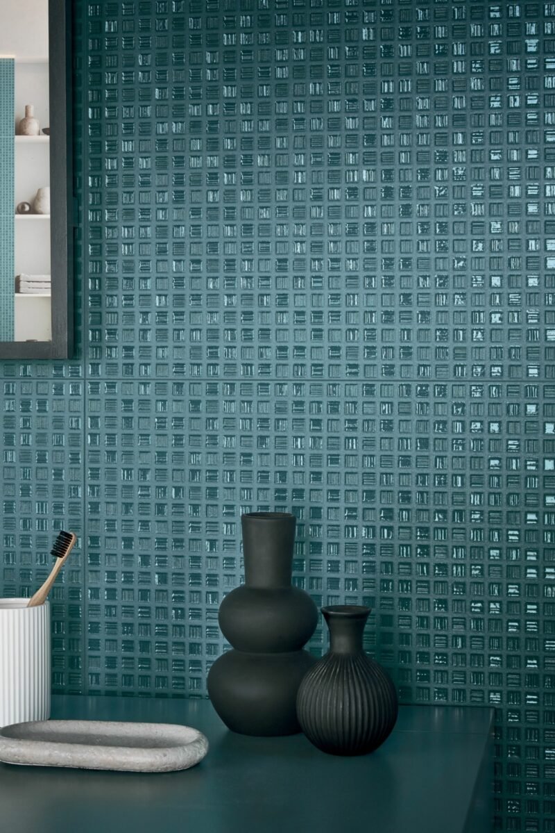
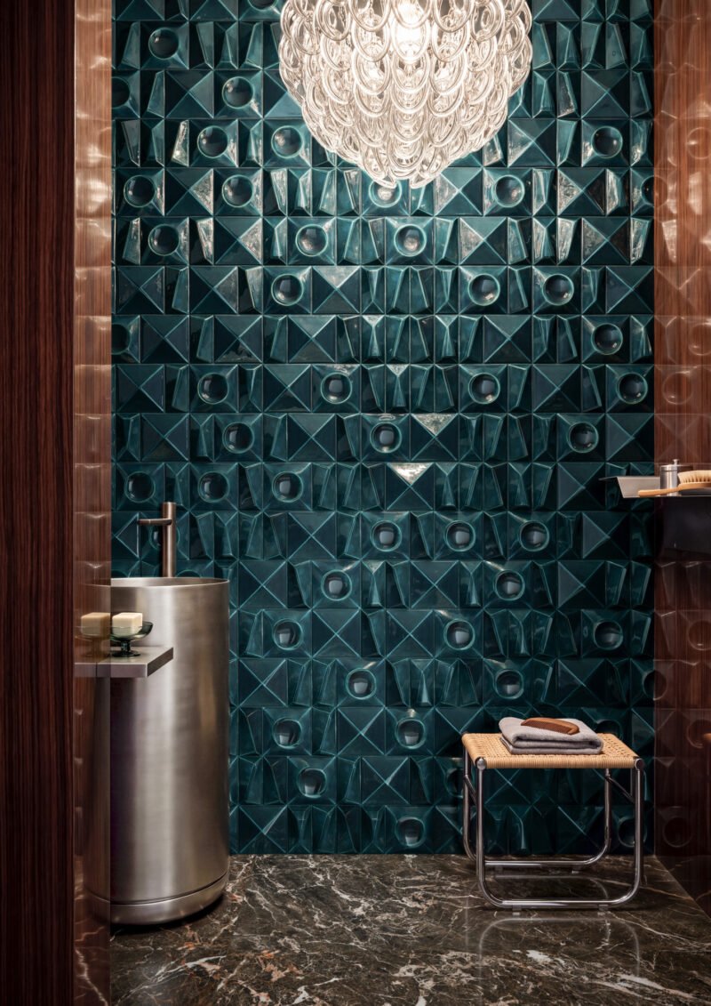
Multiforme Mira by Marca Corona combines matte fields with glossy tesserae.
Multiforme Mira by Marca Corona combines matte fields with glossy tesserae. Image courtesy of the manufacturer.
Smeralda by Cerasarda makes relief part of the wall surface.
Smeralda by Cerasarda makes relief part of the wall surface. Image courtesy of the manufacturer.
Hypnotic Owl by Moooi Ceramic Surfaces and ABK uses digitally applied relief.
Hypnotic Owl by Moooi Ceramic Surfaces and ABK uses digitally applied relief. Image courtesy of the manufacturer.
Lamiere by Appiani creates apparent depth through light and reflectivity.
Lamiere by Appiani creates apparent depth through light and reflectivity. Image courtesy of the manufacturer.

3. Relief changes the work of light

Several collections use real or apparent depth. Marca Corona mixes matte backgrounds with glossy tesserae; Moooi Ceramic Surfaces and ABK use a digitally applied relief; Appiani creates an illusion that looks dimensional while remaining flat to the touch. Each condition carries different consequences for grout lines, cleaning and placement near hand contact.
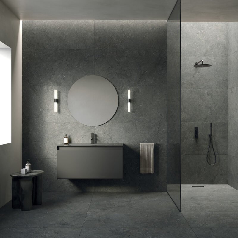
Magma by Flaviker translates slate and lava references into porcelain stoneware.
Magma by Flaviker translates slate and lava references into porcelain stoneware. Image courtesy of the manufacturer.
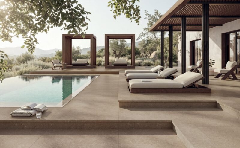
Essenziale by Verde uses 3D printing to model limestone irregularity.
Essenziale by Verde uses 3D printing to model limestone irregularity. Image courtesy of the manufacturer.
Marble Boutique by Del Conca develops marble and onyx effects across several finishes.
Marble Boutique by Del Conca develops marble and onyx effects across several finishes. Image courtesy of the manufacturer.

4. Nature is reproduced, then edited

Porcelain continues to translate slate, lava, limestone, marble and onyx, but the emphasis is shifting from simple imitation to controlled variation. Flaviker’s Magma and Verde’s Essenziale use colour and depth to suggest geological irregularity. Del Conca’s Marble Boutique extends the approach through multiple finishes and slabs up to 48 by 110 inches. The visual effect does not replace a technical comparison of wear, slip, thickness and repair.
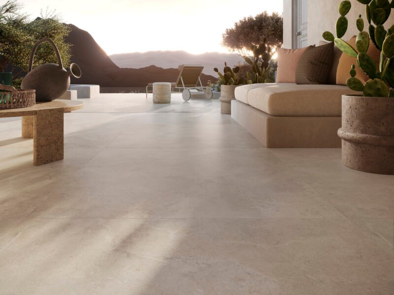
Solaris by Cotto D’Este extends porcelain across floors, walls and furniture-scale surfaces.
Solaris by Cotto D’Este extends porcelain across floors, walls and furniture-scale surfaces. Image courtesy of the manufacturer.

5. Large format moves beyond the floor

Large-format material is now being coordinated across walls, islands, counters and furniture-scale elements. ANSI defined large-format tile in 2025 as tile with at least one facial dimension of 23 inches or more. Solaris by Cotto D’Este reaches formats up to 24 by 128 inches. Fewer joints create continuity, but substrate tolerance, handling and cutting become more demanding.
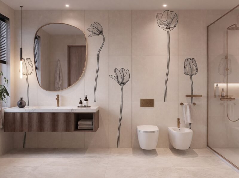
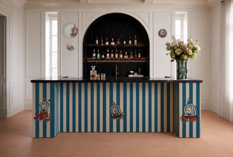
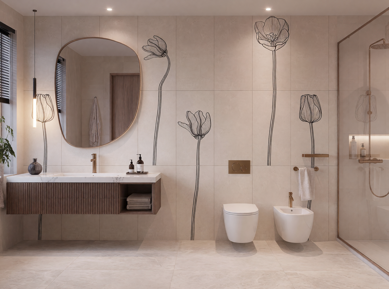
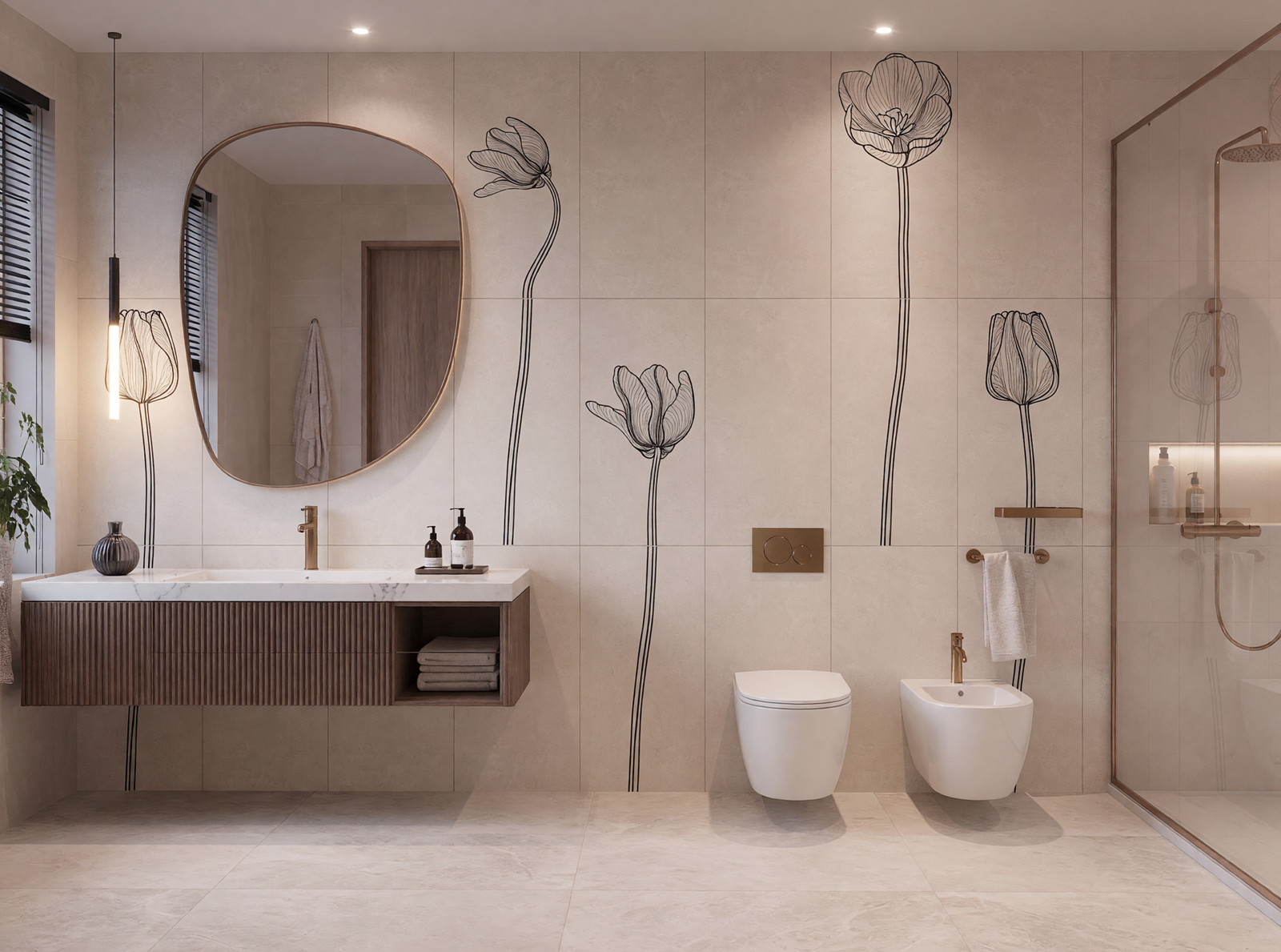
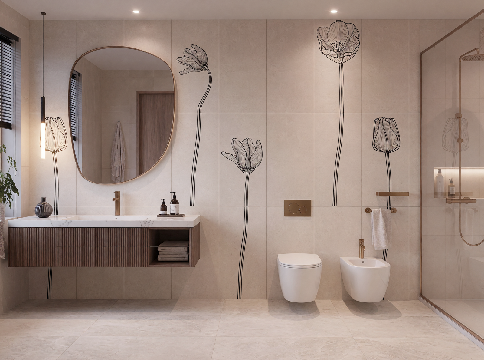
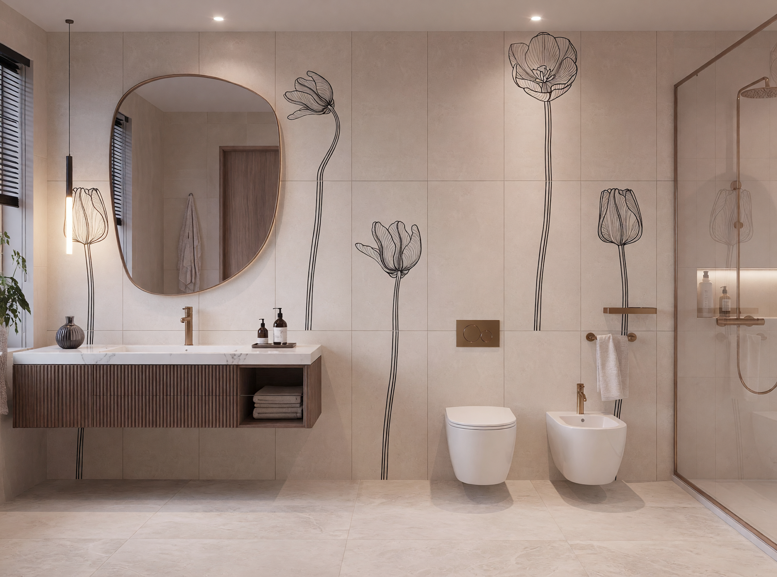
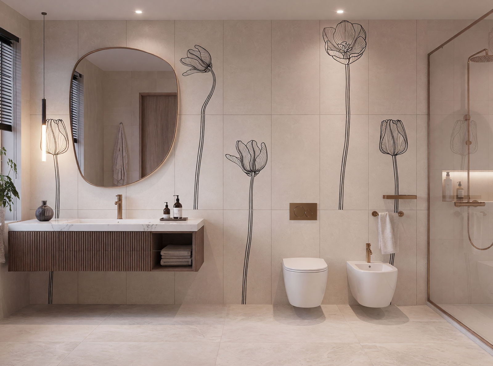
Tulipani by Ceramica Bardelli combines floral imagery with contemporary production.
Tulipani by Ceramica Bardelli combines floral imagery with contemporary production. Image courtesy of the manufacturer.
Searcus by Ceramica Bardelli uses digitally printed patterns inspired by sea and circus imagery.
Searcus by Ceramica Bardelli uses digitally printed patterns inspired by sea and circus imagery. Image courtesy of the manufacturer.
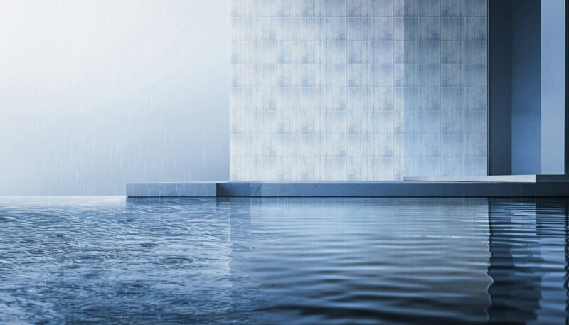
Rain by Kengo Kuma and Ceramica Francesco De Maio preserves the trace of hand painting.
Rain by Kengo Kuma and Ceramica Francesco De Maio preserves the trace of hand painting. Image courtesy of the manufacturer.
Rain Azzurro develops the collection through a cool blue field.
Rain Azzurro develops the collection through a cool blue field. Image courtesy of the manufacturer.
A hand-decorated Rain tile makes variation part of the finished surface.
A hand-decorated Rain tile makes variation part of the finished surface. Image courtesy of the manufacturer.
Tuli Charme variation 5 tests scale and repetition within a floral system.
Tuli Charme variation 5 tests scale and repetition within a floral system. Image courtesy of the manufacturer.
Tuli Charme variation 4 shifts the balance between motif and background.
Tuli Charme variation 4 shifts the balance between motif and background. Image courtesy of the manufacturer.
Tuli Charme variation 3 uses a denser decorative rhythm.
Tuli Charme variation 3 uses a denser decorative rhythm. Image courtesy of the manufacturer.
Tuli Charme variation 2 shows how pattern can organise a wall plane.
Tuli Charme variation 2 shows how pattern can organise a wall plane. Image courtesy of the manufacturer.
Tuli Charme variation 1 isolates the floral language at a smaller scale.
Tuli Charme variation 1 isolates the floral language at a smaller scale. Image courtesy of the manufacturer.
The Tuli Charme family combines repeated modules into a larger composition.
The Tuli Charme family combines repeated modules into a larger composition. Image courtesy of the manufacturer.

6. Digital precision meets the hand-painted mark

Decorative collections ranged from cold digital printing and laser engraving to hand painting. Ceramica Bardelli’s Tulipani and Searcus demonstrate controlled repetition, while Kengo Kuma’s Rain collection for Ceramica Francesco De Maio keeps the movement of the hand visible. The choice is not between old and new technology; it is between predictable modules and accepted variation, each requiring a different layout strategy.

Credits

Products and manufacturers are identified in the image captions. Cersaie 2026 was held in Bologna at the end of September, bringing together ceramic, surface and bathroom-furnishing manufacturers. Image rights belong to their respective owners.

✦ ArchUp Editorial Insight

The pressure behind the Cersaie collections is not simply the demand for new colours. Ceramic manufacturers are being asked to make one surface perform as image, texture, durable finish and, increasingly, a continuous layer across floors, walls, counters and furniture. The design response is greater control: richer glazes, digitally registered relief, deeper printing and larger formats that reduce visible joints. For the user, these tools can produce calmer continuity or stronger orientation, but they also magnify specification errors. A convincing stone image does not make porcelain behave like stone, and a visually seamless slab still requires movement joints, flat substrates, handling equipment and a repair strategy. Relief can animate grazing light yet collect dirt in demanding locations; saturated colour can organise a room but makes later replacement batches more visible. Hand-painted variation offers a different value from digitally repeatable precision, and the two should not be judged by the same expectation of uniformity. The practical lesson is to select tile from the conditions of use outward: slip resistance, cleaning, edge detail, module, installer capability and spare stock should be resolved before the image becomes the specification.

Further Reading From ArchUp

  • Blue Bottle Coffee Harajuku Redefines Urban Tranquility

    Visual Contrast and Spatial Segmentation The architectural response of the Blue Bottle Coffee Harajuku café by TEKI Design extends beyond…

  • Slow Fitness: An Interior Environment for Movement and Pause

    Located within the Towarowa22 complex in central Warsaw, CHANGE Studio is conceived as an interior space that supports physical activity…

  • Historical and Symbolic Inspiration

    Designers drew on the legacy of clay‑court tennis at Roland Garros to frame this concept for the Terracotta Tennis Arena. Over…

  • |

    Meridiani Unveils Its New Milan’s Fashion District Flagship

    The renowned fashion sector of Milan, Via Manzoni, is the ideal location for luxury brands seeking to create a storefront….

Leave a Reply

Your email address will not be published. Required fields are marked *